Preamble
For your interest, I have listed below, other posts on this blogspot that centers on the use of street art:
Unleashed: The Rise of Australian Street Art
New York Spray-Can Memorials: A Backdrop to Life
Another Brick
Cultural Graffiti
Beyond the Fear of Freedom
Oh, Oh Marilyn and Mona@Spoonflower
Neu Kunst: Mona & Marilyn
Paste Modernism 4
Graffiti Versus Post Graffiti Art
Pure Evil - Street Art
3A Crew - Street Art
Street Graphics of Tokyo - Part I
Street Graphics of Tokyo - Part II
Street Art
Introduction [1]
Destruction by an earthquake in 1923 and the U.S. fire bombing of 1945, meant that after the war years Toyko needed to rebuild. The capital's ancient sites were reconstructed, traditional in form, but their 'historic' status now lost in a city of constant reinvention. There appeared to be no thoughtful urban planning outside of the 'new and now', trends passed quickly, rebuilding was continual. Bullet trains glided over the Rainbow bridge to Tokyo Big Sight, a convention center constructed from inverted pyramids on an artificial island.
Poster highlighting a bullet train.
Towering architectural facades are animated by 21st-century digital graphics. Giant images 'speak' through multiple sound systems to mass commuters in the streets below. The futuristic Los Angeles of the classic sci-fi move 'Blade Runner' was inspired by the intensely visual and ultra modern metropolis of Tokyo.
Poster of film, Blade Runner.
Street Graphics of Tokyo - Part I [1]
'Courage,' Kanji Calligraphy Poster (Japanese Wall Art).
A Cake Store Paper Carrier Bag.
Japanese Stamps.
Festival depicted on a flea-market poster.
Wanted Poster featring suspected Aum Sshinrikyo Cult Members.
Another Wanted Poster featuring suspected Aum Sshinrikyo Cult Members.
The cartoon mouse character, Pi-Po on this poster, represents the Tokyo police force.
Reference:
[1] B. Dawson, Street Graphics Tokyo, Thames & Hudson Ltd, London.
Carnovsky [1]
Carnovsky are a Milan-based art/design duo comprising Silvia Quintanilla and Francesco Rugi. They were on the threshold between art and design, mixing different worlds, disciplines and techniques, such as wallpaper to create frescos that continuously mutate via interaction with colored lights ("RGB'), or creating architectures through pulses ('Artificalia'). Color is a key issue in their work, so they are always experimenting with different processes and techniques to arrive at the right colors when printing on various materials, whether it is to create wallpaper, limited-edition prints, garments, accessories or furniture, or utlilsing hand-dyed fabrics for carpets and tapestry.
Animalia No. 2 Black, digital (2012).
Animalia No. 2 Black, digital (2012).
Animalia No. 2 Black, digital (2012).
Animalia No. 2 Black, digital (2012).
The use of wallpaper as a sort of contemporary fresco in combination with RGB (red-green-blue) color-changing lights allows Carnovsky to create completely immersive environments in which the viewer acts like an explorer in an ever-changing world.
Bestiario, digital (2012).
Landscape No. 1, digital (2013).
Their limited editions, ranging from prints to large screens and tapestry, enable them to work on the richness of the materials and to use traditional techniques in creating a unique piece. The general theme of their work is metamorphosis, narrating a story of the elements pictured through ideas of their unceasing mutation and transformation. Carnovsky's visual universe, inspired by their fascination of the antique natural-history books and reproduction techniques, such as engraving, with its richness of stroke, is populated by real and imaginary creatures, plants, anatomical studies, landscapes, gods, atmospheric phenomena and so on.
Jungla No. 1 Black, digital (2011).
Versalio Screen, UV ink, digital (2012).
Vesalio Carpet. Hand-knotted rug. 196 knots per inch (2011).
Carnovsky use reproductions of the original engravings, mostly from the eighteenth and nineteenth centuries. They prefer this period because they like to think of each animal, plant or object as a sort of character in an immense narrative, and these original images, with their subtle balance between the realistic and the fantastical, have a certain look or mood as if they are trying to say something, which is important in the conception of their work. In fact, there is a mix of old and new in Carnovsky's work, so that it is hard to position it in history. On the one hand, their imaginative stimulus comes from ancient sources, though the output is quite contemporary; on the other hand, they are always experimenting with new technologies in printing, production and lighting. In the end, their work deals with the history, memories, the recreational and even childish part in everyone, creating an emotional tie that is what remains in people's memory.
Jungle No. 1. Digital (2011).
Reference:
[1] People of Print, Thames & Hudson.
Preamble
For you convenience, I have listed below posts in this series:
Early Australian Posters and Program Covers [1] - Part I
Early Australian Posters and Program Covers [1] - Part II
Introduction [1]
Like many aspects of white Australian culture, the Australian theatre had convict beginnings. The first stage performance in Australia was by a group of Sydney convicts, who in June of 1789, played 'The Recruiting Officer' by London playwright, George Farquhar. Regular performances, however did not begin until the 1830s when a Sydney publican, Barbett Levey, attached the Theatre Royal to his hotel. Theatre Royal, Royal Victoria and Queen's Theatre Royal, were popular names for colonial theatres, but the early buildings were not always as grand as their names. Sometimes a stage was set up in a warehouse or a large room attached to a tavern or a hotel. By the 1840s there was a Theatre Royal in Hobart (this beautiful building is still standing), a Royal Victoria in Sydney, a Queen's Theatre Royal in Melbourne, and a Queen's in Adelaide.
Theatre Royal, Hobart (Australia).
Queen's Theatre, Adelaide (Australia).
Theatre Royal, Sydney (Australia).
The Regent, Sydney (Australia).
Princess Theatre, Melbourne (Australia).
Theatrical performances began in Brisbane during the 1850s, but the city had to wait until 1881 for its Theatre Royal to be built. Perth's first substantial theatre, also called the Theatre Royal, appeared in 1897. From an early date, small halls such as those attached to mechanics' institutes, also served as venues for theatrical performances. In New South Wales (Australia) these were often called School of Arts. St. George's Hall was another popular name for smaller theatres. For example, Melbourne's theatre of that name saw early variety and music hall entertainment as did Perth's St. Georges Hall.
From the 1840s the gradually increasing white population of Australian eastern colonies began to make them attractive to touring companies and for theatrical settlers from England. Noteable among these early performers was actor-manager, George Selth Coppin, who arrived in Adelaide (Australia) in 1845. Known as the "Father of Australian Theatre," Coppin was for over 50 years, a major figure in Australian entertainment.
George Selth Coppin.
As well as being a great comic actor, his entrepreneurial activities included fine productions of Shakespeare with imported stars like G.V. Brooke, Edwin Booth, Charles and Ellen Kean, and the American comedian Joseph Jefferson. He also encouraged local talent.
The actress Julia Mathews and Nellie Stewart were among many performers whose successful careers were furthered by his management. Other Coppin enterprises included an amusement park, Cremorne Gardens, in Melbourne (Australia) and the introduction of ice-skating and bicycle riding to the Australian public.
In those times, for women especially, the stage was considered a doubtful profession. Mrs. Anne Clarke, an "actress manager," was an early entrepreneur who tried to improve the image of the actress. Arriving in Hobart in 1834, she led a troupe of actors on tour of the eastern colonies and was lessee of the Theatre Royal, Hobart. She also brought a dramatic and operatic company to Hobart in 1842 and offered free acting tuition to "respectable females" before she retired in 1846.
To people who loved the theatre, however, a leading lady was always admired and respected. It was not until the late nineteenth century that the acting profession began to be perceived as a respectable profession. The British actor, Henry Irving, was the first of the profession to be knighted in 1895, but the actress Ellen Terry was not created a Dame of the British Empire until 1925.
The gold rushes of the 1850s to New South Wales and Victoria (Australia) vastly increased the population and prosperity of the regions. Artists such as the notorious Lola Montes and the famous singers, Catherine Hayes and Anna Bishop, entertained miners in ramshackle theatres on the gold fields or the newly properous in the substantial theatres of Sydeny and Melbourne (Australia). By the 1860s there were several theatres able to hold as many as 3,000 people. Although often of uneven quality, performances of opera and ballet had been given since the 1830s. In 1861 the Irishman, William Saurin Lyster, founded the Australian opera company that was to last until Lyster's death in 1880. It was headed by English, Italian and American singers, but included some local talent such as tenor, Armes Beaumont.
Early Australian Posters and Program Covers- Part I[1]
Theatre program cover. The Maid of the Mountains (1925).
Theatre program cover. The Maid of the Mountains (1925).
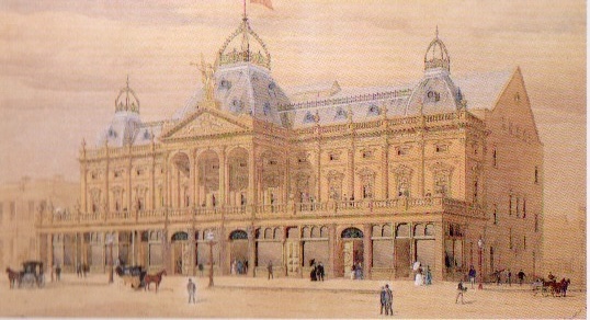
Theatre program cover. Sydney's Tivoli (Australia) (1926).
Theatre program cover. Melbourne's Trivoli (Australia) (1924).
Poster. Melbourne's Princess Theatre (Australia.)
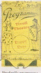
Vaudeville Program.
Program cover.
Program Cover.
Reference:
[1] Article by Mimi Colligan, Australia Post Philatelic Group.
Preamble
This is the thirty-third post in a new Art Resource series that specifically focuses on techniques used in creating artworks. For your convenience I have listed all the posts in this new series below:
Drawing Art
Painting Art - Part I
Painting Art - Part II
Painting Art - Part III
Painting Art - Part IV
Painting Art - Part V
Painting Art - Part VI
Home-Made Painting Art Materials
Quality in Ready-Made Artists' Supplies - Part I
Quality in Ready-Made Artists' Supplies - Part II
Quality in Ready-Made Artists' Supplies - Part III
Historical Notes on Art - Part I
Historical Notes on Art - Part II
Historical Notes on Art - Part III
Historical Notes on Art - Part IV
Historical Notes on Art - Part V
Tempera Painting
Oil Painting - Part I
Oil Painting - Part II
Oil Painting - Part III
Oil Painting - Part IV
Oil Painting - Part V
Oil Painting - Part VI
Pigments
Classification of Pigments - Part I
Classification of Pigments - Part II
Classification of Pigments - Part III
Pigments for Oil Painting
Pigments for Water Color
Pigments for Tempera Painting
Pigments for Pastel
Japanese Pigments
Pigments for Fresco Painting - Part I
Pigments for Fresco Painting - Part II
Selected Fresco Palette for Permanent Frescoes
Properties of Pigments in Common Use
Blue Pigments - Part I
Blue Pigments - Part II
Blue Pigments - Part III
Green Pigments - Part I
Green Pigments - Part II
Red Pigments - Part I
Red Pigments - Part II
Yellow Pigments - Part I
Yellow Pigments - Part II
Brown and Violet Pigments
Black Pigments
White Pigments - Part I
White Pigments - Part II
White Pigments - Part III
Inert Pigments
Permanence of Pigments: New Pigments - Part I
Permanence of Pigments: New Pigments - Part II
Limited or Restricted Palettes
Testing of Pigments - Part I
Testing of Pigments - Part II
Further Refinement of Pigments
There have been another one hundred and thirteen posts in a previous Art Resource series that have focused on the following topics:
(i) Units used in dyeing and printing of fabrics;
(ii) Occupational, health & safety issues in an art studio;
(iii) Color theories and color schemes;
(iv) Optical properties of fiber materials;
(v) General properties of fiber polymers and fibers - Part I to Part V;
(vi) Protein fibers;
(vii) Natural and man-made cellulosic fibers;
(viii) Fiber blends and melt spun fibers;
(ix) Fabric construction;
(x) Techniques and woven fibers;
(xi) Basic and figured weaves;
(xii) Pile, woven and knot pile fabrics;
(xiii) Durable press and wash-and-wear finishes;
(xvi) Classification of dyes and dye blends;
(xv) The general theory of printing.
To access any of the above resources, please click on the following link - Units Used in Dyeing and Printing of Fabrics. This link will highlight all of the one hundred and thirteen posts in the previous a are eight data bases on this blogspot, namely, the Glossary of Cultural and Architectural Terms, Timelines of Fabrics, Dyes and Other Stuff, A Fashion Data Base, the Glossary of Colors, Dyes, Inks, Pigments and Resins, the Glossary of Fabrics, Fibers, Finishes, Garments and Yarns, Glossary of Art, Artists, Art Motifs and Art Movements, Glossary of Paper, Photography, Printing, Prints and Publication Terms and the Glossary of Scientific Terms. All data bases in the future will be updated from time-to-time.
If you find any post on this blog site useful, you can save it or copy and paste it into your own "Word" document for your future reference. For example, Safari allows you to save a post (e.g. click on "File", click on "Print" and release, click on "PDF" and then click on "Save As" and release - and a PDF should appear where you have stored it). Safari also allows you to mail a post to a friend (click on "File", and then point cursor to "Mail Contents On This Page" and release). Either way, this or other posts on this site may be a useful Art Resource for you.
The new Art Resource series will be the first post in each calendar month. Remember - these Art Resource posts span information that will be useful for a home hobbyist to that required by a final year University Fine-Art student and so undoubtedly, some parts of any Art Resource post may appear far too technical for your needs (skip those mind boggling parts) and in other parts, it may be too simplistic with respect to your level of knowledge (ditto the skip). The trade-off between these two extremes will mean that Art Resource posts will be hopefully useful in parts to most, but unfortunately may not be satisfying to all!
Pigments for Fresco Painting - Part I [1]
There is a lack of modern scientific and technical studies directly related to artists' materials; much carefully controlled research remains to be done to bring our data on fresco colors up to date.
The fresco palette is more restricted than any of the others; the pigments must not only be absolutely light proof, but must resist the alkaline action of lime plaster and the acid action in the polluted air. Pigments must be free from soluble salts and any impurities that are likely to react with acids or alkalis. When selecting pigments, attention should be given to the brilliance and purity of tone in the dry state, which is approximately, if not exactly, the same as the finished fresco effect.
Egyptian Mural Palette.
(i) Black.
Carbon Lampblack (see below).
(ii) Blue.
Azurite (see below) and Egyptian Blue Frit.
(iii) Brown.
Various Native Earths.
(iv) Green.
Malachite (see below) and Crysocolla.
(v) Red.
(vi) White.
Chalk (see below) and Gypsum.
(vii) Yellow.
Ochre and native orpiment (see below).
Minoan Fresco Palette.
(i) White.
Lime Putty (see below).
(ii) Black.
Powdered Slate (see below).
(iii) Red.
Native Red Oxide (see below).
(iv) Blue.
Egyptian Blue Frit Balls (see below).
(v) Bluish Green.
The Bull Leapers fresco (see below).
(vi) Yellow.
Fresco depicting three women: This fresco from the complex at Knossos depicts a popular fashion for Minoan women.
Note: The yellow lapels.
Roman Fresco Palette.
(i) Black.
Lampblack and bone black (see below).
(ii) Blue.
Egyptian Blue (possibly in copper ores).
(iii) Brown.
(iv) Aqua.
(v) Lime Green.
(vi) Egyptian Yellow.
(vii) Red.
Native oxides and Pozzuoli Red (see below), etc.
Note: Probably refined, washed, and burnt earths were used. The method of making Egyptian blue and green was brought from Egypt to Pozzuoli.
Reference:
[1] The Artist's Handbook of Materials and Techniques, R. Mayer (ed. E. Smith) 4th Edition, Faber and Faber, London (1981).

 Poster highlighting a bullet train.
 Poster of film, Blade Runner.
 'Courage,' Kanji Calligraphy Poster (Japanese Wall Art).
 A Cake Store Paper Carrier Bag.
 Japanese Stamps.
 Festival depicted on a flea-market poster.
 Wanted Poster featring suspected Aum Sshinrikyo Cult Members.
 Another Wanted Poster featuring suspected Aum Sshinrikyo Cult Members.
 The cartoon mouse character, Pi-Po on this poster, represents the Tokyo police force.