
Preamble
This is the thirty-first post in a new Art Resource series that specifically focuses on techniques used in creating artworks. For your convenience I have listed all the posts in this new series below:
Drawing Art
Painting Art - Part I
Painting Art - Part II
Painting Art - Part III
Painting Art - Part IV
Painting Art - Part V
Painting Art - Part VI
Home-Made Painting Art Materials
Quality in Ready-Made Artists' Supplies - Part I
Quality in Ready-Made Artists' Supplies - Part II
Quality in Ready-Made Artists' Supplies - Part III
Historical Notes on Art - Part I
Historical Notes on Art - Part II
Historical Notes on Art - Part III
Historical Notes on Art - Part IV
Historical Notes on Art - Part V
Tempera Painting
Oil Painting - Part I
Oil Painting - Part II
Oil Painting - Part III
Oil Painting - Part IV
Oil Painting - Part V
Oil Painting - Part VI
Pigments
Classification of Pigments - Part I
Classification of Pigments - Part II
Classification of Pigments - Part III
Pigments for Oil Painting
Pigments for Water Color
Pigments for Tempera Painting
Pigments for Pastel
Japanese Pigments
Pigments for Fresco Painting - Part I
Pigments for Fresco Painting - Part II
Selected Fresco Palette for Permanent Frescoes
Properties of Pigments in Common Use
Blue Pigments - Part I
Blue Pigments - Part II
Blue Pigments - Part III
Green Pigments - Part I
Green Pigments - Part II
Red Pigments - Part I
Red Pigments - Part II
Yellow Pigments - Part I
Yellow Pigments - Part II
Brown and Violet Pigments
Black Pigments
White Pigments - Part I
White Pigments - Part II
White Pigments - Part III
Inert Pigments
Permanence of Pigments: New Pigments - Part I
Permanence of Pigments: New Pigments - Part II
Limited or Restricted Palettes
Testing of Pigments - Part I
Testing of Pigments - Part II
Further Refinement of Pigments
Color and Light - Part I
There have been another one hundred and thirteen posts in a previous Art Resource series that have focused on the following topics:
(i) Units used in dyeing and printing of fabrics;
(ii) Occupational, health & safety issues in an art studio;
(iii) Color theories and color schemes;
(iv) Optical properties of fiber materials;
(v) General properties of fiber polymers and fibers - Part I to Part V;
(vi) Protein fibers;
(vii) Natural and man-made cellulosic fibers;
(viii) Fiber blends and melt spun fibers;
(ix) Fabric construction;
(x) Techniques and woven fibers;
(xi) Basic and figured weaves;
(xii) Pile, woven and knot pile fabrics;
(xiii) Durable press and wash-and-wear finishes;
(xvi) Classification of dyes and dye blends;
(xv) The general theory of printing.
To access any of the above resources, please click on the following link - Units Used in Dyeing and Printing of Fabrics. This link will highlight all of the one hundred and thirteen posts in the previous a are eight data bases on this blogspot, namely, the Glossary of Cultural and Architectural Terms, Timelines of Fabrics, Dyes and Other Stuff, A Fashion Data Base, the Glossary of Colors, Dyes, Inks, Pigments and Resins, the Glossary of Fabrics, Fibers, Finishes, Garments and Yarns, Glossary of Art, Artists, Art Motifs and Art Movements, Glossary of Paper, Photography, Printing, Prints and Publication Terms and the Glossary of Scientific Terms. All data bases in the future will be updated from time-to-time.
If you find any post on this blog site useful, you can save it or copy and paste it into your own "Word" document for your future reference. For example, Safari allows you to save a post (e.g. click on "File", click on "Print" and release, click on "PDF" and then click on "Save As" and release - and a PDF should appear where you have stored it). Safari also allows you to mail a post to a friend (click on "File", and then point cursor to "Mail Contents On This Page" and release). Either way, this or other posts on this site may be a useful Art Resource for you.
The new Art Resource series will be the first post in each calendar month. Remember - these Art Resource posts span information that will be useful for a home hobbyist to that required by a final year University Fine-Art student and so undoubtedly, some parts of any Art Resource post may appear far too technical for your needs (skip those mind boggling parts) and in other parts, it may be too simplistic with respect to your level of knowledge (ditto the skip). The trade-off between these two extremes will mean that Art Resource posts will be hopefully useful in parts to most, but unfortunately may not be satisfying to all!
Pigments for Pastel [1]
All the poisonous and sulfur-sensitive pigments, such as Naples yellow, white lead, arsenic cobalt violet, emerald green, etc., are eliminated from the pastel platette.
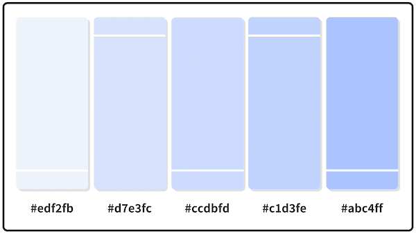 Alice Blue + Lavender Web + Baby Blue Eyes Pastel Color Palettes.
When making one's own crayons, only the strongest, highest-grade colors should be selected, and in all tests, particular attention should be paid to their brightest appearance in the dry state. The only white necessary, or desirable, is precipitated chalk. French chalk (talc) has been recommended by some writers as an addition to pastel crayons on account of its particularly smooth or soapy texture. If it seems advisable for any reason to use one of the more opaque or heavy whites, no more than a 10% addition of the titanium to the chalk should be used.
 French Chalk.
Some pigments which are often rejected for use in other mediums on account of their slight solubility in water, may be used in pastel where this property is of no importance; also some of the colors, which bleed in oil, can be employed if thoroughly light-proof. This makes more of the new synthetic pigment products available. Some of the best grades of Vandyke brown are light-proof and have permanence in pastel in spite of their bad behavior in oil.
 Vandyke Brown.
Some of the borderline colors have been recommended on the theory that the relative thickness of the pastel coating, and the absence of medium, reduce the likelihood of failure to a minimum, but as in any other technique it is safest to use only the most light-proof pigments.
With the exception of the poisonous and sulfur-sensitive pigments, all the permanent water color and tempera colors can be used, but, as in gouache, the transparent or glaze pigments will function as body colors. Emerald green, all the lead colors, and arsenic cobalt violet are considered too poisonous, because of the dusting of crayons during use.
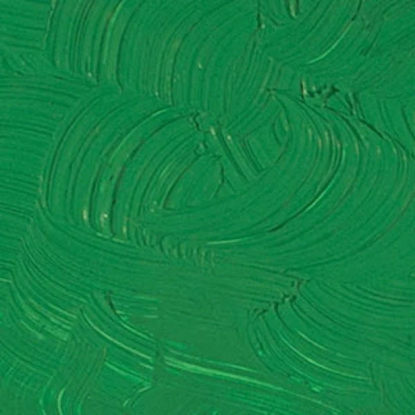 Emerald Green.
One must avoid the continuous inhalation of the dusty powder that is likely to rise during the normal application of pastels to paper, as well as from rubbing or manipulating the crayons. It is well known that no dusty powders (ordinary talc powder for example) should be inhaled. Harmless though their nature may be, the continued breathing into your lungs of any powder is injurious to your health. Pastels are therefore not ideal for individuals who may be sensitive or allergic to such powders.
 Artist Barbara Rachkos wearing a mask while creating a work of art using pastels on paper.
Reference:
[1] The Artist's Handbook of Materials and Techniques, R. Mayer (ed. E. Smith) 4th Edition, Faber and Faber, London (1981).
This is the thirty-first post in a new Art Resource series that specifically focuses on techniques used in creating artworks. For your convenience I have listed all the posts in this new series below:
Drawing Art
Painting Art - Part I
Painting Art - Part II
Painting Art - Part III
Painting Art - Part IV
Painting Art - Part V
Painting Art - Part VI
Home-Made Painting Art Materials
Quality in Ready-Made Artists' Supplies - Part I
Quality in Ready-Made Artists' Supplies - Part II
Quality in Ready-Made Artists' Supplies - Part III
Historical Notes on Art - Part I
Historical Notes on Art - Part II
Historical Notes on Art - Part III
Historical Notes on Art - Part IV
Historical Notes on Art - Part V
Tempera Painting
Oil Painting - Part I
Oil Painting - Part II
Oil Painting - Part III
Oil Painting - Part IV
Oil Painting - Part V
Oil Painting - Part VI
Pigments
Classification of Pigments - Part I
Classification of Pigments - Part II
Classification of Pigments - Part III
Pigments for Oil Painting
Pigments for Water Color
Pigments for Tempera Painting
Pigments for Pastel
Japanese Pigments
Pigments for Fresco Painting - Part I
Pigments for Fresco Painting - Part II
Selected Fresco Palette for Permanent Frescoes
Properties of Pigments in Common Use
Blue Pigments - Part I
Blue Pigments - Part II
Blue Pigments - Part III
Green Pigments - Part I
Green Pigments - Part II
Red Pigments - Part I
Red Pigments - Part II
Yellow Pigments - Part I
Yellow Pigments - Part II
Brown and Violet Pigments
Black Pigments
White Pigments - Part I
White Pigments - Part II
White Pigments - Part III
Inert Pigments
Permanence of Pigments: New Pigments - Part I
Permanence of Pigments: New Pigments - Part II
Limited or Restricted Palettes
Testing of Pigments - Part I
Testing of Pigments - Part II
Further Refinement of Pigments
Color and Light - Part I
There have been another one hundred and thirteen posts in a previous Art Resource series that have focused on the following topics:
(i) Units used in dyeing and printing of fabrics;
(ii) Occupational, health & safety issues in an art studio;
(iii) Color theories and color schemes;
(iv) Optical properties of fiber materials;
(v) General properties of fiber polymers and fibers - Part I to Part V;
(vi) Protein fibers;
(vii) Natural and man-made cellulosic fibers;
(viii) Fiber blends and melt spun fibers;
(ix) Fabric construction;
(x) Techniques and woven fibers;
(xi) Basic and figured weaves;
(xii) Pile, woven and knot pile fabrics;
(xiii) Durable press and wash-and-wear finishes;
(xvi) Classification of dyes and dye blends;
(xv) The general theory of printing.
To access any of the above resources, please click on the following link - Units Used in Dyeing and Printing of Fabrics. This link will highlight all of the one hundred and thirteen posts in the previous a are eight data bases on this blogspot, namely, the Glossary of Cultural and Architectural Terms, Timelines of Fabrics, Dyes and Other Stuff, A Fashion Data Base, the Glossary of Colors, Dyes, Inks, Pigments and Resins, the Glossary of Fabrics, Fibers, Finishes, Garments and Yarns, Glossary of Art, Artists, Art Motifs and Art Movements, Glossary of Paper, Photography, Printing, Prints and Publication Terms and the Glossary of Scientific Terms. All data bases in the future will be updated from time-to-time.
If you find any post on this blog site useful, you can save it or copy and paste it into your own "Word" document for your future reference. For example, Safari allows you to save a post (e.g. click on "File", click on "Print" and release, click on "PDF" and then click on "Save As" and release - and a PDF should appear where you have stored it). Safari also allows you to mail a post to a friend (click on "File", and then point cursor to "Mail Contents On This Page" and release). Either way, this or other posts on this site may be a useful Art Resource for you.
The new Art Resource series will be the first post in each calendar month. Remember - these Art Resource posts span information that will be useful for a home hobbyist to that required by a final year University Fine-Art student and so undoubtedly, some parts of any Art Resource post may appear far too technical for your needs (skip those mind boggling parts) and in other parts, it may be too simplistic with respect to your level of knowledge (ditto the skip). The trade-off between these two extremes will mean that Art Resource posts will be hopefully useful in parts to most, but unfortunately may not be satisfying to all!
Pigments for Pastel [1]
All the poisonous and sulfur-sensitive pigments, such as Naples yellow, white lead, arsenic cobalt violet, emerald green, etc., are eliminated from the pastel platette.

When making one's own crayons, only the strongest, highest-grade colors should be selected, and in all tests, particular attention should be paid to their brightest appearance in the dry state. The only white necessary, or desirable, is precipitated chalk. French chalk (talc) has been recommended by some writers as an addition to pastel crayons on account of its particularly smooth or soapy texture. If it seems advisable for any reason to use one of the more opaque or heavy whites, no more than a 10% addition of the titanium to the chalk should be used.
Some pigments which are often rejected for use in other mediums on account of their slight solubility in water, may be used in pastel where this property is of no importance; also some of the colors, which bleed in oil, can be employed if thoroughly light-proof. This makes more of the new synthetic pigment products available. Some of the best grades of Vandyke brown are light-proof and have permanence in pastel in spite of their bad behavior in oil.

Some of the borderline colors have been recommended on the theory that the relative thickness of the pastel coating, and the absence of medium, reduce the likelihood of failure to a minimum, but as in any other technique it is safest to use only the most light-proof pigments.
With the exception of the poisonous and sulfur-sensitive pigments, all the permanent water color and tempera colors can be used, but, as in gouache, the transparent or glaze pigments will function as body colors. Emerald green, all the lead colors, and arsenic cobalt violet are considered too poisonous, because of the dusting of crayons during use.

One must avoid the continuous inhalation of the dusty powder that is likely to rise during the normal application of pastels to paper, as well as from rubbing or manipulating the crayons. It is well known that no dusty powders (ordinary talc powder for example) should be inhaled. Harmless though their nature may be, the continued breathing into your lungs of any powder is injurious to your health. Pastels are therefore not ideal for individuals who may be sensitive or allergic to such powders.

Reference:
[1] The Artist's Handbook of Materials and Techniques, R. Mayer (ed. E. Smith) 4th Edition, Faber and Faber, London (1981).
No comments:
Post a Comment