Preamble
For your convenience I have listed other posts in this series below:
Chinese Calligraphy
European Illumination - Celtic Style
European Illumination - Gothic Style
European Illumination - Romanesque Style
European Illumination - Renaissance Style
The Illumination Art of South-East Asia [1]
Calligraphy is esteemed as the highest form of all Islamic arts, since its prestige derives from its role as the vehicle for the Divine revelation contained in the Qur'an. Throughout the world Arabic script is seen as the symbol of Islam, serving to unite Muslims in a way that no other script does for any creed.
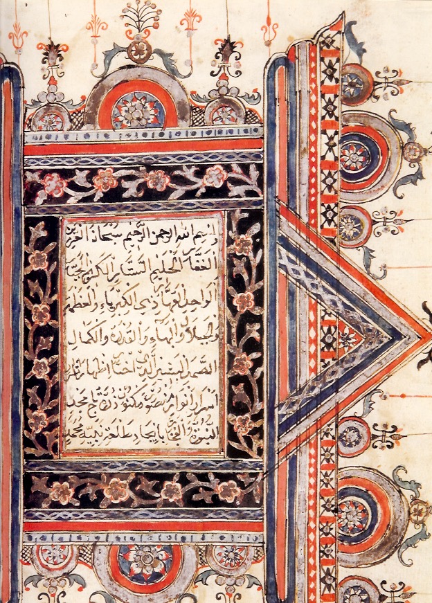
Descrption: Qur'an 19th Century (detail).
Location: Banten, Java, Indonesia.
Courtesy: National Library of Indonesia, Jakarta.
The associated art of illumination has never attracted and retained quite the same level of attention, even when charged with the noble task of beautifying copies of the Qur'an. Yet in view of advantages that paper and pen offer to the artist in the creation of abstract designs it has been suggested that illumination is a kind of "mother art" to other Islamic art forms, responsible for the most highly developed manifestation of patterns and design principles, which later found their way on to pottery, stone, metal, textiles and carpets.
Description: Qur'an 19th Century (detail).
Location: Kitab Mawild, Indonesia.
Courtesy: National Library of Indonesia, Jakarta.
Islamic manuscript art from South-East Asia is still barely known either as a subset of Islamic art or as a distinctive South-East Asian art form. This is largely because, in the Malay world, the study of manuscripts has traditionally been the domain of philologists rather than art historians. It also reflects the uniquely private nature of manuscript art. Textiles and jewelery could be worn; ceramics were used as receptacles; wood carving formed an integral part of architectural structures in mosques, palaces and the houses of nobles; and finely carved tombstones (masonry) heralded the transience of earthly life. Hidden in the covers of manuscript volumes, illumination was only ever encountered and savoured by a very small elite - the readers, owners or patrons of the book.
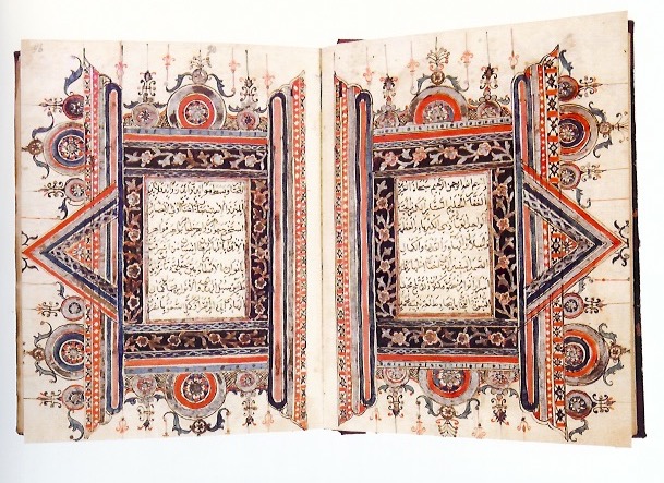
Below are the decorated frames marking the start of the 24th juz' of the Qur'an, chapter al-Zumar 39:32.
Description: Qur'an (1841).
Location: Aceh, North Sumatra.
Courtesy: National Library of Indonesia, Jakarta.
Description: Qur'an (1841).
Location: Aceh, North Sumatra.
Courtesy: National Library of Indonesia, Jakarta.
The number of surviving manuscripts illuminated in the Acehnese style runs into hundreds, and one of the finest is a Qur'an held in the National Library of Indonesia dated 1841 (see above image). An exceptional feature of this Qur'an is that each juz' is marked not merely with a marginal ornament, but with a full decorated double-page frame with elaborate corner pieces and a vertical calligraphic panel containing the juz' number, almost modernist in its dramatic angular presentation (see above two images). The Acehnese style exudes vigour, boldness and a robust graphic sensibility rooted in an unwavering sense of regional identity.
A completely different set of aesthetic attributes is evoked by the manuscript art of the North-East coast of the Malay peninsula. Here, in the present-day Malaysian states of Terengganu and Kelantan, and the Southern Thai region of Patani, magnificent examples of Islamic illumination in South-East Asia can be found, with designs of beauty and refinement, realized with craftsmanship of unsurpassed delicacy and breathtaking technique. The manuscript art of this region undoubtedly forms an integrated whole, but at the same time two distinct styles are evident within this East Coast School, one associated with Terengganu and the other with Patani.
Description: Dala'il al-Khayrat (19th Century).
Location: East coast of the Malay peninsula, probably Patani, Thailand.
Courtesy: National Library of Malaysia, Kuala Lumpur.
Description: Aqidat al-awamm - Terengganu style (late 19th Century).
Location: Terengganu or Kelantan, Malaysia.
Courtesy: National Library of Malaysia, Kuala Lumpur.
The Sulawesi school has a very distinctive style of illuminated double frame (see below). In these frames, the text blocks on each of two facing pages are flanked by decorative vertical borders of the same height. These three vertical sections are in turn closed above and below by a series of densely layered concentric rectangular borders around calligraphic panels containing the surah headings, the whole composition being flanked on both sides by extended vertical borders. At the top and bottom, emerging from the rectangular panels, is a large semi- or partial circle with a smaller circle on either side, while from each of the outer vertical borders protrudes a triangular arch, flanked by two smaller pyramidal composition of three circles.
Description: Sulawesi School - Qur'an February 1731.
Location: Probably Ternate, North Maluku, Indonesia.
Courtesy: National Library of Indonesia, Jakarta.
Description: Sulawesi School - Qur'an 19th Century.
Location: Kitab Mawlid, Indonesia.
Courtesy: National Library of Indonesia, Jakarta.
Description: Qur'an 19th Century.
Location: Kitab Mawlid, Indonesia.
Courtesy: National Library of Indonesia, Jakarta.
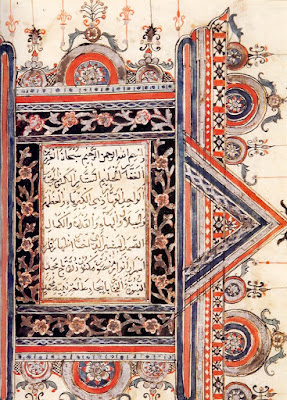
The situation in Banten, situated on the Western end of Java and site of a famous Islamic kingdom founded in the late 16th Century, is rather different. Only a few illuminated manuscripts have been documented and they are linked by such common factors as: technical excellence, unusual color schemes and influence from other Islamic manuscript traditions.
Description: Qur'an 19th Century.
Location: Banten, Java, Indonesia.
Courtesy: National Library of Indonesia, Jakarta.
Description: Qur'an, late 18th Century.
Location: Banten Java, Indonesia.
Courtesy: National Library of Indonesia, Jakarta.
The triangle-rectangle structure can be seen in a very interesting Qur'an dated 1856, now held in Sumedang, near Criebon, in West Java. As is usual in Qur'ans from Java, illuminated double frames in the middle if the book are located at the beginning of Surat al-Kahf (18:1). The ornamentation of the triangular arches and rectangular borders is purely calligraphic, with portions of Muslim affirmation of faith, the shahadah,reserved in white against red or blue backgrounds.
Description: Qur'an 1856.
Location: Sumedang, West Java, Indonesia.
Courtesy: Collection of Prabu Geusan Ulun Museum, Sumedang.
All paths in Javanese manuscript art lead to Yogyakarta, where at the court of the Sultan and minor princely house of Pakualaman the nineteen century appears to have been a time for blossoming for the art of book production. Not only did this period witness the production of considerable numbers of richly illuminated and illustrated manuscripts, but uniquely in Islamic South-East Asia - and even in Java - some of the protagonists emerged from the shadows, revealing their working methods and technical vocabulary. A key figure was Prince Suryakusums (1822 - ca.1886), the youngest son of Sultan Hamengkubiwana IV of Yogykarta, who is linked with several manuals on Javanese manuscript illumination filled with examples of decorated frames and accompanying explanatory text on the significance of every constituent component of decoration.
Description: Qur'an, Serat Tajussalatin, 1799 - 1851.
Location: Yogyakarta, Central Java, Indonesia.
Courtesy: Museum Sonobudoyo, Yogyakarta.
I love these art forms. As a lover of traditional Art of South-East Asia, please enjoy it with me, even though my Art is modern, and Australian, as well as a depiction of art that is environmentally sensitive. My regional cultural heritage has always informed my Art!
Love the experience.
Marie-Therese Wisniowski.
Reference:
[1] A. T. Gallop, Chapter 5: Islamic Manuscript Art of South-East Asia, Crescent Moon, Gordon-Daring Foundation (2005).
Preamble
For your convenience I have listed below the posts on this blog spot that have centered on Arabesque Patterns.
Traditional Japanese Arabesque Patterns - Part I
Traditional Japanese Arabesque Patterns - Part II
Sarasa Arabesque Patterns
Yuzen Arabesque Patterns
Stencil-Dyed Indigo Arabesque Patterns
Introduction [1-3]
The Evolution of Yuzen-dyeing Techniques and Designs after the Meiji Restoration [1]
The following history was written by Yuko Fukatsu-Fukuok[1].
Yuzen-dyeing became the fashion at the end of the 17th Century in Japan. Yuzen-dyeing, a paste resist-dyeing technique, was used to create freehand designs with multiple colors, resulting in large pictorial images, unburdened by the repetitive patterns that characterize most textile techniques. This technique, now called hon-yuzen, which literally means “true yuzen” or “original yuzen” revolutionized kosode decoration in the 18th Century. After the Meiji Restoration of 1868, the design and technique of yuzen dramatically changed, and created a new fashion, not only among the wealthy, but also among middle class women. Behind this evolution stood significant influences of Western textile technology, as well as changes of the social system of Japan. In this paper, Yuko Fukatsu-Fukuok will explore how the introduction of synthetic dyes to Japan influenced hon-yuzen techniques and designs, and how pictorial designs for yuzen created by Japanese artists made a strong impact on kimono decoration in late 19th Century Japan.
The yuzen-dyeing technique was established at the end of the 17th Century and flowered in 18th Century Japanese textile culture. Originally, the term yuzen was derived from the name of a popular fan designer in Kyoto, named Miyazaki Yuzen. Since his designs were very popular, kimono makers and kimono design book publishers designated patterns in his style as the ‘yuzen-pattern’ in kosode. A fashion book, titled Yuzen-hiinagata published in 1688 presented designs in his style such as fan-shaped patterns that were arranged to decorate kosode.
By the end of the 17th Century, the paste resist-dyeing technique that we now call yuzen-dyeing was established. Yuzen-patterns were associated with the technique, and this fashion for pictorial kosode lasted for about ten years. During this period the paste resist-dyeing technique started being called yuzen-dyeing. Around 1692, yuzen-style patterns went out of fashion; nonetheless the technique itself survived and is called yuzen-dyeing to the present day.
Traditional yuzen-dyeing was a true handcraft that made it possible to create pictorial images and as a result, it was very expensive. It is characterized by very fine outlines called "itome", so that hon-yuzen is also called itome-yuzen to the present day. In order to outline pattern areas, rice starch paste (nori) is squeezed from a cone by hand onto the fabric. The paste contained glutinous rice powder, rice paste, rice bran and lime; however the ratio of the ingredients was a secret of the craftsmen. After a liquid made from beans called gojiru is brushed on, to make the dye penetrate, pattern areas are brush-dyed with various colors to create complex designs. The brush shading technique (bokashi-zome) is often used to achieve subtle gradations in shades of colors. After the patterned area of fabric is further resisted with additional rice starch paste, the background is dyed by brush in a technique called hiki-zome. After steaming to set the dyestuff in the fabric, the fabric is washed in water to get rid of the starch paste. In the final step, the fabric is smoothed with steam in order to adjust the length and width. For additional decoration, embroidery could be applied before the cloth was sewn into a kosode.
In the early 19th Century, yuzen designs became standardized and there was little variety. The typical design in the early 19th Century was called akebono-zome, with a ground color of either dark gray or brown, and the lower part was dyed in a light color patterned with stylized motifs such as flowers, leaves and symbolic designs derived from classic literature, Nō plays, and famous landscapes. This fashion did not change until the invention of a new yuzen-dyeing technique created a new fashion in the 1880s.
Japan made a great effort to catch up to Western technology after its national isolation for over 260 years. The Meiji Restoration of 1868 brought radical change to the society and people, and also to the textile industry. The Japanese government was strongly interested in modernizing textile technology. The Japanese Chemistry Bureau (Seimikyoku) was founded in Kyoto in 1870, and chemists from Germany and Holland were invited to Japan in the capacity as supervisors. Japanese weavers and dyers were sent to Europe to learn advanced textile technology. Technical books that introduced Western dyeing methods including both natural and synthetic dyes were published one after another.
The declining economy after the Meiji Restoration made it difficult for kimono dealers in Kyoto to produce and sell high quality yuzen. In order to make yuzen kimonos more widely available, labor-saving and cost-cutting methods were necessary, as well as the adoption of Western technology to develop a system of mass production. The introduction of synthetic dyes brought about a renaissance in yuzen-dyeing, making more complex designs possible while decreasing the amount of time needed to create them. New developments in yuzen occurred in both technique and design: for example in the case of technique there was the invention of a new stencil dyeing technique called kata-yuzen, and in the case of design a new development was the collaboration with Japanese artists to design cartoons.
In the kata-yuzen technique, the newly introduced synthetic dyes could be mixed with the starch paste that had formerly been used only for resisting dyes on the fabric; that is, the starch paste containing dyes functioned simultaneously to dye colors and to resist other dyes. When the dyed fabric was steamed, the dye penetrated the fabric and the paste stayed on the fabric. Thus, the paste with dye could be applied to the fabric through stencils, which traditionally had been used for paste-resist dyeing of cloth. This Western influenced technique (utsushi-yuzen) was first used in 1879, on a woolen fabric called mosurin, and resulted in a cost-effective, mass-produced product called mosurin-yuzen.
Although most yuzen-dyers in Kyoto were proud of their craftsmanship and unwilling to adopt new techniques, one pioneer was Hirose Jisuke who attempted to adapt the new technique for wool to silk crêpe, the typical material for yuzen. Hirose set out to adjust the ratio of starch paste and dye, to prevent the running of colors, and to improve the steaming of dyed fabrics. As a result, he invented a method of mixing starch paste with synthetic dye in 1879 and a method of dyeing the background with the same paste in 1881. It was the birth of a new stencil dyeing technique for silk that is called kata-yuzen, today.
In kata-yuzen, the fabric was placed on a long wooden board. Basically, one stencil was needed for each color so that complex patterns with multiple colors needed a number of stencils. Starch paste mixed with synthetic dye was applied by spatula through stencils instead of using a brush. A brush was directly applied on to the fabric through a stencil only for making a color gradation. The background was also dyed with the dye paste instead of using a brush, and then the fabric was steamed. This background dyeing technique (shigoki) featured a very bright synthetic color compared with the colors of the brush dyeing technique (hiki-zome).
The new technique sped up the process of yuzen-dyeing and allowed for precise kimono designs that led to a new fashion among middle class women who could not purchase high quality, hon-yuzen kimonos. Although the dress code was fixed by class in Japanese feudal society during the Edo period. After 1868 women could wear any kimono regardless of the hierarchy. The background dyed in vivid synthetic colors, contrasted with complex pictorial design.
Bridal Party. The groom is dressed in the most formal attire for men; white under kimono, black kimono, five crested haori with white haori cords, hakama of Sendai hira silk, white tabi, and zori with white straps. The bride wears the uchikake robe over the kakeshita kimono. The uchikake pattern of cranes, waves and pines is for felicitous occasions - see The Kimono and Japanese Textile Designs.
After the Meiji Restoration of 1868, many Japanese painters lost the patronages of the feudal lords. In addition, their works were considered "old fashioned" and not modern enough for Meiji leaders. At that time, looking for new designs for kimono, a yuzen dealer, Nishimura Sōzaemon, had the idea to request a Japanese artist, Chikudo Kishi, to
draw yuzen cartoons. It was around 1875 when painters such as Imao Keinen and Kōno Bairei contributed pictorial drawings for yuzen-patterns. Since then, many Japanese painters of the Shijō-Maruyama school have been associated with yuzen-dyeing processes such as drawing cartoons or underdrawings on fabrics. In the late 19th Century the artists revitalized late Edo-period designs and achieved more realistic patterns on kimonos by way of the new technique of stencil-dyeing with synthetic dyes. Moreover, in the early 20th Century, the new yuzen technique became successfully associated with the new Western artistic style, Art Nouveau, which was introduced into Japan after the International Exposition of 1900 in Paris.
At the end of the 17th Century, the yuzen-dyeing technique would not have developed without fashionable kosode designs by Yuzen. In the late 19th Century, the establishment of a new yuzen-dyeing technique was supported by the introduction of Western textile technology. Then in the early 20th Century, the new yuzen-dyeing technique presented new designs inspired by Art Nouveau. It is clear that development of the yuzen-dyeing technique was always achieved through a series of innovations: the stylish fan designs by Yuzen in the 17th Century, the vivid color of synthetic dyes in the late 19th Century, and Art Nouveau designs in the early 20th Century.
The development in the late 19th Century was related to the drastic change of the Japanese social system and culture after the Meiji Restoration. The establishment of kata-yuzen was a result of a synthesis of Japanese craftsmanship and Western technology. The new dyeing technique and vivid synthetic color in late 19th Century kimonos are reflections of the Japanese admiration for Western technology. At the same time, pictorial designs by Japanese artists represent a longing for the traditional culture and lifestyle of the Edo period that Japanese people in the early Meiji period felt in spite of themselves. Containing both old and new cultural aspects, yuzen-dyed kimonos in the late 19th Century are a unique reflection of a changing Japanese society and of people who faced the Western world.
Yuzen Arabesque Patterns [1-3]
The following are examples of Yuzen Arabesque patterns.
Pattern number 422.
Pattern number 433.
Pattern number 434.
Pattern number 435.
Pattern number 437.
Pattern number 449-451.
Pattern number 459.
Pattern number 462.
Pattern number 463.
Pattern number 464.
References:
[1] Yuko Fukatsu-Fukuok, The Evolution of Yuzen-dyeing Techniques and Designs after the Meiji Restoration, fukaty@aol.com
[2] Textile Design In Japan: Traditional Arabesque, Kamon Yoshimoto, Graphic-sha Publishing Co. Ltd, Tokyo (1977).
[3] The yuzen dyeing method was introduced to Japan from the continent in the 8th Century. Tradition has it that hand painted yuzen was first made by the artist Miyazaki Yuzensai of Kyoto. Many colors are used and yuzen dyeing used to dye kimonos in picturesque designs developed with the cultural life of Kyoto townspeople. In modern times craftsmen developed Utsushi-yuzen (tracing) in which a yuzen design is dyed using paper patterns. Yuzen dyeing is used for kimonos, coats and haori (short coats worn with formal kimonos), and these days is produced in the cities of Kyoto and Uji, part of greater Kyoto. Kyo-yuzen dyeing was designated a traditional craft in 1976.
Introduction
This is Irene Manion's response to my art essay that I wrote on Western Culture Categorization of Gender.
Enjoy!
Marie-Therese
About The Author: Irene Manion
Irene Manion employs a range of textile techniques and materials in her work. She has exhibited textiles since 1983. She employs photography, watercolor painting, and digital graphics techniques in order to create imagery that becomes the subject of her textile art pieces.
Irene's dominant concern in her work is her care for the environment and how human choices and mismanagement have intentionally damaged the local environment. Native birds are often the subject of her work, with an exploration of their social habits and the dangers presented to their successful breeding in ‘developed’ environments, where the habitat is continually being destroyed or endangered.
As well as hand and machine embroidery, and surface embellishment on dye-sublimation printed polyesters, Irene has more recently explored stitching on non-traditional materials such as Perspex and transparent leather, using 3-d printed forms in order to mould the leather substrate.
Experimentation in stitching techniques has led to Irene's development of a ‘long stitch’ technique on the sewing machine that allows greater light reflectiveness in her contemporary embroidered pieces.
The many years Irene has spent working as a Secondary Visual Arts teacher and Head Teacher, has fed her to experiment, explore and originate a wide range of media and techniques.
Irene regularly publishes articles on the work of other textile artists as well as reviews on exhibitions etc.
Irene's work is always innovative, creative and moreover, is sensitive to exposing her concerns about climate change and the impact it is having on the natural environment - using the fragility of bird life as a conduit for her concerns.
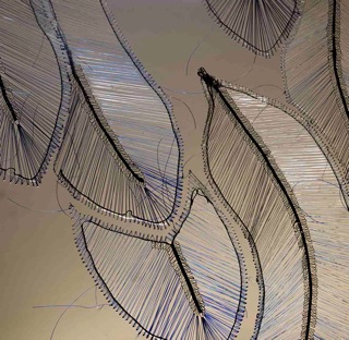
Artist: Irene Manion.
Title: Feathers I (detail) 2017.
Technique: Monofilament on perspex.
My Take on the 'Western Culture Characterisation of Gender.'
Guest Author: Irene Manion
British textile/conceptual/installation artist Tracey Emin, who like Madonna, challenges traditional perceptions of sexuality, also uses traditional textile techniques in her work, achieving high profile gallery exhibition opportunities. However, although her work ‘My Bed’ was nominated for the Turner Prize in 1999 it did not receive the award. " ‘It was overlooked’ despite being the one of the most popular pieces on display.” (Wikipedia).
Artist: Tracey Emin.
Title: 'My Bed' Tate Britain.
Photograph: Courtesy of Andy Hay, 2015.
Later Turner prize winner, Grayson Perry – openly a conventionally married, cross-dresser, most definitely questions sexuality and stereotypes in all of his work and most pertinently in his use of woven ‘paintings’. This use of the ‘traditional’ textile medium creates an association with what is generally perceived as traditional women’s work, to invest layers of meaning into his tapestries. He boldly embraces a more androgynous concept of sexuality and debunks traditional stereotypes.
Artist: Grayson Perry
Title: The Adoration of the Cage Fighters. From the series, The Vanity of Small Differences.
Photograph: Courtesy of Flickr (2012).
Lubiana Himid, the current (2017) winner of the Turner prize, is a female, and the oldest person to ever have received the Turner prize. Her medium is painting/collage and installation. She makes acerbic commentary on perceptions of women, black women and male subconscious stereotyping that has regularly appeared in the Guardian newspaper. Being given recognition for her body of work could indicate that the androgynous view of sexuality is becoming increasingly accepted and questioned by newer generations of both artists and the entire art community, including galleries and critics.
Artist: Lubiana Himid.
Comment: Part of her collection of works submitted for the Turner Prize. She is a current Turner Prize winner.
Photograph: Courtesy of David Perry (Flickr).
Although, at times, the artworld seems to me to be taking steps forward in the right direction, mass media and especially television for the masses, seems to be heading in entirely the opposite direction. Reality TV shows such as "My Kitchen Rules", "The Bachelor", "The Bachelorette", and most recently the advertisements for a new soapie called, "Bad Housewives", seem to be playing a morally reprehensible role in modelling the worst type of extreme behaviour to mass (unquestioning) audiences. On the one hand, one could argue, that they are merely reflecting what is already happening in society, however, on the other hand, one might argue that they are actually modelling the worst kind of sexual stereotypical and often, violent and negative behaviour towards women, and inculcating in women (and men), the very types of behaviours that place women in vulnerable positions in society. Hence, the appalling statistics on domestic violence in Australia. The morality of what these shows are doing can be seen as eroding the values of society in general.
Finally, I recently saw the ‘Preraphaelites’ exhibition in Canberra. There was one painting of a pair of nuns by John Everett Millais, called ‘Vale of Rest’ that stood out for me. One nun was digging a grave while the other peered out at the viewer in a very direct way. This painting showed women in such atypical roles as subjects for paintings of women up to that time. The women are perceived as asexual, strong and so different to the naked female that peers back at the male viewer who is observing them as sexual objects. The nun stares straight back at the viewer with refreshing directness. Her sexuality is not part of the ‘evaluation.’
Artist: Sir John Everett Millais.
Title: Vale of Rest: where the weary find repose,1858. (Partially repainted in 1862).
Technique: Oil on canvas.
Size: 40.5 x 68 inches.
Photograph: Courtesy of Kotomi (Flickr).
Artist: Sir John Everett Millais.
Title: The Vale of Rest: where the weary find repose (detail) 1858.
Photograph: Courtesy of Kotomi (Flickr).
Unfortunately, though so atypical of subjects and portrayals of women at that time, this was anything but a popular painting at the time and was not treated well by the critics.
Preamble
This is the eighty-fifth post in the "Art Resource" series, specifically aimed to construct an appropriate knowledge base in order to develop an artistic voice in ArtCloth.
Other posts in this series are:
Glossary of Cultural and Architectural Terms
Units Used in Dyeing and Printing of Fabrics
Occupational, Health & Safety
A Brief History of Color
The Nature of Color
Psychology of Color
Color Schemes
The Naming of Colors
The Munsell Color Classification System
Methuen Color Index and Classification System
The CIE System
Pantone - A Modern Color Classification System
Optical Properties of Fiber Materials
General Properties of Fiber Polymers and Fibers - Part I
General Properties of Fiber Polymers and Fibers - Part II
General Properties of Fiber Polymers and Fibers - Part III
General Properties of Fiber Polymers and Fibers - Part IV
General Properties of Fiber Polymers and Fibers - Part V
Protein Fibers - Wool
Protein Fibers - Speciality Hair Fibers
Protein Fibers - Silk
Protein Fibers - Wool versus Silk
Timelines of Fabrics, Dyes and Other Stuff
Cellulosic Fibers (Natural) - Cotton
Cellulosic Fibers (Natural) - Linen
Other Natural Cellulosic Fibers
General Overview of Man-Made Fibers
Man-Made Cellulosic Fibers - Viscose
Man-Made Cellulosic Fibers - Esters
Man-Made Synthetic Fibers - Nylon
Man-Made Synthetic Fibers - Polyester
Man-Made Synthetic Fibers - Acrylic and Modacrylic
Man-Made Synthetic Fibers - Olefins
Man-Made Synthetic Fibers - Elastomers
Man-Made Synthetic Fibers - Mineral Fibers
Man Made Fibers - Other Textile Fibers
Fiber Blends
From Fiber to Yarn: Overview - Part I
From Fiber to Yarn: Overview - Part II
Melt-Spun Fibers
Characteristics of Filament Yarn
Yarn Classification
Direct Spun Yarns
Textured Filament Yarns
Fabric Construction - Felt
Fabric Construction - Nonwoven fabrics
A Fashion Data Base
Fabric Construction - Leather
Fabric Construction - Films
Glossary of Colors, Dyes, Inks, Pigments and Resins
Fabric Construction – Foams and Poromeric Material
Knitting
Hosiery
Glossary of Fabrics, Fibers, Finishes, Garments and Yarns
Weaving and the Loom
Similarities and Differences in Woven Fabrics
The Three Basic Weaves - Plain Weave (Part I)
The Three Basic Weaves - Plain Weave (Part II)
The Three Basic Weaves - Twill Weave
The Three Basic Weaves - Satin Weave
Figured Weaves - Leno Weave
Figured Weaves – Piqué Weave
Figured Fabrics
Glossary of Art, Artists, Art Motifs and Art Movements
Crêpe Fabrics
Crêpe Effect Fabrics
Pile Fabrics - General
Woven Pile Fabrics
Chenille Yarn and Tufted Pile Fabrics
Knit-Pile Fabrics
Flocked Pile Fabrics and Other Pile Construction Processes
Glossary of Paper, Photography, Printing, Prints and Publication Terms
Napped Fabrics – Part I
Napped Fabrics – Part II
Double Cloth
Multicomponent Fabrics
Knit-Sew or Stitch Through Fabrics
Finishes - Overview
Finishes - Initial Fabric Cleaning
Mechanical Finishes - Part I
Mechanical Finishes - Part II
Additive Finishes
Chemical Finishes - Bleaching
Glossary of Scientific Terms
Chemical Finishes - Acid Finishes
Finishes: Mercerization
Finishes: Waterproof and Water-Repellent Fabrics
Finishes: Flame-Proofed Fabrics
Finishes to Prevent Attack by Insects and Micro-Organisms
Other Finishes
Shrinkage - Part I
Shrinkage - Part II
Progressive Shrinkage and Methods of Control
Durable Press and Wash-and-Wear Finishes - Part I
Durable Press and Wash-and-Wear Finishes - Part II
Durable Press and Wash-and-Wear Finishes - Part III
Durable Press and Wash-and-Wear Finishes - Part IV
Durable Press and Wash-and-Wear Finishes - Part V
The General Theory of Dyeing – Part I
The General Theory Of Dyeing - Part II
Natural Dyes
Natural Dyes - Indigo
Mordant Dyes
Premetallized Dyes
Azoic Dyes
Basic Dyes
Acid Dyes
Disperse Dyes
Direct Dyes
Reactive Dyes
Sulfur Dyes
Blends – Fibers and Direct Dyeing
The General Theory of Printing
There are currently eight data bases on this blogspot, namely, the Glossary of Cultural and Architectural Terms, Timelines of Fabrics, Dyes and Other Stuff, A Fashion Data Base, the Glossary of Colors, Dyes, Inks, Pigments and Resins, the Glossary of Fabrics, Fibers, Finishes, Garments and Yarns, Glossary of Art, Artists, Art Motifs and Art Movements, Glossary of Paper, Photography, Printing, Prints and Publication Terms and the Glossary of Scientific Terms, which has been updated to Version 3.5. All data bases will be updated from time-to-time in the future.
If you find any post on this blog site useful, you can save it or copy and paste it into your own "Word" document etc. for your future reference. For example, Safari allows you to save a post (e.g. click on "File", click on "Print" and release, click on "PDF" and then click on "Save As" and release - and a PDF should appear where you have stored it). Safari also allows you to mail a post to a friend (click on "File", and then point cursor to "Mail Contents On This Page" and release). Either way, this or other posts on this site may be a useful Art Resource for you.
The Art Resource series will be the first post in each calendar month. Remember - these Art Resource posts span information that will be useful for a home hobbyist to that required by a final year University Fine-Art student and so undoubtedly, some parts of any Art Resource post may appear far too technical for your needs (skip over those mind boggling parts) and in other parts, it may be too simplistic with respect to your level of knowledge (ditto the skip). The trade-off between these two extremes will mean that Art Resource posts will hopefully be useful in parts to most, but unfortunately may not be satisfying to all!
Chemical Finishes - Acid Finishes [1]
Transparent (or parchment) effects in cotton cloth are produced by treatments with strong sulfuric acid. One of the oldest finishes is Swiss or organdy finish produced by the Heberlein process. Since acid damages cotton, the process must be carefully controlled, and "split second" (five to six seconds) timing is necessary to prevent tendering or weakening of the fabric. These effects are possible : all-over parchmentization, localized parchmentization, and plissé effect on either side of the first two.
Nicholas Vintage Organdy Mini Dress.
Since all-over parchmentizing is for the purpose of producing a transparent effect, a sheer fabric of combed lawn is used. The goods are singed, desized, bleached and mercerized. Mercerization is such an important part of the process that the fabric is mercerized again after the acid treatment in order to improve transparency. The fabric is then dyed or printed with colors that will resist acid damage. The cloth is immersed in the acid solution and partial removal of the surface of the cellulose takes place. Upon drying, this surface rehardens as a cellulose film and gives permanent crispness and transparency. After the acid treatment, the cloth is neutralized in a weak alkali, washed and then calendared to give more gloss to the surface. This all over treatment produces organdy fabric.
2013 High-end embroidered organza dress.
Note: The word organdy originated around 1825-1835 from the French word organdi. The word is also sometimes spelled organdie.
In localized parchmentizing, if the design is a small figure with a large transparent area, an acid-resist substance is printed on the figures and the fabric is run through an acid bath. The acid-resistant areas retain their original opacity and contrast sharply with the transparent background.
Localized parchmentizing - acid finish - gives a transparent background.
If a small transparent design is desired, the acid is printed on and then quickly washed off.
The three dimensional plissé effect is achieved by printing caustic soda on the parchmentized fabric. The untreated areas pucker as the caustic soda causes the printed areas to shrink. The plissé effect can also be made on fabric with local parchmentization.
Elie TahariNeila Floral Lace-Trim Plissé Blouse.
Burnt-out or etched effects are produced by printing sulfuric acid on fabric made of fibers from different fiber groups, rayon and silk, for example. The rayon will be eaten away leaving sheer silk areas.
Cheongsam Ruhuashijin: Low Silk Burnt-Out Velvet Fabric Silk Dress.
Carbonizing, which is the treatment of wool yarns or fabrics with sulphuric acid, destroys vegetable matter in the fabric and more level dyeing can be obtained. Carbonizing is also done on reused and reprocessed wool to remove any cellulose that may have been used in the original fabric. Carbonizing gives better texture to all-wool fabrics.
Australian carbonized wool.
Puckered surfaces are created by introducing a partial solution to the surface of nylon or polyester fabric. Plissé, sculptured, and "damasque" effects are made by printing a chemical on the fabric to partially dissolve it. Shrinking occurs as it dries, thus creating a puckered surface.
Removing a nylon "damasque" housecoat from an automatic dryer after washing.
Reference:
[1] N. Hollen and J. Saddler, Textiles, 3rd Edition, MacMillan Company, London (1968).

 Descrption: Qur'an 19th Century (detail).
 Description: Qur'an 19th Century (detail).
 Description: Qur'an (1841).
 Description: Qur'an (1841).
 Description: Dala'il al-Khayrat (19th Century).
 Description: Aqidat al-awamm - Terengganu style (late 19th Century).
 Description: Sulawesi School - Qur'an February 1731.
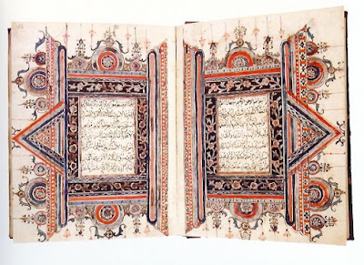 Description: Sulawesi School - Qur'an 19th Century.
 Description: Qur'an 19th Century.
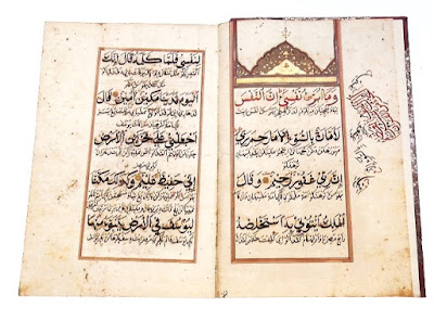 Description: Qur'an 19th Century.
 Description: Qur'an, late 18th Century.
 Description: Qur'an 1856.
 Description: Qur'an, Serat Tajussalatin, 1799 - 1851.