Introduction
Egyptian embroidery is visible in tomb paintings that show decorated clothing and hangings. The Romans, who called it “painting with thread,” held needlework in high regard. Basic needlework stitches probably haven't changed much over the centuries, although the needles are much different. Ancient peoples probably used bone, wood, or ivory to sew warm, simple clothes from animal skins. Today, needles are made of plastic or steel.
Egyptian double-running stitch embroidery from the Whitworth Gallery.
Needlework was also used to adorn garments worn by clergymen during the Middle Ages. The embroidery was stitched by monks and nuns.
Embroidery in the Middle Ages.
The embroidery on the traditional clothing in Russia and central Europe reflected where a person was from. Homemakers embroidered many household items, embellishing curtains, bedspreads, and towels.
Fancy Court Gown of Alexandra Feodrovna, reproducing the dress of the Tsarina Marfa Ilyinichna, wife of Tsar Alexei Michaelovitch, 1903.
Needlework was very popular in America during colonial times. Learning to stitch was part of a girl's education, and she often created a cross-stitch sampler. A vehicle for practicing stitches and learning to read and write, samplers often featured numbers, letters, poetry, and prayers, as well as flowers, buildings, and animal motifs. Many samplers hang in historical societies and museums today, reminders of the beauty and durability of embroidery.
The Metropolitan Museum of Art: An American cross-stitched sampler from the eighteenth century.
Needlework from the USA [1]
Creator and Title of Work: Karin Birch, Serpentine.
Techniques and Materials: Beaded, couched painted; linen, embroidery floss, glass seed beads, acrylic paint.
Size: 22 x 18 inches.
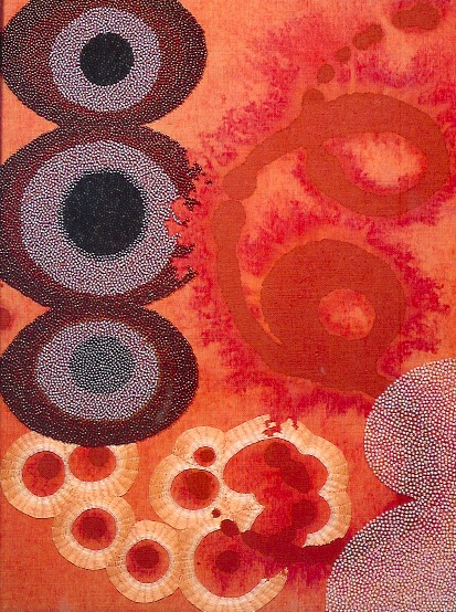
Creator and Title of Work: Maggi Rozycki Hiltner, The Monsanto Twins Try a Little Genetic Engineering.
Techniques and Materials: Appliqué, stitched; cotton.
Size: 13 x 16 inches.
Creator and Title of Work: Tricia Lane, Three Young Men Carrying Two Large Trunks.
Techniques and Materials: Embroidered, appliquéd, quilted; vinyl, cotton thread.
Size: 7.5 x 12 inches.
Comment [1]: As a child of the seventies and eighties, I have very fond memories of living with plastic. It feels natural to combine synethetic fiber with natural fabrics to document my life.
Creator and Title of Work: Linda H. Konya, John.
Techniques and Materials: Embroidered, appliquéd, wrapped; linen, wool, cotton floss.
Size: 15 x 17 inches.
Photo Courtesy: Carla Steckley.
Creator and Title of Work: Carol Ventura, The Rules.
Techniques and Materials: Tapestry crocheted; linen.
Size: 15 x 7 inches.
Photo Courtesy: John S. Cummings.
Creator and Title of Work: Margaret Cusack, Cause and Effect.
Techniques and Materials: Machine appliquéd; metallic fabric, buttons, thread, metal frame.
Size: 8 x 10 inches.
Photo Courtesy: Alex Cao.
Creator and Title of Work: Colleen O'Rourke, Lazy Eye.
Techniques and Materials: Embroidered; cotton, seed beads, thread.
Size: 15 x 19 inches.
Creator and Title of Work: Carol Burns, Rainy Day on the Isle of Spice.
Techniques and Materials: Embroidered; fabric, embroidery floss.
Size: 16.5 x 13.25 inches.
Reference:
[1] S. M. Kieffer (Editor), Fiberarts Design Book 7, Lark Books, New York (2004).
Preamble
For your convenience I have listed below other posts featuring my prints on paper that has featured on this blogspot:
Made to Order
Unique State (Partners in Print)
Veiled Curtains
A Letter to a Friend
Beyond the Fear of Freedom
Travelling Solander Project
Star Series
Imprint
Cry for the Wilderness
Federation on Hold – Call Waiting
Wish You Were Where?
The Four Seasons
The Creation of Hurricane Katrina – The Disruptor
The Creation of ‘Whose Place? My Place, Your Space’
The ‘Vine Glow’ Series
Vine Glow - Series 2
Vine Glow - Series 3
‘Whose Church?’
‘A Journey Ends . . . Another Nightmare Begins’
Introduction
Early in 2021, members of the Newcastle Printmakers Workshop (NPW) were invited to participate in an exhibition titled, ‘Locus,’ by Belinda Hungerford, Exhibitions & Curatorial Manager at New England Regional Art Gallery (NERAM) in Armidale, NSW. Along with 25 participants from the NPW, members from three other print collectives – Black Gully Printmakers (Armidale), Print Circle (Sydney) and the Southern Highlands Printmakers - were also invited.
The ‘Locus’ exhibition will be exhibited from Friday 5th November 2021 until Sunday 30th January 2022, with the official exhibition opening on Friday 5th November. Artist talks will take place on the morning of Saturday 6th November 2021.
Note: See the gallery’s website for additional information - https://www.neram.com.au. My thanks to NPW member Sally Picker who liaised with NERAM and co-ordinated the NPW’s contribution to the exhibition.
Exhibition Theme and Specifications
Artists often respond to what is around them and the notion of ‘place’ can have significant and varying meanings and impact within their work. Recently, where we live, work and sleep has become even more important due to the Covid lockdowns.
This exhibition explores the different meanings of place to each artist. What has kept you sane, or conversely, driven you to frustration? Where has been your place of respite and comfort? What has centred you during this time of lockdown upheaval?
As each collective is based in four geographically different locations it is hoped the works will be diverse and express a range of responses to the theme. The works could be as broad or specific as the artist desired. The size of the prints were fixed, namely, 38 x 28 cm @ portrait orientation. Tabs were required to be attached since the artworks could be pinned to the gallery walls. The prints needed to be limited edition, namely a minimum of one print for exhibition/sale as well as optional prints - one for sale in the gallery shop, and a print for donation to NERAM.
Final Print: ‘Whose Place? My Place, Your Space’

Technique and Media: Silkscreened, stencilled, stamped and mono printed employing glazes, transparent and opaque pigments on Stonehenge stock.
Artist Statement: COVID-19 is a coronavirus disease which causes severe acute respiratory syndrome from being infected with the coronavirus 2 (namely, SARS-CoV-2). Due to the infectious nature of the Delta strain, state and region-wide lockdowns have been put in place to retard its progress through the community, thereby saving lives as well as reducing long-term medical effects because of its transmission. Lockdowns have enforced a conscious awareness of place as well as space. My print – ‘Whose Place? My Place, Your Space’ – features multilayered images, with the hint of a home in the background, and with a multilayered foreground of flora/fauna images unaffected by the COVID outbreak unlike those hidden in their home.
Research and Processes Involved in the Creation of the Print
Before I start on any print project my golden rule is to do an extensive amount of research on the topic.
Research on ‘Whose Place? My Place, Your Space’ was easily gleaned via multiple sources on news services, the internet, and documentaries. Whilst researching my information, I also focused on what media and design I should employ. That is, a synergic relationship between information gained from research and the form or design of the print that works for me.
Numerous images were sourced and/or sketched that concentrated on various visual associations with lockdowns due to the Delta strain of Covid 19 which enforced a conscious awareness of place as well as space. Printmaking tools were then created employing the numerous images.
After creating three very different proofs/versions of prints containing various combinations of design elements, I finally settled on the third proof/version. This printed proof featured all of the design elements that I felt captured the visual aesthetic that I wanted to encapsulate in my print edition. The following images and text give you an insight into the processes that were employed to create my multi-layered print ‘Whose Place? My Place, Your Space’.
‘Whose Place? My Place, Your Space’
Steps And Layers Involved In Creating The Limited Edition Of Five Prints.
The following images and text give you an insight into the processes that were employed to create my multi-layered print ‘Whose Place? My Place, Your Space’.
The first series of printed images consisted of the following seven layers as can be seen in the above example:
1. An initial mono printed layer printed in a metallic black glaze as a textured background.
2. Screen printed images in mid metallic black of buildings representing people’s homes.
3. Screen printed image in yellow featuring a topographical landform map representing world-wide locations and communities affected by Covid 19 lockdowns.
4. Stenciled square window shapes overprinted in warm white representing people placed in hotel quarantine.
5. Stenciled abstract rectangle shapes overprinted in warm white to add depth to the images being overprinted.
6. Roller printed effects in warm white to soften the background buildings on the left side of the print.
7. Roller printed effects in warm white to soften the background buildings on the bottom of the print.
The second series of printed images consisted of the following overprinted five layers as can be seen in the above example:
8. Stamped rectangles in metallic black referencing barriers to restrict movement on roads and highways on the bottom of the print.
9. Overprinted roller effects in warm white and apricot to soften the heavy aesthetic of the barriers.
10. Screen printed images in orange referencing the urban/suburban environment.
11. Screen printed droplet images in warm white referencing the spread and highly transmissible nature of Covid-19.
12. Screen printed images in apricot referencing signage associated with Covid 19 restrictions.
The third and final series of printed images consisted of the following four overprinted layers as can be seen in the above image of the final print:
13. Stenciled square window shapes overprinted in orange representing people locked down in their apartments and homes.
14. to 16. Screen printed images of cascading branches and plants not affected by Covid 19 but offering relief to those in their homes via their local patch of nature to rest, reflect and restore their well-being.
I hope this gives you an insight in what I do as a printmaker in order to birth a final print from an imagined work. Hence, you can see for me it’s a dynamic rather than a static process. I hope you have enjoyed the insight into my printmaking process!
Preamble
Just as a reminder, intaglio prints can be created using solarplates. Here UV light only penetrates the clear area of the transparency and hardens the polymer, whereas areas beneath the opaque lines of the drawing remains soluble and so can be removed.
For your convenience I have listed other posts in this series:
Intaglio Prints Created Using Solarplates - Part I
Intaglio Prints Created Using Solarplates - Part II
Intaglio Prints Created Using Solarplates - Part III
Intaglio Prints Created Using Solarplates - Part IV
Intaglio Prints Created Using Solarplates - Part V
Intaglio Prints Created Using Solarplates[1] - Part VI
Intaglio Prints Created Using Solarplates - Part III [1]

Artist and Title: Marisha Simons, Open Wide (1997).
Technique: Intaglio print with metal foil and tooth.
Size: 23 x 18 cm.
Comment[1]: High quality printing paper is strong enough to decorate and create into three-dimensional works, like this intaglio prnt to which foil and a tooth has been added.
Courtesy of reference [1].
Artist and Title: Ellen Brous, How do we get there? (1997).
Technique: Intaglio print installation.
Size: Various.
Comment[1]: This installation consists of multiple scrim hangings, each of which has been printed with a solarplate method. It shows how versatile solarplate printmaking can be.
Courtesy of reference [1].
Artist and Title: Jodie Watson, Untitled (1999).
Technique: Intaglio print installation.
Size: 12 x 9 inches (30.5 x 23 cm).
Comment[1]: The inspiration for this print comes from traditional Aboriginal body painting. The original drawing was created by rolling a thin layer of etching ink on to the plate glass, dusting with talc, and drawing into the ink with a stick to create a negative transparency. Adding talc to the ink increases the opacity and helps to retain the integrity of the drawing during the exposure.
Courtesy of reference [1].
Artist and Title: Tjungkara Ken, Seven Sisters (1999).
Technique: Intaglio print.
Size: 30.5 x 23 cm.
Comment[1]: Tjungkara Ken drew with a stick through ink on glass to create a negative transparency. She made this plate in October, near her home in Central Australia, where there was so much sunshine that the plate needed only 3 minutes exposure in the sun. Two colors were applied to the plate by using two rollers and varying the pressure when inking. The first color was applied under strong pressure , covering almost all of the plate except those portions next to the shoulder of the relief "bite" that remained uninked. The second color was applied with very light pressure, kissing only the uppermost surface of the plate. When printed both colors were transferred to the paper generating a rich and painterly effect.
Courtesy of reference [1].
Artist and Title: Mary Maynor, Rocks (1997).
Technique: Fimo clay with embossing.
Size: 8 x 8 x 8 cm.
Comment[1]: Mary Maynor used ink solarplates to emboss the surfaces of this totem.
Courtesy of reference [1].
Artist and Title: Margaret Ambridge, Self Portrait (1998).
Technique: Double exposure intaglio print.
Size: 28 x 40.5 cm.
Comment[1]: Working from a photograph, Margaret Ambridge drew with soft pencils and lithographic crayons on True-Grain, applying scraping techniques to vary textures abd modify tonal areas. The transparency was transferred to a solarplate using 18 seconds for each exposure in a commercial exposure unit.
Courtesy of reference [1].
Artist and Title: David Salle, Lanterns (1998).
Technique: Double exposue three-plate print.
Size: 40.5 x 28 cm.
Comment[1]: Each plate was made from a drawing on frosted acetate.
Courtesy of reference [1].
Artist and Title: Kathleen Aird, Possibly Maybe (1998).
Technique: Two plate intaglio print.
Size: 26.5 x 20.5 cm.
Comment[1]: Kathleen Aird drew very delicately with pencil and used the most transparent drafting, semi-matte film in order to pick up all the fine detail from her drawing. Each plate was made using the double exposure technique.
Courtesy of reference [1].
Reference:
[1] D.Welden and P. Muir, Printmaking in the Sun, Watson-Guptill Publications, New York (1997).
Preamble
Art Quilts have featured on this blogspot and so for your convenience I have listed below previous posts in this series:
Art Quilts - Part I
Art Quilts - Part II
Art Quilts - Part III
Art Quilts - Part IV
Art Quilts - Part V
Art Quilts - Part VI
Art Quilts - Part VII
Art Quilters of the Netherlands - Part I
Art Quilters of the Netherlands - Part II
Art Quilters of the Netherlands - Part III
Four Selected European Art Quilters - Part I
Four Selected European Art Quilters - Part II
Four Selected European Art Quilters - Part III
Art Quilts of Jane Sassaman
Art Quilts of Michael A. Cummings
Four Selected European Art Quilters - Part IV
Art Quilts of Carolyn Crump
Jan Myers-Newbury
Art Quilts of Karin Franzen
Art Quilts of Emily Richardson
Four Selected European Art Quilters - Part V
Four Selected European Art Quilters - Part VI
Art Quilters of the Netherlands - Part II [1]

Title and Artist: Wind in the Sails (2010), Marjon Hoftijer-Boer.
Materials and Techniques: Stitching on polyester.
Size: 110 x 130 x 10 cm.
Courtesy of reference [1].
Close up of the stitching in the above artwork.
Title and Artist: Running Figures (2012), Marjon Hoftijer-Boer.
Materials and Techniques: Stitching on polyester.
Size: 150 x 100 x 10 cm.
Courtesy of reference [1].
Title and Artist: Ameland (2010), Dirkje VD Horst-Beetsma.
Materials and Techniques: Textile.
Size: 80 x 155 cm.
Courtesy of reference [1].
Title and Artist: Straightjacket (2001), Dirkje VD Horst-Beetsma.
Materials and Techniques: Textile, rubber.
Size: 262 x 176 cm.
Courtesy of reference [1].
Title and Artist: Elseverywhere (2002), Dirkje VD Horst-Beetsma.
Materials and Techniques: Silk flaps.
Size: 105 x 129 cm.
Courtesy of reference [1].
Title and Artist: The White Night 2 (2011), Mirjam Pet-Jacobs.
Materials and Techniques: Cotton, silk, oil chalk lettering.
Size: 148 x 148 cm.
Courtesy of reference [1].
Title and Artist: Missing Messages (2009), Mirjam Pet-Jacobs.
Materials and Techniques: Mixed media.
Size: 60 x 417 cm.
Courtesy of reference [1].
Close up of the above work in order to detail the use of mixed media.
Courtesy of reference [1].
Title and Artist: Society 2 (2011), Mirjam Pet-Jacobs.
Materials and Techniques: Silk.
Size: 12 x 18 x 7 cm.
Courtesy of reference [1].
Title and Artist: Sometimes I Long For (2012), Mirjam Pet-Jacobs.
Materials and Techniques: Cotton, silk, and embroidered.
Size: 123 x 125 cm.
Courtesy of reference [1].
Title and Artist: Sometimes I Long For (2012), Mirjam Pet-Jacobs.
Materials and Techniques: Video: stop motion technique. Three video stills.
Size: 123 x 125 cm.
Courtesy of reference [1].
Reference:
[1] H. Lijding, Art Quilts in Nederland, W Books, Amsterdam (2013).
Preamble
This is the third post in a new Art Resource series that specifically focuses on techniques used in creating artworks. For your convenience I have listed all the posts in this new series below:
Drawing Art
Painting Art - Part I
Painting Art - Part II
Painting Art - Part III
Painting Art - Part IV
Painting Art - Part V
Painting Art - Part VI
Home-Made Painting Art Materials
Quality in Ready-Made Artists' Supplies - Part I
Quality in Ready-Made Artists' Supplies - Part II
Quality in Ready-Made Artists' Supplies - Part III
Historical Notes on Art - Part I
Historical Notes on Art - Part II
Historical Notes on Art - Part III
Historical Notes on Art - Part IV
Historical Notes on Art - Part V
Tempera Painting
Oil Painting - Part I
Oil Painting - Part II
Oil Painting - Part III
Oil Painting - Part IV
Oil Painting - Part V
Oil Painting - Part VI
Pigments
Classification of Pigments - Part I
Classification of Pigments - Part II
Classification of Pigments - Part III
Pigments for Oil Painting
Pigments for Water Color
Pigments for Tempera Painting
Pigments for Pastel
Japanese Pigments
Pigments for Fresco Painting - Part I
Pigments for Fresco Painting - Part II
Selected Fresco Palette for Permanent Frescoes
Properties of Pigments in Common Use
Blue Pigments - Part I
Blue Pigments - Part II
Blue Pigments - Part III
Green Pigments - Part I
Green Pigments - Part II
Red Pigments - Part I
Red Pigments - Part II
Yellow Pigments - Part I
Yellow Pigments - Part II
Brown and Violet Pigments
Black Pigments
White Pigments - Part I
White Pigments - Part II
White Pigments - Part III
Inert Pigments
Permanence of Pigments: New Pigments - Part I
Permanence of Pigments: New Pigments - Part II
Limited or Restricted Palettes
Testing of Pigments - Part I
Testing of Pigments - Part II
Further Refinement of Pigments
Color and Light - Part I
There have been one hundred and thirteen posts in a previous Art Resource series that focused on the following topics:
(i) Units used in dyeing and printing of fabrics.
(ii) Occupational, health & safety issues in an art studio.
(iii) Color theories and color schemes.
(iv) Optical properties of fiber materials.
(v) General properties of fiber polymers and fibers - Part I to Part V.
(vi) Protein fibers.
(vii) Natural and man-made cellulosic fibers.
(viii) Fiber blends and melt spun fibers.
(ix) Fabric construction.
(x) Techniques and woven fibers.
(xi) Basic and figured weaves.
(xii) Pile, woven and knot pile fabrics.
(xiii) Napped fabrics, double cloth and multicomponent fabrics.
(xiv) Fabric finishes.
(xv) Schrinkage, durable press and wash-wear finishes.
(xvi) Classification of dyes and dye blends.
(xvii) The general theory of printing.
To access any of the above resources click on the following link - Units Used in Dyeing and Printing of Fabrics. This link highlights the one hundred and thirteen posts in the previous Art Resource series.
There are eight data bases on this blogspot, namely: (1) the Glossary of Cultural and Architectural Terms; (2) Timelines of Fabrics, Dyes and Other Stuff; (3) A Fashion Data Base; (4) the Glossary of Colors, Dyes, Inks, Pigments and Resins; (5) the Glossary of Fabrics, Fibers, Finishes, Garments and Yarns; (6) Glossary of Art, Artists, Art Motifs and Art Movements; (7) Glossary of Paper, Photography, Printing, Prints and Publication Terms; (8) Glossary of Scientific Terms.
Note: From time-to-time all the above data bases will be updated.
If you find any post on this blog site useful, you can save it or copy and paste it into your own "Word" document for your future reference. For example, Safari allows you to save a post (e.g., click on "File", click on "Print" and release, click on "PDF" and then click on "Save As" and release - and a PDF should appear where you have stored it). Safari also allows you to mail a post to a friend (e.g., click on "File", and then point cursor to "Mail Contents On This Page" and release). Either way, this or any of the other posts on this site may be a useful Art Resource for you.
The new Art Resource series will be the first post in each calendar month. Remember, these Art Resource posts span information that will be useful for a home hobbyist to that required by a final year University Fine-Art student. Undoubtedly, some parts of any Art Resource post may appear far too technical for your needs (skip those mind boggling parts) and whilst other parts may be too simplistic with respect to your level of knowledge (ditto the skip). Hopefully, the trade-off between these two extremes will mean that the Art Resource posts will be useful in parts to most, but unfortunately, may not be satisfying to all!
Introduction
Although this blogspot hosts posts mostly centered on prints on paper and ArtCloth, we have this year occassionally thrown in an odd post or two on paintings and sculptures. Images of these have also previously appeared on this blogspot whenever we have strayed onto the holdings/exhibitions of museums and art galleries - see for example El Anatsui – Five Decades@Carriageworks
Hence, in order for us to understand about painting surfaces we need to have a working understanding of the science that underpins the processes that are used in artworks.
Painting Art - Part II [1]
Binders in Paints
There are several types of binding action, and the materials which depend upon one action should not be expected to produce either the visual effects or the physical properties of others. A dried oil film encloses pigment particles in a continuous, glassy, solid substance. The film of a resinous varnish acts in the same way; it is even glassier, and is so impervious to atmospheric conditions that a thin layer of clear vanish will produce a durable film without any pigment.
A dried oil film encloses pigment particles.
Tempera paint films are adequately strong and durable, but when dry the volume of a binder in relation to the volume of pigment is less than that of oil paints. This is because the bulk of tempera (and also of all other paints) is water, and when the paint has dried, a relatively small volume of solid matter remains to bind the pigment particles together, whereas a film of pure oil paint loses nothing due to evaporation and normally has a surplus of oil beyond the amount necessary to bind the paint.
Tempera paint.
The pigment particles are surrounded by the binder, but unlike the condition in glossy oil film there is little or no surplus medium; the surface has a mat or semi-mat finish, and the layer is porous.
Pigment particles surrounded by a binder.
Simple solutions of gum, glue, casein etc, are more powerful adhesives than oils and resins; they will bind the pigment particles into a mass and attach them to the ground, but they do not form very durable films by themselves. When such paints are thinned to a brushing consistency, the pigments will be well bound, but not locked in by a continuous level film, and so their surfaces will not be glossy.
Types of paints.
Binders such as the lime in fresco painting fall into another class. They act merely as cementing materials; they hold the particles of pigment or sand to each other but give no protection against outside influences. The surface is porous and any resistance against external attacks it may have is due to its own inert nature and that of the pigments. In the language of the technologist they would be called cementitious rather than pellicular; the latter term refers to an enveloping film.
A porous surface that would be labelled by technologists as cementitious rather than pellicular.
The Creation of Adam, a fresco painting by Italian artist Michelangelo.
Fixatives, such as those employed to bind the pigment of pastel and charcoal pictures, are very weak solutions. They are expected to be absorbed by the surface and they supply only enough superficial binding action to reduce the fragility of the picture so that it can be handled with somewhat more freedom.
Spraying a fixative on a charcoal drawing.
Reference:
[1] The Artist's Handbook of Materials and Techniques, R. Mayer, (ed. E. Smith) 4th Edition, Faber and Faber, London (1981).

 Egyptian double-running stitch embroidery from the Whitworth Gallery.
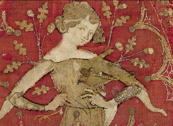 Embroidery in the Middle Ages.
 Fancy Court Gown of Alexandra Feodrovna, reproducing the dress of the Tsarina Marfa Ilyinichna, wife of Tsar Alexei Michaelovitch, 1903.
 The Metropolitan Museum of Art: An American cross-stitched sampler from the eighteenth century.
 Creator and Title of Work: Maggi Rozycki Hiltner, The Monsanto Twins Try a Little Genetic Engineering.
 Creator and Title of Work: Tricia Lane, Three Young Men Carrying Two Large Trunks.
 Creator and Title of Work: Linda H. Konya, John.
 Creator and Title of Work: Carol Ventura, The Rules.
 Creator and Title of Work: Margaret Cusack, Cause and Effect.
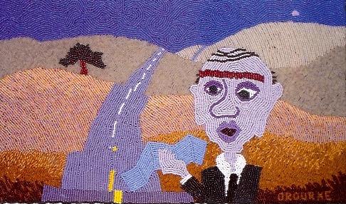 Creator and Title of Work: Colleen O'Rourke, Lazy Eye.
 Creator and Title of Work: Carol Burns, Rainy Day on the Isle of Spice.


