Preamble
Art Quilts have featured on this blogspot and so for your convenience I have listed below previous posts in this series:
Art Quilts - Part I
Art Quilts - Part II
Art Quilts - Part III
Art Quilts - Part IV
Art Quilts - Part V
Art Quilts - Part VI
Art Quilts - Part VII
Art Quilters of the Netherlands - Part I
Art Quilters of the Netherlands - Part II
Art Quilters of the Netherlands - Part III
Four Selected European Art Quilters - Part I
Four Selected European Art Quilters - Part II
Four Selected European Art Quilters - Part III
Art Quilts of Jane Sassaman
Art Quilts of Michael A. Cummings
Four Selected European Art Quilters - Part IV
Art Quilts of Carolyn Crump
Jan Myers-Newbury
Art Quilts of Karin Franzen
Art Quilts of Emily Richardson
Four Selected European Art Quilters - Part V
Four Selected European Art Quilters - Part VI
Introduction by Cocky Verweyen (Oud Trunhout, Belgium) [1]
It is very special to me to be a part of the jury of the European Art Quilt Foundation. I feel very honored.
A long time ago I was a traditional quilter, teaching the basic techniques of quilting as well as the use of color. After 20 years I changed direction as I felt I could better express myself on canvas through the process of painting. This is why I was very surprised by the many special ways with which the quilters express themselves so well. The shapes, techniques and designs were very surprising to me. Congratulations to all the contributors.
Thirty years ago the quilt was an expression of traditional craftsmanship. Today, the quilts I saw on the adjudication have become a true expression of art, which is a joy to look at. The thoughts, ideas and techniques translated into the quilts come together in a creative process, making the quilter a true artist. Looking through the catalogues of the previous years, it show this development very well.
The organization of the jury was professionally managed by the European Art Quilt Foundation. My wish is that the selected work will lead to an interesting and fascinating exhibition which connects Europe in an artistic way.
Four Selected European Art Quilters - Part III [1]
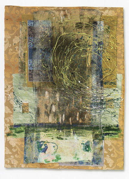
Quilter: Yaek David-Cohen (London, UK) [1].
Full View
Title: Whirlpool (2014).
Materials and Techniques: Mixed media on found textile - four layers of found textile, acrylic, thread, scrim, ink. Sewn by hand, embroidered, painted.
Size: 100 cm (wide) x 137 cm (length).
Comment [1]: This work demonstrates the confluence of growth and new life in the most of natural processes.
Detailed View 1
Detailed View 2
Quilter: Fenella Davies (Bath, UK) [1].
Full View
Title: Death in Venezia (2014).
Materials and Techniques: Antique raw silk, cotton, scrim, flashing, Japanese matting, Lutrador. Painted, hand stitched, collaged.
Size: 91 cm (wide) x 115 cm (length).
Comment [1]: Venice, Italy, is a city full of contradictions. Surface beauty and back street squalor. Ornate luxury and crumbling buildings. Tourists with cameras, beggars with babies. Even death visits Venice.
Detailed View 1
Detailed View 2
Quilter: Rita Dijkstra-Hesselink (Hangelo, the Netherlands) [1].
Full View
Title: Black Shadow (2014).
Materials and Techniques: Hand-dyed, cottons, polyester materials. Patchwork, fusing, appliqué, thermofax printing, free motion quilting.
Size: 124 cm (wide) x 113 cm (length).
Comment [1]: Evertything in life has a colored outside with a black shadow existing in the background. The day-to-day challenge is to enjoy the colors and to accept the existence of the shadow, and deal with it.
Detailed View 1
Detailed View 2
Quilter: Will Doreleijers (Dordrecht, the Netherlands) [1].
Full View
Title: Found Memory (2014).
Materials and Techniques: Cotton, polyester organza. Batik, transfer dye, machine stitching.
Size: 117 cm (wide) x 83 cm (length).
Comment [1]: A colorful retrospective of a distant past.
Detailed View 1
Detailed View 2
Reference:
[1] European Art Quilt Foundation, Molenschat, Netherlands (2014).
Introduction [1]
Ben Rider is a graphic designer, printmaker and an illustrator based in London, England. He is an enthusiastic image maker. He loves the energy and potential for experimentation of printmaking. A commercial illustrator and teacher, he dives into self-initiated projects when time allows.
Ben has a impressive resumé. His clients have included the Victorian and Albert Museum, University of Arts London, Brew Dog, O2 Ireland and Samsung. He produces work for independent magazines and studios in London and internationally.
Ben Rider.
Ben's work can be characterized as punky, vibrant and bursting with energy. It is built up from a dense hybrid of drawings and collaged imagery, untilizing love for offsets, fades, drips and all those happy accidents and small imperfections found within printmaking and working with your hands. His signature is a calm chaos of experimentation, combining different processes, multiple layers, mixed media, even found material or household cleaning products, into a single print, favouring stylistic impression over precision and cleanliness. Ben works in conjunction with the print process, almost creating a collaboration with himself and the process. His prints are one of a kind (more often than not literally) and his work rate unstoppable.
Although vibrant and playful by nature, his work more often hides a more serious tone and content below the surface. His education background in Design for Graphic Communication at the London College of Communication taught him the value of research and the use of this as a basis to create work with content. For example, a female police officer holding a dildo may at first glance appear silly or offensive, but at a deeper level reveals themes of lust and objectification of others for personal gain. This subtext of varying content is central to both his commercial and his personal work.
Ben loves the gratifying nature of print and what it can add to an illustration. The sense of physically making something with your hands has an honesty, giving work a certain soul and character, and to him this acts as a middle finger to the increasingly homogenized and slick corporate world sold to us.
Ben Rider's Graphic Art [1]
Secret 7" Karmacoma, digital (2014).
Hot Girls, screen print (2013).
Sticker Pack, screen print A (2014).
Sticker Pack, screen print B (2014).
Greed, screen print/collage (2013).
Lust, screen print/collage (2013).
Cyanotype Test 1, cyanotype/screen print (2013).
Cyanotype Test 2, cyanotype/screen print (2013).
False Gods, screen print (2014).
Reference:
[1] M.Smith, People of Print, Thames & Hudson, London (2017).
Preamble
For you convenience I have listed below posts on this blogspot that featured Museums and Galleries.
When Rainforests Ruled
Some Textiles@The Powerhouse Museum
Textile Museum in Tilburg (The Netherlands)
Eden Gardens
Maschen (Mesh) Museum@Tailfingen
Museum Lace Factory@Horst(The Netherlands)
Expressing Australia – Art in Parliament House
TextielLab & TextielMuseum – 2013
The Last Exhibition @ Galerie ’t Haentje te Paart
Paste Modernism 4 @ aMBUSH Gallery & The Living Mal
El Anatsui – Five Decades@Carriageworks
The Australian Museum of Clothing and Textiles
Louisiana Museum of Modern Art
Nordiska Museet (The Nordic Museum)
Tarndwarncoort (Tarndie)
Egyptian Museum Cairo - Part I
Egyptian Museum Cairo - Part II
Masterpieces of the Israel Museum
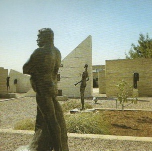
Masterpieces of the Israel Museum - The Billy Rose Sculpture Garden[1]
The calcareous stone of Jerusalem provides the link and the harmony between past and present in a city comprising of many architectural styles. This very stone was selected by American sculptor and landscape artist, Isamu Noguchim to build five terraces that dominate the Billy Rose Sculpture Garden.
Broad view of the Billy Rose Sculpture Garden.
As visitors walk up the pathway to the museum's main entrance, they discover to their right, a wide open space looking out toward the infinte western hills of the city. The sculptures are placed in harmony with the terraces, making the garden a work of art in its own right. Such artists as Rodin, Bourdellem Maillol, Archipenk, Zadkine, Lipchitz, Moore, Picasso, Marini, Wotruba, Vasarely, Arman and Tinguely are presented in this collection dedicated exclusively to contemporary sculpture.
The Patio of the Sculpture Garden
In order to present small-sized sculpture, requiring an intimate environment, Noguchi designed a succession of spaces limited by architectural elements, such as the rectangle set off against a triangular wall, rising like a symbol in the open space of the garden. The pathway leading to the Jacques Lipchitz Pavilion hides surprises around every corner. This partial view of the patio captures three bronze sculptures: "The Study for Balzac" by Rodin (1893), Germaine Richier's "Diabolo Player" (1950), and "Khmer" by Noguchi (1962).
The Patio of the Sculpture Garden.
Otto Freundlich (1878-1943) - The Ascension
Freundlich, a painter and sculptor, was one of the younger members of the pioneering generation of abstract artists. Along with his senior colleagues, Kandinsky, Malevitch and Mondrian, he believed in an artistic language that is intimately linked by its purely spiritual essence to the advent of an ideal society.
"Non-representation," he wrote, "is the expression of a collective will, the artist carring out the will of a new reality." However, the Europe of two World Wars and totalitarian regimes ignored this message and Fruendlich, who was born in Pomerania, raised in Germany and lived in Paris from 1924 until his deportation in 1943, was forced to continue his efforts and proclaim his faith in solitude.
The Ascension (1929) is one of the two large-scale sculptures, which he managed to create. The combined effect of its curved forms express his vision of the curves as the "...result of the substance that deploys its strength in one or more directions." "The path of profundity:" he also wrote, "justifies the third dimension and should have another possibility, besides manfesting itself to the observer, of incorporating itself into the universal unity." In fact, Freundlich considered abstract forms to be intermediaries between nature and man.
The Ascension, Otto Freundlich (1878-1943).
Henry Moore (1898-1986) - Vertebrae: Sculpture in Three Elements
Woman, goddess of fertility or sublime mother, solemnly harmonious body or subject of frivolous luxury: she has a place in the history of sculpture since day one. Woman is also a key theme in this work by the English sculptor Henry Moore, and the pretext for working the most diverse transformations. Prone woman, woman is space, woman in landscape - she ends up becoming a woman-landscape. The shapes and curves of her limbs, even when pushed to the verge of abstraction, maintain and often highlight an erotic undertone through the modelling of her powerful volumes.
After World War II, Moore was able to realize his dream of creating monumental forms. He succeeded not only in orienting his research to exterior shape, but also in focusing on the interior structure of the body. In this exceptionally large broze (nearly 7.5 m high) from 1968-1969, Moore expresses his intentions through the title itself: Vertebrae. He set out to arrange and entangle the elements in such a way as to suggest the idea of a spinal column, but also to metaphorically evoke the organic elements of a landscape.
Vertebrae: Sculpture in Three Elements, Henry Moore (1898-1986).
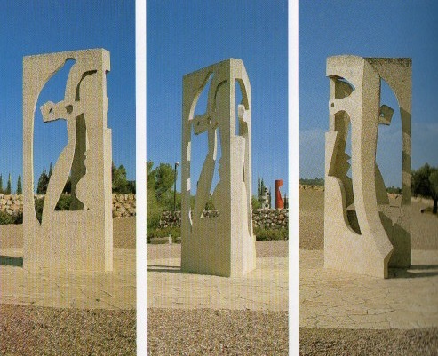
Pablo Picasso (1881-1973) - Profiles
The last great period of Picasso, the sculptor, began in 1960. First in Cannes, then in Mougins, the artist created dozens of busts, figures, masks, birds, and a variety of animals in cut, painted sheet metal. These were small-sized works that later served as models for larger sculptures.
Profiles begins as a flat image folded into apparently equal parts from which two female 'profiles' have been cut. The idea dates back to 1961, when Picasso tended to paint women and female busts using juxtaposed planes.
During this period, the 'betogravure' technique perfected by Norwegian architect, Reling Viksjö and engineer Sverre Lystad was being put to practical use by the sculptor Carl Nesjar.. Nesjar worked together with PIcasso to transform some models into sculptures.
'Profiles' was executed in 1964 at the Collége Sud of Marseilles, and was reworked on a larger scale (nearly 6 m high) by Nesjar in 1967 for the Israel Museum.
Picasso himself chose the setting for the work with the help of photographs of the Billy Rose Sculpture Garden.
Profiles, Pablo Picasso (1881-1973).
David Smith (1906-1965) - Cubi VI
At the end of the cypress- and olive-lined path that leads to the Sculpture Garden and the main entrance of the Museum, Cubi VI springs into view like a latterday totem pole or, as Frank O'Hara put it - 'like a traffic light climbing into the air with the seeming effortlessness and spontaneity of a masterful drawing.'
Its author, the American sculptor, David Smith, conceived it for an outside location. It is impressive, not only because of its size (almost 3 m high), but also because of its polished stainless steel surface literally absorbs the light of day, the sky and the trees. Cubi VI is a part of the Cubi series Smith worked on from 1962 to 1965, and is generally considered to be his masterpiece. The title 'Cubi' seems to refer to the influential role that cubism played in his early career as an artist. Smith returned to Cubism towards the end of his life, after going through several phases during which he experimented with surrealism and expressionism. However, this reference is limited to shapes alone (inspired by Cézanne's works), which Smith revoked to create geometric relationships within an infinite space.
Cubi VI, David Smith (1906 - 1965).
Jean Tinguely (1925 - 1991) - Eos X
In 1965 in Jerusalem, Jean Tinguely built this large (over 4 m high) mobile for the Billy Rose Sculpture Garden; sheer size makes it the most important of a series of scultptures that he completed that year. In it, Tinguely puts to work a vertical rail, creating a form generating movement in space.
Tinguely began experimenting with his first mobiles in 1951, installing adustable motors and creating works with irregular movements by using scrap materials and odds and ends. In 1960 he joined the Parisian Nouveau Realism movement, which he left in 1964 upon designing his black-painted 'machines'.
'Black,' he wrote, 'is a way of making profound objects disappear. It's a gesture "par excellence: against Nouveau Realism." At the same time, he replaced his irregular mobile movements with a monotonous rocking motion intended to recall 'the spirit of Sisyphus, the idea of being condemned to continually repeat the same thing.'
His previous oeuvre, full of joy, was succeeded by works expressing a degree of anguish, testimony to the degraded machine. Nonetheless, they were still imbued with humour: the perennial rocking motion represents a self-satisfied energy with no other purpose than to exist in a pure state.
Jean Tinguely (1925 - 1991).
Reference:
[1] Y. Fisher, Masterpieces of the Israel Museum, CASA EDITRICE BONECHI, Italy (1995).
Preamble
This is the eighteenth post in a new Art Resource series that specifically focuses on techniques used in creating artworks. For your convenience I have listed all the posts in this new series below:
Drawing Art
Painting Art - Part I
Painting Art - Part II
Painting Art - Part III
Painting Art - Part IV
Painting Art - Part V
Painting Art - Part VI
Home-Made Painting Art Materials
Quality in Ready-Made Artists' Supplies - Part I
Quality in Ready-Made Artists' Supplies - Part II
Quality in Ready-Made Artists' Supplies - Part III
Historical Notes on Art - Part I
Historical Notes on Art - Part II
Historical Notes on Art - Part III
Historical Notes on Art - Part IV
Historical Notes on Art - Part V
Tempera Painting
Oil Painting - Part I
Oil Painting - Part II
Oil Painting - Part III
Oil Painting - Part IV
Oil Painting - Part V
Oil Painting - Part VI
Pigments
Classification of Pigments - Part I
Classification of Pigments - Part II
Classification of Pigments - Part III
Pigments for Oil Painting
Pigments for Water Color
Pigments for Tempera Painting
Pigments for Pastel
Japanese Pigments
Pigments for Fresco Painting - Part I
Pigments for Fresco Painting - Part II
Selected Fresco Palette for Permanent Frescoes
Properties of Pigments in Common Use
Blue Pigments - Part I
Blue Pigments - Part II
Blue Pigments - Part III
Green Pigments - Part I
Green Pigments - Part II
Red Pigments - Part I
Red Pigments - Part II
Yellow Pigments - Part I
Yellow Pigments - Part II
Brown and Violet Pigments
Black Pigments
White Pigments - Part I
White Pigments - Part II
White Pigments - Part III
Inert Pigments
Permanence of Pigments: New Pigments - Part I
Permanence of Pigments: New Pigments - Part II
Limited or Restricted Palettes
Testing of Pigments - Part I
Testing of Pigments - Part II
Further Refinement of Pigments
Color and Light - Part I
There have been another one hundred and thirteen posts in a previous Art Resource series that have focused on the following topics:
(i) Units used in dyeing and printing of fabrics;
(ii) Occupational, health & safety issues in an art studio;
(iii) Color theories and color schemes;
(iv) Optical properties of fiber materials;
(v) General properties of fiber polymers and fibers - Part I to Part V;
(vi) Protein fibers;
(vii) Natural and man-made cellulosic fibers;
(viii) Fiber blends and melt spun fibers;
(ix) Fabric construction;
(x) Techniques and woven fibers;
(xi) Basic and figured weaves;
(xii) Pile, woven and knot pile fabrics;
(xiii) Nainkage, durable press and wash-wear finishes;
(xvi) Classification of dyes and dye blends;
(xv) The general theory of printing.
To access any of the above resources, please click on the following link - Units Used in Dyeing and Printing of Fabrics. This link will highlight all of the one hundred and thirteen posts in the previous a are eight data bases on this blogspot, namely, the Glossary of Cultural and Architectural Terms, Timelines of Fabrics, Dyes and Other Stuff, A Fashion Data Base, the Glossary of Colors, Dyes, Inks, Pigments and Resins, the Glossary of Fabrics, Fibers, Finishes, Garments and Yarns, Glossary of Art, Artists, Art Motifs and Art Movements, Glossary of Paper, Photography, Printing, Prints and Publication Terms and the Glossary of Scientific Terms. All data bases in the future will be updated from time-to-time.
If you find any post on this blog site useful, you can save it or copy and paste it into your own "Word" document for your future reference. For example, Safari allows you to save a post (e.g. click on "File", click on "Print" and release, click on "PDF" and then click on "Save As" and release - and a PDF should appear where you have stored it). Safari also allows you to mail a post to a friend (click on "File", and then point cursor to "Mail Contents On This Page" and release). Either way, this or other posts on this site may be a useful Art Resource for you.
The new Art Resource series will be the first post in each calendar month. Remember - these Art Resource posts span information that will be useful for a home hobbyist to that required by a final year University Fine-Art student and so undoubtedly, some parts of any Art Resource post may appear far too technical for your needs (skip those mind boggling parts) and in other parts, it may be too simplistic with respect to your level of knowledge (ditto the skip). The trade-off between these two extremes will mean that Art Resource posts will be hopefully useful in parts to most, but unfortunately may not be satisfying to all!
Oil Painting - Part I [1]
All references to the so-called discovery of oil painting by one painter or one school of painters in an attempt to find a method that would revolutionize art have long been held to be fallacious. The drying properties of linseed, poppy, walnut, and hempseed oil were known to some of the earliest writers and instances of their application to paint are found quite frequently in early records and in accounts of expenditures of materials.
Description: From flax to linseed oil.
The use of such paint, however, was confined to commonplace or simple decorative purposes; no traditional methods for work of purely artistic pretensions were established until later times. From an examination of the old expense records, oil paint is seen to be have been widely used in England for decorative purposes at least as early as the thirteenth century.
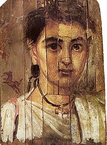
Comment: Fayum Portrait of a Boy.
Note: The earliest forms of panel painting were dossals (altar backs), altar fronts and crucifixes. All were painted with religious images, commonly the Christ or the Virgin, with the saints appropriate to the dedication of the church, and the local town or diocese, or to the donor.
A panel painting is a painting made on a flat panel of wood, either a single piece or a number of pieces joined together.
Tempura painting was eminently successful in meeting the demands of the fourteenth- and fifteenth-century painters, but during the fifteenth century, when the demand and preference arose for a new type of easel painting that could not be produced by using the pure egg-yolk technique, or any other method then in use, the new materials and improved grades of older materials were at hand and were applied to produce these effects. Changes or innovations in techniques are more often attributable to changes in times and circumstances and the demands of changing art forms than to deliberate individual creative departures.
Comment: A section of the earliest discovered oil paintings (~ 650AD) depicting buddhist imagery in Bamiyan, Afghanistan.
Comment: One of the first oil paintings by Jan van Eck - The Arnolfini Portrait (AD 1434).
Material: Oil on panel.
Size: 82 x 59.5 cm.
The fifteenth- and sixteenth-century paintings of the kind innovated by Flemish artists soon after 1400 and referred to by Vasari and other older writers as oil paintings were, for the most part, precisely the sort of works we call tempera paintings today when referring to tempera in the highest stage of development, and some were produced by employing alternate coats of tempera and oily or resinous mediums as in accepted tempera variations.
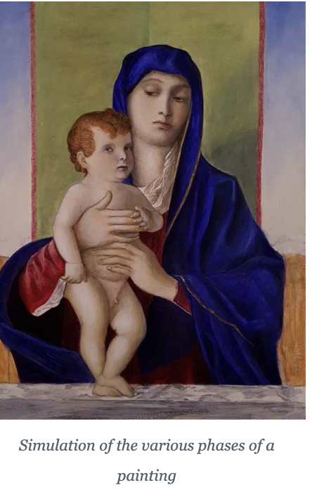
In the paintings of the late 1400s and early 1500s there is a use of various forms of “mixed media”: the oil could be emulsified with egg thus taking the name of “tempera grassa”, or layers of tempera could be superimposed on oil backgrounds or oil layers on tempera backgrounds and the different techniques could also be used in different areas of the same painting. In general, the light backgrounds such as skies and skin tones were made with egg tempera, while the darker and more transparent shades of reds, blues and greens were obtained with binders based on siccative oils.
Below are the various stages of development of a mixed media painting.
Reference:
[1] The Artist's Handbook of Materials and Techniques, R. Mayer (ed. E. Smith) 4th Edition, Faber and Faber, London (1981).

 Full View
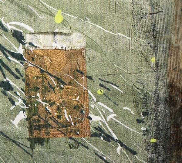 Detailed View 1
 Detailed View 2
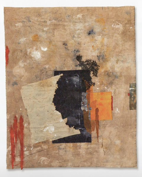 Full View
 Detailed View 1
 Detailed View 2
 Full View
 Detailed View 1
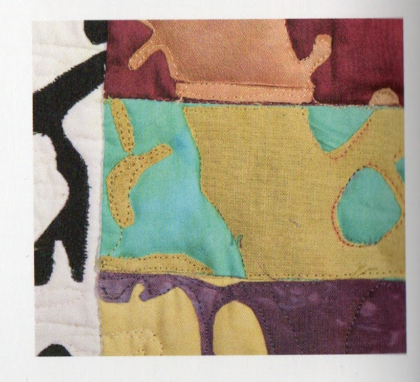 Detailed View 2
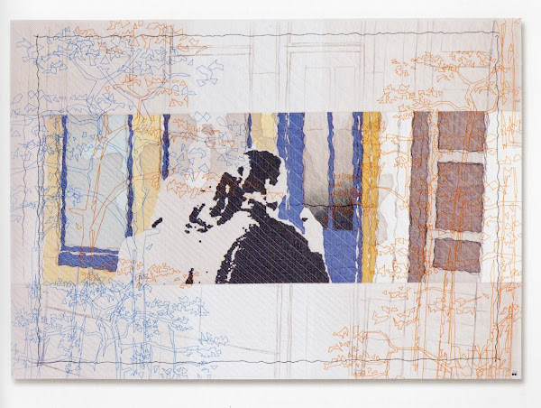 Full View
 Detailed View 1
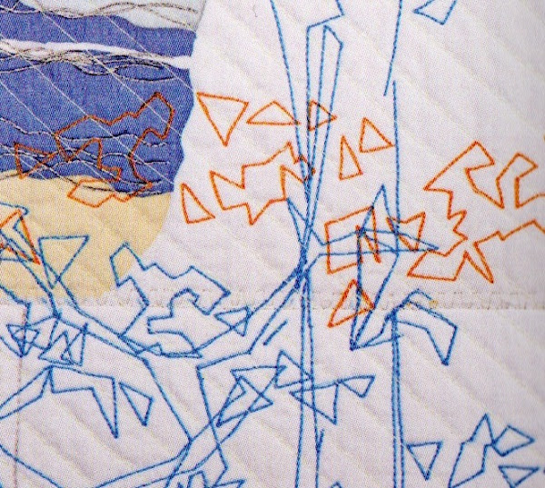 Detailed View 2