
Preamble
For your convenience I have listed other posts in this series below:
Chinese Calligraphy
European Illumination - Celtic Style
The Illumination Art of South-East Asia
European Illumination - Gothic Style
European Illumination - Renaissance Style
Introduction [1]
Romanesque emerged as the dominant style in Europe in the tenth, eleventh and twelfth centuries. Illumination thrived in the hands of the Church, which expanded in wealth and power, spawning new orders and an impressive building program. There were many centres of excellence in illumination in England, France and Germany.
 Romanesque art, is an art form which was created in Western Europe in approximately 1000 AD. The art form is widely known as vigorous.
The historical initial, decorated with a narrative scene, became more popular during this period. Bibles and psalters (i.e. a copy of the biblical Psalms, especially for liturgical use), the most frequently illuminated books, tended to be larger with richly created initials. In Britain, many examples of illumination have survived from this period, faring better than other casualties of history and time, such as works on wood, stone, metal, ivory, embroidery and stain glass, the latter often sources for designs used in illuminations.
 Depiction of the Prophet Daniel is colorful, stiff, and formalized (Romanesque stained glass).
Later Anglo-Saxon illumination, of the late tenth and eleventh Centuries, can be seen to reject Celtic influences and align instead with France and Germany and the more prevalent Romanesque style.
 Albani (St Albans) Psalter: Initial B & King Solomon English Romanesque ca. 1125.
In Germany, the Renaissance, inspired by Charlemagne, was given new life a century later by Otto I, the first in a line of Ottos who gave their name to the Ottonian style. Illuminated letters of this period show a mixture of influences, including Carolingian, early Christian and Byzantine, as well as the individual style of the Winchester School.
 Illuminated letter O, Ottonian style.
The capital letters of the Romanesque Script are called Versals. They were generally used at the beginning of verses and seldom used for whole blocks of text. Versals are based on the Roman script.
 Versals are built up from compound strokes, with the pen held at a horizontal angle. Double strokes are used for the thicker parts of the letter, usually the stem. The double strokes should start at one nib width apart at the head, meet in the middle (see the letter 'B'), then open out again at the base of the letter.
The shape of the letters are Roman, and based on a circular 'O'. The inside curves (called counters) of the letters must be formed from parts of a circle.
 Numerals and lower case figures.
Origins of Illuminated Romanesque Letters J, V, O[1]
The example from which the below 'J' was adapted comes from the Grimbald Gospels, now in the British Library, which were completed in the early eleventh Century.
 Initial 'J' from the Grimbald Gospels (early 11th Century).
Grimbald of St Bertin was founder and first Abbot of the New Minister at Winchester at the time of Alfred the Great.
The initial is a late example of Anglo-Saxon illumination, which shows more classical Roman than Celtic influence, and is perhaps taken from Carolingian examples. This can be seen in the construction of the letter, the rich colors and gilding, and the acanthus leaf decoration. In the adaption of this initial, the artist decided to add extra ornamentation to the trunk of the 'J' to break the starkness of the verticals.
 Initial 'V" from the Pericopes of Emperor Henry II (early 11th Century).
This rich but simple Ottonian 'V' has been taken from Periscopes of Henry II, which date from early eleventh Century, and are now in the Bayerisches Staatsbibliothek, Munich. Periscopes are proportions of scriptures written to be read in public worship. The 'V' characterises the Ottonian style, in almost every way; the letters were very large on the decorated page, with words of the script fitted around them.
The initial has highly burnished gold-foliated branch work, with intense points of color in the interstices. To complement the richness of the gold, the outlining is in red rather than in black. This outline also serves to add relief to the main strokes of the initial by indicating the original calligraphic construction, that is, the two strokes of each line of the 'V'.
 The initial 'O' from the Lincoln Psalms.
This delightful initial shows King David playing his harp. It comes from a Gloss on the Palms in psalter, now in Lincoln Cathedral, England, and was executed in the twelfth Century. King David is seated on a throne, with two stylized curtains wither side of him - curtains are usually wrapped around columns in medieval portrait miniatures. There is a bird apparently 'talking' into the King's right ear and a mystical griffin-like animal forms the horizontal stroke of 'D'.
The asymmetrical nature of the scene is part of its appeal, together with the charming lyrical sway which you must take care not to lose in the process of tracing or enlarging this piece.
The Finished Reproductions of the Letters 'J', 'V' and 'O' Based On The Above [1]
 Rich in gilding and color, but with controlled ornamentation, the result looks dignified. The highlights on the two central panels contrast well with the richer colors around the knot work at each end. Note: The fine details on the dog-head terminals.
 This letter is truly rich, smacking of imperial grandeur. You can imagine how it would look on the dyed purple vellum used by Ottonian illuminators. The influence of metalwork design on such illumination, reinforced by the gilding. If you look carefully, you will see that the width of the outline varies, adding life to the illumination - this was considered to be part of the artistry of the professional.
 The artist has managed to retain the character and sway of the original even though he used a postcard for reference that had a blurred image and unreliable color reproduction. This graceful illumination made use of the artist's in-depth knowledge of such manuscripts. He used the postcard to check color.
Romanesque Gallery[1]
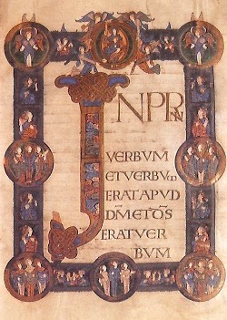
 The initial 'P' from the Winchester Bible (late 12th Century).
This stunning illuminated initial 'P' shows three scenes from the biblical episode in which Moab rebels against Israel. The letter retains some Celtic-style interlace at its head but the inclusion of figures and scenes is typical Romanesque.
 Initial 'B' from the Ramsey Psalter (late 10th Century).
This is a masterpiece of Anglo-Saxon illumination and lettering. The 'B' is lavishly gilded, incorporating interlocking terminations and infilling of acanthus leaves. The grotesque gargoyle-like mask sprouts spirals of colourful foliage which relate to Anglo-Saxon carving and metalwork. The manuscript is believed to have been made at Winchester for use at Ramsey Abbey in Huntingtonshire.
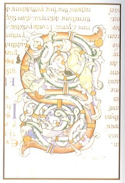 Initial 'S' from Berenggardus' Commentary on the 'Book of Revelation' (early 12th Century).
The whole structure of this flamboyant illuminated 'S' merges with the intertwining and spiralling stems. A dragon climbs among these stems, and a lion, eagerly pursued by a man, feasts on fruit.
 Initial 'V' from the Book of Obadiah, Winchester Bible (late 12th Century).
The historiated decoration within the initial 'V' shows Obadiah hiding 'a hundred prophets' in caves.
 Initial 'O' from the Song of Solomon, Winchester Bible (late 12th Century).
This striking initial 'O' shows the King entertaining the Queen of Sheba, enthroned together in a richly domed palace.
Reference:
[1] P. Seligman and T. Noad, The Illuminated Alphabet, Simon & Schuster, Sydney (1994).
For your convenience I have listed other posts in this series below:
Chinese Calligraphy
European Illumination - Celtic Style
The Illumination Art of South-East Asia
European Illumination - Gothic Style
European Illumination - Renaissance Style
Introduction [1]
Romanesque emerged as the dominant style in Europe in the tenth, eleventh and twelfth centuries. Illumination thrived in the hands of the Church, which expanded in wealth and power, spawning new orders and an impressive building program. There were many centres of excellence in illumination in England, France and Germany.

The historical initial, decorated with a narrative scene, became more popular during this period. Bibles and psalters (i.e. a copy of the biblical Psalms, especially for liturgical use), the most frequently illuminated books, tended to be larger with richly created initials. In Britain, many examples of illumination have survived from this period, faring better than other casualties of history and time, such as works on wood, stone, metal, ivory, embroidery and stain glass, the latter often sources for designs used in illuminations.

Later Anglo-Saxon illumination, of the late tenth and eleventh Centuries, can be seen to reject Celtic influences and align instead with France and Germany and the more prevalent Romanesque style.

In Germany, the Renaissance, inspired by Charlemagne, was given new life a century later by Otto I, the first in a line of Ottos who gave their name to the Ottonian style. Illuminated letters of this period show a mixture of influences, including Carolingian, early Christian and Byzantine, as well as the individual style of the Winchester School.

The capital letters of the Romanesque Script are called Versals. They were generally used at the beginning of verses and seldom used for whole blocks of text. Versals are based on the Roman script.

The shape of the letters are Roman, and based on a circular 'O'. The inside curves (called counters) of the letters must be formed from parts of a circle.

Origins of Illuminated Romanesque Letters J, V, O[1]
The example from which the below 'J' was adapted comes from the Grimbald Gospels, now in the British Library, which were completed in the early eleventh Century.

Grimbald of St Bertin was founder and first Abbot of the New Minister at Winchester at the time of Alfred the Great.
The initial is a late example of Anglo-Saxon illumination, which shows more classical Roman than Celtic influence, and is perhaps taken from Carolingian examples. This can be seen in the construction of the letter, the rich colors and gilding, and the acanthus leaf decoration. In the adaption of this initial, the artist decided to add extra ornamentation to the trunk of the 'J' to break the starkness of the verticals.

This rich but simple Ottonian 'V' has been taken from Periscopes of Henry II, which date from early eleventh Century, and are now in the Bayerisches Staatsbibliothek, Munich. Periscopes are proportions of scriptures written to be read in public worship. The 'V' characterises the Ottonian style, in almost every way; the letters were very large on the decorated page, with words of the script fitted around them.
The initial has highly burnished gold-foliated branch work, with intense points of color in the interstices. To complement the richness of the gold, the outlining is in red rather than in black. This outline also serves to add relief to the main strokes of the initial by indicating the original calligraphic construction, that is, the two strokes of each line of the 'V'.

This delightful initial shows King David playing his harp. It comes from a Gloss on the Palms in psalter, now in Lincoln Cathedral, England, and was executed in the twelfth Century. King David is seated on a throne, with two stylized curtains wither side of him - curtains are usually wrapped around columns in medieval portrait miniatures. There is a bird apparently 'talking' into the King's right ear and a mystical griffin-like animal forms the horizontal stroke of 'D'.
The asymmetrical nature of the scene is part of its appeal, together with the charming lyrical sway which you must take care not to lose in the process of tracing or enlarging this piece.
The Finished Reproductions of the Letters 'J', 'V' and 'O' Based On The Above [1]


Romanesque Gallery[1]

This stunning illuminated initial 'P' shows three scenes from the biblical episode in which Moab rebels against Israel. The letter retains some Celtic-style interlace at its head but the inclusion of figures and scenes is typical Romanesque.

This is a masterpiece of Anglo-Saxon illumination and lettering. The 'B' is lavishly gilded, incorporating interlocking terminations and infilling of acanthus leaves. The grotesque gargoyle-like mask sprouts spirals of colourful foliage which relate to Anglo-Saxon carving and metalwork. The manuscript is believed to have been made at Winchester for use at Ramsey Abbey in Huntingtonshire.

The whole structure of this flamboyant illuminated 'S' merges with the intertwining and spiralling stems. A dragon climbs among these stems, and a lion, eagerly pursued by a man, feasts on fruit.

The historiated decoration within the initial 'V' shows Obadiah hiding 'a hundred prophets' in caves.

This striking initial 'O' shows the King entertaining the Queen of Sheba, enthroned together in a richly domed palace.
Reference:
[1] P. Seligman and T. Noad, The Illuminated Alphabet, Simon & Schuster, Sydney (1994).


