Preamble
Art Quilts have featured on this blogspot and so for your convenience I have listed below previous posts in this series:
Art Quilts - Part I
Art Quilts - Part II
Art Quilts - Part III
Art Quilts - Part IV
Art Quilts - Part V
Art Quilts - Part VI
Art Quilts - Part VII
Art Quilters of the Netherlands - Part I
Art Quilters of the Netherlands - Part II
Art Quilters of the Netherlands - Part III
Four Selected European Art Quilters - Part I
Four Selected European Art Quilters - Part II
Four Selected European Art Quilters - Part III
Art Quilts of Jane Sassaman
Art Quilts of Michael A. Cummings
Four Selected European Art Quilters - Part IV
Art Quilts of Carolyn Crump
Jan Myers-Newbury
Art Quilts of Karin Franzen
Art Quilts of Emily Richardson
Four Selected European Art Quilters - Part V
Four Selected European Art Quilters - Part VI
Art Quilts of Michael A. Cummings [1]
The energy of Michael A. Cummings central appliquéd images threatens to escape boundaries set by his traditional pieced borders. Combining elements from his African American heritage, Yoruba mythology, and formal art training, his narratives focus on subjects such as jazz musicians, historical heroes, and the Yoruba water goddess.
Title (Year): African Jazz #5 (1990).
Materials and Techniques: Cotton, blends, buttons, textile paint; appliquéd, machine sewn.
Size: 2.7 x 1.8 m.
Photograph: Courtesy of Karen Bell.
Helper animal and spirit symbols also occupy Cummings' corners or edges of his works, sometimes crawling into the center in their eagerness to be a part of the story. Masks offer layers of meaning that echo the layers of fabric, while glowing yellow accents appear in almost every work, sometimes symbolizing the rhythms of jazz, sometimes the light of heaven. Visual tension is created through the contrast of the orderliness of traditional chintz fabrics and pieced elements with the organized chaos of his appliquéd forms. in trying to create a new aesthetic, Cummings has produced a body of work filled with energy, edginess and excitment.
Title (Year): Christ Bearing Cross (2003).
Materials and Techniques: Fabric, African cotton print, satin, beads; appliquéd, machine and hand sewn.
Size: 1.8 x 1.5 m.
Photograph: Courtesy of Karen Bell.
'My African American quilting heritage is rich in traditions and characterized by storytelling and improvisational styles that were introduced by slaves. In slecting my themes, some may come from personal experiences. I've been influenced by the works of Romare Bearden, cubism, tapestries from Senegal, music, folk art, and many art forms from around the world.'
Title (Year): Take My Brother Home (1993).
Materials and Techniques: Cotton blends, satin, African beadwork, velvet; appliquéd, machine sewn.
Size: 1.8 x 1.5 m.
Photograph: Courtesy of Karen Bell.
Title (Year): I'll Fly Away (1991).
Materials and Techniques: Cottons, blends, African fabric, fabric, antique quilt blocks.
Size: 2.3 x 2.1 m.
Photograph: Courtesy of Karen Bell.
Title (Year): Haitian Mermaid #3 (1995).
Materials and Techniques: Cottons, blends, fabric, velvet, rayon; machine sewn and appliquéd.
Size: 1.5 x 1.5 m.
Photograph: Courtesy of Karen Bell.
Title (Year): Purplish Cooper (2001).
Materials and Techniques: Cottons, linen, blends, silk; machine sewn.
Size: 1.8 x 1.8 m.
Photograph: Courtesy of Karen Bell.
Title (Year): Rear Admiral (2001).
Materials and Techniques: Cotton, linen silk, machine sewn, appliquéd.
Size: 1.8 x 1.8 m.
Photograph: Courtesy of Karen Bell.
Reference:
[1] M. Sielman, Masters: Art Quilts, Larks Books, New York (2008).
Preamble [1]
'Melbourne Now' was an art exhibition mounted by the National Gallery of Victoria (Melbourne, Australia) in 2014. It took as its premise the idea that a city is significantly shaped by the artists, designers, architects, choreographers, intellectuals, and community groups that lived and worked in the midsts of this multi-cultural city. The aim was to explore how Melbourne's visual artists and creative practitioners contributed to the dynamic cultural identity of this city. The result was an exhibition that celebrates what was unique about Melbourne's art, design, and architectural collectives.
The intention of the exhibition was to encourage and inspire everyone to discover some of the best of Melbourne's culture. To help achieve this, family-friendly activities, dance and music performances, inspiring talks from creative practitioner's, city walks and ephemeral installations and events made up the public program.
This and other posts in this series concentrate on the participating artists, rather than on other features of the exhibition event sych as the family-friendly commissions developed especially for children and young audiences that was aimed to encourage participatory learning for children and their families in general.
For your convenience I have listed below other posts on this blogspot that features Melbourne Now exhibitions:
Melbourne Now - Part I
Melbourne Now - Part II
Melbourne Now - Part III
Melbourne Now - Part IV
Melbourne Now - Part V
Melbourne Now - Part VI
Melbourne Now - Part VII
Melbourne Now - Part VIII
Melbourne Now - Part IX
Melbourne Now - Part III [1]
Lyndell Brown and Charles Green with Jon Cattapan
Title: War and Peace #5: The Leopard, 2013.
Working collaboratively since 1989, Lyndell Brown and Charles Green interweave painting and photography to explore cultural representations and archival histories. Blurring the individual hand, this pair create visually and conceptually layered works that overlap and unfold. Jon Cattapan is an equally well-known visual artist who explores political and social representations of urban environment through paintings of perceptual and narrative complexity. Both Brown/Green (2007) and Cattapan (2008) were commissioned by the Australian War Memorial as 'Offical War Artists,' and the three artists are involved in a long-term collaboration.
Brown/Green and Cattapan recently embarked on new works that commence with photographs printed on Duraclear film, overpainted by Cattapan and Brown/Green in turn. This series, 'War and Peace (2013),' explores the aftermath of peace keeping and war, connecting the Australian landscape to its wider military, media and pop-culture context. Bringing together their on-site observations, screen culture aesthetics and the image flow of the internet, the pictorial strategies of Brown/Green and Cattapan are not aimed at perserving identity, but rather suspending spectacle, allowing for close analysis and arresting contemplation.
Trevor Turbo Brown
Title: Last Man Standing (2012).
Mildura born Trevor Turbo Brown was stolen from his Latje Latje family, grew up in a boy's home in Sydney's west (Australia) and then lived on the streets where, he claims that animals were his only friends. In 1981 Brown moved to Melbourne (Australia) and became a celebrity in the Koori community for his boxing at the Fitzroy Stars Gym and breakdancing street performances, which earned him the epithet 'Turbo' after one of the protangonists in the 1984 film 'Beat Street.' Brown started painting in 2001, and completed a Diploma of Visual Arts at RMIT University (Melbourne) in 2005.
Brown's contribution to Melbourne Now comprises a comforting self-portrait, 'Last Man Standing (2012)' and three spirited paintings of animals in their natural environment symbolic of the artist's vision of his 'Dreaming Country' before it was cleared by whites. Working intuitively with spontaneous brush strokes, Brown creates joyous impressions of his 'friends' - an owl, a crocodile and two goannas - and captures the verdant landscape with breakdance verve and vivid schematic distress. 'Last Man Standing,' Brown's only self-portrait, is a moving unmasking of the self, a cry of psychic pain, an exorcism and a dance of freedom.
Janet Burchill and Jennifer McCamley
Title: Oceania Communion (2012). Detail.
Janet Burchill and Jennifer McCamley have worked collaboratively since the 1980s. Their practice often engages with the legacies of modernism and traverses a wide range of references from psychoanalysis to film to literature to feminism. It also frequently plays across boundaries of art and design, sculpture and furniture.
Shields from Papua New Guinea, held in the National Gallery of Victoria's collection (Melbourne), provided an aesthetic catalyst for the artists to develop an open-ended series of their own shields. The work 'Belief' includes shields made by Burchill and McCamley between 2004 and 2013. In part, this installation mediates on the form and function of shields from the perspective of a type of reverse ethnography.
As the artists explain: 'The shield is an emblematic form ghosted by the functions of attack and defence and characterized by the aggressive display of insignia. We treat the shield as a perverse type of modular unit. While working with repitition, each shield acts as a carrier or container for different types or registers of content, motifs, emblems and aesthetic strategies. The series as a whole then becomes a large sculptural collage which allows us to incorporate a wide range of responses to making art and being alive now.'
Penny Byrne
Title: iProtest (2012-13) Detail.
Penny Byrne is both a visual artist of repute and a highly respected and sought-after ceramics conservator. Using techniques employed in her conservation work, Byrne creates contentious works of art from recycled mass-produced porcelain figurines and toys. Her often satrical modifications of these coy figurines are not obvious: by tinkering with their kitsch aesthetic, Byrne creates a shock of the familiar being used in unexpected ways.
While at first iProtest (2012-2013) resembles a display of endearing souvenir-style figurines hanging on a wall, its potency is revealed on closer inspection. Each figurine is personalized with details relating to one of the many conflicts driven by mass protests around the world. Nationalism is referenced by faces painted with flags; acts of violence leave bodies dismembered and bloodied; and the cutest figures are in fact riot police, wielding guns and dressed as clowns. The omnipresent symbol of Facebook is also ingeniously added to the work. Byrne's crowd of modified figurines explores the way social media has become a significant tool for coordinating protests around the world.
John Campbell
Title: Dunno (T. Towels) (2012) Detail.
John Campbell has been a fixture on the Melbourne art scene since he first began exhibiting paintings of suburban youth culture in the 1980s. Over time his practice has evolved to become one of the more complex examples of Australian 'Pop Art.' Sourcing his materials from a seemingly endless cache of overlooked suburban motifs, Campbell uses the seductively familiar materials and techniques of commercial art and design to foster an audience for these symbols within the hallowed spaces of the contermporary art gallery.
For Melbourne Now, Campbell presents DUNNO (T. Towels) (2012), a work that continues his fascination with the vernacular culture of suburban Australia. Compromising eighty-five tea towels, some in their original condition and others that Campbell had modified through the addition of 'choice' snippets of Australian slang and cultural signifiers, this seemingly quotidian assortment of kitsch 'kitchenalia' is transformed into a mock heroic frieze in which we can discover the values and dramas of our present age.
Maree Clarke
Title: Men in Mourning (2012).
Swan Hill (Victoria, Australia) born Maree Clarke lived for some time on Balranald mission in Munatunga mission Robinvale (Victoria), before settling in Mildura (Victoria), and is connected to the traditional lands of the Mutti Mutti, Wamba Wamba, Yorta Yorta and Boonwurrunga Aboriginal peoples. Clarke has developed a profound and meditative multidisciplinary practice that reclaims and celebrates precious elements of Aborignal customary ritual, language and art, lost during the British colonisation of Victoria.
Clarke's site-specific installation, Ritual and Ceremony (2013), render palpable the unconscionable loss and sorrow experienced by Victorian Aboriginal people as a continuing legacy of colonization. The artist's brooding and poignant photographic images of forty-five men and thirty-eight women bearing ritual markings of mourning create a memorable symbol of collective grief for missing people, stolen Country, lost languages and silenced culture, as well a resilient survival. Moreover, Clarke's video interviews with the individual subjects enable the frozen portraits to come alive, thereby challenging stereotypes of Victorian Aboriginal people as 'inauthentic,' and humanizing their experiences. Resonant with the courageous voices of Koori leaders the installation becomes a healing space inviting multicultural contemplation, sharing and the possibility of reconciliation.
Bindi Cole
Title: EH5452 (2012) (still photograph).
Bindi Cole is a resilient indigenous Melbourne-born photographer, curator and new media artist of Wathaurong Aboriginal descent. Cole's early interest in photography was curtailed by a descent into depression and drugs caused by the trauma of her mother's heroin addiction and death from cancer. During a transformative prison term, Cole found Christianity and recaptured her self-belief. Her deeply personal and powerful artistic practice questions the way settler Australians circumscribed and misconstrued contemporary Aboriginal identity and experience.
Cole's, 'A Wolf in Sheep's Clothing' series (2012) explores the tension between Christianity and Aboriginality, a conflict between different understandings that has resulted in acts of violence and cultural silencing. The artist has been profoundly changed by the revelation of Jesus, but she struggles with the notion that so many 'wolves in sheep's clothing' ran missions in Victoria (Australia) that, in the name of God, participated in the decimation of indigenous culture and languages. The legacy of this difficult history, a longstanding resentment for the atrocities committed under the banner of Christianity, lingers in the Victorian Aboriginal community, and moreover, throughout the world with respect to the indigenous communities.
Reference
[1] T. Ellwood, Director, National Gallery of Victoria (Melbourne, Australia).
Preamble
This is the twenty-nineth post in a new Art Resource series that specifically focuses on techniques used in creating artworks. For your convenience I have listed all the posts in this new series below:
Drawing Art
Painting Art - Part I
Painting Art - Part II
Painting Art - Part III
Painting Art - Part IV
Painting Art - Part V
Painting Art - Part VI
Home-Made Painting Art Materials
Quality in Ready-Made Artists' Supplies - Part I
Quality in Ready-Made Artists' Supplies - Part II
Quality in Ready-Made Artists' Supplies - Part III
Historical Notes on Art - Part I
Historical Notes on Art - Part II
Historical Notes on Art - Part III
Historical Notes on Art - Part IV
Historical Notes on Art - Part V
Tempera Painting
Oil Painting - Part I
Oil Painting - Part II
Oil Painting - Part III
Oil Painting - Part IV
Oil Painting - Part V
Oil Painting - Part VI
Pigments
Classification of Pigments - Part I
Classification of Pigments - Part II
Classification of Pigments - Part III
Pigments for Oil Painting
Pigments for Water Color
Pigments for Tempera Painting
Pigments for Pastel
Japanese Pigments
Pigments for Fresco Painting - Part I
Pigments for Fresco Painting - Part II
Selected Fresco Palette for Permanent Frescoes
Properties of Pigments in Common Use
Blue Pigments - Part I
Blue Pigments - Part II
Blue Pigments - Part III
Green Pigments - Part I
Green Pigments - Part II
Red Pigments - Part I
Red Pigments - Part II
Yellow Pigments - Part I
Yellow Pigments - Part II
Brown and Violet Pigments
Black Pigments
White Pigments - Part I
White Pigments - Part II
White Pigments - Part III
Inert Pigments
Permanence of Pigments: New Pigments - Part I
Permanence of Pigments: New Pigments - Part II
Limited or Restricted Palettes
Testing of Pigments - Part I
Testing of Pigments - Part II
Further Refinement of Pigments
Color and Light - Part I
There have been another one hundred and thirteen posts in a previous Art Resource series that have focused on the following topics:
(i) Units used in dyeing and printing of fabrics;
(ii) Occupational, health & safety issues in an art studio;
(iii) Color theories and color schemes;
(iv) Optical properties of fiber materials;
(v) General properties of fiber polymers and fibers - Part I to Part V;
(vi) Protein fibers;
(vii) Natural and man-made cellulosic fibers;
(viii) Fiber blends and melt spun fibers;
(ix) Fabric construction;
(x) Techniques and woven fibers;
(xi) Basic and figured weaves;
(xii) Pile, woven and knot pile fabrics;
(xiii) Durable press and wash-and-wear finishes;
(xvi) Classification of dyes and dye blends;
(xv) The general theory of printing.
To access any of the above resources, please click on the following link - Units Used in Dyeing and Printing of Fabrics. This link will highlight all of the one hundred and thirteen posts in the previous a are eight data bases on this blogspot, namely, the Glossary of Cultural and Architectural Terms, Timelines of Fabrics, Dyes and Other Stuff, A Fashion Data Base, the Glossary of Colors, Dyes, Inks, Pigments and Resins, the Glossary of Fabrics, Fibers, Finishes, Garments and Yarns, Glossary of Art, Artists, Art Motifs and Art Movements, Glossary of Paper, Photography, Printing, Prints and Publication Terms and the Glossary of Scientific Terms. All data bases in the future will be updated from time-to-time.
If you find any post on this blog site useful, you can save it or copy and paste it into your own "Word" document for your future reference. For example, Safari allows you to save a post (e.g. click on "File", click on "Print" and release, click on "PDF" and then click on "Save As" and release - and a PDF should appear where you have stored it). Safari also allows you to mail a post to a friend (click on "File", and then point cursor to "Mail Contents On This Page" and release). Either way, this or other posts on this site may be a useful Art Resource for you.
The new Art Resource series will be the first post in each calendar month. Remember - these Art Resource posts span information that will be useful for a home hobbyist to that required by a final year University Fine-Art student and so undoubtedly, some parts of any Art Resource post may appear far too technical for your needs (skip those mind boggling parts) and in other parts, it may be too simplistic with respect to your level of knowledge (ditto the skip). The trade-off between these two extremes will mean that Art Resource posts will be hopefully useful in parts to most, but unfortunately may not be satisfying to all!
Introduction
Although any and all of the pigments in this post and following posts may be used, many will be found to be superfluous on a working palette. While painters will naturally have their preferences for specific pigments, some pigments, although definitely separate colors with varying properties, are so closely related to each other than more than one will seldom be required in the same pictiure. The families and groups have been printed on the same line.
Pigments for Water Color [1]
None of the pigments which contain lead or other substances which are chemically affected by exposure to atmosphere may be used. Families or groups have been printed on the same line. An sterisk (*) denotes lesser-used pigments.
White
(i) Chinese white (zinc white).
(ii) Titanium oxide (Titanium pigment).
Black
(i) Ivory Black. Lampblack. Mars Black.
Red
(i) Cadmium light.
(ii) Alizarin Crimson.
(iii) Pure iron oxides (Indian red, light red, Mars red).
(iv)*Cadmium medium, deep, and maroon.
Yellow
(i) Cadmium, pale.
(ii) Cadmium medium. Cadmium deep.
(iii) Cadmium orange.
(iv) Mars yellow. Ochre. Transparent ochre. Raw Sienna.
(v) Cobalt yellow. Hansa yellow.
(vi) Strontium yellow.
Blue
(i) Ultramarine blue (all shades).
(ii) Cobalt blue.
(iii) Cerulean blue. Manganese blue.
Green
(i) Phthalocyanine green.
(ii) Viridian
(iii) Chromium oxide.
(iv) Green earth.
(v) Cobalt, turquoise, and ultramarine greens.
Violet
(i) Cobalt violet. Manganese violet.
(ii) Mars violet.
Brown
(i) Raw umber.
(ii) Burnt umber.
(iii) Burnt sienna.
(iv)Brown madder.
(v) Burnt green earth.
Conclusion:
The weak or low tinctorial permanent colors, such as green earth, ultramarine ash, ultramarine violet etc., are more useful in water color than they are in oil, and some painters make continual use of them; but they are held to be unnecessary by the greater number of water-color painters.
Some of the highest grades of Vandyke brown are light-fast; these may be used in water-color painting where bad properties of this color which have caused its failures in oil have no significance.
Payne's gray, in the highest-grade prepared water colors, is a permanent pigment valued as a useful and convenient color by some painters, but considered unnecessay by others who prefer to make such mixtures in the palette.
For gouache (opaque or impasto water color) the same palette is in use, but when used full strength the transparent pigments will function as body colors and exhibit their top tones. Their undertones will be brought out when they are mixed with a considerable amount of whites, but the color effects of several will be different from those they exhibit in transparent water color.
Cobalt violet often contains arsenic and should be considered poisonous; some of the other chemical colors are not without a harmful effect. In working with a water color, one must not moisten brushes with your mouth. Special care should be taken in the selection of pigments for children's use.
Reference:
[1] The Artist's Handbook of Materials and Techniques, R. Mayer (ed. E. Smith) 4th Edition, Faber and Faber, London (1981).

 Title (Year): African Jazz #5 (1990).
 Title (Year): Christ Bearing Cross (2003).
 Title (Year): Take My Brother Home (1993).
 Title (Year): I'll Fly Away (1991).
 Title (Year): Haitian Mermaid #3 (1995).
 Title (Year): Purplish Cooper (2001).
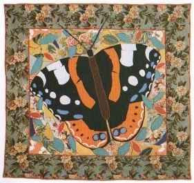 Title (Year): Rear Admiral (2001).


