Preamble
There are a number of posts in this series and for your convenience I have listed them below:
Designing an Art/Craft Project - Part I
Designing an Art/Craft Project - Part II
Designing an Art/Craft Project - Part III
Designing an Art/Craft Project - Part IV
Introduction [1-2]
We have so far covered design elements such as lines, form or shape, balance, unity, proportion, color, texture and function. We will finish the series by summarising the design process.
The Design Process [1-2]
Many years ago I wrote an opinion piece on art entitled - Why ArtCloth? Within it I stated:
"There are three basic ingredients (as opposed to definitions) that all artworks possess. When engaged they are non-functional, and aesthetic. Wearable Art is Art when placed in an art context but when it is not placed in an art context, its functionality obscures the act of engagement." Hence, these three conditions - engagement, non-function and aesthetic - are what the logicians call necessary and sufficient conditions. So designing artwork is different from designing, say, wearable art. There are design regions in which they overlap and then there are design regions which are solely within their domain and of course, design regions which neither of them encompass. Just follow the blue domains in the diagram below to see what I am trying to convey to you in words.
Logicians call this a Venn diagram.
For example, the design principles used in building dams is an area outside of the Art and Wearable Art design domain.
I will try to steer close to the common design areas but if I stray you will know that I have done this on purpose.
The final outcome of this study on the design process is that you will make something with a conscious intention rather than serendipitously fluke an outcome (the latter is an unreliable approach). However, I used to tell all of my students do not over-design; that is, slavishly stick to your original intention rather than - as your project unfolds - modify your original intention if you suddenly perceive a much more interesting direction that your art/craft work is heading during the making of the object. Do you really believe Chihuly knew the hue of every single glass piece before he blew his first glass piece? Now if that were true I would be truly amazed.
Chihuly 'Bridge of Glass.'
As you might already know, some art/craft projects require little or no designing. A little design may be necessary if you are using the same template but changing the texture or color. This often happens when using screen-prints or stencils or stamps. The composition might slightly alter but the tools are basically the same. This is in particular the case in digital designs, where a press of a key here and there can give the act of engagement an entirely different experience. For example, the design process of my new digitally designed fabrics - Celebratory Fireworks - was lengthy (eighteen hours in all), but to get the exact hue I had in mind for each subsequent piece took only one hour per image.
Artist/Creator: Marie-Therese Wisniowski.
Title and Description: 'Celebratory Fireworks 2,' in lime and violet-blue colorway (swatch).
Title and Description" Celebratory Fireworks 2 in lime and violet-blue colorway (fat quarter).
Tile and Description: Celebratory Fireworks 2 in lime and violet-blue colorway (one yard).
Title and Description: Celebratory Fireworks 2 in lime and violet-blue colorway throw pillow.
Artist/Creator: Marie-Therese Wisniowski.
Title and Description: Celebratory Fireworks 5 in cyan, hot pink and red colorway (swatch).
Title and Description: Celebratory Fireworks 5 in cyan, hot pink and red colorway (fat quarter).
Title and Dewcription: Celebratory Fireworks 5 in cyan, hot pink and red colorway (one yard).
Title and Description: Celebratory Fireworks 5 in cyan, hot pink and red colorway placemats.
Generally if you require little designing it will mostly center of these three basic issues:
(i) The shape and size.
(ii) What colors you want to use and where.
(iii) The texture of the materials you wish to exploit.
More formal designs are usually necessary when you plan a project that requires considerable a considerable amount of forms and shapes. The following procedure should help as a guide:
(i) For functional items the adage is "form follows function". Your first step is to decide on the exact purpose of the project. Will it meet the needs you have in mind (e.g. to give viewing pleasure, show ownership, make a statement, provide recreation)?
(ii) Look for ideas that may help you come up with a visually effective design. You may find something you like - well then appropriate it and adapt it to be yours. Take notes or make a quick sketch so you will remember such things as shape, size, color or texture. I know it has become fashionable to title artworks as "Untitled" so as not to straight-jacket the act of engagement to a definable experience. Giving an artwork a working title can give you a greater spur to create what is in your minds eye. This is what I did with my ArtCloth - Neu Kunst: Marilyn - where my intention was to create a Post Graffiti style artwork.
Artist/Creator: Marie-Therese Wisniowski.
ArtCloth with Title: Neu Kunst: Marilyn.
Technique and Media: The techniques include numerous silk screen methods, stitching, discharge, monoprints, lino blocked, stamped, stenciled, hand painted and digitally collaged images employing pigments, dyes, discharge agents, pastels, crayons, charcoal, metallic paints and heat reactive pigment on cotton.
Size: 125 cm long x 75 cm wide.
(iii) Sketch alternative designs until you have the shape or form that satisfy your original/working intention.
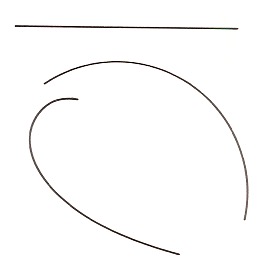
(iv) If your project is a free-form design, the scribble method (see below) may be useful in order to get interesting shapes. Doodling is now an art form in its own right!
How to develop design shapes by using the scribble method.
(v) When you have decided on a design, you will probably want to make a pattern, final sketch or drawing of the project. For most craft projects, your design should be made full size so you can trace it onto the materials you have chosen.
(vi) Gather the necessary materials. Some materials such as sea shells, bottles or stones are free. Others run from fairly inexpensive to quite costly. Choose your materials wisely. The quality of your project will depend on their properties.
(vii) Whatever finishing or fastening materials are required should be at hand.
(viii) Finally, never under-value your work. An artist once said to me: "After I exhibit my textile artwork I cut the artworks into pieces." I said to her: "If you feel your work should be that transient, why exhibit it, just bury it!"
When I was young I read as much as I could. I loved Franz Kafka, who was plagued with self-doubt and so was reluctant to unleash his work onto the world. He requested that Brod, who doubled as his publisher and literary executor, to destroy any unpublished manuscripts. Kafka died on the 3rd of June 1924. Fortunately for us, Brod did not adhere to his friend's wishes and in 1925 published "The Trial", followed by "The Castle", and in 1927, the novel "Amerika". It was only after Kafka died that he gained literary fame. His legacy taught me one salient lesson - it is not for me to judge the merit of my artwork, rather, that is within the provenance of others. Enjoy your work!
References:
[1] C.E. Kicklighter and R.J. Baird, Crafts, The Goodheart-Willcox Company Inc., South Holland (1986).
[2] Marie-Therese Wisniowski, The University of Newcastle Lecture Notes on Design (2008-2010).
Preamble
There are a number of posts in this series and for your convenience I have listed them below:
Designing an Art/Craft Project - Part I
Designing an Art/Craft Project - Part II
Designing an Art/Craft Project - Part III
Designing an Art/Craft Project - Part IV
Introduction [1-2]
We have in the last two posts covered design elements such as lines, form or shape, balance, unity, and proportion. Today we will concentrate on Color, Texture, and Function.
(Note: I shall focus on my work to ensure I am not incorrectly characterizing someone else's artwork.)
Color [1-2]
Color plays a major role in a design project. When color is appropriate to function, such as in wearable art, liberal use of strong color provides excitement to many projects. For example, the strong use of color is evident in many of my ArtCloth fabric lengths and scarves.
My “Rainforest Beauty amidst the Droplets” comes in one multi color way - a dynamic, richly patterned, shibori dyed background in hot vivid pink, hot orange/red and deep blue hues. The linear, gradated structure of the dyed pattern gives an interesting formal quality to the background design. Mono printed circle shapes were printed onto the dyed surface layer. To create visual depth multiple, complex layers of common dogwood and paisley images were screen printed and stamped and overprinted in a semi formal repeat pattern over the entire fabric using transparent and metallic pigments to create a visually deep, richly hued and textured surface.
The “Rainforest Beauty” Collection of fabric lengths and fat quarters can be used for wearable art, accessories, quilts, furnishing, as framed artworks and interior design projects.
Note: See the following link - Rainforest Beauty - for more color way examples.
Artist/Creator: Marie-Therese Wisniowski.
Title: Rainforest Beauty amidst the Droplets - in hot vivid pink, hot orange/red and deep blue hues (close-up view).
Technique and Media: Shibori multi color dyed, mono printed, screen printed and stamped employing transparent and metallic pigments on cotton.
Size: 110 cm (wide) x 110 cm (high).
There are some wearable art objects, where paint could destroy the aesthetic of an item, such as in silver and gold jewelery, a stone sculpture or a walnut serving tray; these are items where the natural color is more engaging and so do not need the addition of synthetic colors.
For non-aesthetic art where functionality is front and center, color is often dictated by its function. Enameled earrings, for example, lend themselves to brilliant color. On the other hand, a knitted hammock would be more suited to subdued and restful colors. Those who have mastered design select colors that bring out the effect they want to convey.
In one of my art resources I have devoted a post on the Psychology of Color. Instead of reiterating it again I will summarize some of the more salient points that were made. Below is a simple color chart.
A great sea of emotion can be obtained through the use of vivid colors.
The following observations about color may serve as a guide in selecting suitable project materials and finishes. Reading from left to right in the figure above:
(i) Red is the most popular color and has the greatest power to attract. It leaves one feeling positive and excited.
(ii) Yellow is bright and cheerful. Gay and lively, it symbolises the sun.
(iii) Blue is cool and serene, giving a feeling of peace.
(iv) Green appears more passive than active. It tends to be neutral in its emotional effect. It is generally considered the most restful of colors.
(v) Purple gives an air of nobility and courage. It provides an impressive effect, rich and stately.
(vi) Pink is warm, feminine and nurturing. It emanates a sense of physical tranquility.
(vii) Brown is found in nature in varying shades. Thus, it gives the impression of warmth and earthiness in materials.
(viii) White is stimulating, light and delicate. It is generally used with other colors to give a luminous feeling.
(ix) Black gives a sense of smart formality. It is somber and profound.
In my ArtCloth work - Shadow Play - I have made use of yellow, orange and red analogous colors as well as dark blue, deep green and grey colors (a mixture of shade and tone colors) to lay down the feeling of a dense but quiet and serene three-dimensional landscape. There is no duality in the viewed existence and so it is nested in the silence you experience when you "go and listen to the sound of one hand clapping”.
Artist/Creator: Marie-Therese Wisniowski.
Title: Shadow Play (full view).
Technique and Media: The artist's signature MultiSperse Dye Sublimation (MSDS) technique employing disperse dyes, native flora and low relief items printed on satin.
Framed Size: 45 cm (width) x 55 cm (height).
Texture [1-2]
Another design tool at your disposal is texture. Every designed material, from the rough side of a piece of bark to the smooth surface of glass, has some degree of texture. Deep or heavy textures can be more stimulating and attention-getting. To achieve some balance in designing a project, different surfaces used together should display varying, modest degrees of texture. Very coarse and highly polished surfaces generally do not compliment each other. Often materials provide their own textured surfaces and can be used as such. Patchwork quilts often use an array of different fabrics, each of which has its own degree of texture. Textured surfaces may also be artificially produced by weaving, printing, sewing, machining or finishing. You should be aware of texturing possibilities when designing. You can make a smooth surface appear textured.
In my 'unique state' ArtCloth print - Urban Explorer - the surface of the cotton fabric was smooth yet the print conveys a highly textured background against an even, smoothly textured surface image.
Artist/Creator: Marie-Therese Wisniowski.
Title: Urban Explorer (full view).
Technique and Media: Screen printed and breakdown silk screen prints employing dyes and opaque pigment on cotton.
Size: 21 cm (wide) x 24 cm (high).
Function [1-2]
Wearable art is different from artwork that is aesthetic and so has no function. My ArtCloth wall hangings, prints and installations are in the same category as oil paintings etc, since they are functionless and so the act of engagement is different from my ArtCloth scarves, which are worn and therefore their functionality places them in a 'Wearable Art' context.
Often an object is said to be functional if it does the job it is intended to do. This may well be true, but there is more to be said for function when you are designing a project. Mechanical function involves the properties of the material. Are the earrings you designed so heavy that they may damage your earlobes? You must also frequently examine the following:
1. OH&S issues with respect to the materials you are using. For example, is it poisonous?
2. The strength of the material you are employing. For example, can it be easily damaged?
3. Its ability to withstand heat, cold and moisture. For example, disperse dyed fabric can de-color fabrics in contact with them in extreme heat.
4. Forces or pressures required. Are the heels too thin and high?
5. Resistance to rust or tarnish. Will the thin copper thread in children's clothing oxidize and produce toxic copper sulfate.
Study the materials you are planning to use for any project. See if they are well suited for what you want them to do, for the age range that they are ear-marked for and make sure they are fit-for-purpose.
My Inspiration/Method in Creating Functional ArtCloth Scarves
The first Prime Minister of India - Nehru - said to his daughter Indira Gandhi: “Be Brave - the rest will follow!” Underlying all of my work is this drive to take risks - to create bold, edgy, contemporary designs and so let my adrenaline drive my artwork. Nonetheless, discarding mainstream design elements is not in itself inspirational, but rather it is an important part of my inner core - to drive my work to create edgy design elements.
Urban and landscape environments inform my images and works. My contemporary urban landscape themes include my interpretation of post-graffiti work. I operate my artistic skill set on these thoughts to project rich and vibrant landscapes on the cloth medium. The ArtCloth scarves I create rely heavily on researching design elements consistent with my worldview to create images from the “utten welt” and/or from life-forms threatened with respect to survival.
I employ various surface design techniques to create the imagery for my scarves. These techniques include the initial image/mark making processes of drawing and designing which are followed by dyeing, discharging, hand painting, stenciling, stamping, screen printing, foiling and other processes on natural fibres.
There are other functions that many projects must serve. The primary functions may be to give satisfaction (value-for-money), pleasure and perhaps even create a sense of envy for those not possessing the item through its form, color, line or texture. Any designed wearable should always come with instructions on how it should be cleaned and maintained.
Artist/Creator: Marie-Therese Wisniowski.
Velvet ArtCloth Scarf.
Technique and Media: Shibori multi-dyed, discharged, silk screened and foiled employing dyes and foil on silk rayon velvet. Printed both sides.
Size: 28 cm (width) x 210 cm (length).
Note: All my scarves come with a swing tag detailing instructions on how they should be cleaned and maintained.
References:
[1] C.E. Kicklighter and R.J. Baird, Crafts, The Goodheart-Willcox Company Inc., South Holland (1986).
[2] Marie-Therese Wisniowski, The University of Newcastle Lecture Notes on Design (2008-2010).
Preamble
There are a number of posts in this series and for your convenience I have listed them below:
Designing an Art/Craft Project - Part I
Designing an Art/Craft Project - Part II
Designing an Art/Craft Project - Part III
Designing an Art/Craft Project - Part IV
Designing an Art/Craft Project - Part II [1-2]
We have covered one basic of design and that was in respect to the most basic of design elements, mainly lines (e.g., straight, arcs and free-formed curves) in last week's post.
When creating an object, whether it is art or craft, the act of engagement is always at the forefront of the design process. Therefore we must be concerned with, "Balance", "Unity", "Proportion", "Color", "Texture" as well as the intended "Concept" that underlies the work. Good design whether intended to aesthetically arouse or provide an intriguing functionality must attempt to clarify these qualities in combinations or separately. A good designer knows how and when they should be used. The blending of these principles and elements is the high point of design. For example, the sumptuous color combinations in the scarf below that was chosen as a finalist in the 2013 Australian Craft Awards.
Note: I shall focus on my work to ensure I am not incorrectly characterizing someone else's artwork.
Artist/Creator: Marie-Therese Wisniowski.
Description: Velvet ArtCloth Scarf.
Technique and Media: Dyed, over-dyed, discharged, silk screened and foiled employing dyes and foil on silk rayon velvet. Printed both sides.
Size: 28 cm (width) x 180 cm (length).
Form or Shape [1-2]
Some simple shapes using concepts already discussed illustrate good characteristics of project design. The following guidelines should help.
(a) Try to be consistent in the use of lines to enclose a shape. When using straight lines, try staying within that style. Straight lines look best when they move toward or away from each other. Straight parallel lines are more normally used for function and decoration (lines running side-by-side which never get closer together are called parallel). Straight lines which are not parallel provide for many interesting design possibilities.
In the printed ArtCloth below, the white stamped images in the mid-ground contain "arrows" that point to each other, which in turn visually create vertical and horizontal parallel lines. These lines enclose the white stencilled "flower" images, the stamped blue Moroccan "window" panels and the multi-colored Moroccan "window" silhouettes in individual square panels. The use of straight, vertical and horizontal lines employed in this piece encapsulates a highly formal and decorative aesthetic.
Artist/Creator: Marie-Therese Wisniowski.
Title: Morocco (section view).
Technique and Medium: Stamped, stencilled and deconstructed/improvisational silk screen prints employing transparent and opaque pigments on cotton.
Size: 50 cm (width) x 100 cm (length).
(b) Free-formed curved lines are often used to enclose a form or shape for many projects. For practice, make some sketches of a project using curved and straight lines. Follow the guidelines set in the last post for making a break in the curved line or for changing direction.
Venue: 2012 QSDS Fabric Show.
Artist/Creator: Marie-These Wisniowski.
Title: FP#2 (full view).
Size: 78 inches (length) x 45 inches (width).
Technique and Media: Dyed, multiple over dyes, discharged, over discharged, hand drawing, silk screened and foiled on silk habotai employing dyes.
Balance [1-2]
Balance is involved in every project. It is not so much a physical matter as it is a "visual" quality. An object properly balanced gives the visual appearance that it will stand up alone. Symmetry (equal on both sides) is the most commonly known form of balance. This is often called FORMAL balance. Without the white markings and text the "Made to Order IV" screen print (below) would have FORMAL balance; that is all the elements on either side of the center line are equal. However, to add interest to the artwork the white markings and text inputs an INFORMAL balance, since there are opposing unequal design elements on either side of the center line. Though elements are not of the same weight, there is an overall feeling of balance.
Artist/Creator: Marie-Therese Wisniowski.
Title: Made to Order IV.
Technique and Medium: Silk screen print - a set of sixteen colors was used in this print on paper.
Size: 70 cm (length) x 55 cm (width).
The attention-getting quality of an element is what lends "weight" to its part of the design balance. Used in equal proportions, red is "heavier" than yellow because of its brilliance and darker value. If used against a smooth background, a course texture is "heavier" than a smooth one. A larger area is naturally heavier than a small one.
Artist/Creator: Marie-Therese Wisniowski.
Title: Wish You Were Where? Environmental Refugees I.
Technique and Medium: Deconstructed silk screen prints and postage stamps, re-digitized into digital prints on paper.
Size: 30 cm (length) x 42 cm (width).
The print explores the disappearance of current coastal regions due to sea level rises (e.g. Venice, Los Angeles, Holland).
Note: The course texture of the print is visually at the fore-front since the smoother areas of the print recede into the background.
Unity [1-2]
Another principle used in developing an effective design is unity (or harmony). Elements of the design - its lines, colors, textures, and shape - must be compatible. Everything must seem to belong in the design. Overuse of materials is an example of poor design. Having four or five different materials, colors, textures or shapes causes design difficulty. One or two would be more effective. Unity also requires restraint on the part of the designer in decoration and color. For it to be visually effective simplicity is the order of the day. The wearable art tie below expresses these qualities.
Artist/Creator: Marie-Therese Wisniowski.
Title: Akash (Wearable Art - Man's Tie).
Technique and Media: Hand dyed and hand painted background colors, discharged, silkscreened and stencilled employing metallic paints on silk satin.
Size: 9.5 cm (wide) x 142 cm (length).
Note: The simplicity of color and the simplicity of design shapes evident in the tie. See the following link - Karma and Akash - for more technique/design information.
Unity requires the honest use of materials. Plan your projects so that the material supports the design idea. Metal picture frames do not have the warmth of wood. Needlepoint has little charm when stitches are made with plastic. Remember, an object has unity when it contains no opposing lines, no colors or textures in conflict. It has unity when all its elements are properly arranged to serve its primary function or use in the act of engagement. However, all of these principles can be broken if shock value or thought provoking ideas are at the forefront of the design.
Artist/Creator: Marie-Therese Wisniowski.
ArtCloth Installation: Another Brick @ Watt Space Gallery.
Note: This art installation centered on Post Graffiti and so the use of safety construction fences to display the artcloth installation brought to the fore these urban Post Graffiti ArtCloth works.
Proportion [1-2]
In designing, think of proportion as the relationship in size and shape between design elements; Proportion is established primarily through division of surfaces and generally refers to the relative size of parts within a whole. It is, therefore, directly dependent upon balance, unity, color and texture. Each of these qualities add something to create the stimulating proportions in your work.
Below is a detailed view of my ArtCloth, Gondwana Retraced II. This artwork highlights two design principles: (a) that proportion refers to the relative size of parts within a whole; (b) that proportion is basically a combination of balance, unity, color and texture in order to provide a thought provoking image.
Artist/Creator: Marie-Therese Wisniowski (detailed view).
Title: Gondwana Retraced II.
Technique and Media: The artist's signature MultiSperse Dye Sublimation (MSDS) technique employing disperse dyes, native flora and low relief items printed on satin.
Size: 60 cm (wide) x 146 cm (length).
Artist Statement: Tasmania’s Cradle Mountain region is an area of marked geological contrasts and forms part of the Tasmanian Wilderness Comment: World Heritage Areas. Its unsurpassed natural beauty, its cultural significance, its unsurpassed pristine wilderness park features a vast array of natural and cultural features found to be of global significance. 'Gondwana Retraced II' traces its pristine history.
References:
[1] C.E. Kicklighter and R.J. Baird, Crafts, The Goodheart-Willcox Company Inc., South Holland (1986).
[2] Marie-Therese Wisniowski, The University of Newcastle Lecture Notes on Design (2008-2010).
Preamble
There are a number of posts in this series and for your convenience I have listed them below:
Designing an Art/Craft Project - Part I
Designing an Art/Craft Project - Part II
Designing an Art/Craft Project - Part III
Designing an Art/Craft Project - Part IV
Introduction [1-2]
Few human experiences are as interesting or rewarding than designing and making something creative that is your own. This is particularly true in a highly technical/digital world where mass production provides an unending supply of identical products. Don't tell me that you are so much of an "Indie" that you have never worn "Target" gear! Well, if you found yourself at a social event where that little black dress you were wearing looked better worn by another woman at the same event then you will appreciate the pleasure in creating something that is one of a kind.
Fashion historians ascribe the origins of the little black dress to the 1920s designs of Coco Chanel and Jean Patou intended to be long-lasting, versatile, affordable, accessible to the widest market possible and in a neutral color (and worn by guess who?).
Art/Craft projects are usually the work of one person, who pines for the desire of a certain object or wishes to create an item simply out of pure joy of using tools and materials to make a unique creation. In every instance the art/craft project serves the purpose: to create an item with intent in order to intellectually/emotionally stimulate the act of engagement. Unlike art, craft items have a further restriction/purpose namely functionality. Functionality does not necessarily mean it is easy to wear or even comfortable. It just means that functionality is an important ingredient for craft items. Perhaps to better frame the difference: there are Art Quilts and there are decorative quilts used on bedding.
Art Quilt by Luke Haynes, who is a quilt artist based in Seattle (USA).
A successful project begins with an intended design. This is a plan of what the project will look like and how it will be made. For example, in creating my ArtCloth installation - The Australian Four Seasons - I designed the ArtCloth concept/sketch on an A4 sheet of paper using watercolours. After numerous sketches I settled on a version that best depicted the concept, size, scale etc. and determined which fabric and dye type to use.
Note: I shall focus on my work to ensure I am not incorrectly characterizing someone else's artwork.
Title: "Winter Bolt" (watercolour version).
Note: (i) The sun is depicted as a liquid bolt; (ii) Wavelets are evident; (iii) The graduation of color going down the artwork depicting a descent into coldness. I decided the fabric would be satin, and the images would be hand painted and heat transferred using disperse dyes. This is how the artwork appeared once completed.
Title: "Winter Bolt" - one of a quadtych of "The Four Australian Seasons".
Artist/Creator: Marie-Therese Wisniowski.
Technique and Material: Hand painted and heat transferred using disperse dyes on satin.
Size: ca. 1.50 wide x 2.00 high meters.
Note: Held in the Artist Collection and so not available for purchase.
Comment: The cloud wavelets are not present in the finished artwork due to my Zen "no-mind" state directing the artwork instead of me slavishly following a "rough". You will note that in my "no-mind" state, I have darkened the background of the artwork as the eye descends and thinned out the liquid sun (i.e., in the form of a bolt), both elements of which I believe indicate, in a more subtle manner, a wintery/watery feel.
In most of my ArtCloth exhibitions, I display my ArtCloths in a three-dimensional mode. I use a rough to work out the placement of the artworks. A maquette (French word for scale model) is a small scale model or rough draft of how I want the exhibition displayed, and where I want the public to meander amongst the hung ArtCloth works. I use it to visualize and test the displayed artwork placements without incurring the cost and effort of producing a full-scale exhibition.
Basics of Design [1-2]
Whatever we design we want it to be visually engaging, and so it is important that we develop a sense of good visual design. Design involves elements and principles that must be understood before they can be used effectively.
Elements are the visible parts of a project. They must give it substance. The usual elements are: line, form, mass, texture and color. Color includes hue, value and chroma.
Principles are simply guides that apply to all design work. They are not rules, which we must fear to break, but observations about the nature of the visible world. Principles help us decide how we wish to transit information to the viewer - whether we want to shock, to reveal, to confuse, to assure, to query, to invent or to re-interpret etc., will depend on principles of proportion, balance, contrast, rhythm, unity, symmetry, asymmetry, unity or harmony etc.
Lines are the most basic of the design elements. Fortunately there are only three kinds:
1. Straight. They may be horizontal, vertical or slanted.
2. Arcs of a circle where rate of curve is unvarying.
3. Free-form curves which may vary in direction.
Lines are one of the important elements in design. As previosly stated they may be straight, curved, sloped or curved free form.
However, designing with lines may still be difficult, even with only three kinds used on the surface.
Straight Lines and Arcs of Circle
Our use of lines varies little from their appearance in nature. The straight line appears frequently in shapes such as snowflakes and crystal formations. Circles and their arcs are familiar in the shapes of planets or water droplets. The designer uses such lines in an aesthetic (artistic) design and if not used aesthetically may become boring since they are static in nature.
Title: “Natural Treasures” (full view).
Comment: This artwork was inspired by the pristine waterways and scenery of the unique wilderness of the Huon Valley in Tasmania, Australia.
Artist/Creator: Marie-Therese Wisniowski.
Technique and Material: Dyed, over-dyed, shibori over-dyed, discharged, silk-screened, hand painted and foiled on silk habutai.
Note: The use of lines and dots incorporated in the work adds greater interest and moreover, gives a watery or rainforest feel to the artwork.
Title: “Renaissance Man” in magenta/purple hues (detail view).
Artist/Creator: Marie-Therese Wisniowski.
Technique and Material: Dyed, over-dyed, screen-printed employing transparent, opaque and metallic pigments on cotton.
Size: 113 cm wide x 100 cm high.
Note: The use of straight lines and arcs in this image give symmetry and balance to the central figure whilst at the same time focussing your eye on the central figure.
Free-Formed Curved Lines
One of the designers most valuable lines is the free formed curve. It comes from the volute or spiral figure.
A flowing free-formed curve line is obtained from a volute.
Title: “La Volute Grungesque” (detail view).
Artist/Creator: Marie-Therese Wisniowski.
Technique and Material: Solid dyed and screen-printed employing transparent and metallic pigments on cotton.
Size: 120 cm wide x 170 cm high.
The spiral line of the route unwinds at an even rate. If extended inward or outward, it will never touch or cross itself. Any section of the volute is a smoothly curved line which is not an arc of a circle. Free-formed curves are appealing since they show motion and are "lively". A wave in an ocean or a leaning blade of grass are good examples of the free-form curve. These curved lines are found in most aspects of nature.
Title: "Flames Unfurling" (detail view) - one of a diptych.
Artist/Creator: Marie-Therese Wisniowski.
Technique: The artist’s signature technique - MultiSperse Dye Sublimation (MSDS) - employs disperse dyes, native flora and low relief items printed on satin.
Size: 60 cm wide x 120 cm high.
Combining Curved Lines
Free-form, curved lines may be combined in a number of ways to provide pleasing results. Some general rules are followed since random use of these lines is generally unsatisfactory. These methods are only guidelines. They are not breakable rules. Yet they are valuable in developing a feeling of good design.
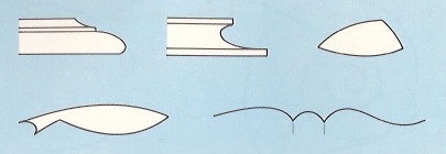
When two or more curved lines are used in sequence, it is necessary to make some type of break or abrupt change in direction. See the figure below. The change in direction may be made by using:
1. A shoulder which is an area next to a higher or bigger area.
2. A bead which is a rim, a band or a folding.
3. A point of tangency. This is a spot where lines moving in different directions touch.
Methods of joining free-formed curve lines to change direction. (A, B and E) a point of tangency; (C) Abrupt change by using a bead; (D) A shoulder break, perpendicular to a point of tangency.
At a point of tangency, the ends of the curved lines should be either parallel or perpendicular to each other. The figure below shows interesting applications of curved lines.
Title: “Rainforest Beauty amidst the Berries” in soft green and lilac hues (detail view).
Artist/Creator: Marie-Therese Wisniowski.
Technique and Material: Multi color dyed and screen-printed employing glazes, transparent, opaque and metallic pigments on cotton.
Size: 77 cm wide x 109 cm high.
Effective use is made of curved lines to enclose shapes and form design styles.
The image below shows an interesting application of the above using the element of curved lines to enclose shapes in the form of deconstructed fish silhouettes.
Title: "A Transient Life" (detail view).
Artist/Creator: Marie-Therese Wisniowski.
Technique and Material: Deconstructed interfacing silk-screen prints on cotton employing transparent and opaque pigments.
Size: 70 cm wide x 74 cm high.
Reference
[1] C.E. Kicklighter and R.J. Baird, Crafts, The Goodheart-Willcox Company Inc., South Holland (1986).
[2] Marie-Therese Wisniowski, The University of Newcastle Lecture Notes on Design (2008-2010).
Preamble
This is the eightieth post in the "Art Resource" series, specifically aimed to construct an appropriate knowledge base in order to develop an artistic voice in ArtCloth.
Other posts in this series are:
Glossary of Cultural and Architectural Terms
Units Used in Dyeing and Printing of Fabrics
Occupational, Health & Safety
A Brief History of Color
The Nature of Color
Psychology of Color
Color Schemes
The Naming of Colors
The Munsell Color Classification System
Methuen Color Index and Classification System
The CIE System
Pantone - A Modern Color Classification System
Optical Properties of Fiber Materials
General Properties of Fiber Polymers and Fibers - Part I
General Properties of Fiber Polymers and Fibers - Part II
General Properties of Fiber Polymers and Fibers - Part III
General Properties of Fiber Polymers and Fibers - Part IV
General Properties of Fiber Polymers and Fibers - Part V
Protein Fibers - Wool
Protein Fibers - Speciality Hair Fibers
Protein Fibers - Silk
Protein Fibers - Wool versus Silk
Timelines of Fabrics, Dyes and Other Stuff
Cellulosic Fibers (Natural) - Cotton
Cellulosic Fibers (Natural) - Linen
Other Natural Cellulosic Fibers
General Overview of Man-Made Fibers
Man-Made Cellulosic Fibers - Viscose
Man-Made Cellulosic Fibers - Esters
Man-Made Synthetic Fibers - Nylon
Man-Made Synthetic Fibers - Polyester
Man-Made Synthetic Fibers - Acrylic and Modacrylic
Man-Made Synthetic Fibers - Olefins
Man-Made Synthetic Fibers - Elastomers
Man-Made Synthetic Fibers - Mineral Fibers
Man Made Fibers - Other Textile Fibers
Fiber Blends
From Fiber to Yarn: Overview - Part I
From Fiber to Yarn: Overview - Part II
Melt-Spun Fibers
Characteristics of Filament Yarn
Yarn Classification
Direct Spun Yarns
Textured Filament Yarns
Fabric Construction - Felt
Fabric Construction - Nonwoven fabrics
A Fashion Data Base
Fabric Construction - Leather
Fabric Construction - Films
Glossary of Colors, Dyes, Inks, Pigments and Resins
Fabric Construction – Foams and Poromeric Material
Knitting
Hosiery
Glossary of Fabrics, Fibers, Finishes, Garments and Yarns
Weaving and the Loom
Similarities and Differences in Woven Fabrics
The Three Basic Weaves - Plain Weave (Part I)
The Three Basic Weaves - Plain Weave (Part II)
The Three Basic Weaves - Twill Weave
The Three Basic Weaves - Satin Weave
Figured Weaves - Leno Weave
Figured Weaves – Piqué Weave
Figured Fabrics
Glossary of Art, Artists, Art Motifs and Art Movements
Crêpe Fabrics
Crêpe Effect Fabrics
Pile Fabrics - General
Woven Pile Fabrics
Chenille Yarn and Tufted Pile Fabrics
Knit-Pile Fabrics
Flocked Pile Fabrics and Other Pile Construction Processes
Glossary of Paper, Photography, Printing, Prints and Publication Terms
Napped Fabrics – Part I
Napped Fabrics – Part II
Double Cloth
Multicomponent Fabrics
Knit-Sew or Stitch Through Fabrics
Finishes - Overview
Finishes - Initial Fabric Cleaning
Mechanical Finishes - Part I
Mechanical Finishes - Part II
Additive Finishes
Chemical Finishes - Bleaching
Glossary of Scientific Terms
Chemical Finishes - Acid Finishes
Finishes: Mercerization
Finishes: Waterproof and Water-Repellent Fabrics
Finishes: Flame-Proofed Fabrics
Finishes to Prevent Attack by Insects and Micro-Organisms
Other Finishes
Shrinkage - Part I
Shrinkage - Part II
Progressive Shrinkage and Methods of Control
Durable Press and Wash-and-Wear Finishes - Part I
Durable Press and Wash-and-Wear Finishes - Part II
Durable Press and Wash-and-Wear Finishes - Part III
Durable Press and Wash-and-Wear Finishes - Part IV
Durable Press and Wash-and-Wear Finishes - Part V
The General Theory of Dyeing – Part I
The General Theory Of Dyeing - Part II
Natural Dyes
Natural Dyes - Indigo
Mordant Dyes
Premetallized Dyes
Azoic Dyes
Basic Dyes
Acid Dyes
Disperse Dyes
Direct Dyes
Reactive Dyes
Sulfur Dyes
Blends – Fibers and Direct Dyeing
The General Theory of Printing
There are currently eight data bases on this blogspot, namely, the Glossary of Cultural and Architectural Terms, Timelines of Fabrics, Dyes and Other Stuff, A Fashion Data Base, the Glossary of Colors, Dyes, Inks, Pigments and Resins, the Glossary of Fabrics, Fibers, Finishes, Garments and Yarns, Glossary of Art, Artists, Art Motifs and Art Movements, Glossary of Paper, Photography, Printing, Prints and Publication Terms and the Glossary of Scientific Terms, which has been updated to Version 3.5. All data bases will be updated from time-to-time in the future.
If you find any post on this blog site useful, you can save it or copy and paste it into your own "Word" document etc. for your future reference. For example, Safari allows you to save a post (e.g. click on "File", click on "Print" and release, click on "PDF" and then click on "Save As" and release - and a PDF should appear where you have stored it). Safari also allows you to mail a post to a friend (click on "File", and then point cursor to "Mail Contents On This Page" and release). Either way, this or other posts on this site may be a useful Art Resource for you.
The Art Resource series will be the first post in each calendar month. Remember - these Art Resource posts span information that will be useful for a home hobbyist to that required by a final year University Fine-Art student and so undoubtedly, some parts of any Art Resource post may appear far too technical for your needs (skip over those mind boggling parts) and in other parts, it may be too simplistic with respect to your level of knowledge (ditto the skip). The trade-off between these two extremes will mean that Art Resource posts will hopefully be useful in parts to most, but unfortunately may not be satisfying to all!
Mechanical Finishes - Part 1
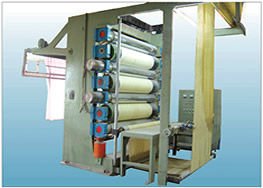
Calendering
Calendering is a mechanical finishing operation performed by a "stack" of rollers through which the cloth passes. There are several types: the simple calender, the friction calender, the moist calender, the Schreiner calender and the embossing calender. Each produces a different finish.
Most calender machines have three rollers. (Others have two, five or seven.) Hard metal rollers alternate with softer cloth wrapped rollers or with solid paper rollers. Two metal rollers never run against each other.
Seven roller Glazing calender.
The simple calender corresponds to the household iron and gives a smoothed ironed finish to the fabric. The cloth is slightly damp before it enters the calender. The metal roller is heated. The cloth travels through the calender at the surface speed of the rollers so the rollers simply exert pressure to smooth out the wrinkles and give a slight sheen.
The friction calender is used to give a highly glazed surface to the cloth. If the fabric is first saturated with starch and waxes, the finish is only temporary; but if resin finishes are used, the glaze will be durable.
The cloth is first passed through the finishing solution and then dried to a certain degree of dryness. It is then threaded into the calender. The speed of the metal roller is greater than the speed of the cloth and the roller polishes the fabric. If the metal roll is hot, a higher glaze is obtained.
The moiré calender has been used for more than 250 years to produce a "water-marked" design on ribbed silk and wool fabrics. When acetate became available, it was possible to have a permanent moiré pattern.
Moiré process on fabrics.
True moiré is applied to ribbed fabrics such as taffeta and faille. The rib is essential in producing the pattern since the rollers of the calender are smooth. An embossed moiré design is made on the calender with an engraved roller.
1865 American green taffeta with minute woven lozenge figure and warp printed moiré fern and flower design in black, lower edge of bodice and peplum trimmed with black silk bobbin lace; tulle ruffles on sleeves; skirt longer in back.
The true moiré is made by placing two layers of ribbed fabric, one on top of the other, so the ribs of the top layer are slightly "off-grain" in relation to the under layer. The two layers are stitched or held together along the selvage and are then fed into the smooth, heated, metal roller calender. Pressure of eight to ten tons causes the rib pattern of the top layer to be pressed into the bottom layer and vice versa. Flattened areas in the ribs reflect more light and create a contrast to the unflattened areas. This procedure can be modified to produce patterned moiré designs other than the water marked one.
Moire (Skirt) Dress.
The Schreiner calender has a metal roller engraved with 200 ti 300 fine diagonal lines visible only under a hand lens. (The lines should not be confused with yarn twist.) Until the advent of the resins and the thermoplastic fibers, this finish was temporary and was removed by the first washing. The primary purpose of this finish is to produce a deep seated luster, rather than a shine, by breaking up of reflected light rays. It also flattens the yarn to reduce the openness between them, and give smoothness and cover.
The arrangement of rollers in a two-bowl Schreiner calender.
It can upgrade a sleazy material. This finish was originally used with cotton sateen and table damask to make them more lustrous and more scalable. It was later used on polished resinated cottons and sateens as a durable finish. In 1957, it was first used to produce the Satinette finish on nylon and polyester tricot jersey. It has upgraded tricot and aroused interest in its use for the following reasons: the Satinette finish is permanent in laundry, thin fabrics are more opaque, smoothness gives a better base for printing color on the fabric. There is less tendency for tricot garments to sag at the hemline.
The diagram below shows a Schreiner calender for tricot fabrics. To avoid stretching the knit construction, the fabric is delivered to the calender in a tensionless state.
Schreiner calender machine for tricot.
The embossing calender produces either flat or raised designs on the fabric. Embossing became a much more important finish after the heat-sensitive fibers were developed because it was possible to produce a durable, washable, embossed pattern. Nylon, acrylics, acetate, polyesters, and fabrics made of nylon and metallic yarns are used. If the fabrics are made of solution-dyed fibers, they can be embossed directly off the loom and are then ready for sale. Mossed satins are used in high-style garments and can be sold for a much higher price than the unembossed fabric.
The embossing calender consists of two rollers, one of which is a hollow engraved metal roller heated from the inside by a gas flame. The other is a solid paper roller exactly twice the size of the engraved roller.
Embossing rollers.
The process differs for the production of flat and raised designs.
1. Flat designs are the simplest to produce. A copper roller, engraved in deep relief, revolves against a smooth paper roller. (See diagram above). The hot engraved areas of the roller produce a glazed pattern on the fabric. Embossed brocades are an example of this type of design.
2. Raised or relief designs require a more complicated routine. The paper roller is soaked in water and then revolved against the steel engraved roller (without fabric) until the pattern of engraving is pressed into the paper roller. The temperature is adjusted to suit the fabric, which is then passed between the rollser.
Reference:
[1] N. Hollen and J. Saddler, Textiles, 3rd Edition, MacMillan Company, London (1968).

 Logicians call this a Venn diagram.
 Chihuly 'Bridge of Glass.'
 Artist/Creator: Marie-Therese Wisniowski.
 Title and Description" Celebratory Fireworks 2 in lime and violet-blue colorway (fat quarter).
 Tile and Description: Celebratory Fireworks 2 in lime and violet-blue colorway (one yard).
 Title and Description: Celebratory Fireworks 2 in lime and violet-blue colorway throw pillow.
 Artist/Creator: Marie-Therese Wisniowski.
 Title and Description: Celebratory Fireworks 5 in cyan, hot pink and red colorway (fat quarter).
 Title and Dewcription: Celebratory Fireworks 5 in cyan, hot pink and red colorway (one yard).
 Title and Description: Celebratory Fireworks 5 in cyan, hot pink and red colorway placemats.
 Artist/Creator: Marie-Therese Wisniowski.
 How to develop design shapes by using the scribble method.