Season's Greetings
What a year! In Australia and New Zealand we fared reasonably well through the pandemic, as we watched from afar the horrific plague and the heartbreak it brought throughout the rest of the world. At the outset I want to acknowledge all those who died due to the virus and those who still have lingering medical issues even though they recovered. Words cannot express the grief in losing a loved one. So many lives lost, so much tragedy for all of us to acknowledge and sympathize with those who had to live through their trauma.
We watched the rollout of the vaccine, but we knew it still was not a time to party. We opened up venues, revisited past activities and explored the possibility of a Covid framed reality. It will fade from our memory as time passes, and when generations not yet born read about it in their history books, it will barely occupy a chapter (re: the Spanish flu of 1919).
No matter what your belief systems, I wish you a happy and joyous festive season.
Marie-Therese Wisniowski.
Note: The next post will appear on the 15th of January 2022.
Introduction
I have written an extensive post on my artist printermakers' book titled Not in My Name. I was asked to submit a paper to a refereed journal, namely, Literature & Aesthetics (i.e. the journal of the Sydney Society of Literature and Aesthetics) which I did and after the refeering process was completed, it was published.
See - Editors, Benitez, E.E. and Christie, W. ‘Not in My Name’ Wisniowski, M.-T. ‘Literature and Aesthetics’, The Journal of the Sydney Society of Literature and Aesthetics, The University of Sydney, Vol.13, No. 2 pp. 83 - 88, December 2003.
Below is a reproduction of that article.
Not in My Name (Article)
Printmaking is often called the democratic medium. Contemporary printmaking in Australia and elsewhere is generated by the action of two forces. On the one hand, the high functionality of prints renders them the medium to communicate visual information to a mass audience. On the other hand, because of its unlimited range of experimentation and expression, printmaking generates 'fine-art', which is intended for art cognoscenti on a purely decorative and aesthetic basis.
One of the major differences between pre-and post-1960s printmaking is the imagery derived from photomechanics - the use of previously printed materials, which employ a halftone screen [1]. Prior to the 1990s, the camera was an analogue device, used by artists as an alternative data-provider for halftone screen manipulation [2]. With the advance of computer technology (i.e. both hardware and software) in the 1990s, pixel manipulation became commonplace [3]. In artistic circles, computer technology was rendered as a mediating process, rather than an end in itself (i.e. computer-generated images required human intervention in order to be considered 'art'). Digital prints embody this idea.
The difference between commercial and fine-art prints rests on definitions of copyright and originality. Mass-produced prints necessarily diffuse the notion of originality. In the 1970s, copyright in fine-art prints did not surface as an issue, because the rise of poster collectives aimed for mass distribution and espoused anonymity of effort. But these issues have since become central to contemporary printmakers, who face and embrace the onslaught of a digital revolution.
Unlike in the 1970s, the issues confronting contemporary printmakers are no longer driven by a need for the social engagement of art. Communications are global and all-pervasive. Getting a message out using the printmaking media is no longer a priority for its own sake. Moreover, if publications are required, the educated masses can utilise modern computer technology and employ publishing application packages, which are easy to use and can produce cheap pamphlets [4].
The focus for printmakers in contemporary Australia has once again centred on master-prints with limited editions. Fine-art traditions have resurfaced. Art theories in terms of post-modernism and deconstruction have threaded their way through prints. With this focus, originality is once again at the fore. The question at hand is whether or not the computer program and hardware are contributing more to the originality of a digital print than the thoughts of the artist printmaker. This delineation is hard to decipher, since only the outcome of a print is judged, and not the difference between the initial intention and the final outcome. No judge counts or wants a map of keystrokes (if any) from the start to the end of the process in the production of a deconstructed digital print. Marion Manifold, winner of the Shell Fremantle Print Award in 2001 for her paper print series remarked:
"Much of the questioning and hesitation as to the merit of digital prints
seems to revolve around two points: the degree of skill needed and the impression
that digital prints are quick to produce ... I spend thousands of hours to create
a set of prints: taking photographs, manipulating ideas, experimenting with techniques, different inks..."[5]
Whilst the integrity of Manifold's prints is not in question, what should be addressed is whether the printmaking process is based on trial and error alone, made feasible only because of the instant feedback of the electronic age, and thereby devoid of any original intent by the artist printmaker. It is now possible to grab a digital print and use a random number generator to re-map pixels and so create a new work of deconstructed art, without a human hand touching a single key [6]. It should be remembered that IBM's Deep Blue computer program outplays most human chess players [7]. It would not be surprising if, in the not-too-distant future, a computer programme, such as IBM's Deep Blue, could win the Shell Fremantle Print Award.
Questions of causality (or the lack of it) in digital prints have not been effectively addressed by contemporary artist printmakers. In a digital age, it is just not originality that is at stake, but the actual copyright of the print, due to the availability of digital prints and the existence of the Internet. For example, artist printmaker Douglas Sheerer argues that: "... I am at this stage not overly worried about possible copyright infringement (anyone with a computer and modem will be able to download my images and print them out)" [8].
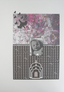
Artist: Marie-Therese Wisniowski.
Title: Not in My Name, The Australian Pilot.
Artist: Marie-Therese Wisniowski.
Title: With Intent X: Cultural Graffiti.
Medium: Print On Paper.
Technique: Black and white version of a digital monoprint.
Comment: The image was published with this article in the following journal:
Eds. Benitez, E.E. and Christie, W. ‘Not in My Name’ Wisniowski, M.-T. ‘Literature and Aesthetics’, The Journal of the Sydney Society of Literature and Aesthetics, The University of Sydney, Vol.13, No. 2 pp. 83 - 88, December 2003.
Others, however, have not taken this point of view. Artists like Heather Hesterman, John Wolseley and John Pollard have used the actual production techniques in order to secure copyright of their work. For example, Hesterman, consciously or unconsciously gives greater weight to her copyright by using fabric instead of paper [9].
Artist: Heather Hesterman.
Title: Warming (2017).
Size: 1000 cm x 853 cm wide.
Wolseley and Pollard go one step further than most of their contemporaries. Wolseley makes his own paper, and although he may generate print editions, each print is made unique due to the specific properties of the individual sheets of paper.
Artist: John Wolseley.
Title: Heartlands and Headwaters.
Exhibition: The Ian Potter Centre: National Gallery of Victoria.
John Pollard has invented his own technique, called "aquachrome"[11].
Artist: John Pollard.
Title: [No.3] Wolfson, 2015
Media: Acrylic on canvas.
Size: 76 cm (height) x 100 cm (width).
Other printmakers use the more time-honoured tradition of destroying the templates of their process, and so preserving the unique markings on their works.
Where do we go from here? With the ubiquitous use of digital prints, the interplay or feedback between the computer and the artist printmaker is so intricate that the original intention may be continuously and incrementally eroded, until it is no longer reflected in the final outcome. This serendipitous or trial-and-error process may have spectacular effects, but will leave the viewer divorced from the original intention of the artist printmaker, which would be obliterated by the iterative process, rendering the work an effect searching for a cause.
Perhaps the modern art viewer may not be able to connect (or even want to connect) with the luxury of resting in the scientific objectivity of deconstructed contemporary art, especially if it is divorced from original intent. The "Not in My Name" prints on paper or cloth (whether digital or non-digital), may once again connect the viewer to the human condition and, more importantly, the original intention of the artist printmakers will impose itself on the outcomes of their art, thereby rendering the processes used (e.g. screen, computer or wood block) not too dissimilar to the process employed when using a canvas, a brush and some paint.
Acknowledgement:
I wish to thank Dr Heather Johnson for her advice and encouragement.
References:
[1] For more information about this subject see - Prints and Printmaking, ed. John Dawson (London: Quill Publishing Ltd, 1981).
[2] Michael Langford, 'The Book of Special Effects Photography' (Melbourne: Thomas Nelson Australia, 1982).
[3] Adobe Systems, Adobe Photoshop 6.0 User Guide (California: Adobe Systems Incorporated, 2000)
[4] For example, Adobe, Products, 2003, at http://www.adobe.com/
[5] Marion Manifold, quoted in Louise Teggart,"The View From Here: Marion Manifold and Louise Teggart", Imprint, Vol. 37, No. 1 (Autumn 2002), pages 12-13.
[6] Apple Computer, Welcome to Mac 05X, Apple Computer Inc., USA, 2001.
[7] IBM, Search Results: IBM Deep Blue Chess Program Anicles, 2003, (2 pages).
[8] Douglas Sheerer, quoted in Sasha Grishin, Australian Printmaking in the 1990s: Artist Printmakers 1990-1995 (Sydney: Craftsman House, 1997), page 7.
[9] Australian Printmaking in the 1990's, page 9.
[10] Australian Printmaking in the 1990's, page 8.
[11] Australian Printmaking in the 1990's, page 12.
Preamble
Art Quilts have featured on this blogspot and so for your convenience I have listed below previous posts in this series:
Art Quilts - Part I
Art Quilts - Part II
Art Quilts - Part III
Art Quilts - Part IV
Art Quilts - Part V
Art Quilts - Part VI
Art Quilts - Part VII
Art Quilters of the Netherlands - Part I
Art Quilters of the Netherlands - Part II
Art Quilters of the Netherlands - Part III
Four Selected European Art Quilters - Part I
Four Selected European Art Quilters - Part II
Four Selected European Art Quilters - Part III
Art Quilts of Jane Sassaman
Art Quilts of Michael A. Cummings
Four Selected European Art Quilters - Part IV
Art Quilts of Carolyn Crump
Jan Myers-Newbury
Art Quilts of Karin Franzen
Art Quilts of Emily Richardson
Four Selected European Art Quilters - Part V
Four Selected European Art Quilters - Part VI
Art Quilters of the Netherlands - Part III [1]
Title and Artist: The First Spring Sun (2009), Colette Berends.
Materials: Mixed textiles.
Size: 85 x 93 cm.
Courtesy of reference [1].
Title and Artist: Passport (2010), Marga Lansink.
Materials: Leaf parts from a passport.
Size: 74 x 59 cm.
Courtesy of reference [1].
Title and Artist: Demented (2011), Marjo van der Leeuw-Lauwereys.
Techniques: Gel medium and rusted substance.
Size: 37 x 44 cm.
Courtesy of reference [1].
Title and Artist: Drove (2012), Wietske Kluck.
Materials: Cotton.
Size: 151 x 105 cm.
Courtesy of reference [1].
Title and Artist: Barcode (2012), Marijke Maijer.
Materials: Cotton.
Size: 80 x 89 cm.
Courtesy of reference [1].
Title and Artist: Firebird (2010), Jelly Dijkstra.
Materials: Textiles and paint.
Size: 100 x 130 cm.
Courtesy of reference [1].
Title and Artist: Different Women, (diptych, 2012), Wil Fritsma.
Techniques: Quilted and burned.
Size: Each piece is 50 x 100 cm.
Courtesy of reference [1].
Reference:
[1] H. Lijding, Art Quilts in Nederland, W Books, Amsterdam (2013).
Preamble
This is the fifth post in a new Art Resource series that specifically focuses on techniques used in creating artworks. For your convenience I have listed all the posts in this new series below:
Drawing Art
Painting Art - Part I
Painting Art - Part II
Painting Art - Part III
Painting Art - Part IV
Painting Art - Part V
Painting Art - Part VI
Home-Made Painting Art Materials
Quality in Ready-Made Artists' Supplies - Part I
Quality in Ready-Made Artists' Supplies - Part II
Quality in Ready-Made Artists' Supplies - Part III
Historical Notes on Art - Part I
Historical Notes on Art - Part II
Historical Notes on Art - Part III
Historical Notes on Art - Part IV
Historical Notes on Art - Part V
Tempera Painting
Oil Painting - Part I
Oil Painting - Part II
Oil Painting - Part III
Oil Painting - Part IV
Oil Painting - Part V
Oil Painting - Part VI
Pigments
Classification of Pigments - Part I
Classification of Pigments - Part II
Classification of Pigments - Part III
Pigments for Oil Painting
Pigments for Water Color
Pigments for Tempera Painting
Pigments for Pastel
Japanese Pigments
Pigments for Fresco Painting - Part I
Pigments for Fresco Painting - Part II
Selected Fresco Palette for Permanent Frescoes
Properties of Pigments in Common Use
Blue Pigments - Part I
Blue Pigments - Part II
Blue Pigments - Part III
Green Pigments - Part I
Green Pigments - Part II
Red Pigments - Part I
Red Pigments - Part II
Yellow Pigments - Part I
Yellow Pigments - Part II
Brown and Violet Pigments
Black Pigments
White Pigments - Part I
White Pigments - Part II
White Pigments - Part III
Inert Pigments
Permanence of Pigments: New Pigments - Part I
Permanence of Pigments: New Pigments - Part II
Limited or Restricted Palettes
Testing of Pigments - Part I
Testing of Pigments - Part II
Further Refinement of Pigments
Color and Light - Part I
There have been one hundred and thirteen posts in a previous Art Resource series that focused on the following topics:
(i) Units used in dyeing and printing of fabrics.
(ii) Occupational, health & safety issues in an art studio.
(iii) Color theories and color schemes.
(iv) Optical properties of fiber materials.
(v) General properties of fiber polymers and fibers - Part I to Part V.
(vi) Protein fibers.
(vii) Natural and man-made cellulosic fibers.
(viii) Fiber blends and melt spun fibers.
(ix) Fabric construction.
(x) Techniques and woven fibers.
(xi) Basic and figured weaves.
(xii) Pile, woven and knot pile fabrics.
(xiii) Napped fabrics, double cloth and multicomponent fabrics.
(xiv) Fabric finishes.
(xv) Schrinkage, durable press and wash-wear finishes.
(xvi) Classification of dyes and dye blends.
(xvii) The general theory of printing.
To access any of the above resources click on the following link - Units Used in Dyeing and Printing of Fabrics. This link highlights the one hundred and thirteen posts in the previous Art Resource series.
There are eight data bases on this blogspot, namely: (1) the Glossary of Cultural and Architectural Terms; (2) Timelines of Fabrics, Dyes and Other Stuff; (3) A Fashion Data Base; (4) the Glossary of Colors, Dyes, Inks, Pigments and Resins; (5) the Glossary of Fabrics, Fibers, Finishes, Garments and Yarns; (6) Glossary of Art, Artists, Art Motifs and Art Movements; (7) Glossary of Paper, Photography, Printing, Prints and Publication Terms; (8) Glossary of Scientific Terms.
Note: From time-to-time all the above data bases will be updated.
If you find any post on this blog site useful, you can save it or copy and paste it into your own "Word" document for your future reference. For example, Safari allows you to save a post (e.g., click on "File", click on "Print" and release, click on "PDF" and then click on "Save As" and release - and a PDF should appear where you have stored it). Safari also allows you to mail a post to a friend (e.g., click on "File", and then point cursor to "Mail Contents On This Page" and release). Either way, this or any of the other posts on this site may be a useful Art Resource for you.
The new Art Resource series will be the first post in each calendar month. Remember, these Art Resource posts span information that will be useful for a home hobbyist to that required by a final year University Fine-Art student. Undoubtedly, some parts of any Art Resource post may appear far too technical for your needs (skip those mind boggling parts) and whilst other parts may be too simplistic with respect to your level of knowledge (ditto the skip). Hopefully, the trade-off between these two extremes will mean that the Art Resource posts will be useful in parts to most, but unfortunately, may not be satisfying to all!
Painting Art - Part IV [1]
Fresh Paint
A common cause of a simple lack of cohesion lies in the use of paint from which some or most of its adherent or glueing-on power has been lost. When the usual coating material begins to dry on exposure to air, it passes through a sticky, tacky or viscous stage, after which it jells and then becomes solid. If the paint passes through this entire viscous stage while it is in contact with the ground it will adhere. If it has already passed into this stage before application to the painting, it obviously cannot be expected to perform so well.
Perfect coating adhesion.
Paints such as oil, egg tempera, casein and ethyl silicate, whose binding actions are due to chemical reactions, will always lose adhesive power to some degree if they are allowed to enter the adherent stage before they get put where they belong, on the canvas, panel or wall.
Egg tempera recipe.
In the case of a fresco, where the wall plays the adhesive role, this principle is accepted as an unquestionable part of the technique; no fresco painter will attempt to apply further strokes after the fresh cementitious character of the surface begins to pass and the wall ceases to imbibe the color.
The anatomy of a fresco.
Some other coatings, for example water colors, gouache paints, and simple solution varnishes such as pure damar, dry by simple evaporation of their solvents and so do not come under the restriction of this observation, for no chemical change is involved and they can be reconditioned so that they will go through the tacky stage once more. Water color and gouache can usually be remoistened or ground in water; more turpentine may be added to thickened damar.
Damar resin.
Another exception is encaustic color, which remains perennially thermoplastic; the difference between the fluid color and the solid painting is solely one of temperature. But no amount of thinner will reverse the oxidation or polymerization of oils or the denaturing of proteins. Technologists classify the film-formers into two groups: thermoplastic or convertible. The former remains unchanged on drying, the latter undergoes an irreversible reaction and becomes a new substance. The term thermoplastic is here used in a somewhat different sense from its general meaning.
Mechanism of aqueous polymer film formation process.
Larger volumes of paints, varnishes, and enamels such as fluid materials in cans, where a thin skin has been formed on the surface on short aging, particularly when a volatile solvent is present, may frequently be utilized by the removal of skin and, if necessary replacement of the evaporated solvent.
Refreshing old paint.
However, the relatively small volumes or dabs of tube paint aged on a palette are more likely to have become affected throughout the mass, even when the interior seems more fluid than the outer crust. According to this principle, on the resumption of painting from a palette that was laid aside, only those oil colors which appear as soft as those fresh from the tube are worth taking chances on, and those which would require thinning to use, should be discarded.
Paint aged on a palette.
Reference:
[1] The Artist's Handbook of Materials and Techniques, R. Mayer, (ed. E. Smith) 4th Edition, Faber and Faber, London (1981).
Preamble
For your convenience I have listed below posts in this series:
Arte Latino Textiles
Arte Latino Prints
Arte Latino Sculptures - Part I
Arte Latino Sculptures - Part II
Arte Latino Paintings - Part I
Arte Latino Paintings - Part II
Arte Latino Sculptures - Part II [1]

Artist and Title of Work: Gloria Lopez Cordova, Our Lady of Light (1997).
Technique and Materials: Aspen and juniper.
Size: 64.1 x 32.4 x 15.9 cm.
Courtesy: Smithsonian American Art Museum.
Acquisition: Museum purchase through the Julia D. Strong Endowment.
Comment[1]: In Our Lady of Light, Lopez Cordova decorates the elborate crown with diamond shapes and motifs that represent the region's flowers. A decorated arc with nine lighted candles echoes the shape of the large crown, with its alternating triangles and finials carved from light-colored aspen and dark-colored juniper. Deeply incised chip carving and intricate patterns unify the work, including the sturdy circular base on which Our Lady of Light stands. The saint's hands and head are simply treated, her hair a ribbon-like pattern, and her face a combination of abstract shapes and forms.
Artist and Title of Work:Ramon Jose Lopez, Liturgical Cross (1998).
Technique and Materials: Silver, mica and pigment on wood.
Size: 89.6 x 63.2 x 5 cm.
Courtesy: Smithsonian American Art Museum.
Acquisition: Museum purchase made possible by William T. Evans.
Comment[1]: New Mexico artist Ramon Jose Lopez worked for a few years in construction before beginning his career as a jeweler and silversmith. The grandson of noted santero Lorenzo Lopez, he uses many of his grandfather's tools in his work. Ramon Lopez has said, "My traditional work [lets] me see how influenced I really was by my heritage, my history. It showed me my roots [and]...opened my eyes. I want to achieve the level...of those old masters...what they captured...emotions, so powerful, so moving." Lopez researches traditional methods and materials and masters them in his contemporary silver and gold jewelery, hollow ware, painted hides, reredos, escudos(reliquaries), and blacksmithing. In addition, he also produces ecclesiastical vessels, chalices with patens, pyxes, rosary boxes, furniture and architectural elements.
Artist and Title of Work: Emanuel Martínez, Farm Workers' Altar (1967).
Technique and Materials: Acrylic on mahogany and plywood.
Size: 96.9 x 138.5 x 91.4 cm.
Courtesy: Smithsonian American Art Museum.
Acquisition: Gift of the International Bank of Commerce in honor of Antonio R. Sanchez Sr.
Comment[1]: Chicano artist Emanuel Martínez was about twenty when he created this altar to commemorate the workers' cause. Perfectly formed grape clusters evoke fruit that still today is boycotted by many Latinos as a symbol of conditions that inspired the farm workers' movement. On one side of the altar four hands of various shades grasp the vines - a symbol of unity, strength, and dignity in labor. Their secure grasp repeats the hands of the crucified brown-skinned Christ on an adjacent panel. A stylized black eagle flies proudly in front of an emblazoned red circle, the symbol of the United Farm Workers, the union that Cesar Chavez founded with Dolores Huerta and others. On the other side, a woman holds grapes in her left hand and corn in her right. Around her neck she wears a peace sign, in keeping with Chavez's practice of non violence. Overhead a large round sun contains a significant cultural icon: the mestizo tripartite head, a powerful symbol of the mixed heritage of many migrant workers.
Artist and Title of Work: Jesus Bautista Moroles, Georgia Stele (1999).
Technique and Materials: Granite.
Size: 208.3 x 31.1 x 520.3 cm.
Courtesy: Smithsonian American Art Museum.
Acquisition: Gift of artist.
Comment[1]: In boyhood and young adult life, Jesus Bautista Moroles worked during summers with an uncle in Rockport, Texas, where he gained a strong foundation in stonemasonry. A series of courses taken at North Texas State University strengthened these skills. During 1980 the artist worked in a foundry at Pietrasanta, Italy, learning European sculpting techniques. On his return to Texas, Moroles started producing monumental granite sculpture for which he is well known today.
Artist and Title of Work: Jose Benito Ortega, Our Father Jesus of Nazareth (ca. 1885).
Technique and Materials: Painted wood and cloth with leather.
Size: 76.2 x 23.8 x 23.8 cm.
Courtesy: Smithsonian American Art Museum.
Acquisition: Gift of Herbert Waide Hemphill Jr and museum purchase made possible by Ralph Cross Johnson.
Comment[1]: Ortega carved, Our Father Jesus of Nazareth, from boards discarded by lumber mills, which explains its flatness. The figure's small size and supporting wooden slats suggest that it was dressed and carried in Holy Week processions, probably by members of the Penitentes. These supporting slats - which help stablize the figure as it was carried - would normally be concealed under a garment when the figure was on display. Ortega's works are said to resemble people whom the artist used as models. This powerful image successfully conveys Christ's suffering through the downcast eyes, solemn face, exposed palms, and the graphic representation of bleeding. Ortega was among the early itinerant artist's working when mass-produced plaster statues began replacing traditional, hand-carved santos. Shortly after 1907, Ortega stopped carving.
Artist and Title of Work: Pepon Osorio, El Chandelier (1988).
Technique and Materials: Chandelier with found objects.
Size: 154.6 x 106.7 cm diam.
Courtesy: Smithsonian American Art Museum.
Acquisition: Museum purchased in part through the Smithsonian Institution Collections Acquistion Program.
Comment[1]: Walking through Spanish Harlem and the South Bronx, where he now lives, Osorio noticed that nearly every apartment had a chandelier. For the artist, these "floating crystal islands" were symbols of cultural pride in Puerto Rican neighborhoods. El Chandelier is fantastically - indeed excessively - decorated with swags of pearls and mass-produced miniature toys and objects, including palm trees, soccer balls, Afro-Caribbean saints, cars, dominoes, black and white babies, giraffes, and monkeys. The objects are metaphors for the immigrant popular culture of the 1950s and '60s, when islanders moved to the US mainland in significant numbers. At night the chandelier sparkles and, as a child once suggested, the multifaceted crystals recall the tears of the community.
Artist and Title of Work: Luis Tapia, Death Cart (1986).
Technique and Materials: Caspen with mica and human hair and teeth.
Size: 130.2 x 81 x 137.2 cm.
Courtesy: Smithsonian American Art Museum.
Acquisition: Museum purchase made possible by Mrs Albert Bracket, John W. de Peyster, and Mrs Herbert Campbell.
Comment[1]: A native of Santa Fe, New Mexico, Luis Tapia is a self-taught contemporary artist. Like many of his generation, who grew up during a time of cultural homogenization - as well as the emergence of movements for civil rights and social consciousness- Tapia was determined to learn more about his culture. He began carving santos, studying them in churches and in collections at the Museum of International Folk Art in Santa Fe. Around the same time, he helped found La Confradia de Artes y Artesanos Hispanicos, which has been instrumental in the contemporary revival of Southwest art.
Artist and Title of Work: Unidentified Artist, Christ Crucified (ca. 1820).
Technique and Materials: Painted wood with hair.
Size: 133 x 93.3 x 17.5 cm.
Courtesy: Smithsonian American Art Museum.
Acquisition: Museum purchase through the Smithsonisn Institution Collections Acquisition Program.
Comment[1]: In this wooden sculpture, human hair falls limply over the Savior's scraggy shoulders, emphasizing the figure's lifelike presence. The gaunt, skeletal Christ grimaces not only in physical pain from asphyxia, but also in spirtual pain for humanity. His emaciated body and sunken chest combine to produce a powerful image. The ribs are formed by an abstract, chevron-like design that hovers over a protruding navel. Although blood oozes from wounds, the skin looks desiccated, much like the cross from which Christ hangs. Christ's attenuated limbs are countered by a strong, straight torso that tapers to thin, bony legs and nailed feet.
This significant work, remarkable for its pathos, is related to a long tradition of New Mexico carvings of saints' images. A smiliar crucifixion, perhaps carved by the same artist, is still venerated in a chapel in Cubero, New Mexico.
Artist and Title of Work: Unidentified Artist, Nuestra Senora de los Dolores (Our Lady of Sorrows) (ca. 1675 - 1725).
Technique and Materials: Painted wood.
Size: 37.8 x 18.4 x 14 cm.
Courtesy: Smithsonian American Art Museum.
Acquisition: Teodoro Videl Collection.
Comment[1]: Carved in a highly dramatic style, this early Puerto Rican figure is reminiscent of 17th century Spanish baroque sculpture found in the island's Catholic Churches. The dynamic tension and energy of the Modonna's dark billowy robe symbolizes the grief of a tormented mother who has lost her beloved son. Deep pleats lead the viewer's eyes to her clenched hands. With her head mantled, her sorrowful eyes leads ours in the same upward gaze.
Artist and Title of Work: Horacio Valdez, Nuestra Senora La Reina del Cielo (Our Lady, Queen of Heaven) (1991).
Technique and Materials: Painted wood with metal and silver.
Size: 79.4 x 24.1 x 19.1 cm.
Courtesy: Smithsonian American Art Museum.
Acquisition: Gift of Chuck and Jan Rosenak and museum purchase through Luisita L and Franz H Denghausen Endowment.
Comment[1]: This Virigin Mary wears a deep blue bodice with a bright red collar. A blend of colors, curves and contours, the figure is exquistively carved and painted, in acrylics rather than natural pigments. In a more traditional carving the Virgin Mary would be holding the Christ Child and a scepter. In Valdez's version, however, she wears a silver crown with a bright red accents and holds a palm frond in her left hand. The large stylized dove is a symbol of peace and the Holy Trinity. Her image, based on a passage in the Book of Revelations, La Reina del Cielo, or Our Queen of Heaven, offers protection from preternatural dangers.
Reference:
[1] J. Yorba, Arte Latino: Treasures from the Smithsonian American Art Museum, Watson-Guptill Publications, New York (2001).
Preamble
For your convenience I have listed below other posts on Australian aboriginal textiles and artwork.
Untitled Artworks
(Exhibition - ArtCloth: Engaging New Visions) Tjariya (Nungalka) Stanley and Tjunkaya Tapaya, Ernabella Arts (Australia)
ArtCloth from the Tiwi Islands
Aboriginal Batik From Central Australia
ArtCloth from Utopia
Aboriginal Art Appropriated by Non-Aboriginal Artists
ArtCloth from the Women of Ernabella
ArtCloth From Kaltjiti (Fregon)
Australian Aboriginal Silk Paintings
Contemporary Aboriginal Prints
Batiks from Kintore
Batiks From Warlpiri (Yuendumu)
Aboriginal Batiks From Northern Queensland
Artworks From Remote Aboriginal Communities
Urban Aboriginal ArtCloths
Western Australian Aboriginal Fabric Lengths
Northern Editions - Aboriginal Prints
Aboriginal Bark Paintings
Contemporary Aboriginal Posters (1984) - (1993)
Aboriginal Art - Colour Power
Lin Onus [1]
Yorta Yorta painter, sculptor and activist, Lin Onus developed a distinctive visual language from a combination of traditional and contemporary Aboriginal imagery. He is a prominent Koori artist in Melbourne, Australia. He is largely self taught, yet his style and mastery of the medium of painting have ensured his central position among contemporary Aboriginal painters.
Fruit Bats - close up (1991).
See last image of this post for the complete sculpture.
Courtesy of NSW Art Gallery.
Lin Onus was unjustly expelled from school on racist grounds at the age of 14, yet later attended university. He worked as a mechanic and spray painter, before managing his father’s boomerang workshop in Melbourne. Onus forged a brilliant career and held exhibitions throughout the world.
Title: Fish and Lillies (1987).
Materials and Technique: Acrylic on canvas.
Size: 90 x 122 cm.
Courtesy of reference [1].
For several years he worked as a motor mechanic and then with his father, Bill Onus at his shop making art and craft souvenirs in the Dandenongs (Victoria, Australia). Over many years, interstate well-known Aboriginal visitors such as Albert Namatjira and actor Robert Tudawali, would stay at Onus' family home. The family was closely associated with Aboriginal welfare and social development.
Title: Road to Redfern (1988).
Materials and Technique: Acrylic on canvas.
Size: 60 x 120 cm.
Courtesy of reference [1].
Linus Onus had his first exhibition in 1975 at the Aboriginal Advancement League, Melbourne, and has since held regular one-man shows in Sydeney and Melbourne and has contributed to joint shows within the Koori community.
Title: Frogs (1988).
Materials and Technique: Acrylic on canvas.
Size: 115 x 240 cm.
Courtesy of reference [1].
Onus’s political commitment was inherent in his work. His Scottish mother was a member of the Communist Party, while his Aboriginal father, Bill, and uncle Eric were leading lights in the Aboriginal rights movement of the 1950s and 1960s.
Title: Wirrirr Wirrirr - Rainbow Birds (1988).
Materials and Technique: Acrylic on canvas.
Size: 115 x 240 cm.
Courtesy of reference [1].
After a visit to Maningrida in 1986, Onus began his long and close association with the late Djinang artist, Djiwul ‘Jack’ Wunuwun and other central Arnhem Land artists, including John Bulunbulun. Onus then developed his signature style of incorporating photorealism with Indigenous imagery.
Title: Fish & Ripple - Dingo Springs II (1985).
Materials and Technique: Acrylic on canvas.
Size: 115 x 240 cm.
Courtesy of reference [1].
It is a virtuoso effect, in which the landscape is overlaid with traditional Indigenous iconography, reflecting his strong ties with his father’s community at Cummergunja Mission, on the Murray River. Onus’ works from this period often have a riddling, Magritte-like quality. A memorable motif in his work is the breaking up of a seamless surface into jigsaw puzzle pieces – a metaphor for the sense of dislocation he felt, caught between black and white, urban and rural, worlds.
Title: Gumingi - Magpie Geese (1987).
Materials and Technique: Acrylic on canvas.
Size: 120 x 267 cm.
Courtesy of reference [1].
In Onus’ sculptures, irony, wit and whimsy are the predominant features. Fruit Bats, 1991, is made up of a flock of fibreglass sculptures of bats decorated with rarrk (crosshatching), hanging on a Hills Hoist clothes line. Beneath this icon of Australian suburbia are wooden discs with flower-like motifs, representing the bat droppings. In this powerful installation, the sacred and the mundane combine. The work was inspired by Murrungun-Djinang imagery, which Onus was given permission to use. In Fruit Bats, the artist shows a head-on collision between two contrasting sets of values, and throws in a few inversions of his own. The backyard – suburban Australia’s haven of privacy – becomes spooked by the formidable presence of these noisy animals. The pre-colonial bats seem to have taken over and reclaimed their place, in a story worthy of Alfred Hitchcock.
Title: Fruit Bats (1991).
See first image of this post for a close-up of one of the bats.
Courtesy of NSW Art Gallery.
Reference:
[1] Aboriginality, J. Isaacs, University of Queensland Press, Queensland (1989).
Preamble
For your convenience I have listed below other posts in this series:
Diversity of African Textiles
African Textiles: West Africa
Stripweaves (West Africa) - Part I
Stripweaves (West Africa) - Part II
Stripweaves (West Africa) - Part III
Stripweaves (West Africa) - Part IV
Djerma Weaving of Niger and Burkina-Faso
Woolen Stripweaves of the Niger Bend
Nigerian Horizontal - Loom Weaving
Yoruba Lace Weave
Nigerian Women's Vertical Looms
The Supplementary Weft Cloths of Ijebu-Ode and Akwete
African Tie and Dye
Tie and Dye of the Dida, Ivory Coast
African Stitch Resist
Yoruba Stitch Resist
Yoruba: Machine-Stitched Resist Indigo-Dyed Cloth
Yoruba and Baulé Warp Ikat
Nigerian Starch-Resist (by hand)
Stencilled Starch-Resist
Wax Resist
Mali Mud Cloths
Adinkra Stamped Cloths of Ghana
Yoruba Lace Weave [1]
The Yoruba are a highly fashion-conscious people. A well to do Yoruba woman swarthed in a matching waist, breast and head cloth is a sight to behold.
Yoruba woman's wedding outfit worn by an Australian woman, Clare Maguire, at her marriage to Abiola Buhari at the Registry Office in Lagos, Nigeria,1997. Clare wore a matching tunic, skirt, shoulder cloth and head cloth.
This man's wedding outfit was worn by Abiola Buhari, a young Nigerian Yoruba man, when he married Australian Clare Maguire (see above) at the Registry Office in Lagos, Nigeria, in August 1997. The heavy cotton material used to make their matching wedding clothes is known as 'asa-oke', and is woven in long narrow strips by Yoruba men. This particular style of fabric is typically worn by Yoruba people.
Although the cloths worn are traditional in shape, size and manufacture, colors can change from season to season and such non-traditional fibers such as lurex can be introduced into the stripwoven cloth. A common form of decoration in Yoruba stripweaves is to introduce rows of holes along the length of the strip. This method is akin to the open technique referred to as 'Spanish lace.'
Yoruba woman's stripwoven cloth.
Lateral rows of four to six tiny holes are spaced every 5 cm (two inches) or so down the strip. A supplementary warp thread is drawn from hole to hole down the length of the strip, giving an almost lacy effect to the cloth. This effect can be achieved in a number of ways. The more prestigious and more expensive method is to incorporate a series of long, slightly thicker and stronger threads that for most of the woven strip lay along its surface.
Yoruba woman's aso oke cloth from Ilorin.
When the weaver wants to introduce a row of small holes into the strip, supplementary yarn is laid in the shed at intervals. These yarns are woven back and forth three times and then carried on the face of the cloth until the next set of holes is to be woven. The structure differs from Spanish lace openwork as the yarns used are supplementary, rather than part of the plain weave ground. Alternatively the weaver can stop adding the regular weft and instead take the floating warp threads, already mentioned, and use them to bind around, and pull apart the regular warps. In the process a new row of holes is formed.
Aso oke woman's strip woven cloth.
A quicker, less expensive and less prestigious method is to introduce a piece of thick, barely malleable wire, the width of the strip bent into the shape of a fine knuckle-duster or jumping jack firecracker with a width the same as the strip and then weave around it. When the knuckle duster is removed, it leaves a row of holes that lack the definition and permanence of the former method. These techniques are used to decorate popular sets of women's clothing consisting of one lager and two smaller wraps.
Yoruba woman's cloth with supplementary weft float decoration and lace weave.
Reference
[1] J. Gillow, African Textiles, Thames & Hudson Ltd, London (2003).
Preamble
This is the fourth post in a new Art Resource series that specifically focuses on techniques used in creating artworks. For your convenience I have listed all the posts in this new series below:
Drawing Art
Painting Art - Part I
Painting Art - Part II
Painting Art - Part III
Painting Art - Part IV
Painting Art - Part V
Painting Art - Part VI
Home-Made Painting Art Materials
Quality in Ready-Made Artists' Supplies - Part I
Quality in Ready-Made Artists' Supplies - Part II
Quality in Ready-Made Artists' Supplies - Part III
Historical Notes on Art - Part I
Historical Notes on Art - Part II
Historical Notes on Art - Part III
Historical Notes on Art - Part IV
Historical Notes on Art - Part V
Tempera Painting
Oil Painting - Part I
Oil Painting - Part II
Oil Painting - Part III
Oil Painting - Part IV
Oil Painting - Part V
Oil Painting - Part VI
Pigments
Classification of Pigments - Part I
Classification of Pigments - Part II
Classification of Pigments - Part III
Pigments for Oil Painting
Pigments for Water Color
Pigments for Tempera Painting
Pigments for Pastel
Japanese Pigments
Pigments for Fresco Painting - Part I
Pigments for Fresco Painting - Part II
Selected Fresco Palette for Permanent Frescoes
Properties of Pigments in Common Use
Blue Pigments - Part I
Blue Pigments - Part II
Blue Pigments - Part III
Green Pigments - Part I
Green Pigments - Part II
Red Pigments - Part I
Red Pigments - Part II
Yellow Pigments - Part I
Yellow Pigments - Part II
Brown and Violet Pigments
Black Pigments
White Pigments - Part I
White Pigments - Part II
White Pigments - Part III
Inert Pigments
Permanence of Pigments: New Pigments - Part I
Permanence of Pigments: New Pigments - Part II
Limited or Restricted Palettes
Testing of Pigments - Part I
Testing of Pigments - Part II
Further Refinement of Pigments
Color and Light - Part I
There have been one hundred and thirteen posts in a previous Art Resource series that focused on the following topics:
(i) Units used in dyeing and printing of fabrics.
(ii) Occupational, health & safety issues in an art studio.
(iii) Color theories and color schemes.
(iv) Optical properties of fiber materials.
(v) General properties of fiber polymers and fibers - Part I to Part V.
(vi) Protein fibers.
(vii) Natural and man-made cellulosic fibers.
(viii) Fiber blends and melt spun fibers.
(ix) Fabric construction.
(x) Techniques and woven fibers.
(xi) Basic and figured weaves.
(xii) Pile, woven and knot pile fabrics.
(xiii) Napped fabrics, double cloth and multicomponent fabrics.
(xiv) Fabric finishes.
(xv) Schrinkage, durable press and wash-wear finishes.
(xvi) Classification of dyes and dye blends.
(xvii) The general theory of printing.
To access any of the above resources click on the following link - Units Used in Dyeing and Printing of Fabrics. This link highlights the one hundred and thirteen posts in the previous Art Resource series.
There are eight data bases on this blogspot, namely: (1) the Glossary of Cultural and Architectural Terms; (2) Timelines of Fabrics, Dyes and Other Stuff; (3) A Fashion Data Base; (4) the Glossary of Colors, Dyes, Inks, Pigments and Resins; (5) the Glossary of Fabrics, Fibers, Finishes, Garments and Yarns; (6) Glossary of Art, Artists, Art Motifs and Art Movements; (7) Glossary of Paper, Photography, Printing, Prints and Publication Terms; (8) Glossary of Scientific Terms.
Note: From time-to-time all the above data bases will be updated.
If you find any post on this blog site useful, you can save it or copy and paste it into your own "Word" document for your future reference. For example, Safari allows you to save a post (e.g., click on "File", click on "Print" and release, click on "PDF" and then click on "Save As" and release - and a PDF should appear where you have stored it). Safari also allows you to mail a post to a friend (e.g., click on "File", and then point cursor to "Mail Contents On This Page" and release). Either way, this or any of the other posts on this site may be a useful Art Resource for you.
The new Art Resource series will be the first post in each calendar month. Remember, these Art Resource posts span information that will be useful for a home hobbyist to that required by a final year University Fine-Art student. Undoubtedly, some parts of any Art Resource post may appear far too technical for your needs (skip those mind boggling parts) and whilst other parts may be too simplistic with respect to your level of knowledge (ditto the skip). Hopefully, the trade-off between these two extremes will mean that the Art Resource posts will be useful in parts to most, but unfortunately, may not be satisfying to all!
Painting Art - Part III [1]
Adhesion to Surfaces
In the discussion on the role of oil as a paint vehicle a distinction must be made between its function as a binder of pigment particles into a continuous film and its function as an adhesive in securing or anchoring the coating to the surface to which it is applied.
Definition of a binder.
Difference between a "good application", an "adhesive failure" and a "cohesive failure."
Each vehicle that has been handed down to us from the past is a survivor of the test of time and a vast amount of experience gained through trial and error; the same properties which make it a successful paint binder also make for good adhesion and usually, if ingredients are properly compounded and applied, for facility in manipulation.
The science of adhesion.
The ability of a paint film to remain securely attached to its ground is, of course, one of the basic considerations of permanance. Several properties contribute toward permanent adhesion; these include the natural adherence or gleyness of the fluid material, the nature of the surface to which it is applied, the elasticity of the dried layer in following the movements of expansion and contraction, its toughness, its impermeability and resistance to chemical attacks, and its ability to retain such characteristics with a minimum of deteriation upon ageing or exposure to external forces.
Paint is made of a pigment, a binder, and a solvent. The binder holds the pigment together; the solvent turns the binder and pigment into a thinner, easier-to-spread fluid.
In the wet stage of painting, adhesian can be promoted by the use of fresh materials, which will behave in a way in which they are supposed to function, by proper application, and in the selection of faultless grounds with the correct degree of absorbency and tooth.
Note: Tooth in art refers to the grain of canvas or paper. In general, the more tooth, the more rough the texture is. Tooth is what allows paint, pastel or whatever to bind to the surface.
Reference:
[1] The Artist's Handbook of Materials and Techniques, R. Mayer, (ed. E. Smith) 4th Edition, Faber and Faber, London (1981).


 Artist: Marie-Therese Wisniowski.
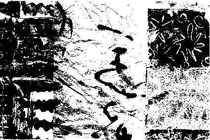 Artist: Marie-Therese Wisniowski.
 Artist: Heather Hesterman.
 Artist: John Wolseley.
![[No.3] Wolfson, 2015](https://blogger.googleusercontent.com/img/b/R29vZ2xl/AVvXsEhCPNpy77RFcZ1PiqFuZWziP4cb4CeISZXxjZFjrkjNFUidkHbqJePwZXGiD_D8NxfvdsfRcUkNoB-gfW1W8ZQNkYQxS0YQjWS7sl1wOl03t15qSoNPUU1G46mbkCE4Pn8oWVHGTHONXCeO/s400/C.png) Artist: John Pollard.
Artist: John Pollard.


![[No.3] Wolfson, 2015](https://blogger.googleusercontent.com/img/b/R29vZ2xl/AVvXsEhCPNpy77RFcZ1PiqFuZWziP4cb4CeISZXxjZFjrkjNFUidkHbqJePwZXGiD_D8NxfvdsfRcUkNoB-gfW1W8ZQNkYQxS0YQjWS7sl1wOl03t15qSoNPUU1G46mbkCE4Pn8oWVHGTHONXCeO/s1070/C.png)


