
Preamble
This is the twenty-seventh post in a new Art Resource series that specifically focuses on techniques used in creating artworks. For your convenience I have listed all the posts in this new series below:
Drawing Art
Painting Art - Part I
Painting Art - Part II
Painting Art - Part III
Painting Art - Part IV
Painting Art - Part V
Painting Art - Part VI
Home-Made Painting Art Materials
Quality in Ready-Made Artists' Supplies - Part I
Quality in Ready-Made Artists' Supplies - Part II
Quality in Ready-Made Artists' Supplies - Part III
Historical Notes on Art - Part I
Historical Notes on Art - Part II
Historical Notes on Art - Part III
Historical Notes on Art - Part IV
Historical Notes on Art - Part V
Tempera Painting
Oil Painting - Part I
Oil Painting - Part II
Oil Painting - Part III
Oil Painting - Part IV
Oil Painting - Part V
Oil Painting - Part VI
Pigments
Classification of Pigments - Part I
Classification of Pigments - Part II
Classification of Pigments - Part III
Pigments for Oil Painting
Pigments for Water Color
Pigments for Tempera Painting
Pigments for Pastel
Japanese Pigments
Pigments for Fresco Painting - Part I
Pigments for Fresco Painting - Part II
Selected Fresco Palette for Permanent Frescoes
Properties of Pigments in Common Use
Blue Pigments - Part I
Blue Pigments - Part II
Blue Pigments - Part III
Green Pigments - Part I
Green Pigments - Part II
Red Pigments - Part I
Red Pigments - Part II
Yellow Pigments - Part I
Yellow Pigments - Part II
Brown and Violet Pigments
Black Pigments
White Pigments - Part I
White Pigments - Part II
White Pigments - Part III
Inert Pigments
Permanence of Pigments: New Pigments - Part I
Permanence of Pigments: New Pigments - Part II
Limited or Restricted Palettes
Testing of Pigments - Part I
Testing of Pigments - Part II
Further Refinement of Pigments
Color and Light - Part I
There have been another one hundred and thirteen posts in a previous Art Resource series that have focused on the following topics:
(i) Units used in dyeing and printing of fabrics;
(ii) Occupational, health & safety issues in an art studio;
(iii) Color theories and color schemes;
(iv) Optical properties of fiber materials;
(v) General properties of fiber polymers and fibers - Part I to Part V;
(vi) Protein fibers;
(vii) Natural and man-made cellulosic fibers;
(viii) Fiber blends and melt spun fibers;
(ix) Fabric construction;
(x) Techniques and woven fibers;
(xi) Basic and figured weaves;
(xii) Pile, woven and knot pile fabrics;
(xiii) Durable press and wash-and-wear finishes;
(xvi) Classification of dyes and dye blends;
(xv) The general theory of printing.
To access any of the above resources, please click on the following link - Units Used in Dyeing and Printing of Fabrics. This link will highlight all of the one hundred and thirteen posts in the previous a are eight data bases on this blogspot, namely, the Glossary of Cultural and Architectural Terms, Timelines of Fabrics, Dyes and Other Stuff, A Fashion Data Base, the Glossary of Colors, Dyes, Inks, Pigments and Resins, the Glossary of Fabrics, Fibers, Finishes, Garments and Yarns, Glossary of Art, Artists, Art Motifs and Art Movements, Glossary of Paper, Photography, Printing, Prints and Publication Terms and the Glossary of Scientific Terms. All data bases in the future will be updated from time-to-time.
If you find any post on this blog site useful, you can save it or copy and paste it into your own "Word" document for your future reference. For example, Safari allows you to save a post (e.g. click on "File", click on "Print" and release, click on "PDF" and then click on "Save As" and release - and a PDF should appear where you have stored it). Safari also allows you to mail a post to a friend (click on "File", and then point cursor to "Mail Contents On This Page" and release). Either way, this or other posts on this site may be a useful Art Resource for you.
The new Art Resource series will be the first post in each calendar month. Remember - these Art Resource posts span information that will be useful for a home hobbyist to that required by a final year University Fine-Art student and so undoubtedly, some parts of any Art Resource post may appear far too technical for your needs (skip those mind boggling parts) and in other parts, it may be too simplistic with respect to your level of knowledge (ditto the skip). The trade-off between these two extremes will mean that Art Resource posts will be hopefully useful in parts to most, but unfortunately may not be satisfying to all!
Introduction
This blogspot contains a number of glossaries and the most pertinent with respect to posts on pigments is the following Glossary: click on this link to see - Glossary of Colors, Dyes Inks and Pigments. Hence the following posts on pigment will not define such pigments as 'Academy Blue,' which is defined in this glossary.
Classification of Pigments - Part III [1]
Masstone and Undertone
The full-strength surface color of a pigment viewed by reflected light is called its mass or top tone; its color effect when it is spread out thinly is called its undertone.

The undertone is discerned when a transparent color is spread out on glass and viewed by transmitted light or when an opaque color is used as a tinting color, diluted with much white. Some pigments have undertones which are dstinctively different from their toptones; this is apparent in the average alizarin when it is viewed on a thin layer of glass held up to the light, or drawn out on paper.
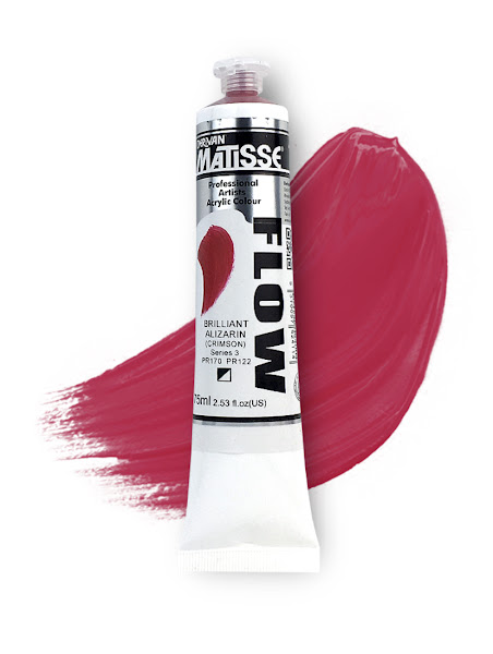 Matisse Flow Acrylic 75ml S3 - Brilliant Alizarin Crimson drawn out on paper.
Some synthetic organic reds used as industrial printing ink colors have such a bluish undertones that they can be used to produce two-toned effects. Other pigments display little or no differences between their toptones and their undertone. The paint chemists generally use the term "mass colors" instead of "mass tones."
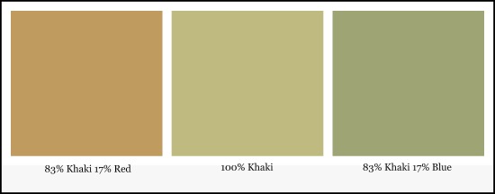
Note: Masstone is the color of the paint that comes straight out of the tube. Undertone is found in the same color once it has been stretched out or diluted.
In the example below, khaki is the masstone. The color on the left has red undertones and the color on the right has blue undertones.
Composition of Pigments
It should be noted that the chemical purity of pigments varies greatly; some are simple, almost pure compounds as described; others of equally high quality contain minor components either as natural impurities or as a result of ingredients added during manufacture to modify color or pigment properties.
 The recent introduction of our Cadmium Free paint lines underscores the importance and obvious benefits of using top quality pure pigments, even in blended colors. Earlier generation synthetic-organic pigments could be combined to offer a functionally similar cadmium "hue", but these mixtures, while offering economical, non-toxic alternatives to real cadmiums, came far short of the genuine pigments in terms of tint strength, covering power and lightfastness. The introduction of newer, premium-quality synthetics made it possible to formulate full-fledged cadmium replacements which, despite being composed of multiple pigments, offer virtually the same appearance, performance and durability as original cadmiums. The Cadmium Free assortment is just the latest example of our continuing commitment to using pure, authentic pigments and bringing each one to its best advantage.
Nomenclature
Pigments are named for their resemblances to objects in nature, for their inventors, their places of origin, the purposes for which they are used, and for their chemical compositions or derivations.
 The opening up of trade routes in the 18th century, coupled with advances in technology and science, allowed for greater experimentation. In 1704, the German color maker Johann Jacob Diesbach created Prussian blue by accident in his laboratory. This became the first chemically synthesised color.
For centuries the nomenclature of pigments was confusing and unsystematic. The principal cause of confusion was the labeling of colors with fancy names by manufacturers and others, often for some ulterior motive. This has caused a single color to be known by a dozen different names and two or more entirely different colors to be known by the same name.
 Color thesaurus illustrating correct name shades. Some look distinctively very similar.
In recent decades attempts have been made to adopt Paint Standards that overcome obvious anomalities.
As a general rule, the manufacturer of a prepared or mixed color or similar material sold under a trademark name or under some indefinite designation such as "permanent green" or "primrose yellow", is not at all bashful about revealing its true composition when it is made of high grade approved ingredients, because they get credit for the use of correct or expensive raw materials. Products whose composition is kept secret have the disadvantage of being under suspicion. Artists who are concerned with the permanence of their work are advised to select only those colors whose pigment origin is clearly indicated by name.
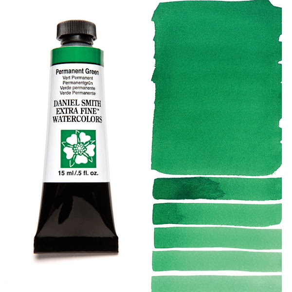 Permanent Green Watercolor.
 Primrose Yellow.
Reference:
[1] The Artist's Handbook of Materials and Techniques, R. Mayer (ed. E. Smith) 4th Edition, Faber and Faber, London (1981).
This is the twenty-seventh post in a new Art Resource series that specifically focuses on techniques used in creating artworks. For your convenience I have listed all the posts in this new series below:
Drawing Art
Painting Art - Part I
Painting Art - Part II
Painting Art - Part III
Painting Art - Part IV
Painting Art - Part V
Painting Art - Part VI
Home-Made Painting Art Materials
Quality in Ready-Made Artists' Supplies - Part I
Quality in Ready-Made Artists' Supplies - Part II
Quality in Ready-Made Artists' Supplies - Part III
Historical Notes on Art - Part I
Historical Notes on Art - Part II
Historical Notes on Art - Part III
Historical Notes on Art - Part IV
Historical Notes on Art - Part V
Tempera Painting
Oil Painting - Part I
Oil Painting - Part II
Oil Painting - Part III
Oil Painting - Part IV
Oil Painting - Part V
Oil Painting - Part VI
Pigments
Classification of Pigments - Part I
Classification of Pigments - Part II
Classification of Pigments - Part III
Pigments for Oil Painting
Pigments for Water Color
Pigments for Tempera Painting
Pigments for Pastel
Japanese Pigments
Pigments for Fresco Painting - Part I
Pigments for Fresco Painting - Part II
Selected Fresco Palette for Permanent Frescoes
Properties of Pigments in Common Use
Blue Pigments - Part I
Blue Pigments - Part II
Blue Pigments - Part III
Green Pigments - Part I
Green Pigments - Part II
Red Pigments - Part I
Red Pigments - Part II
Yellow Pigments - Part I
Yellow Pigments - Part II
Brown and Violet Pigments
Black Pigments
White Pigments - Part I
White Pigments - Part II
White Pigments - Part III
Inert Pigments
Permanence of Pigments: New Pigments - Part I
Permanence of Pigments: New Pigments - Part II
Limited or Restricted Palettes
Testing of Pigments - Part I
Testing of Pigments - Part II
Further Refinement of Pigments
Color and Light - Part I
There have been another one hundred and thirteen posts in a previous Art Resource series that have focused on the following topics:
(i) Units used in dyeing and printing of fabrics;
(ii) Occupational, health & safety issues in an art studio;
(iii) Color theories and color schemes;
(iv) Optical properties of fiber materials;
(v) General properties of fiber polymers and fibers - Part I to Part V;
(vi) Protein fibers;
(vii) Natural and man-made cellulosic fibers;
(viii) Fiber blends and melt spun fibers;
(ix) Fabric construction;
(x) Techniques and woven fibers;
(xi) Basic and figured weaves;
(xii) Pile, woven and knot pile fabrics;
(xiii) Durable press and wash-and-wear finishes;
(xvi) Classification of dyes and dye blends;
(xv) The general theory of printing.
To access any of the above resources, please click on the following link - Units Used in Dyeing and Printing of Fabrics. This link will highlight all of the one hundred and thirteen posts in the previous a are eight data bases on this blogspot, namely, the Glossary of Cultural and Architectural Terms, Timelines of Fabrics, Dyes and Other Stuff, A Fashion Data Base, the Glossary of Colors, Dyes, Inks, Pigments and Resins, the Glossary of Fabrics, Fibers, Finishes, Garments and Yarns, Glossary of Art, Artists, Art Motifs and Art Movements, Glossary of Paper, Photography, Printing, Prints and Publication Terms and the Glossary of Scientific Terms. All data bases in the future will be updated from time-to-time.
If you find any post on this blog site useful, you can save it or copy and paste it into your own "Word" document for your future reference. For example, Safari allows you to save a post (e.g. click on "File", click on "Print" and release, click on "PDF" and then click on "Save As" and release - and a PDF should appear where you have stored it). Safari also allows you to mail a post to a friend (click on "File", and then point cursor to "Mail Contents On This Page" and release). Either way, this or other posts on this site may be a useful Art Resource for you.
The new Art Resource series will be the first post in each calendar month. Remember - these Art Resource posts span information that will be useful for a home hobbyist to that required by a final year University Fine-Art student and so undoubtedly, some parts of any Art Resource post may appear far too technical for your needs (skip those mind boggling parts) and in other parts, it may be too simplistic with respect to your level of knowledge (ditto the skip). The trade-off between these two extremes will mean that Art Resource posts will be hopefully useful in parts to most, but unfortunately may not be satisfying to all!
Introduction
This blogspot contains a number of glossaries and the most pertinent with respect to posts on pigments is the following Glossary: click on this link to see - Glossary of Colors, Dyes Inks and Pigments. Hence the following posts on pigment will not define such pigments as 'Academy Blue,' which is defined in this glossary.
Classification of Pigments - Part III [1]
Masstone and Undertone
The full-strength surface color of a pigment viewed by reflected light is called its mass or top tone; its color effect when it is spread out thinly is called its undertone.

The undertone is discerned when a transparent color is spread out on glass and viewed by transmitted light or when an opaque color is used as a tinting color, diluted with much white. Some pigments have undertones which are dstinctively different from their toptones; this is apparent in the average alizarin when it is viewed on a thin layer of glass held up to the light, or drawn out on paper.

Some synthetic organic reds used as industrial printing ink colors have such a bluish undertones that they can be used to produce two-toned effects. Other pigments display little or no differences between their toptones and their undertone. The paint chemists generally use the term "mass colors" instead of "mass tones."
Note: Masstone is the color of the paint that comes straight out of the tube. Undertone is found in the same color once it has been stretched out or diluted.
In the example below, khaki is the masstone. The color on the left has red undertones and the color on the right has blue undertones.

Composition of Pigments
It should be noted that the chemical purity of pigments varies greatly; some are simple, almost pure compounds as described; others of equally high quality contain minor components either as natural impurities or as a result of ingredients added during manufacture to modify color or pigment properties.

Nomenclature
Pigments are named for their resemblances to objects in nature, for their inventors, their places of origin, the purposes for which they are used, and for their chemical compositions or derivations.

For centuries the nomenclature of pigments was confusing and unsystematic. The principal cause of confusion was the labeling of colors with fancy names by manufacturers and others, often for some ulterior motive. This has caused a single color to be known by a dozen different names and two or more entirely different colors to be known by the same name.

In recent decades attempts have been made to adopt Paint Standards that overcome obvious anomalities.
As a general rule, the manufacturer of a prepared or mixed color or similar material sold under a trademark name or under some indefinite designation such as "permanent green" or "primrose yellow", is not at all bashful about revealing its true composition when it is made of high grade approved ingredients, because they get credit for the use of correct or expensive raw materials. Products whose composition is kept secret have the disadvantage of being under suspicion. Artists who are concerned with the permanence of their work are advised to select only those colors whose pigment origin is clearly indicated by name.


Reference:
[1] The Artist's Handbook of Materials and Techniques, R. Mayer (ed. E. Smith) 4th Edition, Faber and Faber, London (1981).
No comments:
Post a Comment