
Season's Greetings
What a year! In Australia and New Zealand we fared reasonably well through the pandemic, as we watched from afar the horrific plague and the heartbreak it brought throughout the rest of the world. At the outset I want to acknowledge all those who died due to the virus and those who still have lingering medical issues even though they recovered. Words cannot express the grief in losing a loved one. So many lives lost, so much tragedy for all of us to acknowledge and sympathize with those who had to live through their trauma.
We watched the rollout of the vaccine, but we knew it still was not a time to party. We opened up venues, revisited past activities and explored the possibility of a Covid framed reality. It will fade from our memory as time passes, and when generations not yet born read about it in their history books, it will barely occupy a chapter (re: the Spanish flu of 1919).

No matter what your belief systems, I wish you a happy and joyous festive season.
Marie-Therese Wisniowski.
Note: The next post will appear on the 15th of January 2022.
Introduction
I have written an extensive post on my artist printermakers' book titled Not in My Name. I was asked to submit a paper to a refereed journal, namely, Literature & Aesthetics (i.e. the journal of the Sydney Society of Literature and Aesthetics) which I did and after the refeering process was completed, it was published.
See - Editors, Benitez, E.E. and Christie, W. ‘Not in My Name’ Wisniowski, M.-T. ‘Literature and Aesthetics’, The Journal of the Sydney Society of Literature and Aesthetics, The University of Sydney, Vol.13, No. 2 pp. 83 - 88, December 2003.
Below is a reproduction of that article.
Not in My Name (Article)
Printmaking is often called the democratic medium. Contemporary printmaking in Australia and elsewhere is generated by the action of two forces. On the one hand, the high functionality of prints renders them the medium to communicate visual information to a mass audience. On the other hand, because of its unlimited range of experimentation and expression, printmaking generates 'fine-art', which is intended for art cognoscenti on a purely decorative and aesthetic basis.
One of the major differences between pre-and post-1960s printmaking is the imagery derived from photomechanics - the use of previously printed materials, which employ a halftone screen [1]. Prior to the 1990s, the camera was an analogue device, used by artists as an alternative data-provider for halftone screen manipulation [2]. With the advance of computer technology (i.e. both hardware and software) in the 1990s, pixel manipulation became commonplace [3]. In artistic circles, computer technology was rendered as a mediating process, rather than an end in itself (i.e. computer-generated images required human intervention in order to be considered 'art'). Digital prints embody this idea.
The difference between commercial and fine-art prints rests on definitions of copyright and originality. Mass-produced prints necessarily diffuse the notion of originality. In the 1970s, copyright in fine-art prints did not surface as an issue, because the rise of poster collectives aimed for mass distribution and espoused anonymity of effort. But these issues have since become central to contemporary printmakers, who face and embrace the onslaught of a digital revolution.
Unlike in the 1970s, the issues confronting contemporary printmakers are no longer driven by a need for the social engagement of art. Communications are global and all-pervasive. Getting a message out using the printmaking media is no longer a priority for its own sake. Moreover, if publications are required, the educated masses can utilise modern computer technology and employ publishing application packages, which are easy to use and can produce cheap pamphlets [4].
The focus for printmakers in contemporary Australia has once again centred on master-prints with limited editions. Fine-art traditions have resurfaced. Art theories in terms of post-modernism and deconstruction have threaded their way through prints. With this focus, originality is once again at the fore. The question at hand is whether or not the computer program and hardware are contributing more to the originality of a digital print than the thoughts of the artist printmaker. This delineation is hard to decipher, since only the outcome of a print is judged, and not the difference between the initial intention and the final outcome. No judge counts or wants a map of keystrokes (if any) from the start to the end of the process in the production of a deconstructed digital print. Marion Manifold, winner of the Shell Fremantle Print Award in 2001 for her paper print series remarked:
"Much of the questioning and hesitation as to the merit of digital prints seems to revolve around two points: the degree of skill needed and the impression that digital prints are quick to produce ... I spend thousands of hours to create a set of prints: taking photographs, manipulating ideas, experimenting with techniques, different inks..."[5]
Whilst the integrity of Manifold's prints is not in question, what should be addressed is whether the printmaking process is based on trial and error alone, made feasible only because of the instant feedback of the electronic age, and thereby devoid of any original intent by the artist printmaker. It is now possible to grab a digital print and use a random number generator to re-map pixels and so create a new work of deconstructed art, without a human hand touching a single key [6]. It should be remembered that IBM's Deep Blue computer program outplays most human chess players [7]. It would not be surprising if, in the not-too-distant future, a computer programme, such as IBM's Deep Blue, could win the Shell Fremantle Print Award.
Questions of causality (or the lack of it) in digital prints have not been effectively addressed by contemporary artist printmakers. In a digital age, it is just not originality that is at stake, but the actual copyright of the print, due to the availability of digital prints and the existence of the Internet. For example, artist printmaker Douglas Sheerer argues that: "... I am at this stage not overly worried about possible copyright infringement (anyone with a computer and modem will be able to download my images and print them out)" [8].
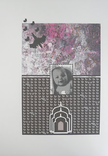 Artist: Marie-Therese Wisniowski.
Title: Not in My Name, The Australian Pilot.
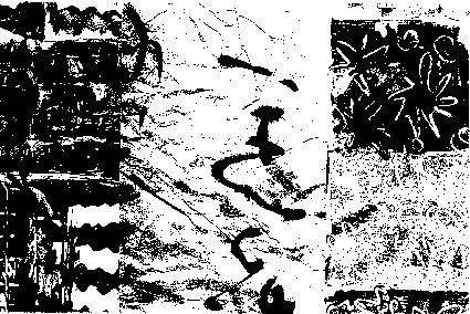 Artist: Marie-Therese Wisniowski.
Title: With Intent X: Cultural Graffiti.
Medium: Print On Paper.
Technique: Black and white version of a digital monoprint.
Comment: The image was published with this article in the following journal:
Eds. Benitez, E.E. and Christie, W. ‘Not in My Name’ Wisniowski, M.-T. ‘Literature and Aesthetics’, The Journal of the Sydney Society of Literature and Aesthetics, The University of Sydney, Vol.13, No. 2 pp. 83 - 88, December 2003.
Others, however, have not taken this point of view. Artists like Heather Hesterman, John Wolseley and John Pollard have used the actual production techniques in order to secure copyright of their work. For example, Hesterman, consciously or unconsciously gives greater weight to her copyright by using fabric instead of paper [9].
 Artist: Heather Hesterman.
Title: Warming (2017).
Size: 1000 cm x 853 cm wide.
Wolseley and Pollard go one step further than most of their contemporaries. Wolseley makes his own paper, and although he may generate print editions, each print is made unique due to the specific properties of the individual sheets of paper.
 Artist: John Wolseley.
Title: Heartlands and Headwaters.
Exhibition: The Ian Potter Centre: National Gallery of Victoria.
John Pollard has invented his own technique, called "aquachrome"[11].
![[No.3] Wolfson, 2015](https://blogger.googleusercontent.com/img/b/R29vZ2xl/AVvXsEhCPNpy77RFcZ1PiqFuZWziP4cb4CeISZXxjZFjrkjNFUidkHbqJePwZXGiD_D8NxfvdsfRcUkNoB-gfW1W8ZQNkYQxS0YQjWS7sl1wOl03t15qSoNPUU1G46mbkCE4Pn8oWVHGTHONXCeO/s400/C.png) Artist: John Pollard.
Artist: John Pollard.
Title: [No.3] Wolfson, 2015
Media: Acrylic on canvas.
Size: 76 cm (height) x 100 cm (width).
Other printmakers use the more time-honoured tradition of destroying the templates of their process, and so preserving the unique markings on their works.
Where do we go from here? With the ubiquitous use of digital prints, the interplay or feedback between the computer and the artist printmaker is so intricate that the original intention may be continuously and incrementally eroded, until it is no longer reflected in the final outcome. This serendipitous or trial-and-error process may have spectacular effects, but will leave the viewer divorced from the original intention of the artist printmaker, which would be obliterated by the iterative process, rendering the work an effect searching for a cause.
Perhaps the modern art viewer may not be able to connect (or even want to connect) with the luxury of resting in the scientific objectivity of deconstructed contemporary art, especially if it is divorced from original intent. The "Not in My Name" prints on paper or cloth (whether digital or non-digital), may once again connect the viewer to the human condition and, more importantly, the original intention of the artist printmakers will impose itself on the outcomes of their art, thereby rendering the processes used (e.g. screen, computer or wood block) not too dissimilar to the process employed when using a canvas, a brush and some paint.
Acknowledgement:
I wish to thank Dr Heather Johnson for her advice and encouragement.
References:
[1] For more information about this subject see - Prints and Printmaking, ed. John Dawson (London: Quill Publishing Ltd, 1981).
[2] Michael Langford, 'The Book of Special Effects Photography' (Melbourne: Thomas Nelson Australia, 1982).
[3] Adobe Systems, Adobe Photoshop 6.0 User Guide (California: Adobe Systems Incorporated, 2000)
[4] For example, Adobe, Products, 2003, at http://www.adobe.com/
[5] Marion Manifold, quoted in Louise Teggart,"The View From Here: Marion Manifold and Louise Teggart", Imprint, Vol. 37, No. 1 (Autumn 2002), pages 12-13.
[6] Apple Computer, Welcome to Mac 05X, Apple Computer Inc., USA, 2001.
[7] IBM, Search Results: IBM Deep Blue Chess Program Anicles, 2003, (2 pages).
[8] Douglas Sheerer, quoted in Sasha Grishin, Australian Printmaking in the 1990s: Artist Printmakers 1990-1995 (Sydney: Craftsman House, 1997), page 7.
[9] Australian Printmaking in the 1990's, page 9.
[10] Australian Printmaking in the 1990's, page 8.
[11] Australian Printmaking in the 1990's, page 12.
What a year! In Australia and New Zealand we fared reasonably well through the pandemic, as we watched from afar the horrific plague and the heartbreak it brought throughout the rest of the world. At the outset I want to acknowledge all those who died due to the virus and those who still have lingering medical issues even though they recovered. Words cannot express the grief in losing a loved one. So many lives lost, so much tragedy for all of us to acknowledge and sympathize with those who had to live through their trauma.
We watched the rollout of the vaccine, but we knew it still was not a time to party. We opened up venues, revisited past activities and explored the possibility of a Covid framed reality. It will fade from our memory as time passes, and when generations not yet born read about it in their history books, it will barely occupy a chapter (re: the Spanish flu of 1919).

No matter what your belief systems, I wish you a happy and joyous festive season.
Marie-Therese Wisniowski.
Note: The next post will appear on the 15th of January 2022.
Introduction
I have written an extensive post on my artist printermakers' book titled Not in My Name. I was asked to submit a paper to a refereed journal, namely, Literature & Aesthetics (i.e. the journal of the Sydney Society of Literature and Aesthetics) which I did and after the refeering process was completed, it was published.
See - Editors, Benitez, E.E. and Christie, W. ‘Not in My Name’ Wisniowski, M.-T. ‘Literature and Aesthetics’, The Journal of the Sydney Society of Literature and Aesthetics, The University of Sydney, Vol.13, No. 2 pp. 83 - 88, December 2003.
Below is a reproduction of that article.
Not in My Name (Article)
Printmaking is often called the democratic medium. Contemporary printmaking in Australia and elsewhere is generated by the action of two forces. On the one hand, the high functionality of prints renders them the medium to communicate visual information to a mass audience. On the other hand, because of its unlimited range of experimentation and expression, printmaking generates 'fine-art', which is intended for art cognoscenti on a purely decorative and aesthetic basis.
One of the major differences between pre-and post-1960s printmaking is the imagery derived from photomechanics - the use of previously printed materials, which employ a halftone screen [1]. Prior to the 1990s, the camera was an analogue device, used by artists as an alternative data-provider for halftone screen manipulation [2]. With the advance of computer technology (i.e. both hardware and software) in the 1990s, pixel manipulation became commonplace [3]. In artistic circles, computer technology was rendered as a mediating process, rather than an end in itself (i.e. computer-generated images required human intervention in order to be considered 'art'). Digital prints embody this idea.
The difference between commercial and fine-art prints rests on definitions of copyright and originality. Mass-produced prints necessarily diffuse the notion of originality. In the 1970s, copyright in fine-art prints did not surface as an issue, because the rise of poster collectives aimed for mass distribution and espoused anonymity of effort. But these issues have since become central to contemporary printmakers, who face and embrace the onslaught of a digital revolution.
Unlike in the 1970s, the issues confronting contemporary printmakers are no longer driven by a need for the social engagement of art. Communications are global and all-pervasive. Getting a message out using the printmaking media is no longer a priority for its own sake. Moreover, if publications are required, the educated masses can utilise modern computer technology and employ publishing application packages, which are easy to use and can produce cheap pamphlets [4].
The focus for printmakers in contemporary Australia has once again centred on master-prints with limited editions. Fine-art traditions have resurfaced. Art theories in terms of post-modernism and deconstruction have threaded their way through prints. With this focus, originality is once again at the fore. The question at hand is whether or not the computer program and hardware are contributing more to the originality of a digital print than the thoughts of the artist printmaker. This delineation is hard to decipher, since only the outcome of a print is judged, and not the difference between the initial intention and the final outcome. No judge counts or wants a map of keystrokes (if any) from the start to the end of the process in the production of a deconstructed digital print. Marion Manifold, winner of the Shell Fremantle Print Award in 2001 for her paper print series remarked:
"Much of the questioning and hesitation as to the merit of digital prints seems to revolve around two points: the degree of skill needed and the impression that digital prints are quick to produce ... I spend thousands of hours to create a set of prints: taking photographs, manipulating ideas, experimenting with techniques, different inks..."[5]
Whilst the integrity of Manifold's prints is not in question, what should be addressed is whether the printmaking process is based on trial and error alone, made feasible only because of the instant feedback of the electronic age, and thereby devoid of any original intent by the artist printmaker. It is now possible to grab a digital print and use a random number generator to re-map pixels and so create a new work of deconstructed art, without a human hand touching a single key [6]. It should be remembered that IBM's Deep Blue computer program outplays most human chess players [7]. It would not be surprising if, in the not-too-distant future, a computer programme, such as IBM's Deep Blue, could win the Shell Fremantle Print Award.
Questions of causality (or the lack of it) in digital prints have not been effectively addressed by contemporary artist printmakers. In a digital age, it is just not originality that is at stake, but the actual copyright of the print, due to the availability of digital prints and the existence of the Internet. For example, artist printmaker Douglas Sheerer argues that: "... I am at this stage not overly worried about possible copyright infringement (anyone with a computer and modem will be able to download my images and print them out)" [8].

Title: Not in My Name, The Australian Pilot.

Title: With Intent X: Cultural Graffiti.
Medium: Print On Paper.
Technique: Black and white version of a digital monoprint.
Comment: The image was published with this article in the following journal:
Eds. Benitez, E.E. and Christie, W. ‘Not in My Name’ Wisniowski, M.-T. ‘Literature and Aesthetics’, The Journal of the Sydney Society of Literature and Aesthetics, The University of Sydney, Vol.13, No. 2 pp. 83 - 88, December 2003.
Others, however, have not taken this point of view. Artists like Heather Hesterman, John Wolseley and John Pollard have used the actual production techniques in order to secure copyright of their work. For example, Hesterman, consciously or unconsciously gives greater weight to her copyright by using fabric instead of paper [9].

Title: Warming (2017).
Size: 1000 cm x 853 cm wide.
Wolseley and Pollard go one step further than most of their contemporaries. Wolseley makes his own paper, and although he may generate print editions, each print is made unique due to the specific properties of the individual sheets of paper.

Title: Heartlands and Headwaters.
Exhibition: The Ian Potter Centre: National Gallery of Victoria.
John Pollard has invented his own technique, called "aquachrome"[11].
![[No.3] Wolfson, 2015](https://blogger.googleusercontent.com/img/b/R29vZ2xl/AVvXsEhCPNpy77RFcZ1PiqFuZWziP4cb4CeISZXxjZFjrkjNFUidkHbqJePwZXGiD_D8NxfvdsfRcUkNoB-gfW1W8ZQNkYQxS0YQjWS7sl1wOl03t15qSoNPUU1G46mbkCE4Pn8oWVHGTHONXCeO/s1070/C.png)
Title: [No.3] Wolfson, 2015
Media: Acrylic on canvas.
Size: 76 cm (height) x 100 cm (width).
Other printmakers use the more time-honoured tradition of destroying the templates of their process, and so preserving the unique markings on their works.
Where do we go from here? With the ubiquitous use of digital prints, the interplay or feedback between the computer and the artist printmaker is so intricate that the original intention may be continuously and incrementally eroded, until it is no longer reflected in the final outcome. This serendipitous or trial-and-error process may have spectacular effects, but will leave the viewer divorced from the original intention of the artist printmaker, which would be obliterated by the iterative process, rendering the work an effect searching for a cause.
Perhaps the modern art viewer may not be able to connect (or even want to connect) with the luxury of resting in the scientific objectivity of deconstructed contemporary art, especially if it is divorced from original intent. The "Not in My Name" prints on paper or cloth (whether digital or non-digital), may once again connect the viewer to the human condition and, more importantly, the original intention of the artist printmakers will impose itself on the outcomes of their art, thereby rendering the processes used (e.g. screen, computer or wood block) not too dissimilar to the process employed when using a canvas, a brush and some paint.
Acknowledgement:
I wish to thank Dr Heather Johnson for her advice and encouragement.
References:
[1] For more information about this subject see - Prints and Printmaking, ed. John Dawson (London: Quill Publishing Ltd, 1981).
[2] Michael Langford, 'The Book of Special Effects Photography' (Melbourne: Thomas Nelson Australia, 1982).
[3] Adobe Systems, Adobe Photoshop 6.0 User Guide (California: Adobe Systems Incorporated, 2000)
[4] For example, Adobe, Products, 2003, at http://www.adobe.com/
[5] Marion Manifold, quoted in Louise Teggart,"The View From Here: Marion Manifold and Louise Teggart", Imprint, Vol. 37, No. 1 (Autumn 2002), pages 12-13.
[6] Apple Computer, Welcome to Mac 05X, Apple Computer Inc., USA, 2001.
[7] IBM, Search Results: IBM Deep Blue Chess Program Anicles, 2003, (2 pages).
[8] Douglas Sheerer, quoted in Sasha Grishin, Australian Printmaking in the 1990s: Artist Printmakers 1990-1995 (Sydney: Craftsman House, 1997), page 7.
[9] Australian Printmaking in the 1990's, page 9.
[10] Australian Printmaking in the 1990's, page 8.
[11] Australian Printmaking in the 1990's, page 12.


