
Preamble [1]
'Melbourne Now' was an art exhibition mounted by the National Gallery of Victoria (Melbourne, Australia) in 2014. It took as its premise the idea that a city is significantly shaped by the artists, designers, architects, choreographers, intellectuals, and community groups that lived and worked in the midsts of this multi-cultural city. The aim was to explore how Melbourne's visual artists and creative practitioners contributed to the dynamic cultural identity of this city. The result was an exhibition that celebrates what was unique about Melbourne's art, design, and architectural collectives.
The intention of the exhibition was to encourage and inspire everyone to discover some of the best of Melbourne's culture. To help achieve this, family-friendly activities, dance and music performances, inspiring talks from creative practitioner's, city walks and ephemeral installations and events made up the public program.
This and other posts in this series concentrate on the participating artists, rather than on other features of the exhibition event sych as the family-friendly commissions developed especially for children and young audiences that was aimed to encourage participatory learning for children and their families in general.
For your convenience I have listed below other posts on this blogspot that features Melbourne Now exhibitions:
Melbourne Now - Part I
Melbourne Now - Part II
Melbourne Now - Part III
Melbourne Now - Part IV
Melbourne Now - Part V
Melbourne Now - Part VI
Melbourne Now - Part VII
Melbourne Now - Part VIII
Melbourne Now - Part IX
Melbourne Now - Part II [1]
Lauren Berkowitz
 Title: Manna (2009).
Nature and the environment are constant themes of Lauren Berkowitz's artistic practice. Her works reflect on the role of nature in biblical narratives and ancient myths - stories which address the importance placed on landscape by the people who utilize it. Inspired by the natural world, but troubled by its degradation, Berkowitz recycles materials to create environmental narratives in an act of regeneration. Her post-Minimalist sculptures are a hybrid form of temporal, process-based installation.
Berkowitz's installation for 'Melbourne Now' is a sensory indoor garden, which utlizes edible and medicinal plants that have healing qualities in traditional and Western medicines. While referencing the Chelsea Physic Garden (London) and the Victory gardens of the First and Second World Wars, this living artwork embodies notions of renewal and sustainability, with the plants cultivated in recycled plastic pots, bottles and takeway containers, Physic Garden (2013) creates an aromatic and immersive experience for the viewer, inviting reflection on the Australian landscape and its transformations throughout history.
Brian Birch
 Title: Koori Elders Dancing (2012).
Brian Birch was born in Fitzroy (Melbourne, Australia) in 1936, where he grew up in strained circumstances with his mother and grandmother, who were of Wurundjeri aboriginal descent. Birch was unaware of his Aboriginality until he was thirty-seven, when he was first told about his family's history by Koori elder Bobby Lovett. In 2006 Birch attended Koori art classes at North Melbourne Insitute of Technology, Preston Campus(Melbourne), in which he came to painting intuitively and swiftly developed his own vocabulary.
Inspired by color and the spontaneous style of Vincent van Gogh, Birch paints with freedom of expression and vibrant brushstrokes and has conceived an iconography of meanders, circles and gestural markings to express his spirtual identity. Koori Elders Dancing (2012) invokes the power of spirited dancing celebration of male elders giving away their daughters in marriage. The work causes Birch to honour the beauty and mourn the loss of his wife, Lorraine, and his mother, Rose. The large roundels, emblematic of two Ngurungaeta (headmen), surrounded by lines of small and large circles which cannot be broken - echo the tiered compositions of William Barak's corroboree drawings.
Chris Bond and Drew Pettifer
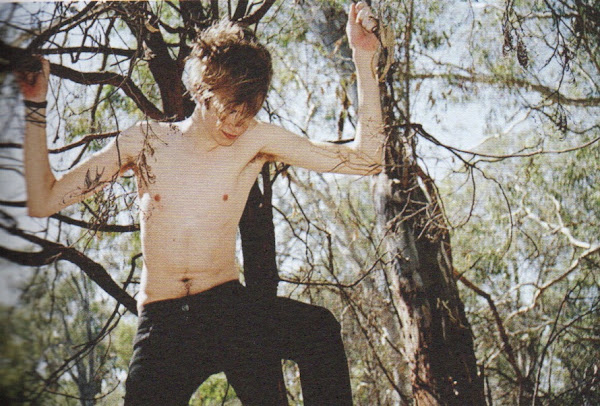 Artist and Title: Drew Pettifer, Untitled (2012).
 Artists and Title: Chris Bond and Drew Pettifer, Untitled.
Note: Supported by the Bowness Family Foundation.
Chris Bond studied fine art at RMIT University, Melbourne (Australia). He makes work that charts the decline and fall of artistic idealism. Chris creates parallel worlds of seeming authenticity by constructing fictitious identities, transforming found objects into painted artifacts, simulating standard modes of artistic prresentation and rewriting art history. Drew Pettifer studied law, arts and art management at the University of Melbourne and RMIT University and undertook a doctorate of photomedia at Monash University. Pettifer's practice explores themes of intimacy, gender, sexuality and the politics of the gaze using photography, video, installation and performance. His subjects are usually young men through whom he explores the private and public act of desire.
For Melbourne Now, Bond and Pettifer have worked collaboratively to create diptychs, initiating a dialogue between their respective photography of young men, while in accompanying duplicate images Bond paints over the figures so as to make them disappear. The presence and absence of the human subjects instils these works with a strong sense of loss and longing.
Stephen Bram
 Title: Untitled (2009).
Courtesy: The commission for Melbourne Now was supported by the Michael and Andrew Buxton Foundation.
For several decades, Stephen Bram has developed a body of work exploring the relationship between abstract painting and the representation of architectural space. His easel and mural-scale wall paintings, installations and architecture, and film and light installations are determined according to very specific rules: the designation of two, sometimes three, perspectival points in space as coordinates that inform the works' shapes, and to which each work refers.
Bram's architectural installation constructed according to designated vanishing points beyond the frame of the National Gallery of Victoria (Melbourne) architecture. Built from conventional materials - steel, wool, plasterboard and paint - it is both an object (sculpture) and an enclosed space (architecture). The work's dynamic planes subject the viewer to new perspectives and perceptions of space. Bram's work is formalist and self-referenential, but at the same time refers to the real world renounced by purely formalist painting and sculpture. As an autonomous structure, it nevertheless is continuous with the world outside and exceeds its objective limits by pointing to the existence of a world beyond.
Angela Brennan
 Title: Cup (2012).
Comment: Jug with two handles (2013). Bust with pot (2013)
For more that two decades, Angela Brennan has been well regarded as a painter of highly colored abstract shapes, playful texts, and laconic philosophical musings. At once cerebral and tactile, her work is marked by an irreverent humour and introduces a ribald, libidinous and sometimes lawless subjectivety into the formal realm of modernist painting. More recently, Brennan has returned to a childhood passion of making ceramics.
For Melbourne Now, Brennan presents a trove of funky, wonky vessels, orbs and figures. Sometimes hand-built, other times thrown on a wheel, these works lovingly reference Bronze and the Iron Age artefacts, ceramics of Anatolian and Cypriot provenance the artist encountered on travels and in local museum collections, as well as antiquities and objects trouvés collected over the years. With an amateur yet studied technical experimentation, and a pleasure in the materiality of glazing, oxidization and earthenware firing, Brennan's works are made with poetic license and sensibility of a painter, rather than a potter, with their unorthodox forms and appendages - including feet, handles and lids - maintaining a sculptural rather than utilitarian demeanour.
Jane Brown
 Title: Decommissioned Art History Library, University of Melbourne (2012-2013).
Jane Brown was born in Al Ahmadi, Kuwait, and lives and works in Melbourne (Australia). She studied photography at the Victorian College of the Arts (Melbourne, Australia) from 1996 to 1997, holds a Bachelor of Arts from the University of Melbourne and also a Graduate Diploma in Library and Information from RMIT University. Her first exhibition, 'A Hopeless Taste of Eternity,' was held in Melbourne in 2009 and two years later she held the solo exhibition, 'Afterlife,' at the Ballarat International Foto Biennale. In 2012, Brown's, Australian Gothic series was included in the exhibition CCP 'Declares - On the Nature of Things' - at the Centre for Contemporary Photography (Melbourne).
For Melbourne Now, Brown has produced the series, 'Not Before Time' (2013). Working with 'almost arcane' film and gelatin silver paper, she explores the transient nature of things, be it her chosen medium or melancholy subjects of decommissioned libraries, steam engines and doomed buildings waiting for the wrecking ball. These photographs prompt feelings of loss and unease, suggesting ghostly imprints rather than hard fast realities.
Reference
[1] T. Ellwood, Director, National Gallery of Victoria (Melbourne, Australia).
'Melbourne Now' was an art exhibition mounted by the National Gallery of Victoria (Melbourne, Australia) in 2014. It took as its premise the idea that a city is significantly shaped by the artists, designers, architects, choreographers, intellectuals, and community groups that lived and worked in the midsts of this multi-cultural city. The aim was to explore how Melbourne's visual artists and creative practitioners contributed to the dynamic cultural identity of this city. The result was an exhibition that celebrates what was unique about Melbourne's art, design, and architectural collectives.
The intention of the exhibition was to encourage and inspire everyone to discover some of the best of Melbourne's culture. To help achieve this, family-friendly activities, dance and music performances, inspiring talks from creative practitioner's, city walks and ephemeral installations and events made up the public program.
This and other posts in this series concentrate on the participating artists, rather than on other features of the exhibition event sych as the family-friendly commissions developed especially for children and young audiences that was aimed to encourage participatory learning for children and their families in general.
For your convenience I have listed below other posts on this blogspot that features Melbourne Now exhibitions:
Melbourne Now - Part I
Melbourne Now - Part II
Melbourne Now - Part III
Melbourne Now - Part IV
Melbourne Now - Part V
Melbourne Now - Part VI
Melbourne Now - Part VII
Melbourne Now - Part VIII
Melbourne Now - Part IX
Melbourne Now - Part II [1]
Lauren Berkowitz

Nature and the environment are constant themes of Lauren Berkowitz's artistic practice. Her works reflect on the role of nature in biblical narratives and ancient myths - stories which address the importance placed on landscape by the people who utilize it. Inspired by the natural world, but troubled by its degradation, Berkowitz recycles materials to create environmental narratives in an act of regeneration. Her post-Minimalist sculptures are a hybrid form of temporal, process-based installation.
Berkowitz's installation for 'Melbourne Now' is a sensory indoor garden, which utlizes edible and medicinal plants that have healing qualities in traditional and Western medicines. While referencing the Chelsea Physic Garden (London) and the Victory gardens of the First and Second World Wars, this living artwork embodies notions of renewal and sustainability, with the plants cultivated in recycled plastic pots, bottles and takeway containers, Physic Garden (2013) creates an aromatic and immersive experience for the viewer, inviting reflection on the Australian landscape and its transformations throughout history.
Brian Birch

Brian Birch was born in Fitzroy (Melbourne, Australia) in 1936, where he grew up in strained circumstances with his mother and grandmother, who were of Wurundjeri aboriginal descent. Birch was unaware of his Aboriginality until he was thirty-seven, when he was first told about his family's history by Koori elder Bobby Lovett. In 2006 Birch attended Koori art classes at North Melbourne Insitute of Technology, Preston Campus(Melbourne), in which he came to painting intuitively and swiftly developed his own vocabulary.
Inspired by color and the spontaneous style of Vincent van Gogh, Birch paints with freedom of expression and vibrant brushstrokes and has conceived an iconography of meanders, circles and gestural markings to express his spirtual identity. Koori Elders Dancing (2012) invokes the power of spirited dancing celebration of male elders giving away their daughters in marriage. The work causes Birch to honour the beauty and mourn the loss of his wife, Lorraine, and his mother, Rose. The large roundels, emblematic of two Ngurungaeta (headmen), surrounded by lines of small and large circles which cannot be broken - echo the tiered compositions of William Barak's corroboree drawings.
Chris Bond and Drew Pettifer


Note: Supported by the Bowness Family Foundation.
Chris Bond studied fine art at RMIT University, Melbourne (Australia). He makes work that charts the decline and fall of artistic idealism. Chris creates parallel worlds of seeming authenticity by constructing fictitious identities, transforming found objects into painted artifacts, simulating standard modes of artistic prresentation and rewriting art history. Drew Pettifer studied law, arts and art management at the University of Melbourne and RMIT University and undertook a doctorate of photomedia at Monash University. Pettifer's practice explores themes of intimacy, gender, sexuality and the politics of the gaze using photography, video, installation and performance. His subjects are usually young men through whom he explores the private and public act of desire.
For Melbourne Now, Bond and Pettifer have worked collaboratively to create diptychs, initiating a dialogue between their respective photography of young men, while in accompanying duplicate images Bond paints over the figures so as to make them disappear. The presence and absence of the human subjects instils these works with a strong sense of loss and longing.
Stephen Bram

Courtesy: The commission for Melbourne Now was supported by the Michael and Andrew Buxton Foundation.
For several decades, Stephen Bram has developed a body of work exploring the relationship between abstract painting and the representation of architectural space. His easel and mural-scale wall paintings, installations and architecture, and film and light installations are determined according to very specific rules: the designation of two, sometimes three, perspectival points in space as coordinates that inform the works' shapes, and to which each work refers.
Bram's architectural installation constructed according to designated vanishing points beyond the frame of the National Gallery of Victoria (Melbourne) architecture. Built from conventional materials - steel, wool, plasterboard and paint - it is both an object (sculpture) and an enclosed space (architecture). The work's dynamic planes subject the viewer to new perspectives and perceptions of space. Bram's work is formalist and self-referenential, but at the same time refers to the real world renounced by purely formalist painting and sculpture. As an autonomous structure, it nevertheless is continuous with the world outside and exceeds its objective limits by pointing to the existence of a world beyond.
Angela Brennan

Comment: Jug with two handles (2013). Bust with pot (2013)
For more that two decades, Angela Brennan has been well regarded as a painter of highly colored abstract shapes, playful texts, and laconic philosophical musings. At once cerebral and tactile, her work is marked by an irreverent humour and introduces a ribald, libidinous and sometimes lawless subjectivety into the formal realm of modernist painting. More recently, Brennan has returned to a childhood passion of making ceramics.
For Melbourne Now, Brennan presents a trove of funky, wonky vessels, orbs and figures. Sometimes hand-built, other times thrown on a wheel, these works lovingly reference Bronze and the Iron Age artefacts, ceramics of Anatolian and Cypriot provenance the artist encountered on travels and in local museum collections, as well as antiquities and objects trouvés collected over the years. With an amateur yet studied technical experimentation, and a pleasure in the materiality of glazing, oxidization and earthenware firing, Brennan's works are made with poetic license and sensibility of a painter, rather than a potter, with their unorthodox forms and appendages - including feet, handles and lids - maintaining a sculptural rather than utilitarian demeanour.
Jane Brown

Jane Brown was born in Al Ahmadi, Kuwait, and lives and works in Melbourne (Australia). She studied photography at the Victorian College of the Arts (Melbourne, Australia) from 1996 to 1997, holds a Bachelor of Arts from the University of Melbourne and also a Graduate Diploma in Library and Information from RMIT University. Her first exhibition, 'A Hopeless Taste of Eternity,' was held in Melbourne in 2009 and two years later she held the solo exhibition, 'Afterlife,' at the Ballarat International Foto Biennale. In 2012, Brown's, Australian Gothic series was included in the exhibition CCP 'Declares - On the Nature of Things' - at the Centre for Contemporary Photography (Melbourne).
For Melbourne Now, Brown has produced the series, 'Not Before Time' (2013). Working with 'almost arcane' film and gelatin silver paper, she explores the transient nature of things, be it her chosen medium or melancholy subjects of decommissioned libraries, steam engines and doomed buildings waiting for the wrecking ball. These photographs prompt feelings of loss and unease, suggesting ghostly imprints rather than hard fast realities.
Reference
[1] T. Ellwood, Director, National Gallery of Victoria (Melbourne, Australia).


