Preamble
On this blog spot there are posts that center on my “Wearable Art” (e.g. scarves, digital or analogue created fabric lengths etc.) For your convenience I have listed these posts below.
A Selection of My Scarves
Leaves Transformed: A New Collection of My Digitally Designed Fabrics
My New Silk Rayon Velvet Scarves@Purple Noon Art And Sculpture Gallery
My Fabric Lengths@QSDS
My Fabric Collection:"Oh, Oh Marilyn and Mona!"@Spoonflower
2013 Australian Craft Awards – Finalist
My Scarves@2014 Scarf Festival: "Urban Artscape" Pashminas
My New Scarves and Fabric Lengths
New Range of Silk Neckties - Karma and Akash
AIVA: My New Hand Dyed and Hand Printed Fabric Design
New Colorways For My 'Cultural Graffiti' Fabrics
Byzantine Glow: A New Collection of My Digitally Designed Fabrics
Wall Flower: A New Collection of My Digitally Designed Fabrics
Ink Fern - A New Collection of My Digitally Designed Fabrics
Celebratory Fireworks
My New Silk ArtCloth Scarves
New ‘Unique State’ Silk ArtCloth Scarves
UBIRR - My New Hand Dyed & Printed Fabric Design
Renaissance Man - My New Hand Dyed & Printed Fabric Design
Banksia - My New Hand Dyed and Hand Printed Fabric Design
Ginkgo Love - My New Hand Dyed and Hand Printed Fabric Design
Garden Delights I & II - My New Hand Dyed and Hand Printed Fabric Design
Wallflower III - My New Hand Dyed and Hand Printed Fabric Design
Rainforest Beauty - Collection My New Hand Dyed and Hand Printed Fabric Design
Spring & Autumn Flurry Collection - My New Hand Dyed and Hand Printed Fabric Design
La Volute Collection - My New Hand Dyed and Hand Printed Fabric Design
Urban Butterfly - My New Hand Printed Fabric Design
Acanthus Dream - My New Hand Printed Fabric Design
“Cascading Acanthus” - My New Hand Dyed and Hand Printed Fabric Design
My New Hand Dyed and Hand Printed 'Rainforest Beauty' Pashmina Wraps Collection
My ArtCloth Tea Towels: A New Collection of Digitally Designed Products
Through the Land it Roared . . . ArtCloth Shawl
My New Hand Dyed and Hand Printed ‘Urban Codes - Series 1’ Collection
Urban Moonlight - My Post Graffiti Doily
My New Hand Printed Fabric Design - "Morocco" ArtCloth
‘Vine Glow’
“Bush Banksia’s” Collection"
Releasing My New - ‘Unique State’ ArtCloth Scarves
‘LRSP’ A New Collection of Digitally Designed ArtCloth Textiles
If you like any of my artworks in the above links, please email me at - Marie-Therese - for pricing and for any other enquiries.
Introduction
A doily (also doiley, doilie, doyly, doyley) is an ornamental mat, typically made of paper or fabric, and variously used for protecting surfaces or binding flowers, in food service presentation, or as a head covering or clothing ornamentation. It is characterized by openwork, which allows the surface of the underlying object to show through [1].
From the Victorian era through to the early 1950’s, doilys were a functional mainstay in almost every room in the house and were predominantly made by women. In the Victorian era, well-born young ladies were taught to make doilys for their dowry chest. In the mid-70’s doilys got a second wave of interest, this time as a craft of workmanship. The 1975 Art of the Doily Exhibition in Port Authority Bus Terminal in New York gave the art of crocheted doilys a new light, and a homage to our mothers and grandmothers for whom doilys were a part of their daily lives.
Since that time doilys, in the mode of doily art, have resurfaced on urban city walls, created mainly by female graffiti artists in their quest to acknowledge the arts of the past into a present-day aesthetic challenging our perceptions of past, quaint, functional pieces for the home with that of a contemporary universal ‘lace’ aesthetic to beautify unadorned urban walls giving a softness to our harsh cityscapes whilst at the same time respecting textile traditions of the past.
Media used to create these stunning urban works include stencils, screen prints, paintings, crocheted lace webbing installations and wheat paste cut outs to name a few.
Post Graffiti is not Graffiti as per the definition of the latter being: “Inscriptions of figures, designs or words on rocks or walls or sidewalks or the like, or on artifacts made of plaster, stone or clay”. It is also not Graffiti Stage II. Graffiti Stage II includes additional techniques such as stenciling, wheat paste or techniques that are used to distinguish contemporary public-space artwork from territorial graffiti and vandalism.
Post Graffiti is a reaction to imagery and marks that are illegally created on public property. It incorporates a plethora of materials and techniques that are cloth specific. Imagery has the “feel” of, but is not Graffiti. It is therefore a reaction against Graffiti Art in the sense that it takes elements from Graffiti Art but regurgitates these elements in an unstructured and unfettered manner. The heavy structured compositional style of the Graffitists - with strong use of typography to deliver socio-political messages - is largely deconstructed by the Post Graffitists.
Relationship Elements between Graffiti and Post Graffiti Art.
For a more detailed discussion on the relationship between Graffiti and Post Graffiti Art please click on the following link: Graffiti Versus Post Graffiti Art.
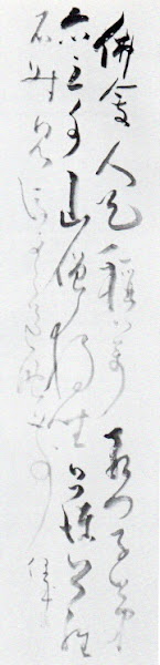
Urban Moonlight - My Post Graffiti Doily Print
Most graffiti art is created during the darkness of night to avoid being caught. My post graffiti print, 'Urban Moonlight', encapsulates that theme by appearing to capture an urban city wall with the moonlight casting its light over a piece of doily street art which is reflected in the colors that have been used – blacks, various grey hues, soft pinks and whites.
The doily art in the background references some of the common techniques used to create street art imagery - stencils, screen prints and wheat paste cut outs. The aesthetic captures a distressed, time worn, weathered appearance whilst the surface imagery which includes images of white, silkscreened, stenciled flora emphasises these popular graffiti techniques which have been translated, collaged and printed onto a piece of cotton fabric.
Title: Urban Moonlight.
Technique and Media: Distressed collaged doily, traditional and improvisational silkscreen prints employing transparent, opaque, and metallic pigments on cotton.
Size: 23 cm (width) x 33 cm (height).
Edition: 1/1.
Title: Urban Moonlight (Detail 1).
Title: Urban Moonlight (Detail 2).
Title: Urban Moonlight (Detail 3).
Reference:
[1] Wikipedia, the free encyclopedia - https://en.wikipedia.org/wiki/Doily
Preamble
For your convenience I have listed below other posts in this series on Chinese textiles:
Chinese Textiles: Amy Clague's Brocade Collection - Part I
Chinese Textiles: Amy Clague's Tapestry Collection - Part I
Chinese Textiles: Amy Clague’s Tapestry Collection - Part II
Chinese Textiles: Amy Clague’s Embroidery Collection - Part I
Chinese Textiles: Amy Clague’s Brocade Collection - Part II
Chinese Clothing: A Historical Overview - Part I
Chinese Clothing: Shenyi and Broad Sleeves - Part I
Chinese Clothing: Shenyi and Broad Sleeves - Part II
Chinese Clothing: A Historical Overview - Part II
Chinese Clothing: A Historical Overview - Part III
Introduction [1]
Chinese clothing has undergone continuous transformations throughout history, providing a reflection of the culture in place, at any given time. A wealth of archaeological findings coupled with ancient mythology, poetry and songs enable us to see the development of distinctive Chinese fashions through the ages. This illustrated introductory survey takes you through traditional Chinese clothing, ornamentation, and ceremonial wear, and so will cover the importance of silk and the diverse costumes of China's ethnic groups before considering modern trends and China's place in the fashion world of today.
A modern Chinese traditional dress.
Chinese Clothing: A Historical Overview - Part I [1]
From the time that clothing first became part of people's lives it has represented differences in social status, lifestyle, aesthetics and culture. Clothing has always reflected the social and historical scenes of a given time. The history of Chinese clothing can therefore provide insights into the development of civilization itself.
Comment: Sui Dynasty women wore short jackets with short sleeves and long skirts. They tied the skirts at chest height, which made them look very elegant. This style of dress can still be seen on Korean women.
To the Chinese, clothing ranks very highly among life's necessities. In a country with a long history of garments and ornaments, there is a wealth of archeological findings illustrating the development of clothing, in addition to the evidence preserved in ancient mythology, chronicles, poems, songs, novels and drama.
Chinese clothing can be traced back to the late Paleolithic age (2.5 million years ago to 10,000 BC). Archeological findings have shown that approximateyl 20,000 years ago people who lived in what is now known as the Zhoukoudian area of Beijing were already wearing accessories, in the form of meticulously carved tiny white stone beads, olive-colored pebbles, animal teeth, clam shells and bones. Appearance was probably not the main concern of the people wearing accessories at this time, for accessories were also used as a means of protection against evil. People had developed the technique of sewing together animal skins.
Comment: A neclace, jade plate and fragment of jade excavated in a Neolithic site.
Photograph: Courtesy of Li Zhanqiang.
Over a thousand archeological sites dating to the Neolithic age (6,000-2,000 BC) have been found in China, across almost all areas of the country. The major means of food production during this age had transitioned from primitive hunting and fishing to more stable agriculture. There is also early evidence of weaving and pottery making. Ancient painted pottery from 5,000 years ago was found in Qinghai Province of western China, decorated with dancing figures. Some of these figures have decorative hair accessories, whilst others have ornamental waist bands. Some wear skirts which are more reminiscent of traditional Chinese attire.
Comment: A colored pottery basin excavated in Tongde County, Qinghai Province in 1975, with a pattern of people in skirts dancing and holding hands.
Photograph: Courtesy of Li Zhanqiang.
In the neighboring province of Gansu, similar items were excavated, decorated with images of people wearing what was later called the guankoushan. This was a typical style of early clothing which consisted of a piece of material with a hole in the middle for the head and a rope tied at the waist, giving the garment a dress-like appearance. Another piece of pottery shows a young girl with long hair, decorated with intricate patterns which give the appearance of a beautiful dress.
Comment: A colored pottery bottle with a "head" shape bottle neck excavated in Dadiwan, Gansu Province in 1973, a relic from 5,600 years ago.
Photograph: Courtesy of Li Zhanqiang.
In addition to clay pots, images of early Chinese clothing were found in rock paintings which showed people wearing earrings. Historical items have also been found in the Daxi Neolithic site of Wushan, Sichuan, including earrings made of jade, ivory and turquoise in a variety of shapes.
With the formation of different social classes came the creaton of rules and regulations on daily attire, in order to distinguish the rich from the poor. The Zhou Dynasty (1,046-256 BC) instigated national laws on clothing and personal accessories, creating different categories of clothing including court attire, army uniform, mourning attire and wedding attire. This tradition was broken during the Spring and Autumn Period (770-476 BC) and the Warring States Period (475-221 BC) when rigid rules on clothing and accessories were abolished, and the extravagant style of the aristocracy developed.
Comment: The Warring States Period (475-221 BC). A traditional Chinese costume.
The rulers of the Han Dynasty (206-220 AD) followed the Zhou Dynasty in establishing laws on clothing and accessories. The style of dress was simple, and clothing colors categorized according to the seasons: Spring - green, Summer - red, Autumn - yellow and Winter - black.
The Wei, Jin, and Northern and Southern Dynasties (220-589), represented a period of ideological diversity, cultural prosperity and significant scientific development, despite frequent wars and changes in power. During this period, the Wei and Jin developed a distinctive aristocratic style. The traditional Han culture was tranformed by northern nomadic tribes when they migrated into central China and settled down with the Han people, influencing, and being influenced by, the Han style of dress.
Comment: Musicians dressed in Hanfu clothed with the Han style of dress.
When China was reunited during the Sui Dynasty (581-618), the Han dress code was revised again. During the Tang Dynasty (618-907) that followed, a strong national power and a more relaxed social order led to a new clothing style. For example, women typically wore a low-cut, short skirt dress or even narrow-sleeved men's clothing.
Comment: The picture above shows a Tang Dynasty lady with a double-drooping bun and a wide waist wrap. In the eighth century, Chinese Tang dresses spread into Japan and then exerted a great influence on the Japanese kimono. The kimono styles at the time had names such as 'Tang grass', 'Tang flower' and 'Tang brocade' and these continued to be used even today.
Reference:
[1] Chinese Clothing, H. Mei, Cambridge University Press (2011).
Preamble
For your convenience, I have listed below other post on Japanese textiles on this blogspot.
Discharge Thundercloud
The Basic Kimono Pattern
The Kimono and Japanese Textile Designs
Traditional Japanese Arabesque Patterns - Part I
Textile Dyeing Patterns of Japan
Traditional Japanese Arabesque Patterns - Part II
Sarasa Arabesque Patterns
Contemporary Japanese Textile Creations
Shibori (Tie-Dying)
History of the Kimono
A Textile Tour of Japan - Part I
A Textile Tour of Japan - Part II
The History of the Obi
Japanese Embroidery (Shishu)
Japanese Dyed Textiles
Aizome (Japanese Indigo Dyeing)
Stencil-Dyed Indigo Arabesque Patterns
Japanese Paintings on Silk
Tsutsugaki - Freehand Paste-Resist Dyeing
Street Play in Tokyo
Birds and Flowers in Japanese Textile Designs
Japanese Colors and Inks on Paper From the Idemitsu Collection
Yuzen: Multicolored Past-Resist Dyeing - Part I
Yuzen: Multi-colored Paste-Resist Dyeing - Part II
Katazome (Stencil Dyeing) - Part I
Katazome (Stencil Dyeing) - Part II
Katazome (Stencil Dyeing) - Part III
Birds and Flowers in Japanese Textile Designs - Part I
Introduction
Japanese arts began in the Jōmon period (the Japanese neolithic cultural period extending from 8,000 BC to about 200 BC). In ancient times and through rhe middle ages, Japan introduced and subsequently assimilated a superb continental culture: from China and Korea, geographically situated near Japan, and even from far away Persia. In modern times, Japan accepted Western European Culture. These Oriental and Occidental cultures underwent development in this island country of the Far East, resulting in forms of artwork unique to Japan.
This post features selected images from the Idemitsu Museum of Arts which were showcased in an exhibition held at the National Gallery of Victoria on 20 April to 12 June, 1983.
Japanese Colors and Inks on Paper From the Idemitsu Collection[1]
Verdant Mountain in Rain by Aoki Mokubei (1767-1833). Dated 1826.
Technique and Materials: Kakemono; colors on paper.
Size: 133.2 x 28.2 cm.
Comment[1]: Mokubei was best known in his day as a potter. The son of a Kyōto restauranteur, he became a potter after reading a copy of the Tao Shou, the first book on Chinese ceramics, in about 1796. In 1806 he visited the Kutani kilns to help revitalize them. His ceramics are extemely individualistic. He worked in a variety of styles imitating late Ming blue and white, celadons and Kochi wares (the popular name for late Ming Chinese enamel wares used in the tea ceremony), most wares being made for sench, a type of tea drinking that used steeped tea and was much favored by the Japanese Sinophiles as it was less formal than chanoyu.
Mokubei is today more highly regarded for his paintings. He seems to have been self taught and most of his dated works belong to the last twenty years of his life. By the late 18th century nanga was firmly established in the Kyōto-Osaka region, patronised by merchants and rich men. Mokubei's friends included Gyokudō and Chikuden. Chikuden apparently regarded Mokubei as the only true bunjinga after Ike no Taiga.
Rinnasei and Cranes by Tanomura Chikuden (1777-1835). Dated 1830.
Technique and Materials: Kakemono; colors on paper.
Size: 124 x 38.5 cm.
Comment[1]: A painting truly in the Chinese landscape style, nanga, in which the foreground is composed of an idyllic setting with 16th century Chinese poet, Lithe Jing (in Japanese, Rinnasei) seated beneath pine trees quietly contemplating the scene. The cranes, like the pine tree are traditional symbols of longevity, have attracted the interests of a youthful attendant whilst another prepares tea beyond the figure of Linhe Jing. The middle distance is dominated by a towering peak drawn with dry ink brushstrokes which, combined with rock-like forms, give a restless evolving energy to the landscape. Through the valley on the left, distant peaks in light color may be glimpsed. The painting conforms to the traditional Chinese landscape formula of distinct foreground, middle-ground and background elements and the brushwork reflects the tradition of the literati style.
Flowers and Birds by Yamamoto Baiitsu (1783-1856).
Technique and Materials: Kakemono; colors on paper.
Size: 169.3 x 90.1 cm.
Comment[1]: This naturalistic, fresh, elegant painting is typical of the work of Baiitsu who had a particular penchant for bird and flower paintings, inventively portraying the same subject in endless compositional variations. The subject of bird-and-flower painting (kachō-ga) had long been a distinct and esteemed category of both Chinese and Japanese paintings. Baiitsu's handling of ink is delicate and meticulous. His colors are clear. The accuracy of his flowers is a botanist's delight!
The handling of the rocks and ground reflect his literati training. The sensitive and realistic depiction of nature reflects the influence of the Shijō school, while the concept derives ultimately from Chinese later Ming artists such as Zhou Zhimain (active between 1580-1610) who was widely admired in Japan as a specialist in the flowers-and-birds genre.
A Quatrain by Sengai Gibon (1750-1837) (1783-1856).
Technique and Materials: Kakemono; ink on paper.
Size: 118.3 x 28.6 cm.
Comment[1]: Sengai was the son of a farmer in Mino (modern Gifu Prefecture). He entered the Seitai-ji temple at Mino at eleven, and at nineteen he started studying under the Zen monk Gessen Zenji at Toki-an, which is near modern Yokohama. Thirteen years later, on the death of Gessen, he moved to the Shōfuku-ji in Hakata, where he eventually became the 123rd abbot (1780-1811). His preist's name was Gibon, so he is usually known as Sengai Gibon. He retired as abbot in 1811, at the age of 61, and nearly all of his paintings and calligraphy was done during the last 25 years of his life. He considered his art an important means of communicating Zen Buddhist values and he is known to have kept busy fulfilling requests for his work.
Calligraphy (Buji) by Sengai Gibon (1750-1837).
Technique and Materials: Kakemono; ink on paper.
Size: 36.0 x 21.0 cm.
Comment[1]: Just two characters are written in a strong, quick and abbreviated manner presented with the courage of conviction that the message is important. The two characters read buji in Japanese (or wu-shi in Chinese). As with many concepts expressed in characters, the word does not translate easily into English. Modern dictionaries offer the varying equivalents of "safe", "secure", "peaceful, at leisure". Literally the characters mean "no work" or "no event". Moreover, this calligraphy is an excellent example of the Zen paradox of brevity of execution yet complexity of concept that is at the heart of zenga (Zen painting).
The Autumnal Moon by Sengai Gibon (1750-1837).
Technique and Materials: Kakemono; ink on paper.
Size: 40.6 x 56.9 cm.
Comment[1]: The Zen monks who practice zenga cultivated an unprofessional naivety and spontaniety to their work expressed in the simplest way with as few brush strokes as possible. Often too in zenga, calligraphy and painting have equal importance, and the text and imagery are complementary.
Reference:
[1] J. Menzies and E. Capon, Japan: Masterpieces from the Idemitsu Collection, International Cultural Corporation of Australia Limited, Sydney (1982).
Preamble
This is the tenth post in a new Art Resource series that specifically focuses on techniques used in creating artworks. For your convenience I have listed all the posts in this new series below:
Drawing Art
Painting Art - Part I
Painting Art - Part II
Painting Art - Part III
Painting Art - Part IV
Painting Art - Part V
Painting Art - Part VI
Home-Made Painting Art Materials
Quality in Ready-Made Artists' Supplies - Part I
Quality in Ready-Made Artists' Supplies - Part II
Quality in Ready-Made Artists' Supplies - Part III
Historical Notes on Art - Part I
Historical Notes on Art - Part II
Historical Notes on Art - Part III
Historical Notes on Art - Part IV
Historical Notes on Art - Part V
Tempera Painting
Oil Painting - Part I
Oil Painting - Part II
Oil Painting - Part III
Oil Painting - Part IV
Oil Painting - Part V
Oil Painting - Part VI
Pigments
Classification of Pigments - Part I
Classification of Pigments - Part II
Classification of Pigments - Part III
Pigments for Oil Painting
Pigments for Water Color
Pigments for Tempera Painting
Pigments for Pastel
Japanese Pigments
Pigments for Fresco Painting - Part I
Pigments for Fresco Painting - Part II
Selected Fresco Palette for Permanent Frescoes
Properties of Pigments in Common Use
Blue Pigments - Part I
Blue Pigments - Part II
Blue Pigments - Part III
Green Pigments - Part I
Green Pigments - Part II
Red Pigments - Part I
Red Pigments - Part II
Yellow Pigments - Part I
Yellow Pigments - Part II
Brown and Violet Pigments
Black Pigments
White Pigments - Part I
White Pigments - Part II
White Pigments - Part III
Inert Pigments
Permanence of Pigments: New Pigments - Part I
Permanence of Pigments: New Pigments - Part II
Limited or Restricted Palettes
Testing of Pigments - Part I
Testing of Pigments - Part II
Further Refinement of Pigments
Color and Light - Part I
There have been one hundred and thirteen posts in a previous Art Resource series that focused on the following topics:
(i) Units used in dyeing and printing of fabrics.
(ii) Occupational, health & safety issues in an art studio.
(iii) Color theories and color schemes.
(iv) Optical properties of fiber materials.
(v) General properties of fiber polymers and fibers - Part I to Part V.
(vi) Protein fibers.
(vii) Natural and man-made cellulosic fibers.
(viii) Fiber blends and melt spun fibers.
(ix) Fabric construction.
(x) Techniques and woven fibers.
(xi) Basic and figured weaves.
(xii) Pile, woven and knot pile fabrics.
(xiii) Napped fabrics, double cloth and multicomponent fabrics.
(xiv) Fabric finishes.
(xv) Schrinkage, durable press and wash-wear finishes.
(xvi) Classification of dyes and dye blends.
(xvii) The general theory of printing.
To access any of the above resources click on the following link - Units Used in Dyeing and Printing of Fabrics. This link highlights the one hundred and thirteen posts in the previous Art Resource series.
There are eight data bases on this blogspot, namely: (1) the Glossary of Cultural and Architectural Terms; (2) Timelines of Fabrics, Dyes and Other Stuff; (3) A Fashion Data Base; (4) the Glossary of Colors, Dyes, Inks, Pigments and Resins; (5) the Glossary of Fabrics, Fibers, Finishes, Garments and Yarns; (6) Glossary of Art, Artists, Art Motifs and Art Movements; (7) Glossary of Paper, Photography, Printing, Prints and Publication Terms; (8) Glossary of Scientific Terms.
Note: From time-to-time all the above data bases will be updated.
If you find any post on this blog site useful, you can save it or copy and paste it into your own "Word" document for your future reference. For example, Safari allows you to save a post (e.g., click on "File", click on "Print" and release, click on "PDF" and then click on "Save As" and release - and a PDF should appear where you have stored it). Safari also allows you to mail a post to a friend (e.g., click on "File", and then point cursor to "Mail Contents On This Page" and release). Either way, this or any of the other posts on this site may be a useful Art Resource for you.
The new Art Resource series will be the first post in each calendar month. Remember, these Art Resource posts span information that will be useful for a home hobbyist to that required by a final year University Fine-Art student. Undoubtedly, some parts of any Art Resource post may appear far too technical for your needs (skip those mind boggling parts) and whilst other parts may be too simplistic with respect to your level of knowledge (ditto the skip). Hopefully, the trade-off between these two extremes will mean that the Art Resource posts will be useful in parts to most, but unfortunately, may not be satisfying to all!
Quality in Ready-Made Artists' Supplies - Part II[1]
There is no longer much cause to quarrel with the manufacturers of good artists' materials on the score of their prices; it is reasonable to assume that considerable expense is involved in the care and technical skill required to select the highest-grade materials and to compound them properly. Furthermore, the maintenance of stocks and the distribution of finished products will result in a higher percentage of costs in such products than in those which are consumed in greater quantities. In fact, most of the higher-grade materials which go into artists' paints are produced in quantities which are insignificant in comparison with quantities of similar products made for mass production.
Cadmium Red, for example sold for about £1.75 per tube when it was first introduced in Britain in 1919, and was used primarily as an artists' color.
Cadmium Red.
When it was found that it would be a valuable color for industrial lacquers and other products, the dry color immediately dropped to a considerable lower price, owing to mass production, and the best grades of tube colors now sell for half what they cost when this pigment was exclusively an arttists' color.
Brilliantly colored, with good permanence and tinting power, cadmium red is a familiar artists’ color, and is frequently employed as architectural paints, as it can add life and vibrancy to renderings.
However, the artists' color trade is like every other in that there is always the possibility that unscrupulous firms will trade on the reputation of fine materials and substitute inferior grades under the same name; the maintenance of high quality is entirely up to the conscience of the maker; because the majority of manufacturers have or can easily obtain technical data there are therefore few secrets in the modern industry.
An example of cadium pigments in At. Winslow Homer, "Hunter in the Adirondacks" (1892).
Ordinary house paints and varnishes are of three grades: first, the best possible products that can be turned out with reasonable allowance for availability of supplies and restrictions of distribution; second, the best possible material that can be made within a limited or competitive price range; and third, the cheapest sort of rubbish that looks and smells like paint.
There is a big difference in the quality of the color between artist grade paints (sometimes also called professional or extra-fine) and student grade paints. The biggest difference in quality of paint is the amount of pigment in the binder. If the paint is all binder and not much pigment (the expensive part) then it is weak. Artists’ paints are more concentrated and go further than student quality paints.
If a responsible manufacturer makes second-grade products, they will be careful to indicate the fact, but there have been firms, particularly jobbers and sales organizations that did not maintain factories, which sold second- and even third-grade paint advertised to compete with first-class products. It is possible for this to be replicated in the artists' supply trade. However, conditions at present are much improved due to the internet and so the standards of quality, even among the cheaper grades, are higher than they were in the recent past.
Adult Online Acrylic & Oil Painting | Northville Art House.
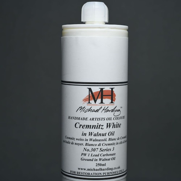
Recently three tubes of artists' white was examined, of a brand that is happily no longer on the market. They were sold at a low price but with no intimation that they were of students' grade or otherwise inferior to the best, and it was discovered that zinc white, flake white, and Cremnitz white apparently came out of the same tube. They were identical mixtures of lithopone, a little zinc oxide, and near 20 percent barytes ground in an oil which contained materials to give the colors an acceptable buttery consistency.
Reference:
[1] The Artist's Handbook of Materials and Techniques, R. Mayer, (ed. E. Smith) 4th Edition, Faber and Faber, London (1981).

 Relationship Elements between Graffiti and Post Graffiti Art.
 Title: Urban Moonlight.
 Title: Urban Moonlight (Detail 1).
 Title: Urban Moonlight (Detail 2).
 Title: Urban Moonlight (Detail 3).