
Preamble
There are a number of posts in this series and for your convenience I have listed them below:
Designing an Art/Craft Project - Part I
Designing an Art/Craft Project - Part II
Designing an Art/Craft Project - Part III
Designing an Art/Craft Project - Part IV
Introduction [1-2]
Few human experiences are as interesting or rewarding than designing and making something creative that is your own. This is particularly true in a highly technical/digital world where mass production provides an unending supply of identical products. Don't tell me that you are so much of an "Indie" that you have never worn "Target" gear! Well, if you found yourself at a social event where that little black dress you were wearing looked better worn by another woman at the same event then you will appreciate the pleasure in creating something that is one of a kind.
 Fashion historians ascribe the origins of the little black dress to the 1920s designs of Coco Chanel and Jean Patou intended to be long-lasting, versatile, affordable, accessible to the widest market possible and in a neutral color (and worn by guess who?).
Art/Craft projects are usually the work of one person, who pines for the desire of a certain object or wishes to create an item simply out of pure joy of using tools and materials to make a unique creation. In every instance the art/craft project serves the purpose: to create an item with intent in order to intellectually/emotionally stimulate the act of engagement. Unlike art, craft items have a further restriction/purpose namely functionality. Functionality does not necessarily mean it is easy to wear or even comfortable. It just means that functionality is an important ingredient for craft items. Perhaps to better frame the difference: there are Art Quilts and there are decorative quilts used on bedding.
 Art Quilt by Luke Haynes, who is a quilt artist based in Seattle (USA).
A successful project begins with an intended design. This is a plan of what the project will look like and how it will be made. For example, in creating my ArtCloth installation - The Australian Four Seasons - I designed the ArtCloth concept/sketch on an A4 sheet of paper using watercolours. After numerous sketches I settled on a version that best depicted the concept, size, scale etc. and determined which fabric and dye type to use.
Note: I shall focus on my work to ensure I am not incorrectly characterizing someone else's artwork.
 Title: "Winter Bolt" (watercolour version).
Note: (i) The sun is depicted as a liquid bolt; (ii) Wavelets are evident; (iii) The graduation of color going down the artwork depicting a descent into coldness. I decided the fabric would be satin, and the images would be hand painted and heat transferred using disperse dyes. This is how the artwork appeared once completed.
 Title: "Winter Bolt" - one of a quadtych of "The Four Australian Seasons".
Artist/Creator: Marie-Therese Wisniowski.
Technique and Material: Hand painted and heat transferred using disperse dyes on satin.
Size: ca. 1.50 wide x 2.00 high meters.
Note: Held in the Artist Collection and so not available for purchase.
Comment: The cloud wavelets are not present in the finished artwork due to my Zen "no-mind" state directing the artwork instead of me slavishly following a "rough". You will note that in my "no-mind" state, I have darkened the background of the artwork as the eye descends and thinned out the liquid sun (i.e., in the form of a bolt), both elements of which I believe indicate, in a more subtle manner, a wintery/watery feel.
In most of my ArtCloth exhibitions, I display my ArtCloths in a three-dimensional mode. I use a rough to work out the placement of the artworks. A maquette (French word for scale model) is a small scale model or rough draft of how I want the exhibition displayed, and where I want the public to meander amongst the hung ArtCloth works. I use it to visualize and test the displayed artwork placements without incurring the cost and effort of producing a full-scale exhibition.
Basics of Design [1-2]
Whatever we design we want it to be visually engaging, and so it is important that we develop a sense of good visual design. Design involves elements and principles that must be understood before they can be used effectively.
Elements are the visible parts of a project. They must give it substance. The usual elements are: line, form, mass, texture and color. Color includes hue, value and chroma.
Principles are simply guides that apply to all design work. They are not rules, which we must fear to break, but observations about the nature of the visible world. Principles help us decide how we wish to transit information to the viewer - whether we want to shock, to reveal, to confuse, to assure, to query, to invent or to re-interpret etc., will depend on principles of proportion, balance, contrast, rhythm, unity, symmetry, asymmetry, unity or harmony etc.
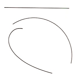
Lines are the most basic of the design elements. Fortunately there are only three kinds:
1. Straight. They may be horizontal, vertical or slanted.
2. Arcs of a circle where rate of curve is unvarying.
3. Free-form curves which may vary in direction.
 Lines are one of the important elements in design. As previosly stated they may be straight, curved, sloped or curved free form.
However, designing with lines may still be difficult, even with only three kinds used on the surface.
Straight Lines and Arcs of Circle
Our use of lines varies little from their appearance in nature. The straight line appears frequently in shapes such as snowflakes and crystal formations. Circles and their arcs are familiar in the shapes of planets or water droplets. The designer uses such lines in an aesthetic (artistic) design and if not used aesthetically may become boring since they are static in nature.
 Title: “Natural Treasures” (full view).
Comment: This artwork was inspired by the pristine waterways and scenery of the unique wilderness of the Huon Valley in Tasmania, Australia.
Artist/Creator: Marie-Therese Wisniowski.
Technique and Material: Dyed, over-dyed, shibori over-dyed, discharged, silk-screened, hand painted and foiled on silk habutai.
Note: The use of lines and dots incorporated in the work adds greater interest and moreover, gives a watery or rainforest feel to the artwork.
 Title: “Renaissance Man” in magenta/purple hues (detail view).
Artist/Creator: Marie-Therese Wisniowski.
Technique and Material: Dyed, over-dyed, screen-printed employing transparent, opaque and metallic pigments on cotton.
Size: 113 cm wide x 100 cm high.
Note: The use of straight lines and arcs in this image give symmetry and balance to the central figure whilst at the same time focussing your eye on the central figure.
Free-Formed Curved Lines
One of the designers most valuable lines is the free formed curve. It comes from the volute or spiral figure.
 A flowing free-formed curve line is obtained from a volute.
 Title: “La Volute Grungesque” (detail view).
Artist/Creator: Marie-Therese Wisniowski.
Technique and Material: Solid dyed and screen-printed employing transparent and metallic pigments on cotton.
Size: 120 cm wide x 170 cm high.
The spiral line of the route unwinds at an even rate. If extended inward or outward, it will never touch or cross itself. Any section of the volute is a smoothly curved line which is not an arc of a circle. Free-formed curves are appealing since they show motion and are "lively". A wave in an ocean or a leaning blade of grass are good examples of the free-form curve. These curved lines are found in most aspects of nature.
 Title: "Flames Unfurling" (detail view) - one of a diptych.
Artist/Creator: Marie-Therese Wisniowski.
Technique: The artist’s signature technique - MultiSperse Dye Sublimation (MSDS) - employs disperse dyes, native flora and low relief items printed on satin.
Size: 60 cm wide x 120 cm high.
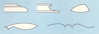
Combining Curved Lines
Free-form, curved lines may be combined in a number of ways to provide pleasing results. Some general rules are followed since random use of these lines is generally unsatisfactory. These methods are only guidelines. They are not breakable rules. Yet they are valuable in developing a feeling of good design.
When two or more curved lines are used in sequence, it is necessary to make some type of break or abrupt change in direction. See the figure below. The change in direction may be made by using:
1. A shoulder which is an area next to a higher or bigger area.
2. A bead which is a rim, a band or a folding.
3. A point of tangency. This is a spot where lines moving in different directions touch.
 Methods of joining free-formed curve lines to change direction. (A, B and E) a point of tangency; (C) Abrupt change by using a bead; (D) A shoulder break, perpendicular to a point of tangency.
At a point of tangency, the ends of the curved lines should be either parallel or perpendicular to each other. The figure below shows interesting applications of curved lines.
 Title: “Rainforest Beauty amidst the Berries” in soft green and lilac hues (detail view).
Artist/Creator: Marie-Therese Wisniowski.
Technique and Material: Multi color dyed and screen-printed employing glazes, transparent, opaque and metallic pigments on cotton.
Size: 77 cm wide x 109 cm high.
 Effective use is made of curved lines to enclose shapes and form design styles.
The image below shows an interesting application of the above using the element of curved lines to enclose shapes in the form of deconstructed fish silhouettes.
 Title: "A Transient Life" (detail view).
Artist/Creator: Marie-Therese Wisniowski.
Technique and Material: Deconstructed interfacing silk-screen prints on cotton employing transparent and opaque pigments.
Size: 70 cm wide x 74 cm high.
Reference
[1] C.E. Kicklighter and R.J. Baird, Crafts, The Goodheart-Willcox Company Inc., South Holland (1986).
[2] Marie-Therese Wisniowski, The University of Newcastle Lecture Notes on Design (2008-2010).
There are a number of posts in this series and for your convenience I have listed them below:
Designing an Art/Craft Project - Part I
Designing an Art/Craft Project - Part II
Designing an Art/Craft Project - Part III
Designing an Art/Craft Project - Part IV
Introduction [1-2]
Few human experiences are as interesting or rewarding than designing and making something creative that is your own. This is particularly true in a highly technical/digital world where mass production provides an unending supply of identical products. Don't tell me that you are so much of an "Indie" that you have never worn "Target" gear! Well, if you found yourself at a social event where that little black dress you were wearing looked better worn by another woman at the same event then you will appreciate the pleasure in creating something that is one of a kind.

Art/Craft projects are usually the work of one person, who pines for the desire of a certain object or wishes to create an item simply out of pure joy of using tools and materials to make a unique creation. In every instance the art/craft project serves the purpose: to create an item with intent in order to intellectually/emotionally stimulate the act of engagement. Unlike art, craft items have a further restriction/purpose namely functionality. Functionality does not necessarily mean it is easy to wear or even comfortable. It just means that functionality is an important ingredient for craft items. Perhaps to better frame the difference: there are Art Quilts and there are decorative quilts used on bedding.

A successful project begins with an intended design. This is a plan of what the project will look like and how it will be made. For example, in creating my ArtCloth installation - The Australian Four Seasons - I designed the ArtCloth concept/sketch on an A4 sheet of paper using watercolours. After numerous sketches I settled on a version that best depicted the concept, size, scale etc. and determined which fabric and dye type to use.
Note: I shall focus on my work to ensure I am not incorrectly characterizing someone else's artwork.

Note: (i) The sun is depicted as a liquid bolt; (ii) Wavelets are evident; (iii) The graduation of color going down the artwork depicting a descent into coldness. I decided the fabric would be satin, and the images would be hand painted and heat transferred using disperse dyes. This is how the artwork appeared once completed.

Artist/Creator: Marie-Therese Wisniowski.
Technique and Material: Hand painted and heat transferred using disperse dyes on satin.
Size: ca. 1.50 wide x 2.00 high meters.
Note: Held in the Artist Collection and so not available for purchase.
Comment: The cloud wavelets are not present in the finished artwork due to my Zen "no-mind" state directing the artwork instead of me slavishly following a "rough". You will note that in my "no-mind" state, I have darkened the background of the artwork as the eye descends and thinned out the liquid sun (i.e., in the form of a bolt), both elements of which I believe indicate, in a more subtle manner, a wintery/watery feel.
In most of my ArtCloth exhibitions, I display my ArtCloths in a three-dimensional mode. I use a rough to work out the placement of the artworks. A maquette (French word for scale model) is a small scale model or rough draft of how I want the exhibition displayed, and where I want the public to meander amongst the hung ArtCloth works. I use it to visualize and test the displayed artwork placements without incurring the cost and effort of producing a full-scale exhibition.
Basics of Design [1-2]
Whatever we design we want it to be visually engaging, and so it is important that we develop a sense of good visual design. Design involves elements and principles that must be understood before they can be used effectively.
Elements are the visible parts of a project. They must give it substance. The usual elements are: line, form, mass, texture and color. Color includes hue, value and chroma.
Principles are simply guides that apply to all design work. They are not rules, which we must fear to break, but observations about the nature of the visible world. Principles help us decide how we wish to transit information to the viewer - whether we want to shock, to reveal, to confuse, to assure, to query, to invent or to re-interpret etc., will depend on principles of proportion, balance, contrast, rhythm, unity, symmetry, asymmetry, unity or harmony etc.
Lines are the most basic of the design elements. Fortunately there are only three kinds:
1. Straight. They may be horizontal, vertical or slanted.
2. Arcs of a circle where rate of curve is unvarying.
3. Free-form curves which may vary in direction.
However, designing with lines may still be difficult, even with only three kinds used on the surface.
Straight Lines and Arcs of Circle
Our use of lines varies little from their appearance in nature. The straight line appears frequently in shapes such as snowflakes and crystal formations. Circles and their arcs are familiar in the shapes of planets or water droplets. The designer uses such lines in an aesthetic (artistic) design and if not used aesthetically may become boring since they are static in nature.

Comment: This artwork was inspired by the pristine waterways and scenery of the unique wilderness of the Huon Valley in Tasmania, Australia.
Artist/Creator: Marie-Therese Wisniowski.
Technique and Material: Dyed, over-dyed, shibori over-dyed, discharged, silk-screened, hand painted and foiled on silk habutai.
Note: The use of lines and dots incorporated in the work adds greater interest and moreover, gives a watery or rainforest feel to the artwork.

Artist/Creator: Marie-Therese Wisniowski.
Technique and Material: Dyed, over-dyed, screen-printed employing transparent, opaque and metallic pigments on cotton.
Size: 113 cm wide x 100 cm high.
Note: The use of straight lines and arcs in this image give symmetry and balance to the central figure whilst at the same time focussing your eye on the central figure.
Free-Formed Curved Lines
One of the designers most valuable lines is the free formed curve. It comes from the volute or spiral figure.


Artist/Creator: Marie-Therese Wisniowski.
Technique and Material: Solid dyed and screen-printed employing transparent and metallic pigments on cotton.
Size: 120 cm wide x 170 cm high.
The spiral line of the route unwinds at an even rate. If extended inward or outward, it will never touch or cross itself. Any section of the volute is a smoothly curved line which is not an arc of a circle. Free-formed curves are appealing since they show motion and are "lively". A wave in an ocean or a leaning blade of grass are good examples of the free-form curve. These curved lines are found in most aspects of nature.

Artist/Creator: Marie-Therese Wisniowski.
Technique: The artist’s signature technique - MultiSperse Dye Sublimation (MSDS) - employs disperse dyes, native flora and low relief items printed on satin.
Size: 60 cm wide x 120 cm high.
Combining Curved Lines
Free-form, curved lines may be combined in a number of ways to provide pleasing results. Some general rules are followed since random use of these lines is generally unsatisfactory. These methods are only guidelines. They are not breakable rules. Yet they are valuable in developing a feeling of good design.
When two or more curved lines are used in sequence, it is necessary to make some type of break or abrupt change in direction. See the figure below. The change in direction may be made by using:
1. A shoulder which is an area next to a higher or bigger area.
2. A bead which is a rim, a band or a folding.
3. A point of tangency. This is a spot where lines moving in different directions touch.

At a point of tangency, the ends of the curved lines should be either parallel or perpendicular to each other. The figure below shows interesting applications of curved lines.

Artist/Creator: Marie-Therese Wisniowski.
Technique and Material: Multi color dyed and screen-printed employing glazes, transparent, opaque and metallic pigments on cotton.
Size: 77 cm wide x 109 cm high.
The image below shows an interesting application of the above using the element of curved lines to enclose shapes in the form of deconstructed fish silhouettes.
Artist/Creator: Marie-Therese Wisniowski.
Technique and Material: Deconstructed interfacing silk-screen prints on cotton employing transparent and opaque pigments.
Size: 70 cm wide x 74 cm high.
Reference
[1] C.E. Kicklighter and R.J. Baird, Crafts, The Goodheart-Willcox Company Inc., South Holland (1986).
[2] Marie-Therese Wisniowski, The University of Newcastle Lecture Notes on Design (2008-2010).
No comments:
Post a Comment