Preamble:
One of my passions is to create Post-Graffiti artwork on cloth as well as on prints on paper. A series of posts on this blog spot have addressed issues in Graffiti and Post Graffiti Art as well as presenting images of such art. I have listed links to some of these posts below for your convenience.
Time Dimension in Art
Unleashed: The Rise of Australian Street Art
Act of Engagement
New York Spray-Can Memorials
Another Brick
A Letter to a Friend
Cultural Graffiti
Beyond the Fear of Freedom
Oh, Oh Marilyn and Mona@Spoonflower
Neu Kunst: Mona & Marilyn
Cycle [1]
Cycle acquired his nom de plume during his college days. During anthropology classes he used to sit at the back of the auditorium with his notebook. Instead of taking notes he would draw whatever the professor put up on the screen. When the professor was using the word, 'life-cycle,' it just resonated with him. Hence his nom de plume, 'Cycle.'
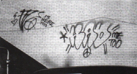
Growing up in Connecticut he noticed graffiti around 1986 during his freshman year at high school, but he didn’t start doing his own graffiti until 1989. He grew up on the Connecticut-New York border, and so his Dad would take him to the city to see the Mets. Living in such close proximity to the city, it’s the New York graffiti he paid attention to. At that time (1989-90) there still wasn’t any record of graffiti in media like books or the internet. There weren't articles in magazines or elsewhere that featured this new rising form of art. The only media record was the “Style Wars” documentary movie, which he see until much later, and there was Henry Chalfant’s book “Subway Art”. Since there was not graffiti media he had to go out on the street to search it out. 'I didn’t even know that there was really any graffiti anywhere else. So coming to the city looking at stuff, among the first people who I really appreciated were Bio, T-Kid, SaneSmith and Sento.'
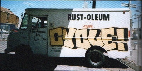
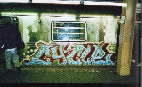
Like other big names in the Graffiti scene, Cycle was influenced first hand by the writers who originated the famous New York City subway train style and he became an active part of its evolution. An avid drawer as a child, he nonetheless had to find his own way into making art, rebelling against established art forms and inventing new styles in graffiti and illustration over and over again to become one of the most skillful letter benders of our time. Cycle is known for experimentation and trying new things. The vast diversity of his graffiti pieces and illustrations often confuse people into thinking that he is more than one person. Always looking for a new challenge, Cycle recently has become serious about switching from the spray can to the brush. In the past months he has been working on an art show featuring new paintings, which are now on display at Ad Hoc Art in Brooklyn. A few days before the opening, NYAB met him at his studio to see the new work and ask a few questions.
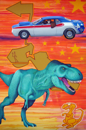
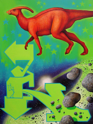
More recently he has turned his hand to painting. 'Painting is something new to me and I have my mind set on how far I can push myself in this medium. There is a learning curve but in some ways the graffiti is the prequel to what’s going on here.'
Cycle at work.
Title: HummingCee.
Media: Mixed Media on Wood.
Size: 11” x 20”.
Title: Rex.
Media: Mixed Media on Canvas.
Size: 68“ x 43.5“.
Title: Kuiper.
Media: Mixed Media on Canvas.
Size: 48“ x 36“.
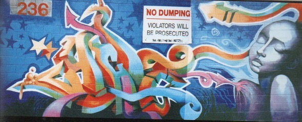
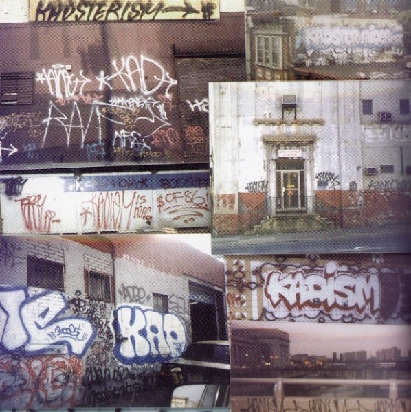
Cycle's Graffiti Art.
Cycle's Graffiti Art.
Cycle's Graffiti Art.
Cycle's Graffiti Art.
Cycle's Graffiti Art.
Reference:
[1] The Art of Getting Over Graffiti at the Millennium, S. Powers, St. Martin's Press, New York (1999).


