Preamble [1]
'Melbourne Now' was an art exhibition mounted by the National Gallery of Victoria (Melbourne, Australia) in 2014. It took as its premise the idea that a city is significantly shaped by the artists, designers, architects, choreographers, intellectuals, and community groups that lived and worked in the midsts of this multi-cultural city. The aim was to explore how Melbourne's visual artists and creative practitioners contributed to the dynamic cultural identity of this city. The result was an exhibition that celebrates what was unique about Melbourne's art, design, and architectural collectives.
The intention of the exhibition was to encourage and inspire everyone to discover some of the best of Melbourne's culture. To help achieve this, family-friendly activities, dance and music performances, inspiring talks from creative practitioner's, city walks and ephemeral installations and events made up the public program.
This and other posts in this series concentrate on the participating artists, rather than on other features of the exhibition event such as the family-friendly commissions developed especially for children and young audiences that was aimed to encourage participatory learning for children and their families in general.
For your convenience I have listed below other posts on this blogspot that features Melbourne Now exhibitions:
Melbourne Now - Part I
Melbourne Now - Part II
Melbourne Now - Part III
Melbourne Now - Part IV
Melbourne Now - Part V
Melbourne Now - Part VI
Melbourne Now - Part VII
Melbourne Now - Part VIII
Melbourne Now - Part VI [1]
Designer Thinking
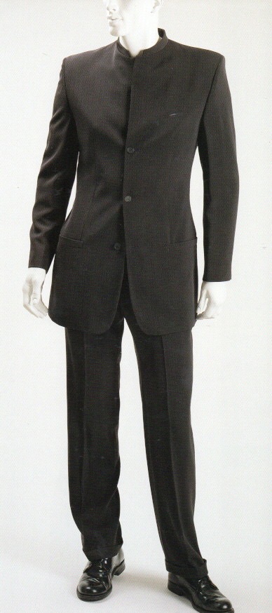
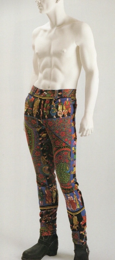
'Designer Thinking' is a show within a show wihin the framework of 'Melbourne Now,' which highlights the importance of independent fashion design as a vehicle for original creative expression. All of the designers represented, worked out of small studios in the inner-city of Melbourne (Australia) and prioritised local manufacturing. Their ranges remain small and innovative, pushing the boundaries of design possibilities via collaborations with visual artists, new fabric technologies and methods of making.
Eight labels have been selected for 'Melbourne Now,' each represented by two outfits, in order to highlight the energy, diversity and talent of designers working at an independent level. Grouped en masse, the inventive installation featured works by 'Above' (Alexi Freeman), 'From Britten' (Kinoak Lui Hon, Pageant, Strateas Carlucci and Verner). Contrasting aesthetics, construction methodologies, easons and genders, 'Design Thinking' charts a plethora of conceptual and practical design approaches. Whether their emphasis is on print and texture, minimalist tailoring principles, utilitarian or wardrobe fundamentals, sculptural drape or fabric technology, each designer has developed a distinctive vocabulary that resonates singularly within Melbourne's rich fashion landscape.
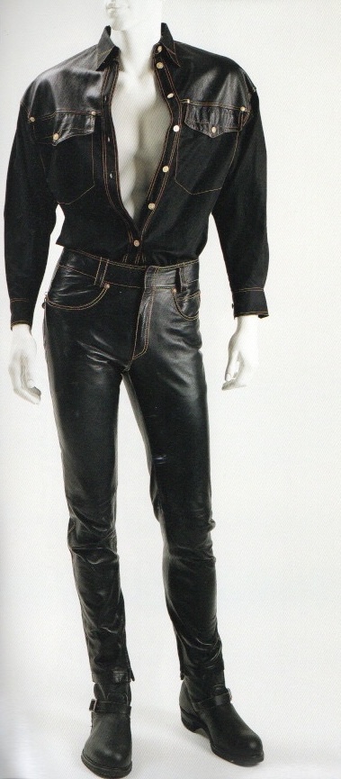
 Fashion House: Kinoak, Melbourne.
Designer: Annie Kohane.
Apparrel: Kiwaa dress (2013).
Sponsor: The project for 'Melbourne Now' is supported by MECCA Cosmetica.
Julia deVille
Julia deVille was born in New Zealand in 1982 and moved to Melbourne in 2001. While studying gold and silversmithing at RMIT, she completed a mentorship with expert taxidermist Rudy Mineur, and this preservation technique has become a major feature of her work. deVille believes that taxidermy is a celebration of life, a preservation of something beautiful and a powerful exemplar of the visual language of death.
Informed by a facination with death, memento mori and Victorian jewllery design, deVille's work relies on traditional techniques and involves a broad range of animals, precious and semiprecious metals and gems. The artist is a vegan and a passionate advocate for fair and just treatment of animals, and only uses animals that have died of natural causes in her work. By examining death in this distinctive way, deVille urges us to consider our own mortality and the beauty of death and rememberance. For 'Melbourne Now' she has created an installation titled 'Degustation (2013),' which invokes an ornate Victorian-style dining room, filled with her sculptural pieces and works from the NGV collection.
 Title: Peter (2012).
Designer: Julia deVille.
The Donkey's Tail
The Donkey's Tail JNR.
Formed in 2007 by artist John Nixon, The Donkey's Tail is an experimental art-music ensemble featuring a diverse array of artists, musicians and amateur collaborators, who perform Nixon's unconvential musical compositions. The group has been prolific in the experimental music scene, releasing more than sixty-five recordings on CD and playing regularly in Melbourne (Australia) galleries and music venues. Known for their use of homemade instruments constructed from found objects, and for playing orthodox instruments in unorthodox ways, The Donkey's Tail's improvised performances make for engaging and unexpected events. Their recorded material traverses noise instrumentals to songs written by Nixon in folk, spoken word and operatic idioms.
For 'Melbourne Now' Nixon's group has conceived an installation encompassing homemade instruments, CDs, photos, paintings, graphic scores, sheet music cover designs, flyers and posters and abstract kinetic videos, all of which invite the audience to explore and discover the group's experimental approach to musical composition, graphic design, instrument-making and performance. The Donkey's Tail Jnr, that 'Melbourne Now' has commissioned for chldren, encourages particpants to experiment with sound and create, perform and record their own improvised scores using various musical and sound-making instruments and found objects.
 Designers: Donkey Tail.
Technique (Date): Graphic score (21 May, 2013).
 Designers: Donkey Tail.
Title: White Guitar (2010).
Note: The above was commission for 'Melbourne Now' by 'Melbourne Now Champions' - The Dewhurst family.
Drawing Now
'Drawing Now' presents drawings from a cross-section of Melbourne (Australia) artists. These drawings have been gathered from personal and professional networks and so should be seen from a subjective viewpoint.
The selection process was organic, but guided by certain principles. They were selected on artists whom drawing is an allied field for propositions within their work as a whole. Both abstract and realist art was chosen from a wide demographic of artists at different stages of their careers. The works came from artist's studios and are not the kind usually offered by them for exhibition, or prioritised in the gallery world. Rather than displaying the work in thematic groupings, they were presented alphabetically, according to their surnames, with a view of emphasizing the individuality of each artist's drawing and diversity of approaches overall. Spectators are therefore forced to find their own links between the works.
Participating Artists in "A Constructed World."
J. Andrews, J. Aslanidis, D. Bertoli, S. Bram, N. Christensen, R. Cosgrave, P. Cripps, D. de Clario, L. Eastman, A. Finlayson, E. Floyd, M. Fusinato, M. Gilligan, J. Gorman, N. Gray, M. Harper, R. Haskings, B. Hester, R. Ishak, J. Lynch, T. Mackenzie, A. McLuckie, A. McQualter, D. Martorell, A-M. May, V. Meertens, V. Miller, C. Morton, E. Newman, R. Nolan, R. Owen, D. Palliser, R. Piggot, K. Poliness, B. Spier, M. Takasaka, K. Temin, R. Vinnecombe, K. Wiebke, P. Yore, and J. Young.
 Artist and Title (Date): Byran Spier, Untitled (2012).
George Egerton-Warburton
George Egerton-Warburton's works operate in the realm of chance and unpredictability. Working across video, sculpture, painting, events, performance and installation, Egerton-Warburton often sets up the conditions for an uncontrollable reaction to take place. He has exhibited widely in Australia and New Zealand in recent years, and was a studio resident at Gertrude Contemporary, Melbourne.
In Egerton-Warburton's single-take film, 'Why are you wearing athletic gear if you're not playing any sport today?' (Melbourne: Run Artist Run, 2013), viewers are escorted past landmarks of Melbourne's artist-run community. Glimpses of the protangist's shoes in the footage reflect contemporary trends in Melbourne's artistic community which conflate urban fashion, criminality, yoga culture and post-London riot footware to articulate radical chic. The film concludes with the camera being placed on a tripod in the space where it is later installed. Completing a cycle from three-dimensional space and back again, the resulting work is an examination of the awkward moral balance in nature and the expanded notion of video as well as structuralist filmmaking technique.
 Artist and Title (Date): George Egerton-Warburton, Streaming Ties (2013).
Reference: [1] T. Ellwood, Director, National Gallery of Victoria (Melbourne, Australia).
'Melbourne Now' was an art exhibition mounted by the National Gallery of Victoria (Melbourne, Australia) in 2014. It took as its premise the idea that a city is significantly shaped by the artists, designers, architects, choreographers, intellectuals, and community groups that lived and worked in the midsts of this multi-cultural city. The aim was to explore how Melbourne's visual artists and creative practitioners contributed to the dynamic cultural identity of this city. The result was an exhibition that celebrates what was unique about Melbourne's art, design, and architectural collectives.
The intention of the exhibition was to encourage and inspire everyone to discover some of the best of Melbourne's culture. To help achieve this, family-friendly activities, dance and music performances, inspiring talks from creative practitioner's, city walks and ephemeral installations and events made up the public program.
This and other posts in this series concentrate on the participating artists, rather than on other features of the exhibition event such as the family-friendly commissions developed especially for children and young audiences that was aimed to encourage participatory learning for children and their families in general.
For your convenience I have listed below other posts on this blogspot that features Melbourne Now exhibitions:
Melbourne Now - Part I
Melbourne Now - Part II
Melbourne Now - Part III
Melbourne Now - Part IV
Melbourne Now - Part V
Melbourne Now - Part VI
Melbourne Now - Part VII
Melbourne Now - Part VIII
Melbourne Now - Part VI [1]
Designer Thinking
'Designer Thinking' is a show within a show wihin the framework of 'Melbourne Now,' which highlights the importance of independent fashion design as a vehicle for original creative expression. All of the designers represented, worked out of small studios in the inner-city of Melbourne (Australia) and prioritised local manufacturing. Their ranges remain small and innovative, pushing the boundaries of design possibilities via collaborations with visual artists, new fabric technologies and methods of making.
Eight labels have been selected for 'Melbourne Now,' each represented by two outfits, in order to highlight the energy, diversity and talent of designers working at an independent level. Grouped en masse, the inventive installation featured works by 'Above' (Alexi Freeman), 'From Britten' (Kinoak Lui Hon, Pageant, Strateas Carlucci and Verner). Contrasting aesthetics, construction methodologies, easons and genders, 'Design Thinking' charts a plethora of conceptual and practical design approaches. Whether their emphasis is on print and texture, minimalist tailoring principles, utilitarian or wardrobe fundamentals, sculptural drape or fabric technology, each designer has developed a distinctive vocabulary that resonates singularly within Melbourne's rich fashion landscape.

Designer: Annie Kohane.
Apparrel: Kiwaa dress (2013).
Sponsor: The project for 'Melbourne Now' is supported by MECCA Cosmetica.
Julia deVille
Julia deVille was born in New Zealand in 1982 and moved to Melbourne in 2001. While studying gold and silversmithing at RMIT, she completed a mentorship with expert taxidermist Rudy Mineur, and this preservation technique has become a major feature of her work. deVille believes that taxidermy is a celebration of life, a preservation of something beautiful and a powerful exemplar of the visual language of death.
Informed by a facination with death, memento mori and Victorian jewllery design, deVille's work relies on traditional techniques and involves a broad range of animals, precious and semiprecious metals and gems. The artist is a vegan and a passionate advocate for fair and just treatment of animals, and only uses animals that have died of natural causes in her work. By examining death in this distinctive way, deVille urges us to consider our own mortality and the beauty of death and rememberance. For 'Melbourne Now' she has created an installation titled 'Degustation (2013),' which invokes an ornate Victorian-style dining room, filled with her sculptural pieces and works from the NGV collection.

Designer: Julia deVille.
The Donkey's Tail
The Donkey's Tail JNR.
Formed in 2007 by artist John Nixon, The Donkey's Tail is an experimental art-music ensemble featuring a diverse array of artists, musicians and amateur collaborators, who perform Nixon's unconvential musical compositions. The group has been prolific in the experimental music scene, releasing more than sixty-five recordings on CD and playing regularly in Melbourne (Australia) galleries and music venues. Known for their use of homemade instruments constructed from found objects, and for playing orthodox instruments in unorthodox ways, The Donkey's Tail's improvised performances make for engaging and unexpected events. Their recorded material traverses noise instrumentals to songs written by Nixon in folk, spoken word and operatic idioms.
For 'Melbourne Now' Nixon's group has conceived an installation encompassing homemade instruments, CDs, photos, paintings, graphic scores, sheet music cover designs, flyers and posters and abstract kinetic videos, all of which invite the audience to explore and discover the group's experimental approach to musical composition, graphic design, instrument-making and performance. The Donkey's Tail Jnr, that 'Melbourne Now' has commissioned for chldren, encourages particpants to experiment with sound and create, perform and record their own improvised scores using various musical and sound-making instruments and found objects.

Technique (Date): Graphic score (21 May, 2013).

Title: White Guitar (2010).
Note: The above was commission for 'Melbourne Now' by 'Melbourne Now Champions' - The Dewhurst family.
Drawing Now
'Drawing Now' presents drawings from a cross-section of Melbourne (Australia) artists. These drawings have been gathered from personal and professional networks and so should be seen from a subjective viewpoint.
The selection process was organic, but guided by certain principles. They were selected on artists whom drawing is an allied field for propositions within their work as a whole. Both abstract and realist art was chosen from a wide demographic of artists at different stages of their careers. The works came from artist's studios and are not the kind usually offered by them for exhibition, or prioritised in the gallery world. Rather than displaying the work in thematic groupings, they were presented alphabetically, according to their surnames, with a view of emphasizing the individuality of each artist's drawing and diversity of approaches overall. Spectators are therefore forced to find their own links between the works.
Participating Artists in "A Constructed World."
J. Andrews, J. Aslanidis, D. Bertoli, S. Bram, N. Christensen, R. Cosgrave, P. Cripps, D. de Clario, L. Eastman, A. Finlayson, E. Floyd, M. Fusinato, M. Gilligan, J. Gorman, N. Gray, M. Harper, R. Haskings, B. Hester, R. Ishak, J. Lynch, T. Mackenzie, A. McLuckie, A. McQualter, D. Martorell, A-M. May, V. Meertens, V. Miller, C. Morton, E. Newman, R. Nolan, R. Owen, D. Palliser, R. Piggot, K. Poliness, B. Spier, M. Takasaka, K. Temin, R. Vinnecombe, K. Wiebke, P. Yore, and J. Young.

George Egerton-Warburton
George Egerton-Warburton's works operate in the realm of chance and unpredictability. Working across video, sculpture, painting, events, performance and installation, Egerton-Warburton often sets up the conditions for an uncontrollable reaction to take place. He has exhibited widely in Australia and New Zealand in recent years, and was a studio resident at Gertrude Contemporary, Melbourne.
In Egerton-Warburton's single-take film, 'Why are you wearing athletic gear if you're not playing any sport today?' (Melbourne: Run Artist Run, 2013), viewers are escorted past landmarks of Melbourne's artist-run community. Glimpses of the protangist's shoes in the footage reflect contemporary trends in Melbourne's artistic community which conflate urban fashion, criminality, yoga culture and post-London riot footware to articulate radical chic. The film concludes with the camera being placed on a tripod in the space where it is later installed. Completing a cycle from three-dimensional space and back again, the resulting work is an examination of the awkward moral balance in nature and the expanded notion of video as well as structuralist filmmaking technique.

Reference: [1] T. Ellwood, Director, National Gallery of Victoria (Melbourne, Australia).