Preamble
For your convenience I have listed below other posts in this series:
Diversity of African Textiles
African Textiles: West Africa
Stripweaves (West Africa) - Part I
Stripweaves (West Africa) - Part II
Stripweaves (West Africa) - Part III
Stripweaves (West Africa) - Part IV
Djerma Weaving of Niger and Burkina-Faso
Woolen Stripweaves of the Niger Bend
Nigerian Horizontal - Loom Weaving
Yoruba Lace Weave
Nigerian Women's Vertical Looms
The Supplementary Weft Cloths of Ijebu-Ode and Akwete
African Tie and Dye
Tie and Dye of the Dida, Ivory Coast
African Stitch Resist
Yoruba Stitch Resist
Yoruba: Machine-Stitched Resist Indigo-Dyed Cloth
Yoruba and Baulé Warp Ikat
Nigerian Starch-Resist (by hand)
Stencilled Starch-Resist
Wax Resist
Mali Mud Cloths
Adinkra Stamped Cloths of Ghana
Yoruba: Machine-Stitched Resist Indigo-Dyed Cloth [1]
Singer treadle sewing machines were introduced into Nigeria at the turn of the 19th-20th Century and popularized in rural areas by Lebanese traders. It was not long before the inventive Nigerians considered the possibility of stitching resists by machine instead of by hand. Although many of the machine-stitched patterns are similar to the hand stitched ones, the machine creates finer, though, normally more linear designs.
Machine-Stitched Resist Indigo-Dyed Cloth.
For many years, this work was the domain of male traders, but, with the weakening of traditional demarcations between the sexes, many women started to undertake this task.
Machine-Stitched Resist Indigo-Dyed Cloth.
All machine resist is carried out on mill cloth, such as white shirting, otherwise it would snag. Mill cloth is pleated and, along the crease, two or four rows of tight stitching are sewn. This process is repeated with each pleat, until the whole cloth is concertinaed.
Machine-Stitched Resist Indigo-Dyed Cloth.
At this stage the cloth is dyed in the traditional indigo or, mostly nowadays, in a range of synthetic dyes, of which brown and purple are possibly the most popular. The machine-stitched cotton thread is then unpicked with a razor blade, taking care not to damage the cloth. A pattern of columns of fine white dashes remain against a colored ground. There are many variations of this theme.
Yoruba indigo-dyed wrap. Prior to dyeing, the cloth has been pleated and sewn by machine. After dyeing, the stitches are painstakingly unpricked.
Machine-sewn resist textiles are a major export from Nigeria to other parts of Africa. This pleated and diagonally stitched cloth was chemically dyed, probably at Abeokuta, Yorubaland, but bought in a market in Cameroon.
A Yoruba indigo-dyed cotton cloth. Machine stitching has been used to resist the dye and make the pattern.
Reference:
[1] J. Gillow, African Textiles, Thames & Hudson Ltd, London (2003).
Preamble
For you convenience, I have listed below posts in this series:
Early Australian Posters and Program Covers - Part I [1]
Early Australian Posters and Program Covers - Part II [1]
Introduction [1]
Live theatre appealed to a very wide audience in the nineteenth century. "Ladies" and "gentlemen" sat in relative comfort in the dress circle and boxes, while the pit and galleries were packed with less affluent, but just as appreciative theatre goers members of what was called at that time, the "lower orders." In goldrich Melbourne (Australia) in the 1860s, for example, there were three large theatres: the Theatre Royal, the Haymarket and the Princess's, which were resplendent with plush and gilt fittings.
Outside view of the Theatre Royal.
Inside view of the Theatre Royal.
Outside view of the Princess's, Melbourne (Australia) ca. 1860s.
Inside view of the Princess's, Melbourne (Australia) ca. 1860s.
Outside view of the Haymarket.
Inside view of the Haymarket
These theatres regularly drew large audiences simultaneously to dramas, operas or ballets. At other times of course, a theatre may be dark for months until a venturesome manager leased it for a season.
Theatres, before the days of electric light, with their gas lighting and use of volatile limelight for stage effects, were vulnerable to fires. Noteable among the theatres destroyed were Melbourne and Sydney Royals, which were burnt down in the 1870s. The Melbourne Royal was rebuilt within six months by George Coppin. The auditoria of nineteenth century theatres were not darkened performances: the audiences tended to look at each other as well as at the stage. Prices ranged from six pence or a shilling in the pit and gallery respectively, to five shillings or seven and six pence in the dress circle and boxes respectively. Performances began at 7:30 pm, and often ended after 11 pm. A typical theatre year might consist of plays from the English repertory, including Shakespeare and current London hits, opera, ballet, and minstral shows. For instance, in 1863, Melbourne's Theatre Royal's year began with an opera season, followed by a few performances by a minstral company. The great American actor, Barry Sullivan, then leased the theatre and appeared in plays ranging from Shakespeare to Sheridan.
The period's more flexible attitude to classics can be highlighted in the programming of such plays as Hamlet with the laughable farce, 'The Double-Bedded Room.'
The culimination of the year was the Christmas pantomine, which started its season on Boxing Day, an Australian holiday on the 26th December of any given year.
Pantomime was one of the most popular forms of stage entertainment. Based on the old forms of Italian Commedia dell'Arte, pantomimes appealed to adults as well as to children. For adults, there was political satire, lavish production, chorus girls, and a 'Principal Boy', played by a curvaceous actress in doublet and hose.
By the 1890s there was a circuit of theatres throughout the Australian colonies, and an appreciative audience for both international touring companies and local talent. During this period, long theatrical tours were made possible by improvements in shipping and railways. In 1882, the American actor James Cassius Williamson founded a management company with theatre outlets in most Australian capital cities. The "Firm", as it became to be known, specialized in musical comedy and plays. It was to dominate Australian show business until the 1970s.
In 1890, the popular English music hall comedian, Harry Rickards, established a chain of variety theatres around Australia that eventually became known as the Tivoli Circuit. Australian vaudeville, and its other derivatives, such as variety and revue, had its origins in American minstrel shows and English music hall entertainment. It consisted of many different acts performed by comedians, magicians, jugglers, acrobats, singers and dancers. Rickards arranged tours by English music hall stars, such as Marie Lloyd and Little Tich, and the American comedian W.C.Fields.
Harry Rickards.
The careers of local artists, such as Florrie Forde and Fred Bluett, were advanced under Rickards' management. By the 1920s vaudeville was also playing in theatres owned by J.C. Williamson and the Fullers. From about 1914, Australian variety stars acquired a large following.
Early Australian Posters and Program Covers[1] - Part II
Rickards' Poster.
Miss Stella Gastelle's Poster.
Program Poster.
Poster of an Australian Film Star.
Poster for a Ken Hall film.
Program for a Pantomime.
Poster for a Chauvel film.
Reference:
[1] Article by Mimi Colligan, Australia Post Philatelic Group.
Preamble
For your convenience I have listed below other post in this series:
Fourth International Textile Competition '94 Kyoto - Part I
Fourth International Textile Competition '94 Kyoto - Part II
Fourth International Textile Competition '94 Kyoto - Part III
Fourth International Textile Competition '94 Kyoto - Part IV
Fourth International Textile Competition '94 Kyoto - Part V
Fourth International Textile Competition '94 Kyoto - Part VI
Fourth International Textile Competition '94 Kyoto - Part II [1]
(i) Naoto Izukura (Kyoto, Japan). Outstanding Award.
Background: Born in 1971, Naoto Izukura graduated from Doshisha University. He studied at ESMODE in Paris. He participated in the International Textile Competition in 1992. He researches in natural dyeing.
Naoto Izukura.
Artist: Naoto Izukura.
Title: Materialism.
Materials: Silk (scraped cocoons).
Technique: Natural dyeing, silk thread making.
Size: 200 (width) x 610 (depth) cm.
Detailed View.
Judges' Comment: When manufacturing silks, the first 100 meters and the last 1100 meters of the thread is excluded from industrial standards, and discarded. Known as 'worthless silk', this material is the perfect medium for a powerful expression of presence by the artists concerning the contradictions of an industrial society which values only profitable achievement. This expression of presence is in fact an expression of the material itself. Using only natural dyes extracted from plants, the artist has taken the theme of this competition and has worked and reworked it; the answer will be provided by those who come to see.
It is indeed a sharp anti-thesis and warning for this industrial society by an artist who possesses a deep love for materials used in his work. The time has come for us to consider very carefully the affluence we thought we had achieved. This work is not an industrial production, nor is it merely a work created through the dexterous techniques at the command of the artist. Searching through the depths of possibility contained within textiles themselves, it is this search itself which has given this work its profunity, and its high evaluation by ITF.
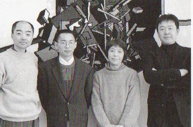
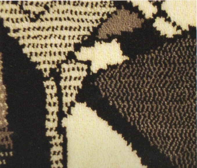
(ii) Noise Dance Industrial. Design Award. Principal Creator: Mitsuo Toyazaki.
A collaborative work. From far right: Mitsuo Toyazaki (Principal creator) with co-creators: Akira Koyama, Eiji Hashimoto and Mihoko Matsumoto.
Background:
Born in 1955, Mitsuo Toyazaki graduated from Tokyo University of Arts in 1981.
Artists: Mitsuo Toyazaki (Principal creator). Akira Koyama, Eiji Hashimoto and Mihoko Matsumoto (co-creators).
Title: Noise Dance.
Materials: Weaving with OMT.
Technique: Computer Graphics.
Size: 260 (H) x 630 (W) cm.
Detailed View.
Judge's Comment: The employment of computer graphics as an additional technique to be used in the field of textile design was a natural, and epochal development, allowing for what effectively amounts to limitless expansion of possibility, and the induction of computer graphics in the industrial world of textiles will only increase as time passes. However, the introduction of computer graphics in textile design was never intended to be merely a time and labor saving means of greater production efficiency. Its main purpose, and ultimate significance shall be found in the transcendence of function, for this can be considered to be the time of experimentation, a chance to grope for the means of achieving a new generation of textiles through the unpredictable relationship between humans and computer graphics. This work indeed makes one aware of this relationship through its peculiar, three-dimensional expression of the passage of time, made possible by the techniques of computer graphics.
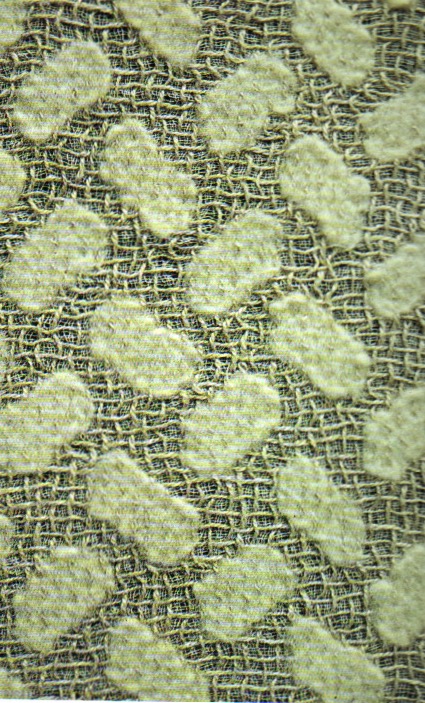
(iii) Gilian Little (UK). Technology Award.
Gilian Little.
Background: Born in 1962, Gilian Little graduated from the West Surrey College of Art and Design from the Royal College of Art, London in 1993. She exhibited at Textprint at Interstoff, Frankfurt in 1994 was commissioned by the Crafts Council Works in 1994.
Artist: Gilian Little.
Title: Brick Linen Devoré.
Materials: Cotton, linen, lambs wool.
Technique: Woven fabric printed with devoré.
Size: 241 (H) x 79 (W) cm.
Detailed View.
Judges' Comment: Devoré is a traditional art whereby cellulose is basically transformed into felt through the chemical organization of layers of natural fibers. The particular appearance of the withering of time exuded by this work has been accomplished through the techniques of devoré weaving. The artist has taken the different, individual characteristics of the natural fibers, cotton, linen and wool, and has woven them into a single, magnificent expression of subtle, hidden possibilities contained in each fiber.
In creating this work of art, the artist has paid particular attention to the expression of materials. Through her masterful use of texture, she has created a work which makes one strongly re-evaluate the position of natural materials, and resounds as a chilling warning to those who would de-predate nature.
Notwithstanding, this work is permeated with classical beauty and leisurely atmosphere designed to give forth a sense of peace and harmony as one gazes upon it.
Reference:
[1] Edited by: International Textile Fair Executive Committee.
Published by: International Textile Fair Executive Committee (Nishijin-ori-Kiakan, Horikawa Imadegawa, Kamigyo-ku, Kyoto 602,Japan.
Printed by: New Color Photographic Printing Co. Ltd. © 1994 International Textile Fair Executive Committe.
Preamble
This is the thirty-fifth post in a new Art Resource series that specifically focuses on techniques used in creating artworks. For your convenience I have listed all the posts in this new series below:
Drawing Art
Painting Art - Part I
Painting Art - Part II
Painting Art - Part III
Painting Art - Part IV
Painting Art - Part V
Painting Art - Part VI
Home-Made Painting Art Materials
Quality in Ready-Made Artists' Supplies - Part I
Quality in Ready-Made Artists' Supplies - Part II
Quality in Ready-Made Artists' Supplies - Part III
Historical Notes on Art - Part I
Historical Notes on Art - Part II
Historical Notes on Art - Part III
Historical Notes on Art - Part IV
Historical Notes on Art - Part V
Tempera Painting
Oil Painting - Part I
Oil Painting - Part II
Oil Painting - Part III
Oil Painting - Part IV
Oil Painting - Part V
Oil Painting - Part VI
Pigments
Classification of Pigments - Part I
Classification of Pigments - Part II
Classification of Pigments - Part III
Pigments for Oil Painting
Pigments for Water Color
Pigments for Tempera Painting
Pigments for Pastel
Japanese Pigments
Pigments for Fresco Painting - Part I
Pigments for Fresco Painting - Part II
Selected Fresco Palette for Permanent Frescoes
Properties of Pigments in Common Use
Blue Pigments - Part I
Blue Pigments - Part II
Blue Pigments - Part III
Green Pigments - Part I
Green Pigments - Part II
Red Pigments - Part I
Red Pigments - Part II
Yellow Pigments - Part I
Yellow Pigments - Part II
Brown and Violet Pigments
Black Pigments
White Pigments - Part I
White Pigments - Part II
White Pigments - Part III
Inert Pigments
Permanence of Pigments: New Pigments - Part I
Permanence of Pigments: New Pigments - Part II
Limited or Restricted Palettes
Testing of Pigments - Part I
There have been another one hundred and thirteen posts in a previous Art Resource series that have focused on the following topics:
(i) Units used in dyeing and printing of fabrics;
(ii) Occupational, health & safety issues in an art studio;
(iii) Color theories and color schemes;
(iv) Optical properties of fiber materials;
(v) General properties of fiber polymers and fibers - Part I to Part V;
(vi) Protein fibers;
(vii) Natural and man-made cellulosic fibers;
(viii) Fiber blends and melt spun fibers;
(ix) Fabric construction;
(x) Techniques and woven fibers;
(xi) Basic and figured weaves;
(xii) Pile, woven and knot pile fabrics;
(xiii) Durable press and wash-and-wear finishes;
(xvi) Classification of dyes and dye blends;
(xv) The general theory of printing.
To access any of the above resources, please click on the following link - Units Used in Dyeing and Printing of Fabrics. This link will highlight all of the one hundred and thirteen posts in the previous a are eight data bases on this blogspot, namely, the Glossary of Cultural and Architectural Terms, Timelines of Fabrics, Dyes and Other Stuff, A Fashion Data Base, the Glossary of Colors, Dyes, Inks, Pigments and Resins, the Glossary of Fabrics, Fibers, Finishes, Garments and Yarns, Glossary of Art, Artists, Art Motifs and Art Movements, Glossary of Paper, Photography, Printing, Prints and Publication Terms and the Glossary of Scientific Terms. All data bases in the future will be updated from time-to-time.
If you find any post on this blog site useful, you can save it or copy and paste it into your own "Word" document for your future reference. For example, Safari allows you to save a post (e.g. click on "File", click on "Print" and release, click on "PDF" and then click on "Save As" and release - and a PDF should appear where you have stored it). Safari also allows you to mail a post to a friend (click on "File", and then point cursor to "Mail Contents On This Page" and release). Either way, this or other posts on this site may be a useful Art Resource for you.
The new Art Resource series will be the first post in each calendar month. Remember - these Art Resource posts span information that will be useful for a home hobbyist to that required by a final year University Fine-Art student and so undoubtedly, some parts of any Art Resource post may appear far too technical for your needs (skip those mind boggling parts) and in other parts, it may be too simplistic with respect to your level of knowledge (ditto the skip). The trade-off between these two extremes will mean that Art Resource posts will be hopefully useful in parts to most, but unfortunately may not be satisfying to all!
Selected Fresco Palette for Permanent Frescoes [1]
The palette for permanent frescoes must be especially resistant to the corrosive action of polluted air. All the pigments must be neutral, free from soluble salts and other impurities. For example, the following pigments have these properties.
White:
Slaked lime putty, Bianco san giovanni and neutral blanc fixe.
Bianco San Giovanni.
Black:
Mars black and Lampblack.
Mars Black.
Red:
Indian red and light red.
Indian Red.
Blue:
Cobalt blue and cerulean blue.
Cerulean Blue.
Green:
Chromium oxide and viridian.
Viridian.
Yellow:
Mars Yellow.
Violet:
Mars Violet.
It has been the practice of fresco painters from an early date to plaster a test panel and subject all their colors to a test of the suitability of their materials for the circumstances of the job in hand. Six months' exposure is considered adequate to determine whether or not a new color or a pigment from a new source is lime-proof.
Many colors not universally adopted or at present disputed, such as the cadmium lithopones, phthalocyanine blue, Hansa yellow lakes, and cobalt yellow, have been proposed as fresco colors. Some have shown promise in tests, but so far, data has been insufficient to form the basis for definite opinions. Painters who add lime or limewater to their colors favor pure slaked lime as white; those who depend solely on the capillary penetration of their pigments into the surface of the wall prefer a more inert, non-binding white. It is doubtful whether the Pozzuoli red mentioned by some writers is always authentic cementitious material; its color, however, is usually a highly desirable rosy shade of red. The cementing property of this substance is of doubtful or negative value. A number of perfectly suitable fresco colors, such as turquoise green, potter's ink, and Egyptian blues, are not available in some international markets. The cadmiums have been generally rejected for three reasons: there is doubt as to their permanent resistance to alkaline lime, their color effects in the dry state are very brilliant and usually out of key with the rest of the fresco palette, and they are all sulphides and therefore among those compounds sensitive to disintegration by minute amounts of mineral acids in the air. The cobalt violets currently on the market vary considerably in color and chemical properties and some are light-proof in other mediums but will fade when exposed in contact with lime; untried specimens should be tested under fresco conditions before adoption. Colors sold for enameling and other ceramic uses have bad paint-pigment properties and always contain added fluxing and refractory ingredients.
So far, no artist tests have been made, but the results of their industrial use, manganese violet, manganese blue, and phthalocyanine blue should prove to be lime-proof.
Reference:
[1] The Artist's Handbook of Materials and Techniques, R. Mayer (ed. E. Smith) 4th Edition, Faber and Faber, London (1981).

 Machine-Stitched Resist Indigo-Dyed Cloth.
 Machine-Stitched Resist Indigo-Dyed Cloth.
 Machine-Stitched Resist Indigo-Dyed Cloth.
 Yoruba indigo-dyed wrap. Prior to dyeing, the cloth has been pleated and sewn by machine. After dyeing, the stitches are painstakingly unpricked.
 Machine-sewn resist textiles are a major export from Nigeria to other parts of Africa. This pleated and diagonally stitched cloth was chemically dyed, probably at Abeokuta, Yorubaland, but bought in a market in Cameroon.
 A Yoruba indigo-dyed cotton cloth. Machine stitching has been used to resist the dye and make the pattern.