Preamble
For your convenience I have listed below other posts in this series:
Diversity of African Textiles
African Textiles: West Africa
Stripweaves (West Africa) - Part I
Stripweaves (West Africa) - Part II
Stripweaves (West Africa) - Part III
Stripweaves (West Africa) - Part IV
Djerma Weaving of Niger and Burkina-Faso
Woolen Stripweaves of the Niger Bend
Nigerian Horizontal - Loom Weaving
Yoruba Lace Weave
Nigerian Women's Vertical Looms
The Supplementary Weft Cloths of Ijebu-Ode and Akwete
African Tie and Dye
Tie and Dye of the Dida, Ivory Coast
African Stitch Resist
Yoruba Stitch Resist
Yoruba: Machine-Stitched Resist Indigo-Dyed Cloth
Yoruba and Baulé Warp Ikat
Nigerian Starch-Resist (by hand)
Stencilled Starch-Resist
Wax Resist
Mali Mud Cloths
Yoruba and Baulé Warp Ikat [1]
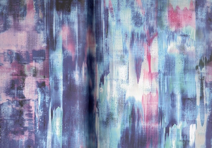
Ikat is the process whereby threads are tie-dyed before weaving takes place. When the cloth is woven, any section of the cloth where the threads have been previously ikat-dyed will have a rather frayed pattern in the color of the undyed thread against the dyed background. The ikat process can be applied to warp or weft or both. It is only warp ikat, though, that is used, albeit sparingly, in West Africa.
North Ghanaian stripwoven 'country cloth.'
Section of a cotton warp-ikat woman's wrap, Baulé people.
There are no records of African weft, double or compound ikat, but both the Baulé of the Ivory Coast and the Yoruba use warp-ikat details in some of their strip weaves. The technique was practiced at one time in parts of Ghana and by present-day northern Edo women in Igarra, Nigeria. It is used sparingly, though the color range can vary. However, white warp threads are often simply tied and then dip-dyed in indigo. The Yoruba use warp strips of alternate colors to create contrasts in their 'country' cloths. In the Ivory Coast around Tiébissou, Dioula dyers tie-dye patterns into warp threads for Baulé weavers. The resulting warp-ikat textiles can be more complex than those of the Yoruba, though they usually also keep to a blue-and-white color scheme.
One of these Baulé cloths was found as a backing for a Central Asian ikat- evidence of the trade that co-exists with Haj pilgramage to Mecca.
Igarra stripwoven cotton woman's cloth with warp-like details (Nigeria).
Baulé man's cloth.
One of these Baulé cloths was found as a backing for a Central Asian ikat - evidence of the trade that co-exists with Haj pilgrimage to Mecca.
Yoruba stripwoven "country cloth' with simple warp ikat details in alternate strips.
Yoruba stripwoven cotton cloth with warp-ikat details.
The warp-ikat method gives the textile a pattern by tying resists tightly around the warp threads that have been stretched out on a frame. The tied hanks are then immersed in a dye-bath. Warp ikat in West Africa is often plain blue and white. If the original white thread is placed in an indigo dye-bath to give blue, the tied portions make a white pattern against a blue ground. When the dyeing process is finished, the dyed warp is woven with a plain colored weft to create a warp-faced, patterned textile.
Reference:
[1] J. Gillow, African Textiles, Thames & Hudson Ltd, London (2003).
Preamble
For your convenience I have listed below other posts featuring fairs and markets:
That Little Art Place
Art Quill Studio@2018 Sydney Craft & Quilt Fair
ArtCloth Textiles Created by Marie-Therese Wisniowski
Art Quill Studio@2019 Melbourne Craft & Quilt Fair
2024 SPRING INTO PRINT - OPEN DAY & MARKET
2024 SPRING INTO PRINT - OPEN DAY & MARKET
In 2024 the Newcastle Printmakers Workshop in Newcastle (NSW, Australia) celebrates 45 years as the oldest community access printmaking workshop in Australia! A significant event marking an important juncture in Australia’s printmaking history!
On the 14th September 2024, Newcastle Printmakers Workshop held their Annual ‘Spring into Print’ Open Day and Inaugural Market at the NPW’s premises at 27 Popran Road, Adamstown, NSW, Australia.
With a focus on renewal and coming together, visitors could enjoy a range of activities which included:
(i) An opportunity to meet members of the NPW.
(ii) An exhibition of prints by NPW members which focused on celebrating the Spring season.
(iii) A series of demonstrations by printmakers using gel plate, dry point, and lino print techniques.
(iv) A cake stall selling freshly baked goods and refreshments.
(v) A plant stall for visitors to purchase plants to bring in the Spring.
(vi) A quality second-hand art materials and tools stall.
(vii) The NPW’s Inaugural, bespoke Art Market which featured a range of unique hand-made and hand-printed Items and artist prints by members.
Art Quill Studio attended the ‘Spring into Print’ Open Day Inaugural Market featuring my prints on paper/cloth, scarves, pashmina's and ArtCloth textiles along with other stall holders who presented their array of unique, printed items for sale.
On a perfect Spring day, it was a wonderful opportunity to meet and support local printmakers and artist’s from the Newcastle region.
Below are images of the activities that were enjoyed on the day thanks to the hard work of the NPW team in organizing not only the Annual Spring Open Day, but also in creating the new Market initiative.
See the Newcastle Printmakers Workshop website for information about their exhibitions, workshops and activities by clicking on the following link - Newcastle Printmakers Workshops
Newcastle Printmakers Workshop’s colorful poster promoting the 2024 Annual Open Day activities.
Image Courtesy Newcastle Printmakers Workshop.
NPW members Lois Herman, Fiona Johnson and Jo Wood (left to right), manning the cake stall and refreshment stand, and doing their ‘groovy’ moves!
NPW member Shirley Mort (right hand side) demonstrating the gel plate printing technique employing plant materials to a visitor.
NPW member Vicki MacNamara (left hand side) demonstrating and discussing lino block printing techniques with visitors.
NPW member Lynne Birchill (standing) manning the colorful plant stall with attendees.
NPW members and friends setting up their marquees and stands for the Inaugural Open Day Market.
General view of the NPW members marquees and stands brimming with unique hand made, hand printed items and artist prints.
NPW member Valé Zakarauskas of Inknot featured with her exciting array of hand crafted and hand printed bags, tea towels, cards, and artist prints.
NPW member and former Chairperson, Ardel Prout featured with her range of exquisite hand printed artist prints.
NPW member Jane Collins featured with her range of striking and colorful hand printed artist prints.
NPW member Simone Lindhout (left) of Promenade Design featured with her display of hand printed tea towels, textile items and artist prints.
NPW member Emma Croxton featured with her range of stunning hand printed artist prints.
NPW member Aurelia Nowak featured with her range of distinctive hand printed artist prints.
View of Marie-Therese’s Art Quill Studio stand with CEO of Art Quill & Co. P/L, Dr. Ellak von Nagy-Felsobuki attending to final details.
A general view of the Art Quill Studio stand at the NPW Open Day Inaugural Market which featured Marie-Therese’s 'Unique, Australian, contemporary, hand dyed and hand printed ArtCloth textiles and artist's prints.
A general view of the Art Quill Studio stand at the NPW Open Day Inaugural Market which featured Marie-Therese’s hand dyed and hand printed ArtCloth fabric lengths, fat quarters and fabric samplers; hand dyed and hand printed ArtCloth velvet scarves, silk scarves and pashminas; hand dyed and hand printed Shibori ArtCloth; one-off/limited edition digitally printed fabric lengths and artist prints on paper and artist prints on cloth.
A general view of the Art Quill Studio table of items at the NPW Open Day Inaugural Market which featured Marie-Therese’s hand dyed and hand printed fat quarters and fabric samplers; hand marbled book marks, books published by the parent company, Art Quill & Co. P/L, and artist prints on paper and artist prints on cloth.
Introduction [1]
Seetal Solanki is a London-based multidisciplinary design studio, delivering design, art and creative direction within the realms of fashion, wearable technology, sustaintability, architecture, installations, materials, automotive, interiors, trend forecasting, research, strategy, brand identity, publications for print and online, and more.
Seetal has spent the past decade building on her style and unique approach to creative briefs and projects. Through her time of running her own studio she has gained insight into working in a wide range of disciplines. She has the same approach when it comes to the creative process, and none of her work has the same outcome, as it will lend itself to a different result depending on what outset. There is purpose to everything she creates, whether it be an artwork, a strong narrative, a visual identity or even just something great to look at.
Seetal graduated from Central Saint Martins with a MA in Design for Textile Futures. The studio collaborates with a number of industry experts, which allows it to achieve an international presence. Clients include Nike, Levi, Made & Crafted, Surface To Air, Alexander McQueen, Hussein Chalayan, Nissan Design Europe, It's Nice That, Alvar magazine, WGSN, Havaianas, United Visual Artists, PPQ, Markus Lupfer, Hentsch Man, Rowland Mouret, Chloé, Missoni, Pucci, Alberta Ferretti and James Long.
Seetal Solanki[1]
James Long Menswear. Marbling, paint and pencil (2012).
Alexander McQueen. Acrylic, paint (2008).
2nd Day Birger. Womanswear Night. Marbling (2013).
Alexander McQueen. Acrylic paint (2008).
Missoni. Marbling (2011).
Missoni. Marbling (2011).
Alexander McQueen. Paint, photoshop (2012).
Alexander McQueen. Paint, photoshop (2012).
Alexander McQueen. Paint, photoshop (2008).
Missoni. Marbling (2011).
Alexander McQueen. Paint, photoshop (2012).
Reference:
[1] People of Print, M. Smith and A. Cooke, Thames & Hudson (2017).
Preamble
This is the thirty-seventh post in a new Art Resource series that specifically focuses on techniques used in creating artworks. For your convenience I have listed all the posts in this new series below:
Drawing Art
Painting Art - Part I
Painting Art - Part II
Painting Art - Part III
Painting Art - Part IV
Painting Art - Part V
Painting Art - Part VI
Home-Made Painting Art Materials
Quality in Ready-Made Artists' Supplies - Part I
Quality in Ready-Made Artists' Supplies - Part II
Quality in Ready-Made Artists' Supplies - Part III
Historical Notes on Art - Part I
Historical Notes on Art - Part II
Historical Notes on Art - Part III
Historical Notes on Art - Part IV
Historical Notes on Art - Part V
Tempera Painting
Oil Painting - Part I
Oil Painting - Part II
Oil Painting - Part III
Oil Painting - Part IV
Oil Painting - Part V
Oil Painting - Part VI
Pigments
Classification of Pigments - Part I
Classification of Pigments - Part II
Classification of Pigments - Part III
Pigments for Oil Painting
Pigments for Water Color
Pigments for Tempera Painting
Pigments for Pastel
Japanese Pigments
Pigments for Fresco Painting - Part I
Pigments for Fresco Painting - Part II
Selected Fresco Palette for Permanent Frescoes
Properties of Pigments in Common Use
Blue Pigments - Part I
Blue Pigments - Part II
Blue Pigments - Part III
Green Pigments - Part I
Green Pigments - Part II
Red Pigments - Part I
Red Pigments - Part II
Yellow Pigments - Part I
Yellow Pigments - Part II
Brown and Violet Pigments
Black Pigments
White Pigments - Part I
White Pigments - Part II
White Pigments - Part III
Inert Pigments
Permanence of Pigments: New Pigments - Part I
Permanence of Pigments: New Pigments - Part II
Limited or Restricted Palettes
There have been another one hundred and thirteen posts in a previous Art Resource series that have focused on the following topics:
(i) Units used in dyeing and printing of fabrics;
(ii) Occupational, health & safety issues in an art studio;
(iii) Color theories and color schemes;
(iv) Optical properties of fiber materials;
(v) General properties of fiber polymers and fibers - Part I to Part V;
(vi) Protein fibers;
(vii) Natural and man-made cellulosic fibers;
(viii) Fiber blends and melt spun fibers;
(ix) Fabric construction;
(x) Techniques and woven fibers;
(xi) Basic and figured weaves;
(xii) Pile, woven and knot pile fabrics;
(xiii) Durable press and wash-and-wear finishes;
(xvi) Classification of dyes and dye blends;
(xv) The general theory of printing.
To access any of the above resources, please click on the following link - Units Used in Dyeing and Printing of Fabrics. This link will highlight all of the one hundred and thirteen posts in the previous a are eight data bases on this blogspot, namely, the Glossary of Cultural and Architectural Terms, Timelines of Fabrics, Dyes and Other Stuff, A Fashion Data Base, the Glossary of Colors, Dyes, Inks, Pigments and Resins, the Glossary of Fabrics, Fibers, Finishes, Garments and Yarns, Glossary of Art, Artists, Art Motifs and Art Movements, Glossary of Paper, Photography, Printing, Prints and Publication Terms and the Glossary of Scientific Terms. All data bases in the future will be updated from time-to-time.
If you find any post on this blog site useful, you can save it or copy and paste it into your own "Word" document for your future reference. For example, Safari allows you to save a post (e.g. click on "File", click on "Print" and release, click on "PDF" and then click on "Save As" and release - and a PDF should appear where you have stored it). Safari also allows you to mail a post to a friend (click on "File", and then point cursor to "Mail Contents On This Page" and release). Either way, this or other posts on this site may be a useful Art Resource for you.
The new Art Resource series will be the first post in each calendar month. Remember - these Art Resource posts span information that will be useful for a home hobbyist to that required by a final year University Fine-Art student and so undoubtedly, some parts of any Art Resource post may appear far too technical for your needs (skip those mind boggling parts) and in other parts, it may be too simplistic with respect to your level of knowledge (ditto the skip). The trade-off between these two extremes will mean that Art Resource posts will be hopefully useful in parts to most, but unfortunately may not be satisfying to all!
Blue Pigments - Part I
Utramarine is the standard blue color in artistic use. The best quality of ultramarines as made since 1826 are identical with native lapis lazuli for all practical purposes.
Lapis lazuli in its natural state, with pyrite inclusions (specimen from Afghanistan).
Composition: Primary - Lazurite. Secondary - a mixture of other minerals, often including pyrite.
They have the same chemical reactions and are indistinguishable from each other, only upon microscopic examination, when the difference in crystalline structure is immediately apparent. The principle defect to be taken into account in the use of ultramarine is its extreme susceptibility to bleaching by even minute amounts of mineral acids; hence, it has never been used in the fresco palette.
Base Historic Fresco Pigments.
Like most other high-temperature furnace products, it is otherwise of great permanence. When ground in oil, ultramarine normally has one of the worst painting consistences of any of the pigments, and tends to make paints of erractic and usually stringy nature. It is therefore diluted with waxes and other stablizers by some makers of tube color, who require all their paints to have the same butterfly plasicity.
The tube stock of ultramarine acrylic paint.
Artists who grind their own oil colors find, however, that they are able to paint with colors which are not quite up to this standard. Furthermore, ultramarine in oil is of a hue, which is seldom employed full strength. It is almost always used as a tinting color in mixtures with whites, yellow, etc., that tend to impart a normal consistency to the mixtures.
Artist grinding an oil color.
Ultramarine was the most precious of artists' materials from the Middle Ages up to the early 19th Century. Although azurite, blue verditer, and other unsatisfactory blues were augumented by smalt in the 17th century and Prussian Blue in the 18th entury, the invention of artificial ultramarine was one of the major events in the history of artists' materials.
The history of the color 'Blue.'
Its invention was the result of intensive chemical research following the accidental observation of a mysterious blue color encrusted as an impurity in furnances where soda ash was made. Since then it has become a moderately priced article of large-scale use.
Engraving depicting the production of sodium carbonate and ammonia soda processes at a factory.
The above drawing featured a charge from a revolving black ash furnace at the maletra factory in Rouen, France.
True cobalt blue (that is, Thénard's blue which is named after named after Baron L. J. Thénard) is one of the more expensive colors and in cheaper paints it is universally replaced by a cobalt shade of ultramarine.
Baron L. J. Thénard.
Utramarine is satisfactory for many practical painting purposes, and need give the artist no concern, as it is reliably permanent a pigment as can be desired, except in case of fresco painting, where the genuine Thénard's blue must be insisted upon, because of the previously mentioned effect of atmospheric acid on the color of the imitation cobalt. The color of the imitation or ultramarine cobalt, however, is never an exact match for the true cobalt blue, especially in undertone; it is an approximation rather than a close match. The pigment listed as cobalt utramarine (Gahn's blue) is not always available and its name may be used to designate ordinary imitation cobalt blue.
Note: Gahn's blue was an unstandardized commercial name that has been used for Cobalt ultramarine, Cobalt blue, and imitation cobalt blue. The name originally was given to an inferior grade of cobalt blue made by a process developed in 1777 in Germany (Mayer 1969).
Reference:
[1] The Artist's Handbook of Materials and Techniques, R. Mayer (ed. E. Smith) 4th Edition, Faber and Faber, London (1981).

 North Ghanaian stripwoven 'country cloth.'
 Section of a cotton warp-ikat woman's wrap, Baulé people.
 Igarra stripwoven cotton woman's cloth with warp-like details (Nigeria).
 Baulé man's cloth.
 Yoruba stripwoven "country cloth' with simple warp ikat details in alternate strips.
 Yoruba stripwoven cotton cloth with warp-ikat details.