Preamble
For your convenience, I have listed below other post on Japanese textiles on this blogspot.
Discharge Thundercloud
The Basic Kimono Pattern
The Kimono and Japanese Textile Designs
Traditional Japanese Arabesque Patterns - Part I
Textile Dyeing Patterns of Japan
Traditional Japanese Arabesque Patterns - Part II
Sarasa Arabesque Patterns
Contemporary Japanese Textile Creations
Shibori (Tie-Dying)
History of the Kimono
A Textile Tour of Japan - Part I
A Textile Tour of Japan - Part II
The History of the Obi
Japanese Embroidery (Shishu)
Japanese Dyed Textiles
Aizome (Japanese Indigo Dyeing)
Stencil-Dyed Indigo Arabesque Patterns
Japanese Paintings on Silk
Tsutsugaki - Freehand Paste-Resist Dyeing
Street Play in Tokyo
Birds and Flowers in Japanese Textile Designs
Japanese Colors and Inks on Paper From the Idemitsu Collection
Yuzen: Multicolored Past-Resist Dyeing - Part I
Yuzen: Multi-colored Paste-Resist Dyeing - Part II
Katazome (Stencil Dyeing) - Part I
Katazome (Stencil Dyeing) - Part II
Katazome (Stencil Dyeing) - Part III
Birds and Flowers in Japanese Textile Designs - Part I
Katazome (Stencil Dyeing) - Part II [1]
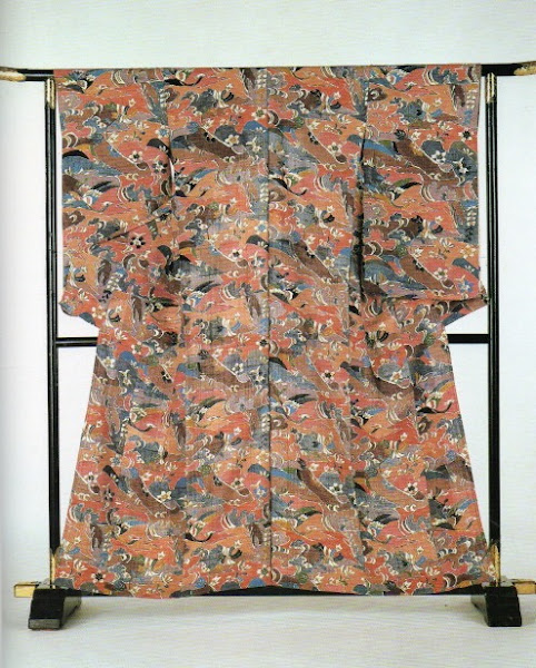
The Katazome technique uses a rice-paste resist which protects the fabric from the dye. It is extremely durable under limited exposure to moisture. At the same time, it can create a very fine design and can be completely washed from the fabric. Made from a mixture of rice flour and rice bran (nuka), it is first steamed, then kneaded to the proper consistency for even spreading.
Before the paste is applied, the stencil must be cut. The design is drawn on transparent paper that is then applied directly to the stencil paper with wax. With a very sharp knife both layers are cut. The stencil is then reinforced either with fine silk threads, which are laid between the layers of the stencil, or silk gauze, which is applied to the outside of the paper. The stencil is soaked in water to make it pliable, enabling an accurate fit over the fabric. Then the paste is spread over the stencil with a wooden spatula. This process is repeated as often as necessary to complete the design. When the paste is dry, a sizing of soybean extract liquid is applied to it and the fabric, and then the dye is applied. The dyed fabric is left for several days to cure. Then the paste is removed by soaking it in water, and the design becomes visible. Traditionally, each step was performed by a specific artisan, but some craftsman today complete the whole process alone.
Flowers, rocks, and birds are depicted in vibrant colors and designs by Toshiko Soeda.
Murasaki Tsuyukusa (purple spiderwort) by Choko Tachibana. Tiny wild flowers, insects, butterflies and leaf motifs cover the entire surface of the silk crepé.
Kamikochi, a playful depiction of highland scenery by Nobuo Sekiguchi.
This silk crepé has been stencil dyed with motifs of pine, iris maple, blue bellflower, flowing water, rustic fences, and festive outdoor curtains. Akiko Ueshima collection.
The following three fabrics below are stencil-dyed cotton yukata fabric. The fabric of this type is considered appropriate for young women. They are a part of the Seung Kim Collection.
Reference:
[1] A. Yang and R. M. Narasin, Shufunotomo. Co. Ltd.,Tokyo (1989).
Preamble
Just as a reminder, intaglio prints can be created using solarplates. Here UV light only penetrates the clear area of the transparency and hardens the polymer, whereas areas beneath the opaque lines of the drawing remains soluble and so can be removed.
For your convenience I have listed other posts in this series:
Intaglio Prints Created Using Solarplates - Part I
Intaglio Prints Created Using Solarplates - Part II
Intaglio Prints Created Using Solarplates - Part III
Intaglio Prints Created Using Solarplates - Part IV
Intaglio Prints Created Using Solarplates - Part V
Intaglio Prints Created Using Solarplates[1] - Part VI
Intaglio Prints Created Using Solarplates - Part V [1]

Creator: Marta Romer.
Title: Matter # 3 (1998).
Print: Single exposure intaglio print.
Size: 7.5 x 10.5 in (19 x 26.7 cm).
Comment [1]: Color photocopiers can vary in quality, but the newer machines have a good tonal range which can endow a print with soft, subtle qualities. Here, Marta Romer collaged a variety of images, including an original drawing, a photograph, and digital images, and printed them on to a transparency using color photocopier set on black and white.
Creator: Deborah Donelson.
Title: Untitled (1996).
Print: Single exposure intaglio print.
Size: 30 x 22 in (76 x 56 cm).
Comment [1]: Debra Donelson created an image on clear glass by drawing with India ink and rubber stamps. The resulting plate was printed with Gamblin Portland Black, a richly pigmented ink, which added more plate tone to the final image.
Creator: Joanna Melrose.
Title: Fundy Shore Breeze (1998).
Print: Single exposure intaglio print.
Size: 15 x 20 in (38 x 51 cm).
Comment [1]: This image originated from painting lithographic tusche on grained glass to create the subtle effects captured by this plate.
Creator: Esteban Vicente.
Title: Untitled (1996).
Print: Mixed relief and intaglio print.
Size: 18 x 12 in (45.7 x 30.5 cm).
Comment [1]: Esteban Vicente drew on grained glass with charcoal from which a single exposure intaglio plate was made and inked in black. Color was added to the image by cutting interesting shapes from scrap solarplate and inking them with rollers. These small relief plates were inked and printed separately.
Creator: William Negron.
Title: Tandem (1998).
Print: Double exposure intaglio print.
Size: 18 x 24 in (45.7 x 61 cm).
Comment [1]: Working directly on the plate with etching ink can yield very expressive prints and is a very spontaneous way of working. William Negron uses the double exposure technique to capture as much tone as possible from his painting.
Creator: Pauline Muir.
Title: Joy (1998).
Print: Single exposure intaglio print.
Size: 3 x 23.75 in (7.5 x 9.5 cm).
Comment [1]: Pauline Muir worked the plate with etching ink, inked it in intaglio and painted with monoprinting inks before printing.
Creator: Gary Wright.
Title: Return to the Womb (1996).
Print: Three plate relief and intaglio print.
Size: 11.5 x 5.25 in (30 x 13 cm).
Comment [1]: Gary Wright printed two plates in intaglio, one a solarplate and one an etched metal plate. The third plate was a relief solarplate made from a photocopy of a circuit board, and was printed with silver lithographic ink to form an overlay.
Reference:
[1] D.Welden and P. Muir, Printmaking in the Sun, Watson-Guptill Publications, New York (1997).
Preamble [1]
'Melbourne Now' was an art exhibition mounted by the National Gallery of Victoria (Melbourne, Australia) in 2014. It took as its premise the idea that a city is significantly shaped by the artists, designers, architects, choreographers, intellectuals, and community groups that lived and worked in the midsts of this multi-cultural city. The aim was to explore how Melbourne's visual artists and creative practitioners contributed to the dynamic cultural identity of this city. The result was an exhibition that celebrates what was unique about Melbourne's art, design, and architectural collectives.
The intention of the exhibition was to encourage and inspire everyone to discover some of the best of Melbourne's culture. To help achieve this, family-friendly activities, dance and music performances, inspiring talks from creative practitioner's, city walks and ephemeral installations and events made up the public program.
This and other posts in this series concentrate on the participating artists, rather than on other features of the exhibition event such as the family-friendly commissions developed especially for children and young audiences that was aimed to encourage participatory learning for children and their families in general.
For your convenience I have listed below other posts on this blogspot that features Melbourne Now exhibitions:
Melbourne Now - Part I
Melbourne Now - Part II
Melbourne Now - Part III
Melbourne Now - Part IV
Melbourne Now - Part V
Melbourne Now - Part VI
Melbourne Now - Part VII
Melbourne Now - Part VIII
Melbourne Now - Part VII [1]
Tama tk Favell
Contemporary printmaker Tama tk Favell works mainly in linocut and other forms of relief printing. The artist was born in Otepoti/Dunedin, Aotearoa/New Zealand, and moved to Melbourne (Australia) in 2001. He studied printmaking at the Victorian College of the Arts, receiving a Bachelor of Fine Arts (Honours) in 2010.
Favell's 'Pacific Transformer' series of linocuts (2009-2013) for 'Melbourne Now' explores and develops the idea that male spiritual identity can be expressed through iconographic tattooing, creating a cultural means of gender transition as an alternative and/or addition to Western medical models. His use of mulberry paper is a tribute to and continuation of the use of tapa cloth (beaten mulberry bark) at times of transition throughout the Pacific. This powerful body of work is an account of the negotiation and navigation required to live between worlds. It is about moving between forms, changing form, the integration of self and culture and being takatapui, queer/transgender in a culturally Pacific sense. Favell's ultimate vision is for his imagery to be applied to his skin.
Tama tk Favell, Pacific Transformer 3 (2009-2013).
National Gallery of Victoria, Melbourne (Australia).
Emily Floyd
Melbourne-born artist, Emily Floyd, holds a Bachelor of Fine Arts from Swinburne University of Technology (Melbourne, Australia) and a Bachelor of Fine Art (Sculpture) from RMIT University (Melbourne, Australia). Since 2001 she has represented numerous solo exhibitions, including at the Bendigo Art Gallery; Monash University Museum of Art, Melbourne; and the Museum of Contemporary Art, Sydney, amongst others.
Floyd's prints and sculptures explore the history of pedagogical play, employing it as a framework for investigations into literature, typography, protest, public art and the legacy of modernism. Her work incorporates bold color and geometrical forms referencing early modernist movements and collectives such as De Stijl, the Bauhaus and Russian Constructivism. Floyd's work in 'Melbourne Now, Students in dissent (2013)' is a collaborative screen-printing project with Steward Russell, Warren Taylor and students from Monash Art Design and Architecture. The project was generated through Floyd's research into the history and legacy of radical student organizations based at Monash University during the 1960s and 1970s. The group worked together to reproduce nine political posters from the archives of former Monash Labor Club activist, Ken Mansell.
E. Floyd, S. Russell, W. Taylor and students from Monash Art Design and Architecture: J. Aucutt, M. Coombs, J. Dixon, P. Failla, J. Gordon, B. Hosford, J. Hoskin, S. Liu, G. Munn, P. Sin, K. Soda, V. Taing, N. truong, L. Walker, and J. Williams, Students in Dissent (2013).
Juan Ford
In his work, Juan Ford often pursues themes of transformation and discord between man and nature. While best known for realist paintings of people, landscape, nature, light and shadow, in recent times Ford has branched out and created installations, incorporating photography. The artist lives in Melbourne (Australia) and graduated from RMIT University in 1998. He has exhibited extensively throughout Australia in solo and group shows, and has work in the National Gallery of Victoria's collection.
Separation, alignment and cohesion are three interrelated concepts applied by scientists in their attempt to understand the flocking behaviour of birds. For his 'Melbourne Now' commission for kids, 'You, me and the flock (2013),' Ford investigates how this behaviour is related to human beings by inviting viewers of all ages to add birds to a flock that inhabits a panoramic sky-scape. Each bird added changes the flock's shape and movement as it grows and becomes overpopulated, resulting in some birds breaking away to form another configuration. With this playful installation, Ford poses challenging questions about human behaviour, highlighting our interaction with precious natural habitats.
Juan Ford, 'You, me and the flock' (Detail, 2013).
Supported by Melbourne Now Champions - the Dewhurst family.
Louise Forthun
For the past three decades, Louise Forthun has worked the urban landscape to the point of abstraction. The artist uses stencil painting processes to pile layers of architectural representations on top of one another, enveloping the viewer in a hypnotic vision of the contemporary metropolis. Since she began exhibiting in Melbourne in the 1990s, Forthun has sustained an ongoing investigation into critical abstraction through her work. She describes herself as a visual artist who makes paintings that explore abstractation's objective as well as non-objective dimensions.
For 'Melbourne Now,' Forthun contributes one of her most ambitious works to date - a portrait of Melbourne entitled, 'Bright light (2011).' More than five meters in length, Forthun's representation of her home city interweaves details drawn from an aerial plan of Melbourne with more familiar representations of its landmarks to create an immersive spatial construction that echoes in the frenetic energy of its source.
Louise Forthun, Bright Light (2011).
Patrick Francis
Patrick Francis began exhibiting at Arts Project Australia, Melbourne, in 2009, when he was eighteen years old. Since then his work has been included in every Arts Project Annual Gala Exhibition and numerous group exhibitions, the most recent being 'Classic Albums,' 2012 and 2013, and 'At The Table,' 2013. In 2012 Francis was selected as one of Arts Project Australia's featured artists for Melbourne Art Fair, and was also awarded the 2012 Art & Australia Credit Suisse Private Banking Contemporary Art Award.
A prolific painter, Francis works primarily in acrylic on paper. His paintings draw from his personal experiences, from first-hand encounters with Melbourne to his knowledge of popular culture and art history. Using a bold color palette, Francis' paintings are refined, expressive representations of portraiture and still life. His work's subject matter ranges from well-known celebrities and icons - from Marilyn Monroe to the fifteenth century Italian Renaissance author, Balassare Castiglione - to observations of everyday life. Francis has also interrupted the work of iconic Australian painters, including Sidney Nolan's early Ned Kelly series.
Patrick Francis - Ballet Dancer, Laura (2012).
Marco Fusinato
Marco Fusinato is a Melbourne-based artist whose practice references the rhetoric of radical politics (its ambitions and failures), noise as music and the frameworks of conceptual art. Through wide ranging forms of work in gallery contexts, Fusinato foregrounds moments of disruption and impact in which lie the possibility of a shift in perception or change in the course of events. Most recently, his work was included in 'Soundongs: A Contemporary Score,' the first sound exhibition at the Museum of Modern Art, New York (2013). Fusinato also performs regularly in the international experimental music underground, manipulating the guitar to produce what would have been referred to as 'improvised noise-spit tsunamis.'
For 'Melbourne Now,' Fusinato presents 'Aetheric plexus (Broken X)' (2013), a dispersed sculpture comprising deconstructed stage equipment that is activated by the presence of the viewer, triggering a sensory onslaught with a resonating orphic haze. The work responds to the wider context of galleries, in the artist's word,'...changing from places of reflection to palaces of entertainment...' by turning the engulfed audience member into a spectacle.
Marco Fusinato, Aetheric Plexus (2009).
Note: Installation view (Australian Centre for Contemporary Art, Melbourne, Australia).
Commissioned for 'Melbourne Now,' from the support of Joan Clemenger, AM.
Reference:
[1] T. Ellwood, Director, National Gallery of Victoria (Melbourne, Australia).
Preamble
This is the forty-fifth post in a new Art Resource series that specifically focuses on techniques used in creating artworks. For your convenience I have listed all the posts in this new series below:
Drawing Art
Painting Art - Part I
Painting Art - Part II
Painting Art - Part III
Painting Art - Part IV
Painting Art - Part V
Painting Art - Part VI
Home-Made Painting Art Materials
Quality in Ready-Made Artists' Supplies - Part I
Quality in Ready-Made Artists' Supplies - Part II
Quality in Ready-Made Artists' Supplies - Part III
Historical Notes on Art - Part I
Historical Notes on Art - Part II
Historical Notes on Art - Part III
Historical Notes on Art - Part IV
Historical Notes on Art - Part V
Tempera Painting
Oil Painting - Part I
Oil Painting - Part II
Oil Painting - Part III
Oil Painting - Part IV
Oil Painting - Part V
Oil Painting - Part VI
Pigments
Classification of Pigments - Part I
Classification of Pigments - Part II
Classification of Pigments - Part III
Pigments for Oil Painting
Pigments for Water Color
Pigments for Tempera Painting
Pigments for Pastel
Japanese Pigments
Pigments for Fresco Painting - Part I
Pigments for Fresco Painting - Part II
Selected Fresco Palette for Permanent Frescoes
Properties of Pigments in Common Use
Blue Pigments - Part I
Blue Pigments - Part II
Blue Pigments - Part III
Green Pigments - Part I
Green Pigments - Part II
Red Pigments - Part I
Red Pigments - Part II
Yellow Pigments - Part I
Yellow Pigments - Part II
Brown and Violet Pigments
Black Pigments
White Pigments - Part I
White Pigments - Part II
White Pigments - Part III
Inert Pigments
Permanence of Pigments: New Pigments - Part I
Permanence of Pigments: New Pigments - Part II
Limited or Restricted Palettes
There have been another one hundred and thirteen posts in a previous Art Resource series that have focused on the following topics:
(i) Units used in dyeing and printing of fabrics;
(ii) Occupational, health & safety issues in an art studio;
(iii) Color theories and color schemes;
(iv) Optical properties of fiber materials;
(v) General properties of fiber polymers and fibers - Part I to Part V;
(vi) Protein fibers;
(vii) Natural and man-made cellulosic fibers;
(viii) Fiber blends and melt spun fibers;
(ix) Fabric construction;
(x) Techniques and woven fibers;
(xi) Basic and figured weaves;
(xii) Pile, woven and knot pile fabrics;
(xiii) Durable press and wash-and-wear finishes;
(xvi) Classification of dyes and dye blends;
(xv) The general theory of printing.
To access any of the above resources, please click on the following link - Units Used in Dyeing and Printing of Fabrics. This link will highlight all of the one hundred and thirteen posts in the previous a are eight data bases on this blogspot, namely, the Glossary of Cultural and Architectural Terms, Timelines of Fabrics, Dyes and Other Stuff, A Fashion Data Base, the Glossary of Colors, Dyes, Inks, Pigments and Resins, the Glossary of Fabrics, Fibers, Finishes, Garments and Yarns, Glossary of Art, Artists, Art Motifs and Art Movements, Glossary of Paper, Photography, Printing, Prints and Publication Terms and the Glossary of Scientific Terms. All data bases in the future will be updated from time-to-time.
If you find any post on this blog site useful, you can save it or copy and paste it into your own "Word" document for your future reference. For example, Safari allows you to save a post (e.g. click on "File", click on "Print" and release, click on "PDF" and then click on "Save As" and release - and a PDF should appear where you have stored it). Safari also allows you to mail a post to a friend (click on "File", and then point cursor to "Mail Contents On This Page" and release). Either way, this or other posts on this site may be a useful Art Resource for you.
The new Art Resource series will be the first post in each calendar month. Remember - these Art Resource posts span information that will be useful for a home hobbyist to that required by a final year University Fine-Art student and so undoubtedly, some parts of any Art Resource post may appear far too technical for your needs (skip those mind boggling parts) and in other parts, it may be too simplistic with respect to your level of knowledge (ditto the skip). The trade-off between these two extremes will mean that Art Resource posts will be hopefully useful in parts to most, but unfortunately may not be satisfying to all!
Yellow Pigments - Part II [1]
Strontium Yellow is seldom included in elementary, or simplified palettes, but it should not be overlooked when very light, clear yellows, chartreuses, or light greens are needed, or when a variety of greens is sought after. It has not the density of Cadmium Yellow, and so is rated as semi-opaque.
Strontium Yellow.
Strontium Yellow is the preferred member of a family of three pigments of identical hue; the other two are Zinc Yellow, which is somewhat water-soluble and has a tendency to become greenish, and Barium Yellow, which is permanent but much less intense in color.
Zinc Yellow.
Barium Yellow.
Naples Yellow seems to have been the most disputed yellow pigment among nineteenth-century painters and commentators; some claim that it was indispensable and others that its color might easily be duplicated by mixtures of white with other yellows. The true product, Lead Antimonate, was for a period not standardized; it was even claimed that no such pigment has ever been in general use, and that any pigment combination of similar superficial hue or top tone could be sold under its label. This is because it never has had any industrial significance, and has never been made in other than small quntities as an artists' color and for ceramic use. The precautions for the use of lead-bearing pigments apply to it; it has the same defects as white lead.
Lead Antimonate.
True Naples Yellow in oil has the peculiar property of turning a muddy green when the paste is rubbed with a steel palette knife. This does not occur when a stainless steel blade is used. Older books recommend spatulas with horn or hard rubber blades.
Genuine Naples Yellow Light PY41 Pigment.
Genuine Naples Yellow is produced in limited amounts in about six shades, from greenish yellow to a comparatively pinkish orange yellow. These shades are not very different, and the usual material avaliable on the market as a dry color seldom offers a choice of more than two shades, generally called light and dark.
The six shades of Naples Yellow.
Note: The last color is not a shade because the end result of this trend must be a white.
Because of its permanence to light, and the general all-round excellence of its pigment properties, which closely resemble those of flake white, Naples Yellow is well liked by painters. There is scarcely any advantage in buying imitation Naples Yellow made with mixed pigments, because it will not duplicate the unique pigment properties of the original, and furthermore, such approximations can easily be made on the palette. Nevertheless, most Naples Yellow oil colors are now these mixtures; when based on Zinc Oxide they will not have the special brushing characteristics for which the true Naples Yellow has which was noted above, and which was a large factor in its survival. Made with flake white, such mixtures would undoubtedly be a closer approximation to the original.
Da Vinci Hansa Yellow Light Oil-Paint 37ml tube swatch.
Ochres occur in all parts of the world, but the finest ones, in fact the only ones suitable for artist's colors, are mined in France, where they are most carefully washed, refined, and placed on the market as recognized uniform grades designated by a series of letters established by long use. For example, one of the most desirable ochres is called J.F.L.S., which stands for jaune, fin, lavé, surfin. Mars Yellow is much more brilliant and powerful than the ochres and raw siennas; theoretically it should supplant them, especially because of its purity, but most artists continue to prefer the more delicate and subtle tones of Native Earths.
The Ochre mines are just a short walk from the centre of Roussillon village (France). It is easy to reach on foot and clearly signposted. You can also see the red cliff that is on one edge of the mines from the centre of the village, so they are very easy to find.
Reference:
[1] The Artist's Handbook of Materials and Techniques, R. Mayer (ed. E. Smith) 4th Edition, Faber and Faber, London (1981).

 Flowers, rocks, and birds are depicted in vibrant colors and designs by Toshiko Soeda.
 Murasaki Tsuyukusa (purple spiderwort) by Choko Tachibana. Tiny wild flowers, insects, butterflies and leaf motifs cover the entire surface of the silk crepé.
 Kamikochi, a playful depiction of highland scenery by Nobuo Sekiguchi.
 This silk crepé has been stencil dyed with motifs of pine, iris maple, blue bellflower, flowing water, rustic fences, and festive outdoor curtains. Akiko Ueshima collection.


