Dangerfork [1]
Dangerfork Print Co. is the brainchild of creative couple, Chris Drummond and Megan Quigley. The company produces and sells limited edition screen prints.
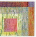
Dangerfork, Silk Screen (2013).
Chris Drummond and Megan Quigley.
The Melbourne-based Australian boutique screen printer and print gallery, where these artists print work for other artists, was born in 2010, when the husband and wife team returned to their home city after a stint in Europe.
Specializing in fine-art screen printing, Chris and Megan print on a number of media including wood, canvas, glass and film, but favour paper printing.
Ink dots black spots (2013).
They endeavour to maintain the highest level of quality and workmanship by collaborating with each artist to produce the best possible screen print. They often work with each artist personally to help establish a basic understanding of screen printing and highlight the qualities the medium can bring to the artwork.
Dangerfork Richmond (Australia) Studio (2013).
Dangerfork uses a hand-pulled screen-printing process, and prints using environmentally friendly water-based inks. Because everything is done by hand, there are many variables that can have an impact on the final product, but that's simply part of the charm of screen printing. Every print is unique and is numbered and embossed with the Dangerfork seal. Dangerfork sells a selection of limited-edition prints by Australian and International artists through its studio outlet in Melbourne (Australia).
Mysterious AI, print on racks (2012).
Color Swatches (2013).
Test Prints (2013).
Dangerfork paper emboss (2012).
Reference:
[1] M.Smith, People of Print, Thames & Hudson, London (2017).
Preamble
For your convenience, I have listed below other posts in this series:
Optical Illusions - Part I
Optical Illusions - Part II
Introduction [1]
Optical illusions in this post come from recent work in vision and perception laboratories, and others come from a variety of modern artists, who have deliberately incorporated an "obvious" illusion into a drawing, photograph, or sculpture. There were also quite a number of illusions that were created specially by the team, who put this book together. Of course, you will find the familiar classics here too, making the images below an invaluable reference source for those interested in studying illusion.
Optical Illusions - Part I [1]

Color Assimilation Do you perceive a reddish hue within the white squares on the right and a bluish hue within the white squares on the left?
Shepard's Tabletop: These two tabletops are absolutely identical in size and shape. If you don't believe it, trace only the tabletops and see for yourself.
Fraser's Spiral: It is one of the most powerful illusions known. What you see appears to be a spiral, but it is really a series of perfect concentric circles! This illuson is so powerful that it has been known to induce incorrect finger tracing.
Extent and Perspective: Although they appear to be dramatically different in length, lines AB and CD are equal.
The Scintillating Grid: The disks at the junctions will appear to flash, when you move your eyes around this image.
Checker Shadow: The light check inside the shadow is identical to the dark check outside the shadow. If you don't believe it, cut out a peephole exactly the size of each square and test it.
Escher's Impossible Box: Belgian artist Matheau Haemakers, drawing his inspiration from a print by Dutch graphic artist M.C. Escher, has created a physical model of an impossible box.
Ouchi Illusion: Move the image back and forth. The center section may appear to move in a direction different from its surroundings. The center section will also appear to be at a different depth.
Reference:
[1] A. Seckel, The Fanatastic World of Optical Illusions, Carlton Books Limited (2002).
Preamble
Art Quilts have featured on this blogspot and so for your convenience I have listed below previous posts in this series:
Art Quilts - Part I
Art Quilts - Part II
Art Quilts - Part III
Art Quilts - Part IV
Art Quilts - Part V
Art Quilts - Part VI
Art Quilts - Part VII
Art Quilters of the Netherlands - Part I
Art Quilters of the Netherlands - Part II
Art Quilters of the Netherlands - Part III
Four Selected European Art Quilters - Part I
Four Selected European Art Quilters - Part II
Four Selected European Art Quilters - Part III
Art Quilts of Jane Sassaman
Art Quilts of Michael A. Cummings
Four Selected European Art Quilters - Part IV
Art Quilts of Carolyn Crump
Jan Myers-Newbury
Art Quilts of Karin Franzen
Art Quilts of Emily Richardson
Four Selected European Art Quilters - Part V
Art Quilts of Jan Myers-Newbury [1]
Inspired by the colors she is able to create in her dye baths, Jan Myers-Newbury uses a variation of arashi shibori techniques to produce the seductive hues that make her quilts glow.
Jan Myers-Newbury.
During the arashi shibori process, Myers-Newbury wraps white fabric around a pole and binds it with string or thread, then submerges it in a series of dye baths. The wrapping and tying results in thin lines of color that enliven the surfaces of her quilts.
Title: Upon Reflection (2008).
Materials and Techniques: Cotton: hand dyed, discharged, arashi shibori, clamp resist, machine pieced, and machine quilted.
Size: 48.5 x 75 inches (1.2 x 1.9 m).
Photograph: Courtesy of artist.
Detail view of a portion of the quilt.
Myers-Newbury begins each new quilt by playing with fabric on her design wall, and color dictates nearly all of her creative decisions. She cuts her fabric into squares and rectangles, then arranges and rearranges the shape until they coalesce into an ordered whole.
Title: Urubamba (2006).
Materials and Techniques: Cotton: hand dyed, arashi shibori, machine pieced, machine quilted.
Size: 62 x 52.5 inches (1.5 x 1.3 m).
Photograph: Courtesy of Sam Newbury.
Comment: I never have a notion of how a finished piece will look at the outset. I start with fabrics that I like and arrange them by color and scale. Once I see how things are filling in, I start to work more specifically to balance the whole.
Title: Wild Thing (2008).
Materials and Techniques: Cotton: hand dyed, arashi shibori, discharged, machine pieced, machine quilted.
Size: 63 x 84 inches (1.6 x 2.1 m).
Photograph: Courtesy of Sam Newbury.
Title: Coronae (2004).
Materials and Techniques: Cotton: hand dyed, arashi shibori, clamp resist, machine pieced, machine quilted.
Size: 59 x 42 inches (1.5 x 1 m).
Photograph: Courtesy of Sam Newbury.
Comment: In 1992, I made my first all-shibori quilt. Since then, I've been working mostly with arashi shibori, combined at times with clamp resist.
Title: Boogie Woogie (2005).
Materials and Techniques: Cotton: hand dyed, arashi shibori, machine pieced, machine quilted.
Size: 33 x 44 inches (83.8 x 111.8 cm).
Photograph: Courtesy of Sam Newbury.
Detailed View.
Title: Ode to Albers (2004).
Materials and Techniques: Cotton: hand dyed, arashi shibori, clamp resist, machine pieced, machine quilted.
Size: 75 x 75 inches (1.9 x 1.9 m).
Photograph: Courtesy of Sam Newbury.
Detailed View.
Title: It's Dark Outside (2006).
Materials and Techniques: Cotton: hand dyed, arashi shibori, machine pieced, machine quilted.
Size: 64 x 54 inches (1.6 x 1.3 m).
Photograph: Courtesy of Sam Newbury.
Title: Interuptions (2008).
Materials and Techniques: Cotton: hand dyed, arashi shibori, machine pieced, machine quilted.
Size: 34 x 44 inches (86.4 x 111.8 cm).
Photograph: Courtesy of Sam Newbury.
Comment: My work has always been about intellectual and spiritual matters. It's important to me that a quilt be beautiful and orderly.
Title: Moog (2006).
Materials and Techniques: Cotton: hand dyed, arashi shibori, clamp resist, machine pieced, machine quilted.
Size: 68 x 72 inches (1.7 x 1.8 m).
Photograph: Courtesy of Sam Newbury.
Title: Ten Squared (2009).
Materials and Techniques: Cotton: hand dyed, discharged, arashi shibori, machine pieced, machine quilted.
Size: 60 x 60 inches (1.5 x 1.5 m).
Photograph: Courtesy of the artist.
Reference:
[1] Masters: Art Quilts, Vol. 2, Curated by M. Sielman, Lark Crafts, An Imprint of Sterling Publishing Co., Inc., New York (2011).
Preamble
This is the forty-sixth post in a new Art Resource series that specifically focuses on techniques used in creating artworks. For your convenience I have listed all the posts in this new series below:
Drawing Art
Painting Art - Part I
Painting Art - Part II
Painting Art - Part III
Painting Art - Part IV
Painting Art - Part V
Painting Art - Part VI
Home-Made Painting Art Materials
Quality in Ready-Made Artists' Supplies - Part I
Quality in Ready-Made Artists' Supplies - Part II
Quality in Ready-Made Artists' Supplies - Part III
Historical Notes on Art - Part I
Historical Notes on Art - Part II
Historical Notes on Art - Part III
Historical Notes on Art - Part IV
Historical Notes on Art - Part V
Tempera Painting
Oil Painting - Part I
Oil Painting - Part II
Oil Painting - Part III
Oil Painting - Part IV
Oil Painting - Part V
Oil Painting - Part VI
Pigments
Classification of Pigments - Part I
Classification of Pigments - Part II
Classification of Pigments - Part III
Pigments for Oil Painting
Pigments for Water Color
Pigments for Tempera Painting
Pigments for Pastel
Japanese Pigments
Pigments for Fresco Painting - Part I
Pigments for Fresco Painting - Part II
Selected Fresco Palette for Permanent Frescoes
Properties of Pigments in Common Use
Blue Pigments - Part I
Blue Pigments - Part II
Blue Pigments - Part III
Green Pigments - Part I
Green Pigments - Part II
Red Pigments - Part I
Red Pigments - Part II
Yellow Pigments - Part I
Yellow Pigments - Part II
Brown and Violet Pigments
Black Pigments
White Pigments - Part I
White Pigments - Part II
White Pigments - Part III
Inert Pigments
Permanence of Pigments: New Pigments - Part I
Permanence of Pigments: New Pigments - Part II
Limited or Restricted Palettes
There have been another one hundred and thirteen posts in a previous Art Resource series that have focused on the following topics:
(i) Units used in dyeing and printing of fabrics;
(ii) Occupational, health & safety issues in an art studio;
(iii) Color theories and color schemes;
(iv) Optical properties of fiber materials;
(v) General properties of fiber polymers and fibers - Part I to Part V;
(vi) Protein fibers;
(vii) Natural and man-made cellulosic fibers;
(viii) Fiber blends and melt spun fibers;
(ix) Fabric construction;
(x) Techniques and woven fibers;
(xi) Basic and figured weaves;
(xii) Pile, woven and knot pile fabrics;
(xiii) Durable press and wash-and-wear finishes;
(xvi) Classification of dyes and dye blends;
(xv) The general theory of printing.
To access any of the above resources, please click on the following link - Units Used in Dyeing and Printing of Fabrics. This link will highlight all of the one hundred and thirteen posts in the previous a are eight data bases on this blogspot, namely, the Glossary of Cultural and Architectural Terms, Timelines of Fabrics, Dyes and Other Stuff, A Fashion Data Base, the Glossary of Colors, Dyes, Inks, Pigments and Resins, the Glossary of Fabrics, Fibers, Finishes, Garments and Yarns, Glossary of Art, Artists, Art Motifs and Art Movements, Glossary of Paper, Photography, Printing, Prints and Publication Terms and the Glossary of Scientific Terms. All data bases in the future will be updated from time-to-time.
If you find any post on this blog site useful, you can save it or copy and paste it into your own "Word" document for your future reference. For example, Safari allows you to save a post (e.g. click on "File", click on "Print" and release, click on "PDF" and then click on "Save As" and release - and a PDF should appear where you have stored it). Safari also allows you to mail a post to a friend (click on "File", and then point cursor to "Mail Contents On This Page" and release). Either way, this or other posts on this site may be a useful Art Resource for you.
The new Art Resource series will be the first post in each calendar month. Remember - these Art Resource posts span information that will be useful for a home hobbyist to that required by a final year University Fine-Art student and so undoubtedly, some parts of any Art Resource post may appear far too technical for your needs (skip those mind boggling parts) and in other parts, it may be too simplistic with respect to your level of knowledge (ditto the skip). The trade-off between these two extremes will mean that Art Resource posts will be hopefully useful in parts to most, but unfortunately may not be satisfying to all!
Brown and Violet Pigments [1]
Brown Pigments [1]
Vandyke Brown was employed, not so much for its general hue, which might have been matched by a mixture of black, red oxide, and a little ochre or sienna, but for its rich, deep tones against which the umbers seem chalky.
Vandyke Brown.
Burnt Umber.
Old oil paintings in which iBurnt umber was employed are frequently found to be deteriorated into a mass of wide traction fissures.
Note: A whole art restoration industry has been created to repair wide traction fissures associated with the use of Burnt umber (see above).
Burnt Sienna is one of the most valuable pigments for producing mixed or broken hues of depth and clarity. Like the other Earths, it is sold in a great variety of top-tones, but the undertones are fairly uniform. In oil colors, the deepest and darker mahogany shades are the most useful and will yield the least chalky results in mixtures.
Note: Further mention of some of these mixtures will be found in a post under 'Green Pigments.'
Mahogany Paint.
Burnt Sienna is classified sometimes as a brown, and sometimes as a red. In a very restricted or simplified oil palette, it can be used as a red; in most mediums (like pastel, gouache, and tempera) the color effect of its top-tone is so close to those of Indian or Light Reds, that the latter are frequently considered as unnecessary labels.
Burnt Sienna.
Raw and Burnt Umbers are the most widely used browns; they have a pronounced siccative effect on oil, and tend to produce tough, flexible, leathery films. Their oil content is so high that when used to full strength in undercoats, they have the tendency to produce crackling of the top coat, as noted in the previous posts on 'Oil Painting.' To be on the safe side, they should not be used in underpaintings in greater concentration than 40% admixture with pigments of low or medium oil absorption; up to this amount, they may be added to undercoats in order to secure quick drying and uniform, durable oil paint films.
Raw Umber.
Burnt Umber.
Sepia and Bistre, used exclusively in water colors and wash drawings, are not so commonly employed as they were in the past. Sepia is rated as a semi-permanent or a borderline color, whereas Bistre is definitely not permanent. Bistre is a rather cool, greenish brown compared with Sepia. The difference between them is analogous to that between Raw and Burnt Umbers, but their tones are more subtle and delicate than those of the Umbers. Bistre use is now very rare.
Sepia.
Bistre.
Both Sepia and Bistre were valued for their versatility in producing water color washes of great variation in tone or color, depending on their dilution with water; therefore, in the case of a substitute color used to replace one of their hues, a diluted or more highly concentrated mixture will not necessarily match the diluted or more highly concentrated original.
Violet Pigments [1]
The use of violet pigments in painting is generally limited; many painters prefer the broken violets produced by mixtures of blues and reds, because they fall into the average color scheme better than the pure, clear violet pigments, which, as a rule, tend to produce cold or harsh effects. When a bright, clean violet color is desired Cobalt Violet is usually found suitable by most painters.
Note: The poisonous nature of cobalt violets required extra occupational, health and safety procedures in order to ensure their use is safe.
Cobalt Violet.
Compared with bright cobalt and manganese violets, Mars Violet is dull and subdued, but when used straight or in mixtures on the average picture of low intensity, it serves well to produce the majority of purple and lavender colors ordinarily required.
Mars Violet.
Reference:
[1] The Artist's Handbook of Materials and Techniques, R. Mayer (ed. E. Smith) 4th Edition, Faber and Faber, London (1981).

 Dangerfork, Silk Screen (2013).
 Chris Drummond and Megan Quigley.
 Ink dots black spots (2013).
 Dangerfork Richmond (Australia) Studio (2013).
 Mysterious AI, print on racks (2012).
 Color Swatches (2013).
 Test Prints (2013).
 Dangerfork paper emboss (2012).