Tugboat Printshop [1]
Paul Roden and Valarie Lueth are the collaborate woodcut artists known as Tugboat Printshop. The couple have been publishing their traditionally hand-crafted color woodblock print editions from Pittsburgh, Pennsylvania since 2006.
Moon, woodcut in progress (2012).
Moon, woodcut (2012).
Tugboat Printshop's intricate color woodcuts celebrate their natural world and humankind's relationship to it. With extreme focus on craft and detail, the artists build idealistic, nostalgic and meticulously patterned worlds with traditionally made prints. Rich color is layered in multiple impressions from hand-drawn, hand-carved and individually printed wood blocks.
Garden, woodcut in progress (2012).
Garden, woodcut (2012).
All prints are published with high quality oil-based inks onto fine papers. Tugboat Printshop's narrative is one of sustainability, resourcefulness and an upbeat do-good attitude.
Desert Island, woodcut in progress (2012).
Clod, woodcut (2012).
Bonfire, woodcut (2010).
Reference:
[1] M. Smith and A. Cook, People of Print, Thames & Hudson, London (2017).
Age of Reason [1]
Age of Reason is a UK print label with a playful punk twist. It prides itself on making beautiful natural fiber scarves from silk, cashmere and wool, which are available in some of the world's best boutiques. Audacious prints and beautiful fabrics define the work, which is inspired by the collision between designer Ali Mapletoft's African childhood and the streets of London.
Lollipop Queen. (Digital print, 2014).
Ali marries her own sketchy drawing style with bold color combinations and textures inspired by her travel and personal history. A large dose of quintessentially British humor finishes off Ali's signature style.
Age of Reason, No More Drama. (Digital print, 2014).
'I want Age of Reason to be the antidote to cute kitten and chintzy flowers on scarves,' says Ali. "My passion is to surprise and delight people by creating things that are more thoughtful, bolder, naughtier or more excited than expected. A scarf should never be boring, it should become part of your own style story and be a very special rare thing that can't be found everywhere.'
Age of Reason permanent collection classic scarves. (Digital, 2014).
Age of Reason, Ship in a Storm. (Digital print, 2014).
Age of Reason, Swag Lime. (Digital print, 2014).
Reference:
[1] M. Smith and A. Cook, People of Print, Thames & Hudson, London (2017).
Preamble
On this blog spot there are posts that center on my “Wearable Art” (e.g. scarves, digital or analogue created fabric lengths etc.) For your convenience I have listed these posts below.
A Selection of My Scarves
Leaves Transformed: A New Collection of My Digitally Designed Fabrics
My New Silk Rayon Velvet Scarves@Purple Noon Art And Sculpture Gallery
My Fabric Lengths@QSDS
My Fabric Collection:"Oh, Oh Marilyn and Mona!"@Spoonflower
2013 Australian Craft Awards – Finalist
My Scarves@2014 Scarf Festival: "Urban Artscape" Pashminas
My New Scarves and Fabric Lengths
New Range of Silk Neckties - Karma and Akash
AIVA: My New Hand Dyed and Hand Printed Fabric Design
New Colorways For My 'Cultural Graffiti' Fabrics
Byzantine Glow: A New Collection of My Digitally Designed Fabrics
Wall Flower: A New Collection of My Digitally Designed Fabrics
Ink Fern - A New Collection of My Digitally Designed Fabrics
Celebratory Fireworks
My New Silk ArtCloth Scarves
New ‘Unique State’ Silk ArtCloth Scarves
UBIRR - My New Hand Dyed & Printed Fabric Design
Renaissance Man - My New Hand Dyed & Printed Fabric Design
Banksia - My New Hand Dyed and Hand Printed Fabric Design
Ginkgo Love - My New Hand Dyed and Hand Printed Fabric Design
Garden Delights I & II - My New Hand Dyed and Hand Printed Fabric Design
Wallflower III - My New Hand Dyed and Hand Printed Fabric Design
Rainforest Beauty - Collection My New Hand Dyed and Hand Printed Fabric Design
Spring & Autumn Flurry Collection - My New Hand Dyed and Hand Printed Fabric Design
La Volute Collection - My New Hand Dyed and Hand Printed Fabric Design
Urban Butterfly - My New Hand Printed Fabric Design
Acanthus Dream - My New Hand Printed Fabric Design
“Cascading Acanthus” - My New Hand Dyed and Hand Printed Fabric Design
My New Hand Dyed and Hand Printed 'Rainforest Beauty' Pashmina Wraps Collection
My ArtCloth Tea Towels: A New Collection of Digitally Designed Products
Through the Land it Roared . . . ArtCloth Shawl
My New Hand Dyed and Hand Printed ‘Urban Codes - Series 1’ Collection
Urban Moonlight - My Post Graffiti Doily
My New Hand Printed Fabric Design - "Morocco" ArtCloth
‘Vine Glow’
“Bush Banksia’s” Collection"
Releasing My New - ‘Unique State’ ArtCloth Scarves
‘LRSP’ A New Collection of Digitally Designed ArtCloth Textiles
If you like any of my artworks in the above links, please email me at - Marie-Therese - for pricing and for any other enquiries.
Introduction - Symbolism of Colors in Moroccan Culture
Colors have always had an eminent position in history; their symbolism can dramatically vary between cultures. Furthermore, colors have a deep psychological dimension as their choice can vividly reflect one’s psychology and personality. Moroccan decorative art is characterized by the prominent use of six colors: White, Black, Blue, Green, Red and Yellow. The symbolism of colors in the Moroccan culture is greatly derived from Islam.
White is associated with wisdom, honor, dignity, purity and creative thinking; Sufi followers consider white as an inner light and describe it as the light of divine secrets. Moroccans wear white clothes in their joyful and sorrowful ceremonies, and in so doing, apply the Sunnah of the Prophet Muhammed who addresses Muslims saying: 'Wear white clothes, ask the living to wear white and shroud the dead in them; they are the best clothes.' On the other hand, black is sometimes related to unclean and satanic things.In fact, there are still some Moroccan families that refuse to wear black clothing or use it in furniture and decorating. Green is associated with nature and fertility. It also symbolizes prosperity, which explains the Moroccan tradition of sewing a green cover for the shrines of saints to seek their blessings. Blue is associated with the absolute and the infinite. It also embodies tranquility and peace of mind. Red is associated with exorcising evil spirits and yellow symbolizes the wilting of objects as they near their end. Click on the following link - Colors in the Moroccan Culture.
Symmetry and Repetition in Design
People often have a visual preference for symmetry and repetition. They are frequently attracted to geometric forms and patterns. We find it inherently fascinating and reassuring about seeing a shape or an image repeated in a formal sequence. Artists understand this human attribute and frequently use pattern and design methodologies for both structural and decorative purposes.
For artists painting Islamic tiles, geometry is the key to achieving the perfect tile. Some designs are made in a way that they strictly work for square tiles, whilst others may only work well on a honeycomb design. The main idea of Islamic tiles is to have each tile perfectly aligned with the next with not a single line or shape unequal to the rest. The complexity and simplicity of Islamic tiles differ greatly from one design to the next.
‘Morocco’ ArtCloth - Concept and Design Processes
My ArtCloth textile design, ‘Morocco’, is fundamentally based on shapes and forms found in Moroccan architecture and tile designs. The design intentionally features colors used in Moroccan symbolism. The piece is concerned with employing the design principles of balance, unity, proportion, color, and texture, as well as the ‘concept’ that underlies the work.
In the printed ArtCloth below, the white stamped images in the mid-ground contain 'arrows' that point to each other, which in turn visually create vertical and horizontal parallel lines. These lines enclose the white stencilled foreground 'flower' images, the blue Moroccan stamped mid-ground 'window' panels and the multi-colored, Moroccan background 'window' silhouettes in individual square panels.
The use of straight, vertical and horizontal lines employed in this piece encapsulates a highly formal, geometric and decorative aesthetic. A contemporary feature that has been integrated into the design elements is the deconstructed, mutli-colored, screenprinted background layer, which adds movement and textural qualities without affecting the balance, unity, colors, and proportions that underlie the design aesthetic and principles which have been employed.
Artist/Creator: Marie-Therese Wisniowski.
Title: ‘Morocco’ (full view).
Technique and Media: Stamped, stencilled and deconstructed/improvisational silk screen prints employing transparent and opaque pigments on cotton.
Size: 50 cm (width) x 100 cm (length).
‘Morocco’ (close view).
‘Morocco’ (detail view).
Preamble
For your convenience, I have listed below other post on Japanese textiles on this blogspot.
Discharge Thundercloud
The Basic Kimono Pattern
The Kimono and Japanese Textile Designs
Traditional Japanese Arabesque Patterns - Part I
Textile Dyeing Patterns of Japan
Traditional Japanese Arabesque Patterns - Part II
Sarasa Arabesque Patterns
Contemporary Japanese Textile Creations
Shibori (Tie-Dying)
History of the Kimono
A Textile Tour of Japan - Part I
A Textile Tour of Japan - Part II
The History of the Obi
Japanese Embroidery (Shishu)
Japanese Dyed Textiles
Aizome (Japanese Indigo Dyeing)
Stencil-Dyed Indigo Arabesque Patterns
Japanese Paintings on Silk
Tsutsugaki - Freehand Paste-Resist Dyeing
Street Play in Tokyo
Birds and Flowers in Japanese Textile Designs
Japanese Colors and Inks on Paper From the Idemitsu Collection
Yuzen: Multicolored Past-Resist Dyeing - Part I
Yuzen: Multi-colored Paste-Resist Dyeing - Part II
Katazome (Stencil Dyeing) - Part I
Katazome (Stencil Dyeing) - Part II
Katazome (Stencil Dyeing) - Part III
Birds and Flowers in Japanese Textile Designs - Part I
Yuzen: Multi-Colored Paste-Resist Dyeing - Part II [1]
Yuzen is classified into two basic types, namely freehand paste drawing (tegaki) yuzen and stencil (kata) yuzen, according to the method of paste application used (see post Yuzen: Multicolored Paste-Resist Dyeing - Part I). Yuzen is also categorized according to the places in which it is dyed. Each locale gives its own flavor and feeling to its work. Kyo (Kyoto) yuzen is aristocratic in design and motifs. Its bright colors contrast with the deeper and more subtly shaded colors of Kaga yuzen, dyed in the Kaga Province using a special plum-juice dye produced there. Another characteristic of Kaga yuzen is the realism of its designs. For example, autumn leaves depicted in Kaga yuzen may show even the brownish stains or holes of insect damage.
Iris flowers in a variety of hues depicted by the Kaga yuzen dyer Uzan Kimura - a living national treasure.
Section of a Kaga yuzen kimono entitled - 'Poetry of Flowers,' by Uzan Kimura. The huge bouquet of blossoms is arranged in a Kutani ceramic vase.
Kaga yuzen always stands alone - it is never combined with embroidery, gold or slver imprint, or other embellishment. The Edo yuzen of Tokyo is more flamboyant and bolder in color and design, reflecting the world of the theatre and objects of daily life, such as vegetables, fish, paper umbrellas, festival dancing, bridges, and drums - motifs influenced by the aesthetic of the Genroku era.
Yuzen is combined with other dyeing and decorative methods to create symbolic motifs appropriate to different seasons, occasions, the age and social role of the wearer.
Gold Leaf is also frequently supplied to yuzen fabric.
Formal Edo yuzen furisode for a young woman with the auspicious symbol of the crane and embroidery. Kuniko Kishimoto collection.
Section of a formal Edo yuzen kimono with Gagaku (music and dance of the ancient court) motif on crepé silk. Ueshima collection.
The moon and plum blossoms are gracefully expressed in yuzen obi by Terutaro Arai.
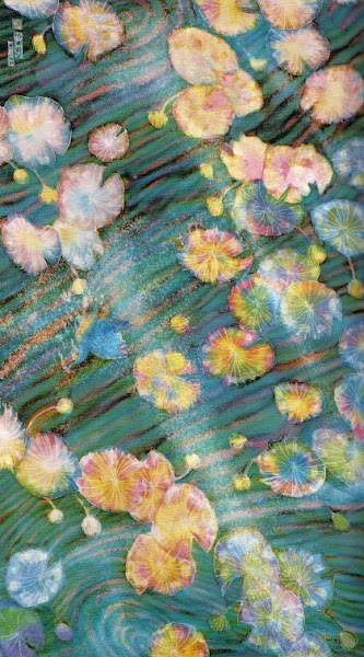
A wall hanging by Eisen Kubo using his original yuzen technique to depict rippling water, shimmering reflections of light, water lilies, and a brightly colored kingfisher.
Kako Moriguchi, designated a 'Living National Treasure',is the consummate yuzen artist. He incorporates into his dyeing a technique that creates images remininiscent of laquerware strewn with small geometrically shaped pieces of gold leaf. In place of the gold leaf, he sprinkles bits of dried paste over damp silk, arranging them carefully. These bits of paste work as a resist against the dye. When he brushes the dye into the silk, the shapes of the paste remain on the fabric. This technique, called maki nori, creates a texture that can be used as a background design or incorporated into major motifs according to the desire of the artist.
Semiformal kimono entitled - Lingering Snow - by Kako Moriguchi, a Living National Treasure.
The bamboo leaves are drawn by the yuzen process and the snow depicted by Moriguchi's maki nori gold-flake technique.
Crafts Gallery, National Museum of Modern Art.
Reference:
[1] A. Yang and R. M. Narasin, Shufunotomo. Co. Ltd.,Tokyo (1989).
Preamble
This is the fifteenth post in a new Art Resource series that specifically focuses on techniques used in creating artworks. For your convenience I have listed all the posts in this new series below:
Drawing Art
Painting Art - Part I
Painting Art - Part II
Painting Art - Part III
Painting Art - Part IV
Painting Art - Part V
Painting Art - Part VI
Home-Made Painting Art Materials
Quality in Ready-Made Artists' Supplies - Part I
Quality in Ready-Made Artists' Supplies - Part II
Quality in Ready-Made Artists' Supplies - Part III
Historical Notes on Art - Part I
Historical Notes on Art - Part II
Historical Notes on Art - Part III
Historical Notes on Art - Part IV
Historical Notes on Art - Part V
Tempera Painting
Oil Painting - Part I
Oil Painting - Part II
Oil Painting - Part III
Oil Painting - Part IV
Oil Painting - Part V
Oil Painting - Part VI
Pigments
Classification of Pigments - Part I
Classification of Pigments - Part II
Classification of Pigments - Part III
Pigments for Oil Painting
Pigments for Water Color
Pigments for Tempera Painting
Pigments for Pastel
Japanese Pigments
Pigments for Fresco Painting - Part I
Pigments for Fresco Painting - Part II
Selected Fresco Palette for Permanent Frescoes
Properties of Pigments in Common Use
Blue Pigments - Part I
Blue Pigments - Part II
Blue Pigments - Part III
Green Pigments - Part I
Green Pigments - Part II
Red Pigments - Part I
Red Pigments - Part II
Yellow Pigments - Part I
Yellow Pigments - Part II
Brown and Violet Pigments
Black Pigments
White Pigments - Part I
White Pigments - Part II
White Pigments - Part III
Inert Pigments
Permanence of Pigments: New Pigments - Part I
Permanence of Pigments: New Pigments - Part II
Limited or Restricted Palettes
Testing of Pigments - Part I
Testing of Pigments - Part II
Further Refinement of Pigments
There have been another one hundred and thirteen posts in a previous Art Resource series that have focused on the following topics:
(i) Units used in dyeing and printing of fabrics;
(ii) Occupational, health & safety issues in an art studio;
(iii) Color theories and color schemes;
(iv) Optical properties of fiber materials;
(v) General properties of fiber polymers and fibers - Part I to Part V;
(vi) Protein fibers;
(vii) Natural and man-made cellulosic fibers;
(viii) Fiber blends and melt spun fibers;
(ix) Fabric construction;
(x) Techniques and woven fibers;
(xi) Basic and figured weaves;
(xii) Pile, woven and knot pile fabrics;
(xiii) Nainkage, durable press and wash-wear finishes;
(xvi) Classification of dyes and dye blends;
(xv) The general theory of printing.
To access any of the above resources, please click on the following link - Units Used in Dyeing and Printing of Fabrics. This link will highlight all of the one hundred and thirteen posts in the previous a are eight data bases on this blogspot, namely, the Glossary of Cultural and Architectural Terms, Timelines of Fabrics, Dyes and Other Stuff, A Fashion Data Base, the Glossary of Colors, Dyes, Inks, Pigments and Resins, the Glossary of Fabrics, Fibers, Finishes, Garments and Yarns, Glossary of Art, Artists, Art Motifs and Art Movements, Glossary of Paper, Photography, Printing, Prints and Publication Terms and the Glossary of Scientific Terms. All data bases in the future will be updated from time-to-time.
If you find any post on this blog site useful, you can save it or copy and paste it into your own "Word" document for your future reference. For example, Safari allows you to save a post (e.g. click on "File", click on "Print" and release, click on "PDF" and then click on "Save As" and release - and a PDF should appear where you have stored it). Safari also allows you to mail a post to a friend (click on "File", and then point cursor to "Mail Contents On This Page" and release). Either way, this or other posts on this site may be a useful Art Resource for you.
The new Art Resource series will be the first post in each calendar month. Remember - these Art Resource posts span information that will be useful for a home hobbyist to that required by a final year University Fine-Art student and so undoubtedly, some parts of any Art Resource post may appear far too technical for your needs (skip those mind boggling parts) and in other parts, it may be too simplistic with respect to your level of knowledge (ditto the skip). The trade-off between these two extremes will mean that Art Resource posts will be hopefully useful in parts to most, but unfortunately may not be satisfying to all!
Historical Notes on Art - Part IV [1]
Medieval Europe
The period which follows, i.e., the early Christian or medieval era, supplies us with a somewhat larger number of surviving examples of painting, and also with written accounts of more definite character in all countries. These include manuscripts written by contemporary craftsmen and specialists for the purpose of disseminating their knowledge, records of expenditures of materials and letters of painters.
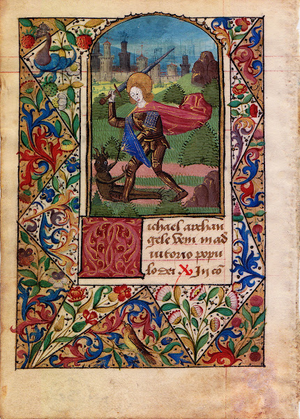
Illuminated Manuscript: Saint Michael Battling a Demon.
Much of our knowledge and evidence concerning techniques of the past is based on the study and careful interpretation of the early manuscripts. A long list of such documents could be made; some of them are well known to students, and others have received little attention. Most of them have been translated into English and critically interpreted by experts, some of which are in the form of art dictionaries focussed on artists of a particular nationality.
The Orient
As with the earliest European painters, permanence was regarded by the Chinese and Japanese as an essential requirement in a work of art. The Japanese have carried on this tradition and today they use the same list of twenty or so pigments that they used centuries ago. The Japanese pigments are basically pastel pigments. The finely powdered minerals differ in shade from the same minerals more coarsely powdered. The basic pigments are listed below:
White
Ground quartz crystal (sui sho matsu).
Ground calcite (hokai matsu).
Shell white (go fun).
Mica (unmo).
Note: The whites have various textural and reflective characteristics.
Blue
Powdered azurite (gunjo).
Very finely powdered azurite (byankugun).
Japanese indigo (ai).
Green
Malachite (byaku roku)
Bluish Green
Azurite and malachite mixture.
Malachite rich (shin sha).
Burnt azurite and malachite.
Azurite rich (yakigunroku).
Red
Pure vermilion.
"Red" (hon shu goku akakuchi).
Cochineal red (enji).
Red lead (tan).
Red earth color (benigara).
Yellow earth (odo).
Although most colors in the above list are of natural mineral origin, one (indigo) is derived from a plant and another (cochineal) from an insect.
Wild Indigo Plant.
Cochineal insect.
It must be understood that paintings created by Oriental artists are not as continuously exposed to light as Western works of art. Their paintings are rolled up and stored in individual wooden boxes after a brief showing.
Chinese box used for storing Chinese artwork.
The Chinese were well acquainted with several kinds of drying oils for many centuries and employed them for various technical purposes, but their pictorial art was confined to ink and water-color tints on paper.
An Ancient Chinese Painting.
A drying oil was used as a medium for the vermilion seal that was impressed by the artist on each painting. Their fundamental conceptions of pictorial art were exactly served by the materials they used, and although in later days they might have absorbed Western influences and ideas, the Chinese have always rejected Western materials.
Tradition Chinese art implements.
Reference:
[1] The Artist's Handbook of Materials and Techniques, R. Mayer, (ed. E. Smith) 4th Edition, Faber and Faber, London (1981).

 Moon, woodcut in progress (2012).
 Moon, woodcut (2012).
 Garden, woodcut in progress (2012).
 Garden, woodcut (2012).
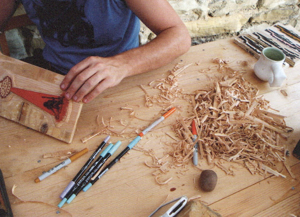 Desert Island, woodcut in progress (2012).
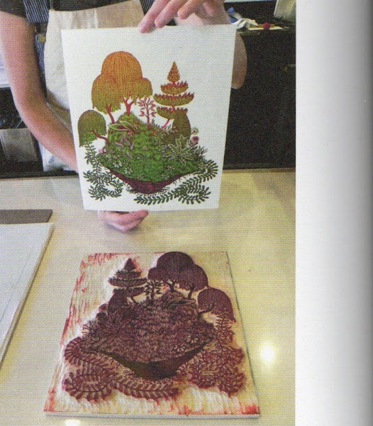 Clod, woodcut (2012).
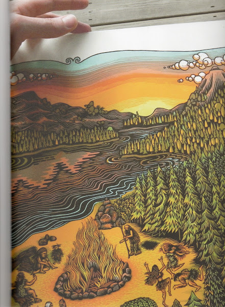 Bonfire, woodcut (2010).