Saturday, March 29, 2025

Art Quilts of Carolyn Crump [1]
Art Quilts

Marie-Therese Wisniowski

Preamble
Art Quilts have featured on this blogspot and so for your convenience I have listed below previous posts in this series:
Art Quilts - Part I
Art Quilts - Part II
Art Quilts - Part III
Art Quilts - Part IV
Art Quilts - Part V
Art Quilts - Part VI
Art Quilts - Part VII
Art Quilters of the Netherlands - Part I
Art Quilters of the Netherlands - Part II
Art Quilters of the Netherlands - Part III
Four Selected European Art Quilters - Part I
Four Selected European Art Quilters - Part II
Four Selected European Art Quilters - Part III
Art Quilts of Jane Sassaman
Art Quilts of Michael A. Cummings
Four Selected European Art Quilters - Part IV
Art Quilts of Carolyn Crump


Art Quilts of Carolyn Crump[1]
A fifth-generation quilter, who has also studied painting and graphic design, Carolyn Crump draws on a variety of media to create vivid, richly textured portraits and scenes. Block prints or linocuts, her figures are outlined in black against boldly colored backgrounds. Lively and dynamic, the black lines of each figure create a sense of movement that Crump echoes in images like flowing scarves, billowing ribbons, and flags etc.

Cherished Times
Title: Cherished Times (2007).
Size: 38 x 34 inches (96.5 x 86.4 cm).
Materials and Techniques: Cotton; appliquéd, machine sewn.
Photograph: Courtesy of the artist.

CloseUp
Close up view of the above image.

African Attitude
Title: African Attitude (2009).
Size: 19 x 17 inches (48.2 x 43.2 cm).
Materials and Techniques: Cotton; painted, machine sewn.
Photograph: Courtesy of Ash Wilson.

African Attitude
Close up view of the above image.

The Kiss
Title: The Kiss (2009).
Size: 14.5 x 10 inches (36.8 x 25.4 cm).
Materials and Techniques: Cotton, silk; appliquéd, machine sewn.
Photograph: Courtesy of Ash Wilson.

Awakening Spring
Title: Awakening Spring (2007).
Size: 52.5 x 34 inches (1.3 x 0.8 cm).
Materials and Techniques: Cotton; glass beads; appliquéd, machine sewn, hand sewn.
Photograph: Courtesy of Rodolfo Hernandez.
Artist's Comment[1]: I like challenging myself to be better. When I fail at one process, I don't stop until I find a solution.

Close-up
Close up view of the above image.

Dichotomy
Title: Dichotomy (2009).
Size: 31 x 18 inches (78.7 x 45.7 cm).
Materials and Techniques: Cotton; appliquéd, machine sewn.
Photograph: Courtesy of Ash Wilson.

Wings of Faith
Title: Wings of Faith (2008).
Size: 28 x 26 inches (71.7 x 66 cm).
Materials and Techniques: Cotton; appliquéd, machine sewn.
Photograph: Courtesy of Rick Stein.
Artist's Comment [1]: The medium of fiber draws me into a world of unlimited imagination.

Close-up
Close up view of the above image.

Like Father, Like Son
Title: Like Father, Like Son (2009).
Size: 26 x 16 inches (66 x 40.6 cm).
Materials and Techniques: Cotton; paint; appliquéd, machine sewn.
Photograph: Courtesy of Ash Wilson.

Detail
Close up view of the above image.

Dusty Cove
Title: Dusky Cove (2007).
Size: 38 x 53 inches (0.9 x 1.3 m).
Materials and Techniques: Cotton; appliquéd, machine sewn.
Photograph: Courtesy of Ash Wilson.

Rita
Title: Spirit of Rita (2006).
Size: 40.5 x 54 inches (1 x 1.4 m).
Materials and Techniques: Cotton; buttons, appliquéd, machine sewn.
Photograph: Courtesy of Ash Wilson.

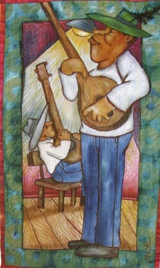
Playing the Blues
Title: Playing the Blues (2008).
Size: 14 x 10 inches (35.6 x 25.4 m).
Materials and Techniques: Cotton; appliquéd, machine sewn.
Photograph: Courtesy of Ash Wilson.
Artist's Comment [1]: Quilting gives me the opportunity to express what I imagine, to materialize it on a surface for others to see.


Reference:
[1] Masters: Art Quilts, Vol. 2, Curated by M. Sielman, Lark Crafts, An Imprint of Sterling Publishing Co., Inc., New York (2011).

Saturday, March 22, 2025

Fabric Swatches - Part IV [1]
ArtCloth

Marie-Therese Wsniowski


Preamble
For you convenience I have listed below other posts in this series which were sourced from the book - The Pattern Base[1].
The Pattern Base by Kristi O'Meara - Book Review
The Art of Lorenzo Nanni
The Geometric Abstract Designs of Kristi O'Meara
Representational Designs of Kristi O'Meara
Geometric Patterns Designed by Patrick Morissey and Jasmin Elisa Guerrero
Fabric Swatches - Part I
Hannah Truran
Fabric Swatches - Part II
Fabric Swatches - Part III
Fabric Swatches - Part IV


Fabric Swatches - Part IV

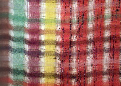
Avalanche Looms
Creator: Susan Johnson.
Title: Avalanche Looms. We're not out of the woods yet #1 (2012).

Avalanche Looms
Creator: Susan Johnson.
Title: Avalanche Looms. We're not out of the woods yet #2 (2012).

Avalanche Looms
Creator: Susan Johnson.
Title: Avalanche Looms. We're not out of the woods yet #3 (2013).

Avalanche Looms
Creator: Susan Johnson.
Title: Avalanche Looms. We're not out of the woods yet #4 (2013).

Sister Queen!
Creator: Cantoinette Studios.
Title: Sister Queen! Sister Queen! (2011).

Party Fabric
Creator: Etta Sandry.
Title: Party Fabric (Detail) (2012).

Party Fabric
Creator: Etta Sandry.
Title: Party Fabric (Detail 1) (2012).

Party Fabric (Detail)
Creator: Etta Sandry.
Title: Party Fabric (Detail 2) (2012).

Creator: Etta Sandry.
Title: Party Fabric (Detail 3) (2012).

Summer Walk
Creator: Nelda Warkentin.
Title: Summer Walk (2005)

Buds
Creator: Roshannah Bagley.
Title: Buds (Series) (2009).

Basilica
Creator: Roshannah Bagley.
Title: Basilica (Repeat) (2010).


Reference:
[1] The Pattern Base, Kristi O'Meara (Ed. A. Keiffer) Thames & Hudson (2015).

Saturday, March 15, 2025

Katazome (Stencil Dyeing) - Part I [1]
Art Essay

Marie-Therese Wisniowski

Preamble
For your convenience, I have listed below other post on Japanese textiles on this blogspot.
Discharge Thundercloud
The Basic Kimono Pattern
The Kimono and Japanese Textile Designs
Traditional Japanese Arabesque Patterns - Part I
Textile Dyeing Patterns of Japan
Traditional Japanese Arabesque Patterns - Part II
Sarasa Arabesque Patterns
Contemporary Japanese Textile Creations
Shibori (Tie-Dying)
History of the Kimono
A Textile Tour of Japan - Part I
A Textile Tour of Japan - Part II
The History of the Obi
Japanese Embroidery (Shishu)
Japanese Dyed Textiles
Aizome (Japanese Indigo Dyeing)
Stencil-Dyed Indigo Arabesque Patterns
Japanese Paintings on Silk
Tsutsugaki - Freehand Paste-Resist Dyeing
Street Play in Tokyo
Birds and Flowers in Japanese Textile Designs
Japanese Colors and Inks on Paper From the Idemitsu Collection
Yuzen: Multicolored Past-Resist Dyeing - Part I
Yuzen: Multi-colored Paste-Resist Dyeing - Part II
Katazome (Stencil Dyeing) - Part I


Katazome (Stencil Dyeing) - Part I [1]
One of the many traditional dyeing techniques from China is stencil dyeing, or katazome, as it is known and still practiced in Japan. Stencils were first used in the Heian period to decorate leather, and during the Kamakura period as a method of stencil dyeing on fabric. By the sixteenth century, this technique had been perfected. The isolation of the Edo period brought katazome to full flower, and it continued as a popular dyeing technique until modern technology and changing tastes in fashion nearly brought it to an end during the Meiji period. For its revival, we are indebted to the Mingei, or Folk Crafts movement, and artisans such as Keisuki Serizawa and Toshijiro Inagaki, as well as to the Japanese government's recognition of superior craftsmen and works.

The word 'Katazome' is derived from a combination of two Japanese words, kata, meaning stencil, and zome meaning dye. Katazome refers to the process of fabric dyeing that employs a water-soluble paste-resist, which is applied to the fabric through a cut stencil. The qualities of precision and repetition that are characteristic of katazome are due to the durable stencil paper and a water-soluble rice-paste resist.

Tanks of permission juice
Tanks of persimmon juice to make fermented tannin dye called Kakishibu.

Paper for stencils drying
Paper for stencils drying after persimmon juice has been applied to the rice paper.

Making a stencil of a flower design
Making a stencil of a flower design.

Detail Pattern
Extreme care and skill are needed in making a stencil for the highly detailed patterns of komon.

Drying in Sun
Dyed fabrics, drying in the sun.

The stencil paper is made by gluing together several layers of 'washi' (paper made from the kozo or paper mulberry plant). Then treating it with persimmon juice, and smoking it for several days. This extremely durable paper, strengthened by the persimmon tannin and the smoke, can withstand long exposure to moisture, and yet can be cut precisely into intricate or bold designs with a very clear edge. Using razor-sharp knives and tools especially created to form unique shapes, precise designs are then cut out.

Stencil Dyeing
Stencil dyeing using two stencils - the main stencil.

The second stencil
Stencil dyeing using two stencils - the second stencil.

Finished Work
The finished artwork.

Inserting Silk Threads
Silk threads are inserted in a stencil to strengthen the most delicate parts of it.


Reference:
[1] A. Yang and R. M. Narasin, Shufunotomo. Co. Ltd.,Tokyo (1989).

Saturday, March 8, 2025

Intaglio Prints Created Using Solarplates[1] - Part IV
Prints on Paper

Marie-Therese Wisniowski

Preamble
For your convenience I have listed other posts in this series:
Intaglio Prints Created Using Solarplates[1] - Part I
Intaglio Prints Created Using Solarplates[1] - Part II
Intaglio Prints Created Using Solarplates[1] - Part III
Intaglio Prints Created Using Solarplates[1] - Part IV


Introduction
Just as a reminder, intaglio prints can be created using solarplates. Here UV light only penetrates the clear area of the transparency and hardens the polymer, whereas areas beneath the opaque lines of the drawing remains soluble [1] and so can be removed.

Intaglio Prints Created Using Solarplates[1] - Part IV
It is a good idea to keep a notebook with test transparencies, the exposure times, and development details with corresponding prints for future reference.

Eric Fischl
Creator: Eric Fischl.
Title: Jumprope (1992).
Print: Intaglio Print.
Size: 19 x 15 in (48 x 38 cm).
Comment [1]: This painterly print was created by working with ink on acetate.

Lynda Benglis
Creator: Lynda Benglis.
Title: Hot Spots (1999).
Print: Intaglio Print.
Size: 15 x 22 in (38 x 56 cm).
Comment [1]: Double exposure intaglio print. Lynda Benglis found that painting watercolor on tracing paper caused the paper to crinkle, resulting in a subtle pattern in the final print.

Richard Mello
Creator: Richard Mello.
Title: Untitled (1997).
Print: Intaglio Print.
Size: 7 x 10 in (17.5 x 25.5 cm).
Comment [1]: This is an example of a positive transparency. Artist Richard Mello is just putting the finishing touches to a drawing on acetate, which is now ready for exposure.

Meredith Perrin
Creator: Meredith Perrin.
Title: Dragon Pot (1997).
Print: Intaglio Print.
Size: 8.5 x 6 in (21.5 x 15 cm).
Comment [1]: Meredith Perrin likes to develop several versions of the same image before selecting one for exposure on a plate. To create the image, she photocopied an original drawing onto a transparency and then worked it further with felt tip pen and scratching back techniques.

Carol Hunt
Creator: Carol Hunt.
Title: Solar Etching (from a Suite of 15) (1993).
Print: Intaglio Print.
Size: 8 x 6 in (20.5 x 15 cm).
Comment [1]: Carol Hunt uses repeated photocopying to alter and develop the image. This process also enriches the depth of black tones.

Janet Ayliffe
Creator: Janet Ayliffe.
Title: Kangarilla (1998).
Print: Single exposure two-plate intaglio print.
Size: 21 x 11.5 in (53.5 x 29 cm).
Comment [1]: Janet Ayliffe tells stories through her art. To create this print, she photocopied an original drawing onto a transarency and then used drawing and scraping techniques to further work the image. This transparency was used to make the key plate. The second plate was a traditional zinc etching plate. The final print was made by printing the etching plate first, then printing the key plate to give definition to the image.


Reference:
[1] D.Welden and P. Muir, Printmaking in the Sun, Watson-Guptill Publications, New York (1997)

Saturday, March 1, 2025

Red Pigments - Part I [1]
Art Resource

Marie-Therese Wisniowski

Preamble
This is the fourty-second post in a new Art Resource series that specifically focuses on techniques used in creating artworks. For your convenience I have listed all the posts in this new series below:
Drawing Art
Painting Art - Part I
Painting Art - Part II
Painting Art - Part III
Painting Art - Part IV
Painting Art - Part V
Painting Art - Part VI
Home-Made Painting Art Materials
Quality in Ready-Made Artists' Supplies - Part I
Quality in Ready-Made Artists' Supplies - Part II
Quality in Ready-Made Artists' Supplies - Part III
Historical Notes on Art - Part I
Historical Notes on Art - Part II
Historical Notes on Art - Part III
Historical Notes on Art - Part IV
Historical Notes on Art - Part V
Tempera Painting
Oil Painting - Part I
Oil Painting - Part II
Oil Painting - Part III
Oil Painting - Part IV
Oil Painting - Part V
Oil Painting - Part VI
Pigments
Classification of Pigments - Part I
Classification of Pigments - Part II
Classification of Pigments - Part III
Pigments for Oil Painting
Pigments for Water Color
Pigments for Tempera Painting
Pigments for Pastel
Japanese Pigments
Pigments for Fresco Painting - Part I
Pigments for Fresco Painting - Part II
Selected Fresco Palette for Permanent Frescoes
Properties of Pigments in Common Use
Blue Pigments - Part I
Blue Pigments - Part II
Blue Pigments - Part III
Green Pigments - Part I
Green Pigments - Part II
Red Pigments - Part I
Red Pigments - Part II

There have been another one hundred and thirteen posts in a previous Art Resource series that have focused on the following topics:
(i) Units used in dyeing and printing of fabrics;
(ii) Occupational, health & safety issues in an art studio;
(iii) Color theories and color schemes;
(iv) Optical properties of fiber materials;
(v) General properties of fiber polymers and fibers - Part I to Part V;
(vi) Protein fibers;
(vii) Natural and man-made cellulosic fibers;
(viii) Fiber blends and melt spun fibers;
(ix) Fabric construction;
(x) Techniques and woven fibers;
(xi) Basic and figured weaves;
(xii) Pile, woven and knot pile fabrics;
(xiii) Durable press and wash-and-wear finishes;
(xvi) Classification of dyes and dye blends;
(xv) The general theory of printing.

To access any of the above resources, please click on the following link - Units Used in Dyeing and Printing of Fabrics. This link will highlight all of the one hundred and thirteen posts in the previous a are eight data bases on this blogspot, namely, the Glossary of Cultural and Architectural Terms, Timelines of Fabrics, Dyes and Other Stuff, A Fashion Data Base, the Glossary of Colors, Dyes, Inks, Pigments and Resins, the Glossary of Fabrics, Fibers, Finishes, Garments and Yarns, Glossary of Art, Artists, Art Motifs and Art Movements, Glossary of Paper, Photography, Printing, Prints and Publication Terms and the Glossary of Scientific Terms. All data bases in the future will be updated from time-to-time.

If you find any post on this blog site useful, you can save it or copy and paste it into your own "Word" document for your future reference. For example, Safari allows you to save a post (e.g. click on "File", click on "Print" and release, click on "PDF" and then click on "Save As" and release - and a PDF should appear where you have stored it). Safari also allows you to mail a post to a friend (click on "File", and then point cursor to "Mail Contents On This Page" and release). Either way, this or other posts on this site may be a useful Art Resource for you.

The new Art Resource series will be the first post in each calendar month. Remember - these Art Resource posts span information that will be useful for a home hobbyist to that required by a final year University Fine-Art student and so undoubtedly, some parts of any Art Resource post may appear far too technical for your needs (skip those mind boggling parts) and in other parts, it may be too simplistic with respect to your level of knowledge (ditto the skip). The trade-off between these two extremes will mean that Art Resource posts will be hopefully useful in parts to most, but unfortunately may not be satisfying to all!


Red Pigments - Part I [1]
The wide range of effects which may easily be obtained with permanent reds and mixtures of them make it simple to match reds or reddish colors. For nearly all purposes, vermilion is perfectly replaced by the light cadmium reds; if these are too cold or chalky in comparison with it, a touch of toning color may be necessarily added.

Vermilion versus light Cadmium Reds
Vermilion versus light Cadmium Reds.

Alizarin will substitute for all transparent lakes.

Alizarin
Alizarin.
Note: Alizarin crimson is a shade of red that is biased slightly more towards purple than towards orange on the color wheel and has a blue undertone. It is named after the organic dye alizarin, found in the madder plant, and the related synthetic lake pigment alizarin crimson (PR83 in the Color Index).

The brilliant geranium reds, magentas, and rose pinks of the past were synthetic organic pigments of poor fade-resistance and were employed for illustration and other work done for reproduction rather than for creative easel paintings. Today such hues are available in pigments with permanence.

Geranium Red
Geranium Reds.

Magenta
Magenta is a purplish-red color. On color wheels of the RGB (additive) and CMYK (subtractive) color models, it is located precisely midway between blue and red.

Rose Pink
Rose Pink.

The Earth Reds (Venetian Red etc.) should be replaced whenever possible by their artificial counterparts; i.e., the Mars colors and the bright red oxides.

Venetian Red
Venetian Red.

Red Oxide
Red Oxide.

Except in fresco painting, however, this is not a seriously important precaution; and it is fortunate, since nomenclature for these colors was such as to bewilder persons not thoroughly familiar with their properties.

In the color trade the impure native oxide of bluish tone is mainly known as Spanish Red, and the scarlet shade as Venetian Red (see above).

Spanish Red
Spanish Red.

The pure varieties are called Indian Red (bluish shade) and light red or bright red oxide.

Indian Red
Indian Red.

However, special trade names or numbers for various grades are widely used in the paint industry, thereby eliminating much confusion.

The principle distinction can be made in that one brand is brighter and more scarlet in mass tone, and when reduced with white produces salmon pinks.

Salmon Pink
Salmon Pink.

Mars Violets and highly burned Indian Reds, produce Lavenders, when reduced with white.

Lavender

Lavender.


Reference:
[1] The Artist's Handbook of Materials and Techniques, R. Mayer (ed. E. Smith) 4th Edition, Faber and Faber, London (1981).